Dashboard design best practices are most useful when they are framed around the failures they prevent rather than the features they prescribe. Most enterprise dashboards that underperform are not poorly built. They are built to the wrong specification, optimized for the data layer rather than for the decisions the people using them need to make. This post covers the dashboard design best practices that consistently produce dashboards users return to, drawn from Wandr's work with enterprise and SaaS products across cybersecurity, fintech, and B2B software.

The Dashboard Design Best Practice Nobody Talks About First
Every resource about dashboard design best practices starts with visual hierarchy, chart selection, or color theory. These are legitimate considerations. They are also downstream of the most important best practice, which almost no resource covers first: define the decisions before you design the dashboard.
A dashboard is not a data display tool. It is a decision support tool. The distinction determines everything about how it should be designed: what information appears, at what level of prominence, in what sequence, and with what supporting context.
When a product team starts dashboard design by asking "what data do we have access to" or "what metrics should we track," the resulting dashboard reflects the data architecture. When they start by asking "what decisions does this person make, and what do they need to know to make them confidently," the resulting dashboard reflects the user's actual work.
The difference between these two starting points is the difference between a dashboard that changes how a team operates and one that sits in a browser tab nobody opens.
Every best practice in this post follows from this foundational one. Read them in that context.
Best Practice 1: Define User Roles Before Defining Dashboard Views
The most common dashboard design mistake in enterprise products is building a single dashboard that attempts to serve all user types simultaneously. An executive who needs to assess organizational health at a glance has fundamentally different information needs from a practitioner who needs to investigate a specific anomaly or a manager who needs to track team performance against targets.
A single dashboard serving all three users will fail all three in different ways. The executive will find the detail overwhelming. The practitioner will find the summary insufficient. The manager will find neither view matches the questions they actually need to answer.
Role-based dashboard design is not about building three separate products. It is about designing an information architecture with clearly defined entry points for different user contexts, appropriate depth at each level, and navigation between levels that feels natural rather than disorienting.
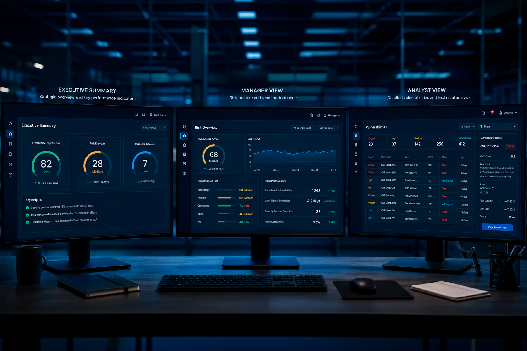
Tenable's enterprise cybersecurity platform serves security analysts, security managers, and executive stakeholders who all need different views of the same underlying risk data. The security analyst needs granular vulnerability detail to prioritize remediation. The security manager needs aggregate risk posture to allocate team resources. The executive needs the overall exposure picture to make investment decisions. Each of these views is a distinct design problem that requires distinct structural decisions.
Best Practice 2: Establish Load Time Requirements Before Starting Visual Design
Dashboard performance is a design constraint, not an engineering afterthought. A dashboard that takes six seconds to load will not be checked as a regular part of a user's workflow, regardless of how well the visual design is executed.
The best practice is to define acceptable load time requirements for each view during the design phase, then design within those constraints. This means working with engineering during information architecture to understand which data combinations are expensive to query, which visualizations require heavy computation, and how the loading sequence can be structured to surface the most critical information first while secondary data loads in the background.
Skeleton states, placeholder layouts that appear while data loads, are a design decision, not an engineering one. A well-designed skeleton state maintains the visual structure of the loaded dashboard and gives users a sense of where to look before the data appears. A poorly designed skeleton state or no skeleton state at all creates visual instability as elements shift when data populates, which degrades the perception of performance even when the actual load time is acceptable.
Best Practice 3: Make the Comparison Explicit
A metric without a reference point is not information. It is a number. The best practice for every metric displayed on a dashboard is to make the comparison explicit: compared to the previous period, compared to target, compared to benchmark, or compared to a threshold that defines acceptable versus unacceptable performance.
This sounds obvious. Enterprise dashboards consistently violate it. The data team knows that a 3.2% conversion rate is above target because they know the target is 3.0%. The user who is not a data team member does not know this, and the dashboard that displays 3.2% without the reference point forces them to either hold the target in their head or look it up every time they check the dashboard.
The specific reference point to include depends on the decision the metric supports. For operational metrics, the relevant comparison is usually period-over-period trend. For performance metrics, it is actual versus target. For competitive or market metrics, it is internal versus external benchmark. Defining the right comparison is part of the decision mapping work that should precede visual design.
Best Practice 4: Design the Empty State With the Same Care as the Populated State
The empty state is the first thing a new user sees on any dashboard. It is also the state most consistently neglected in enterprise dashboard design.
A well-designed empty state tells the user what the dashboard will show when populated, why the data is not there yet, and what action they need to take to generate the first data. It is, in effect, an onboarding experience embedded in the dashboard itself.
A poorly designed empty state, or no empty state, shows a blank screen with placeholder text that says "no data available." To a new user, this is indistinguishable from an error. It creates uncertainty about whether the product is working correctly, which is exactly the wrong impression to make during the first session.
For enterprise products with complex onboarding requirements, such as data integrations, account configuration, and permission setup, the empty state is particularly critical because the time from account creation to first meaningful data can be measured in days. Every user who encounters the empty state during that period is evaluating whether the product is worth the implementation effort. A well-designed empty state that communicates what is coming and what to do next maintains engagement during that period. A blank screen or generic error message accelerates abandonment.

Best Practice 5: Treat Filter and Search as Core Features, Not Advanced Features
Dashboards that hide filtering and search behind an "advanced" label or a secondary navigation layer are making a structural error about how enterprise users actually use data interfaces.
Enterprise users access dashboards with specific investigative intent as often as they access them for routine status checks. A security analyst who needs to find all critical vulnerabilities on a specific subnet needs to be able to filter to that view in seconds, not minutes. A financial analyst who needs to isolate transactions from a specific merchant category in a specific date range needs search that works immediately, not a filter configuration that requires understanding a query syntax.
The best practice is to treat filtering and search as primary interaction patterns that are visible and accessible without additional navigation. The most relevant filters for each user role should be surfaced prominently in the default view. Search should return meaningful results from the first character, not only after a complete search term is submitted.
This is particularly important for dashboards serving power users, the analysts, operators, and practitioners who are in the product for extended periods doing investigative work. Hiding the tools they use most behind additional layers of navigation signals that the product was not designed for how they actually work.

Best Practice 6: Accessibility Is Not Optional in Enterprise Products
Enterprise dashboard design consistently underinvests in accessibility, which creates two problems that are both more significant than most teams realize.
The first is a procurement problem. Enterprise buyers in government, healthcare, financial services, and education are increasingly required to evaluate accessibility compliance as part of vendor selection. A dashboard that fails WCAG 2.1 AA standards can disqualify a product from procurement consideration before the evaluation process begins.
The second is a user experience problem. Accessibility standards are not exclusively about screen reader compatibility. They cover color contrast ratios, text sizing, keyboard navigation, focus management, and interaction patterns that affect every user, not only users with disabilities. A dashboard that meets WCAG 2.1 AA standards is, by definition, a more legible, more navigable, and more usable dashboard for all users.
Color alone as the only differentiator for data states, using red and green to indicate status without any other visual cue, fails accessibility standards and fails the approximately 8% of male users with color vision deficiency. These users see the dashboard differently from how it was designed, and the information it is meant to communicate may be lost entirely. Adding shape, pattern, or text labels as secondary differentiators alongside color costs nothing in design complexity and makes the dashboard more usable for everyone.
Best Practice 7: Version the Dashboard Experience
Enterprise dashboards evolve as products grow and as user needs change. The best practice for managing that evolution is treating the dashboard experience with the same versioning discipline that engineering applies to APIs and data schemas.
This means communicating changes before they happen rather than after, giving users a period where the new and old experiences coexist before the old one is deprecated, and providing documentation for what changed and why. Users who have built their workflows around a specific dashboard layout experience significant disruption when that layout changes without warning. Enterprise users who report this disruption to their procurement team create renewal risk.
The practical implication for dashboard design is that modular, component-based design systems make dashboard evolution significantly less disruptive than monolithic dashboard designs. When the underlying design system is stable, individual components can evolve and new views can be added without restructuring the entire experience. This is one of several reasons why building a dashboard design system is a better long-term investment than building individual dashboard views.
Final Thoughts
Dashboard design best practices are tools for preventing the specific failures that cause enterprise dashboards to be ignored rather than used. The failures are consistent across industries: designing around data availability rather than decision needs, building for one user type when multiple types exist, neglecting performance as a design constraint, and treating empty states and error states as engineering problems rather than user experience problems.
The dashboards that perform are the ones where every design decision traces back to a specific user, a specific decision, and a specific context. That traceability is not a design methodology. It is the discipline of starting with the person rather than the data, and it is the best practice that makes all the others possible.
Work With a Dashboard Design Team That Starts With the Decision
Wandr designs dashboards for enterprise cybersecurity, fintech, and B2B SaaS products where the stakes of a poorly designed dashboard are measured in team efficiency, user retention, and product adoption. If your dashboard is not driving the decisions it was built to support, schedule a free consultation with our team and let us show you where to start.