


Fintech dashboard design patterns in 2026 are defined by one constraint that does not apply to most other dashboard categories: trust. Every design decision in a fintech dashboard, from how balances are displayed to how transaction history is structured, is also a trust decision. Users who do not trust what they see on a financial dashboard will not act on it, and users who cannot act on it will find a product they trust more. This post covers the specific patterns that work in fintech dashboard design and why they work, drawn from Wandr's work with Synchrony and Modfi.
Why Fintech Dashboard Design Is Different
Most dashboard design advice is category-agnostic. Lead with the most important metric. Reduce cognitive load. Establish clear visual hierarchy. These principles are sound and apply universally.
Fintech dashboards require all of those principles plus a layer that most dashboard categories do not need: the design has to continuously earn and reinforce the user's trust that the data they are seeing is accurate, current, and secure.
This is not a minor consideration. Financial data is among the most sensitive information users interact with digitally. When a fintech dashboard presents a balance figure, the user is trusting that the number is correct, that it is current, and that the interface they are using to view it is secure. Any design decision that creates ambiguity about any of those three factors, whether through visual inconsistency, unclear data freshness indicators, or interface patterns associated with low-quality products, erodes that trust before the user consciously registers it.
Trust in fintech dashboard design is not a UX polish concern. It is a retention and conversion driver. Users who do not trust the interface of a financial product will not link accounts, will not increase balances, and will not recommend the product to others.
Pattern 1: Data Freshness as a First-Class Design Element
Fintech users checking a dashboard are almost always asking one question before any other: is this current? A balance that is two days stale is meaningless for any decision involving that money. A transaction feed that has not updated since yesterday morning creates anxiety rather than clarity.
The pattern that works is making data freshness visible without making it distracting. Timestamps showing when data was last updated, indicators distinguishing pending from posted transactions, and clear signals when real-time data is unavailable and the dashboard is showing cached values all reduce anxiety rather than creating it.
The worst pattern is showing financial data without any freshness indicator. Users fill the ambiguity with the assumption that the data might be stale, which means they distrust every figure they see and seek confirmation elsewhere before making any decision. That extra step is friction that compounds across every session.
Pattern 2: Balance Display Hierarchy That Reflects User Intent
The balance display is the most viewed element of any personal or business financial dashboard. How it is structured determines whether the user can assess their financial position in a single glance or has to work to understand it.
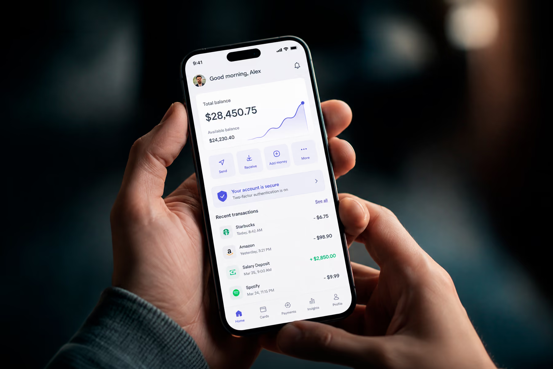
The patterns that consistently perform in fintech dashboard design separate available balance from total balance, make pending transactions visually distinct from posted ones, and position the most action-relevant figure at the top of the hierarchy.
For a consumer financial product, the most action-relevant figure is usually available balance, the amount the user can actually spend or transfer right now. For a business financial product, it might be runway, cash position, or available credit depending on the user's role and the decisions they make from the dashboard.
The common failure pattern is displaying all balance figures at equal visual weight, forcing the user to interpret which number matters for their current intent. This is particularly damaging in products like Synchrony's GiftNow platform, where users have multiple account relationships and need to understand the consolidated picture instantly before any transaction decision.
Pattern 3: Transaction History as Investigation Tool, Not Record
Most fintech dashboards treat transaction history as a chronological record. The most recent transactions appear at the top, older transactions below, and the user scrolls backward through time to find what they are looking for.
This pattern makes sense from a data architecture perspective. It makes almost no sense from a user intent perspective.
Users access transaction history for three primary reasons: to verify a specific transaction appeared correctly, to understand spending in a category over a period, or to investigate an anomaly they noticed in their balance. None of these tasks is well-served by a chronological list without filtering, search, or categorization.
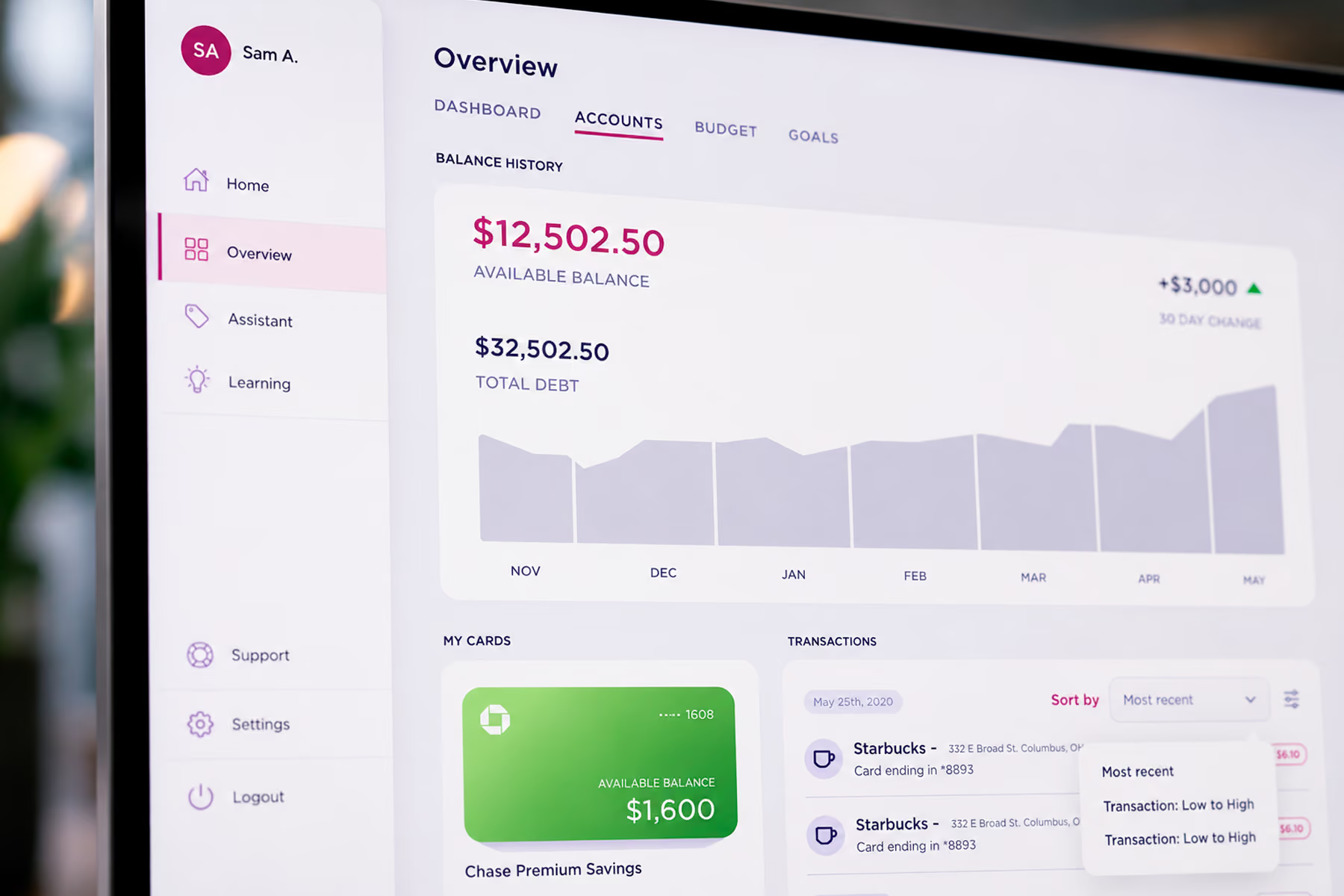
The patterns that work are: robust filtering by category, merchant, and date range without requiring the user to understand the filter syntax; instant search that returns results from the full transaction history, not just the visible page; and categorization that happens automatically and is editable when the automatic assignment is wrong.
When Wandr redesigned Modfi's financial platform, the transaction history was restructured around these three user intents rather than around chronological record-keeping. The result was a surface that users could actually investigate rather than simply scroll through.
Pattern 4: Alert and Notification Architecture That Earns Attention
Fintech dashboards that surface every alert with equal urgency train users to ignore all of them. Notification fatigue in financial products is particularly damaging because the alerts that users learn to ignore include the ones that actually require action: a fraud flag, a payment due, a balance below threshold.
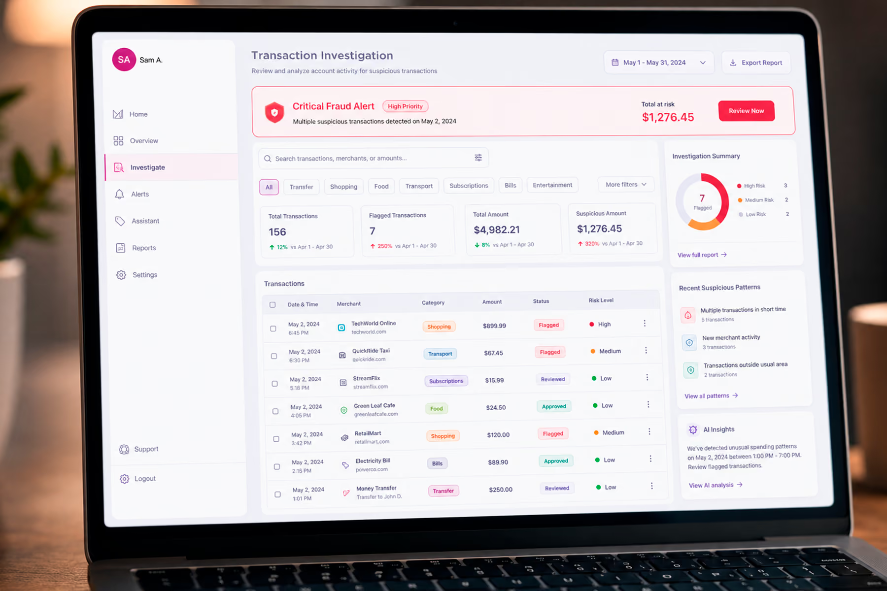
The patterns that work establish a clear hierarchy of alert severity and use visual weight, color, and position to communicate that hierarchy consistently. Critical alerts (potential fraud, failed payments, security events) appear at the top of the dashboard and use visual treatment that is genuinely distinct from informational alerts. Informational alerts (promotional offers, feature announcements, tips) appear in a secondary location and use substantially lower visual weight.
The practical implication is that a financial dashboard should be designed with a defined alert taxonomy before any alert UI is created. What are the alert categories? What severity level does each belong to? What is the required response time for each severity level? These decisions shape the information architecture and visual hierarchy of the entire alerts system.
Pattern 5: Trust Signals Embedded in the Interface Architecture
Fintech products that bury their trust signals, such as security certifications, regulatory compliance indicators, and data protection information, in footer links or dedicated compliance pages are making a structural mistake.
Users assess the trustworthiness of a financial interface continuously, not once during initial setup. Every time they see a balance they are about to act on, every time they initiate a transfer, every time they connect a new account, they are re-evaluating whether this interface is safe to use for this action.
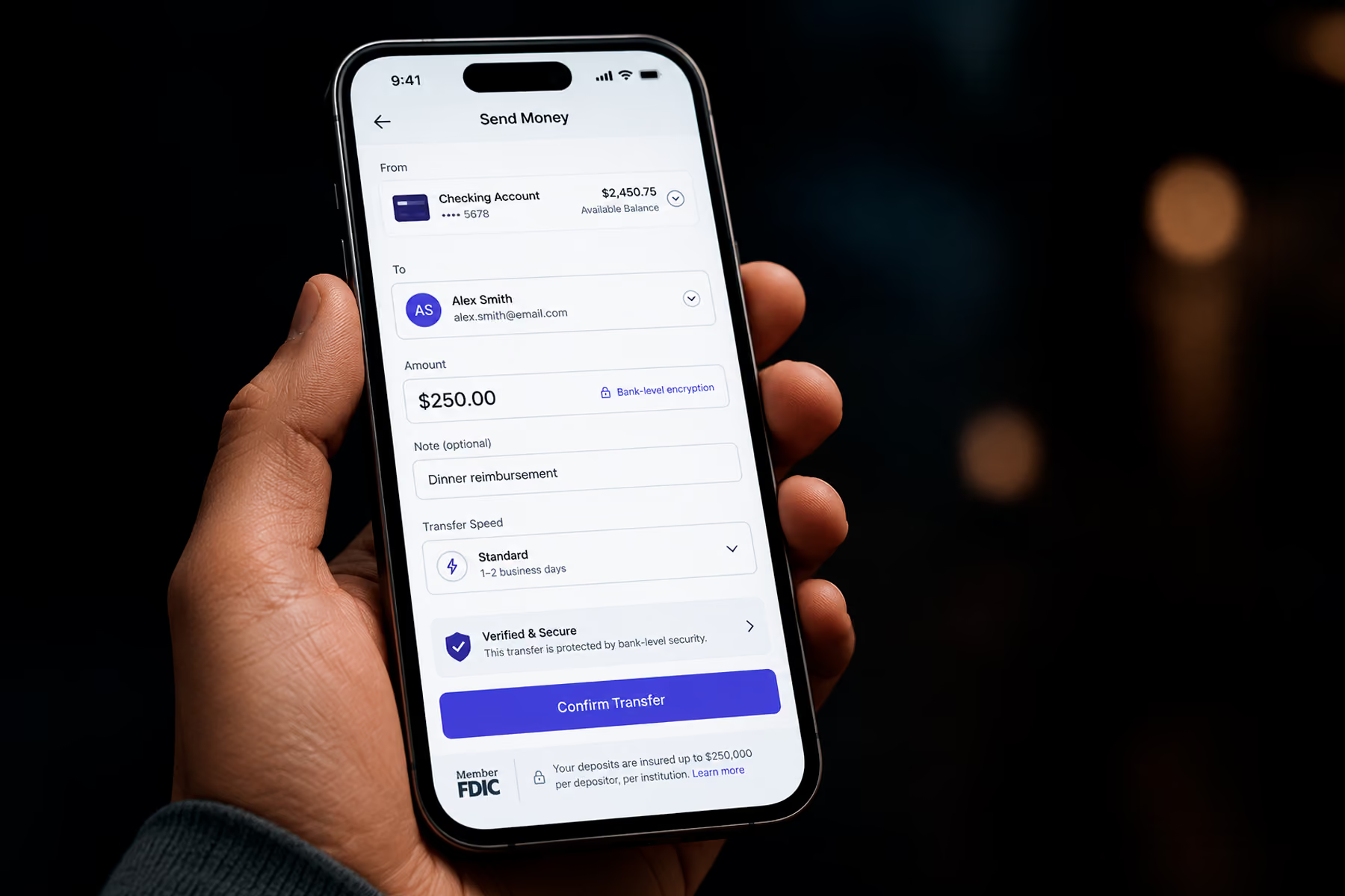
The patterns that work embed trust signals at the points of action rather than at the points of information. Security indicators appear near sensitive data fields, not only on the security settings page. Encryption indicators appear during transaction initiation, not only in the privacy policy. Regulatory compliance information appears when users are evaluating whether to link an account, not only during onboarding.
This is the pattern that drove the trust architecture work Wandr completed for Synchrony's GiftNow platform. Rather than treating compliance and security information as legal content separate from the product experience, we embedded trust signals at the specific interaction points where users were making trust-dependent decisions. The result was a measurable improvement in the actions users were willing to take.
Pattern 6: Progressive Disclosure for Complex Financial Data
Financial data is inherently complex. Most users do not need or want to see the full complexity at once. The pattern that works is progressive disclosure: surface the primary metric or status at the top level of the hierarchy, and make detailed data available through deliberate navigation rather than presenting everything simultaneously.
For a consumer dashboard, this might mean showing the account balance prominently with a single tap to see the transaction breakdown, and a second tap to see categorized spending analysis. For a business financial dashboard, it might mean showing the cash position summary prominently with drill-down available for account-level detail, ledger entries, and reconciliation status.
Progressive disclosure respects that different users accessing the same dashboard at different moments need different depths of information. The user checking their balance between meetings needs one second to get the answer. The user investigating an end-of-month discrepancy needs access to full transaction detail. Both needs can be served by the same dashboard if the information hierarchy is structured correctly.
Pattern 7: Error Handling That Maintains Trust
In fintech dashboards, an error is never just a technical failure. It is a trust event.
A transaction that fails to process, a data feed that breaks, a balance that stops updating: each of these creates anxiety that extends beyond the specific failure. Users who experience unexplained errors in financial interfaces begin questioning whether their money is safe, whether the platform is reliable, and whether they should be using it.
The patterns that work are specific, honest, and action-oriented. When a transaction fails, the error message explains what failed, whether any money moved, and what the user should do next. When a data feed breaks, the dashboard indicates clearly that it is showing cached data, when it was last updated, and when real-time data will be available again. When an account link fails, the error message explains why and provides a clear path to retry.
Generic error messages such as "something went wrong, please try again" are not acceptable in financial products. They create ambiguity about the state of the user's money, which is the one thing fintech dashboards must never create.
Final Thoughts
Fintech dashboard design patterns in 2026 are shaped by the same fundamental requirement they have always been shaped by: users will only act on financial data they trust, and trust is a design output, not a legal or compliance output.
Every pattern in this post is, at its root, a trust pattern. Data freshness visibility is trust. Balance display hierarchy is trust. Alert architecture that earns rather than exhausts attention is trust. Error handling that is specific and honest is trust.
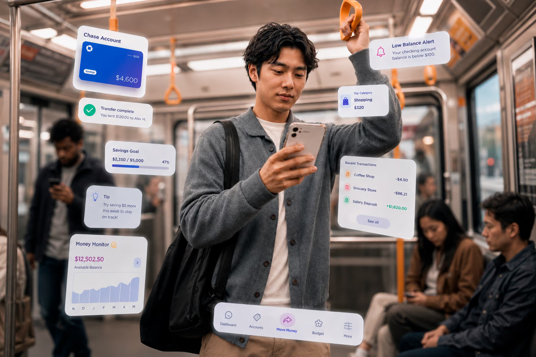
The fintech products that get dashboard design right build platforms where users feel confident acting, not just informed about their situation. That confidence is the output of design decisions made at every level of the interface, and it is what separates financial products that grow through word of mouth from those that struggle to retain the users they acquire.
Work With a Fintech Dashboard Design Team That Understands the Stakes
Wandr has designed financial dashboards for Synchrony, Modfi, and other fintech products where trust architecture and data complexity require more than standard dashboard design practice. If your financial product's dashboard is creating friction rather than confidence, schedule a free consultation with our team and let us show you what is possible.
