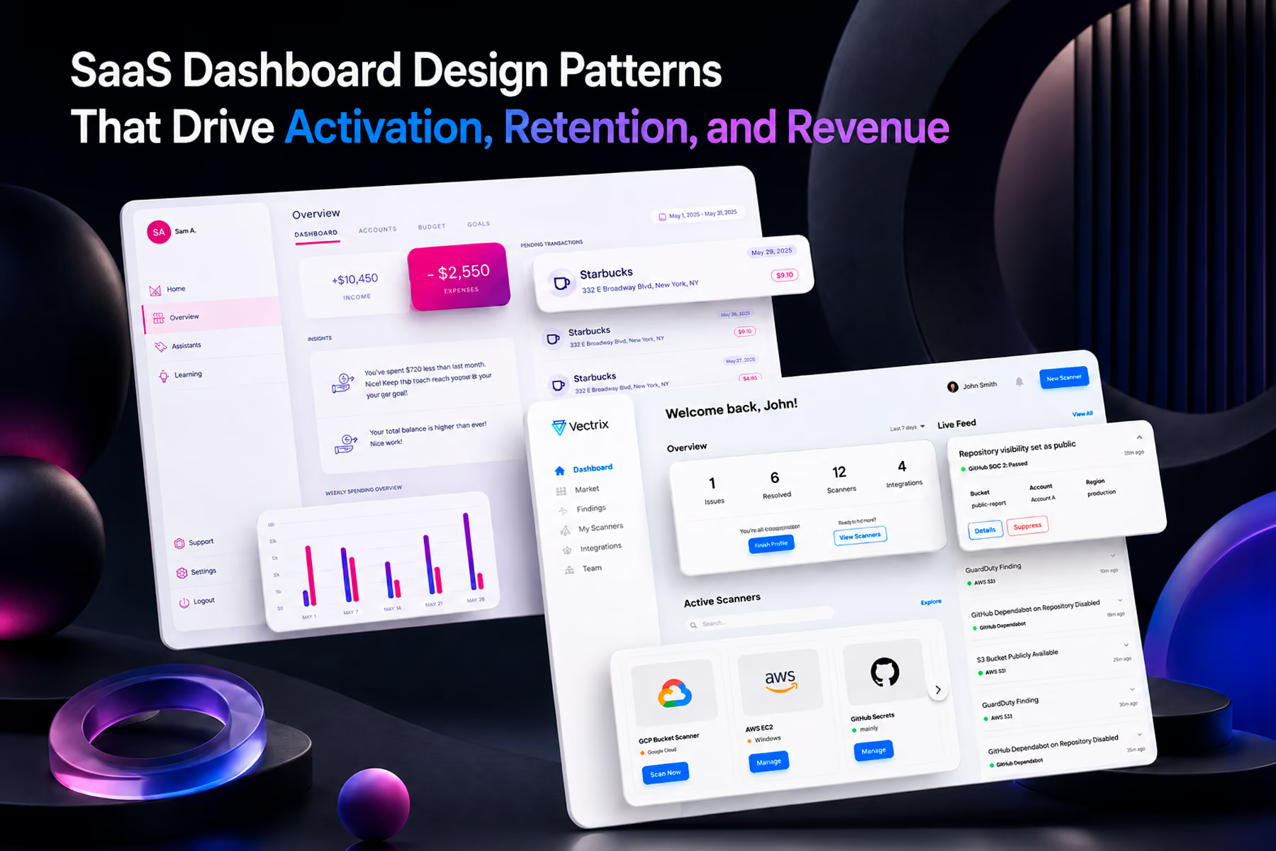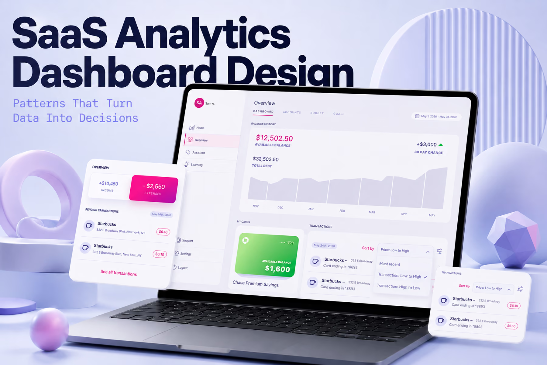
SaaS analytics dashboard design patterns are distinct from general dashboard patterns because the primary user job is different. A status dashboard answers "is everything okay." An analytics dashboard answers "why is this happening and what should I do about it." The design patterns that serve investigation and insight generation are structurally different from the patterns that serve monitoring and alerting. Most SaaS analytics dashboards are built with monitoring patterns applied to an investigation use case, which is why they generate traffic without generating decisions.

The Analytics Dashboard Problem
SaaS analytics dashboards consistently underdeliver on their core promise: helping users understand what their data means and what to do about it.
The gap between data surface and actionable insight is a design problem, not a data problem. Most SaaS analytics dashboards have access to the right data. What they lack is the structural architecture that guides users from a metric to an understanding of what drove it, and from that understanding to a specific next action.
This gap exists because analytics dashboard design borrows patterns from monitoring dashboard design. Monitoring patterns optimize for fast status assessment: is the metric above or below threshold, is the trend moving in the right direction, does anything require immediate attention. These patterns serve the user who opens the dashboard for thirty seconds to verify that nothing needs their attention.
Analytics users are doing something different. They arrive with a question: why did conversion drop last week, which customer segments are expanding fastest, what is the relationship between onboarding completion and retention, and they need the dashboard architecture to support a structured investigation that might take twenty minutes and involve multiple views, filters, comparisons, and drill-downs.
Designing for investigation requires different patterns than designing for monitoring, and most SaaS analytics dashboards have not made that distinction.
Pattern 1: Question-First Navigation Architecture
The most effective SaaS analytics dashboard navigation is organized around the questions users come to answer rather than around the data structures that produce the answers.
Most analytics dashboards are organized by data category: an acquisition section, a retention section, an engagement section, a revenue section. This organization reflects the data architecture and requires users to know which data category contains the answer to their question before they can start looking for it. A user trying to understand why a cohort is retaining poorly has to decide whether that is an engagement question, a retention question, or a product question before they can navigate to the right view.
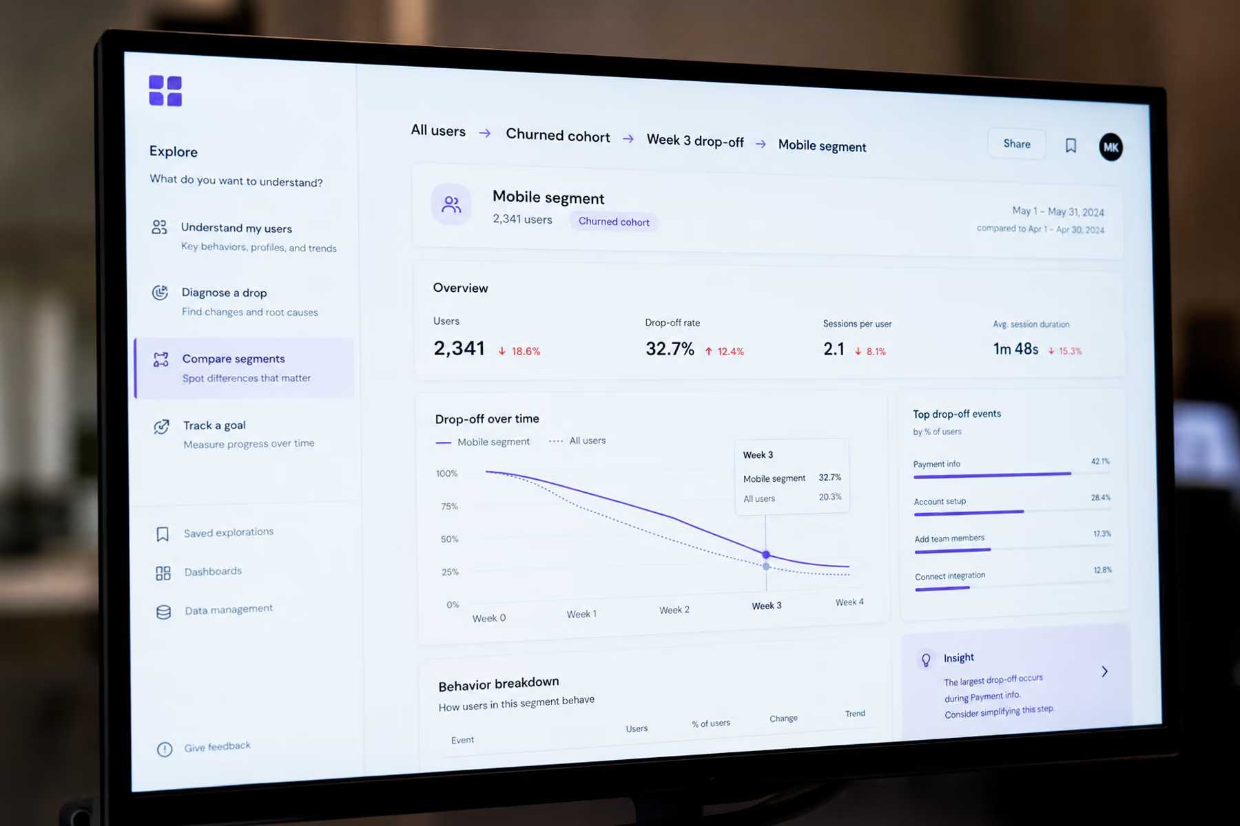
The pattern that reduces this friction is organizing navigation around the user's analytical intent: "understand my users," "diagnose a drop," "compare segments," "track a goal." Each of these entry points leads to a view assembled from the right data combinations for that investigative purpose rather than requiring the user to assemble the combination themselves.
This requires more upfront design investment than category navigation because it involves defining user intent models before designing views. But the reduction in time-to-insight it produces is the difference between an analytics dashboard users consult regularly and one they use only when someone asks them a specific question they cannot answer from memory.
Pattern 2: The Investigation Trail
Analytics users need to move fluidly between summary views and detailed data without losing their orientation or their investigative thread. The pattern that supports this is the investigation trail: a persistent record of the analytical path the user has taken that allows them to step backward to a previous view, share the investigation with a colleague, or return to the same analytical context in a future session.
Most SaaS analytics dashboards have no investigation trail. Each navigation action replaces the previous view rather than adding to a navigable history. A user who drills down three levels to find a specific insight cannot easily return to the summary view without losing the drill-down context, and cannot share "what I found" with a colleague in a way that lets the colleague replicate the investigation.
The practical implementation is a breadcrumb trail that records filter states, drill-down paths, and date range selections as persistent URL parameters, allowing any analytical view to be bookmarked, shared, or returned to. This is not a sophisticated technical feature. It is a design pattern that requires deliberate implementation rather than happening by default, which is why most analytics dashboards do not have it despite how much value it would add to collaborative analytical workflows.
Pattern 3: Contextual Benchmarking
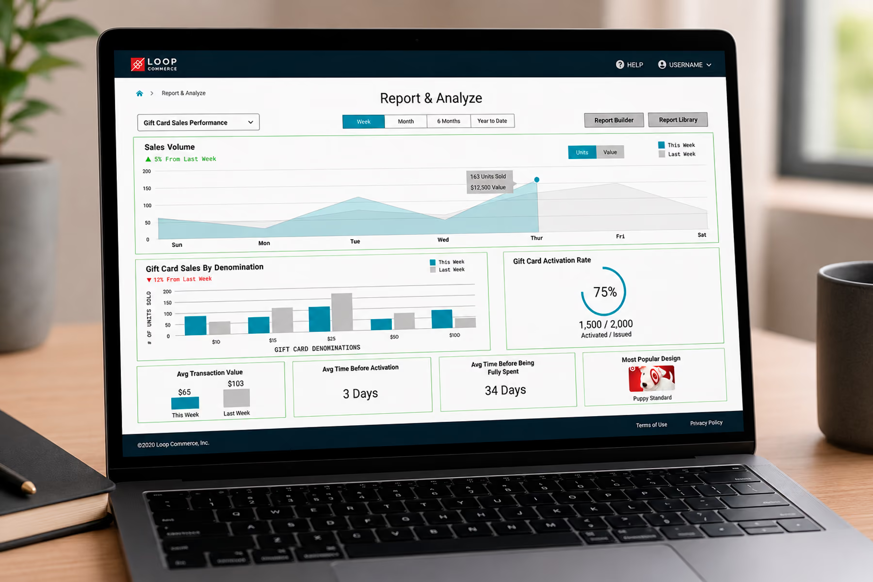
Analytics metrics are only useful when they can be evaluated against something. The pattern that converts raw metrics into actionable intelligence is contextual benchmarking: surfacing the reference point that tells the user whether a metric is good, bad, or expected at the moment they see it.
The reference points that matter most for SaaS analytics depend on the metric category. For performance metrics, the reference is the target and the trend against the target. For cohort metrics, the reference is the comparison cohort that isolates the variable the user is investigating. For funnel metrics, the reference is the historical benchmark that defines normal conversion rates at each stage.
Building contextual benchmarks into the default view of every primary metric requires knowing what questions users will be asking about each metric, which is a user research question rather than a data architecture question. The design investment required is modest. The impact on how quickly users can extract insight from the analytics dashboard is significant.
Synchrony's platform required this pattern specifically for their campaign analytics view. Account managers needed to evaluate campaign performance not just in absolute terms but relative to baseline performance for that merchant category and relative to the same period in the prior year. Building those two reference points into the default metric display eliminated the manual comparison workflow that account managers had been running in parallel with the dashboard.
Pattern 4: Guided Insight Surfaces
The most sophisticated SaaS analytics dashboard design pattern is the guided insight surface: a view that identifies the most significant patterns in the user's data and surfaces them as specific, actionable findings rather than requiring the user to conduct open-ended exploration to find them.
This pattern is different from automated alerting. Alerts notify users when a metric crosses a threshold. Guided insights surface patterns that the user would not know to look for: a cohort that is retaining at twice the rate of average, a feature that correlates strongly with expansion revenue, a time-of-day pattern in user engagement that suggests an optimization opportunity.
The design challenge is framing. Guided insights that are framed as conclusions can feel presumptuous or incorrect when the pattern has an explanation the system does not know about. Guided insights framed as observations and questions ("this cohort is retaining at 2x average, what's different about them?") invite investigation without asserting authority the system does not have.
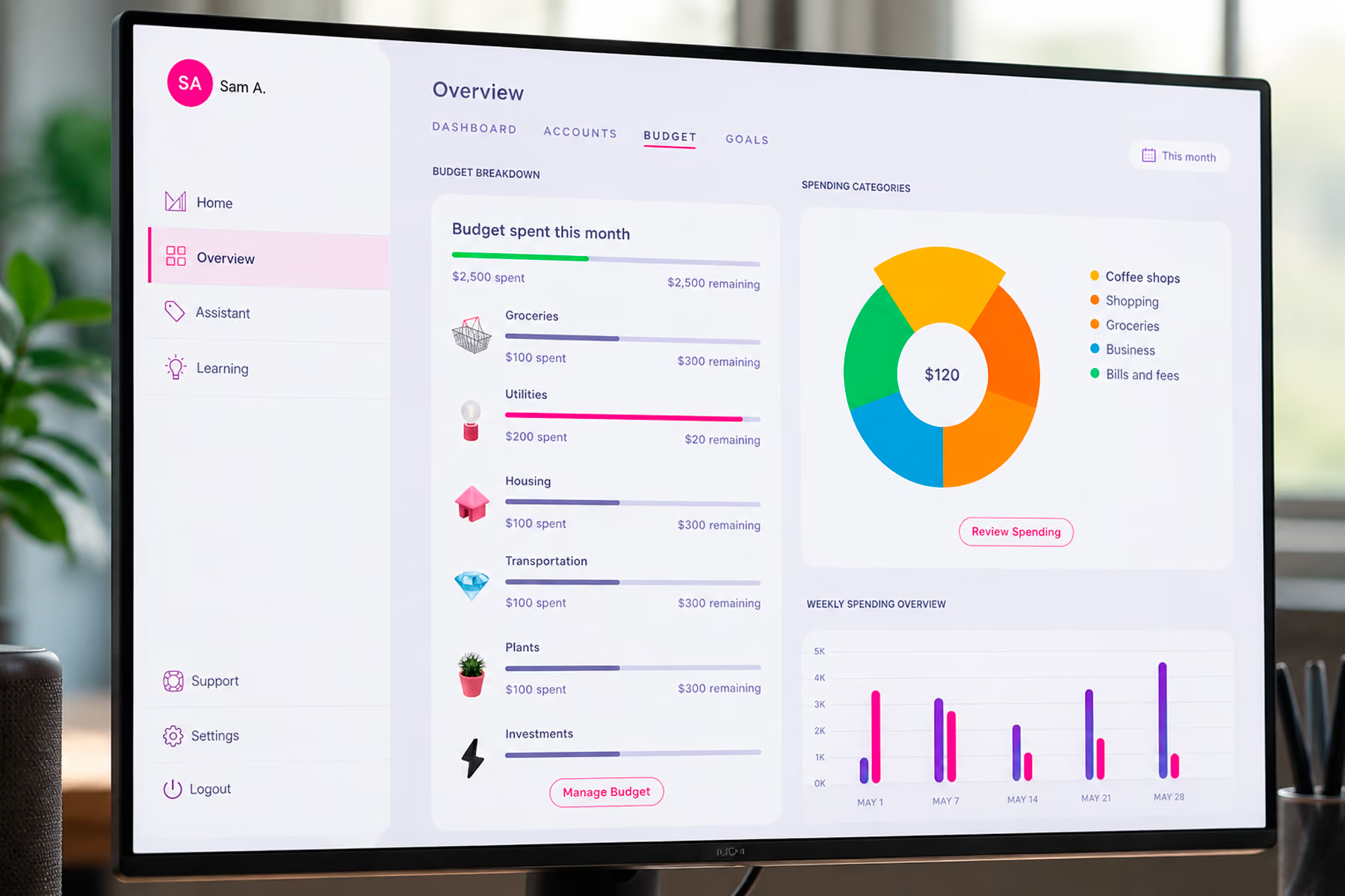
For Modfi's financial platform, the guided insight pattern was central to the product's value proposition. The platform was designed to help users understand their financial behavior, and the analytics component needed to surface non-obvious patterns in spending and saving that users would not find through open-ended exploration. Framing those patterns as observations with clear investigation paths rather than recommendations made the insights feel useful rather than presumptuous.
Pattern 5: Segment Comparison Architecture
Segmentation is the analytical operation that produces the most actionable insights in SaaS analytics: understanding not just what the aggregate metric is, but how it differs across the segments that matter. Which acquisition channels produce the best-retaining customers? Which user behaviors in the first week predict long-term retention? Which product features correlate with expansion revenue?
The pattern that makes segment comparison analytically productive is a comparison architecture that allows users to select two or more segments and view the same set of metrics across all of them simultaneously, with differences highlighted rather than requiring the user to mentally calculate comparisons between separately viewed metrics.
Most SaaS analytics dashboards support filtering by segment but do not support true parallel comparison. The user can view the metrics for segment A, note the values, change the filter to segment B, and mentally compare. This is an analytical workflow that introduces error and fatigue, particularly for comparisons involving more than two segments or more than a handful of metrics.
The implementation of true segment comparison requires more complex data querying and more deliberate visualization design than simple filtering. The analytical value it delivers is proportionally higher, particularly for the product and marketing leaders who use segment comparison to make the resource allocation decisions that most directly affect SaaS growth.
Pattern 6: Export and Integration That Closes the Analytics Loop
SaaS analytics dashboards that exist as islands, where data flows in but insights cannot flow out to the tools where decisions get made, consistently underdeliver on their value proposition.
The pattern that closes the analytics loop is friction-free export and integration: insights can be shared as links that preserve the analytical context, exported as formatted reports that do not require the recipient to navigate the dashboard to understand, and pushed to the tools where action happens (CRM, project management, communication) without requiring a manual translation step.
This is a design pattern rather than just a technical feature because the implementation determines whether it gets used. An export function that produces a CSV of raw data is technically an export but is not a design pattern that supports the analytical workflow. A share function that creates a link to the exact view the user is looking at, with all filter states preserved, is a design pattern that transforms a solo analytical discovery into a collaborative decision-making input.

Final Thoughts
SaaS analytics dashboard design patterns that produce genuine value share a common structural characteristic: they are designed for the investigation workflow, not the monitoring workflow. They help users move from a question to an understanding, and from an understanding to a decision, with as little friction as possible at each transition.
The SaaS companies that get this right build analytics capabilities that users actively consult when making decisions rather than treating as a reporting artifact they check when asked for numbers. That difference in engagement is the difference between an analytics dashboard that drives product decisions and one that accumulates unused.
Work With a SaaS Dashboard Design Team That Understands Analytics
Wandr has designed analytics dashboards for SaaS products where the primary user job is insight generation rather than status monitoring. If your analytics dashboard is generating traffic without generating decisions, schedule a free consultation with our team and let us show you what a decision-driven analytics architecture looks like.