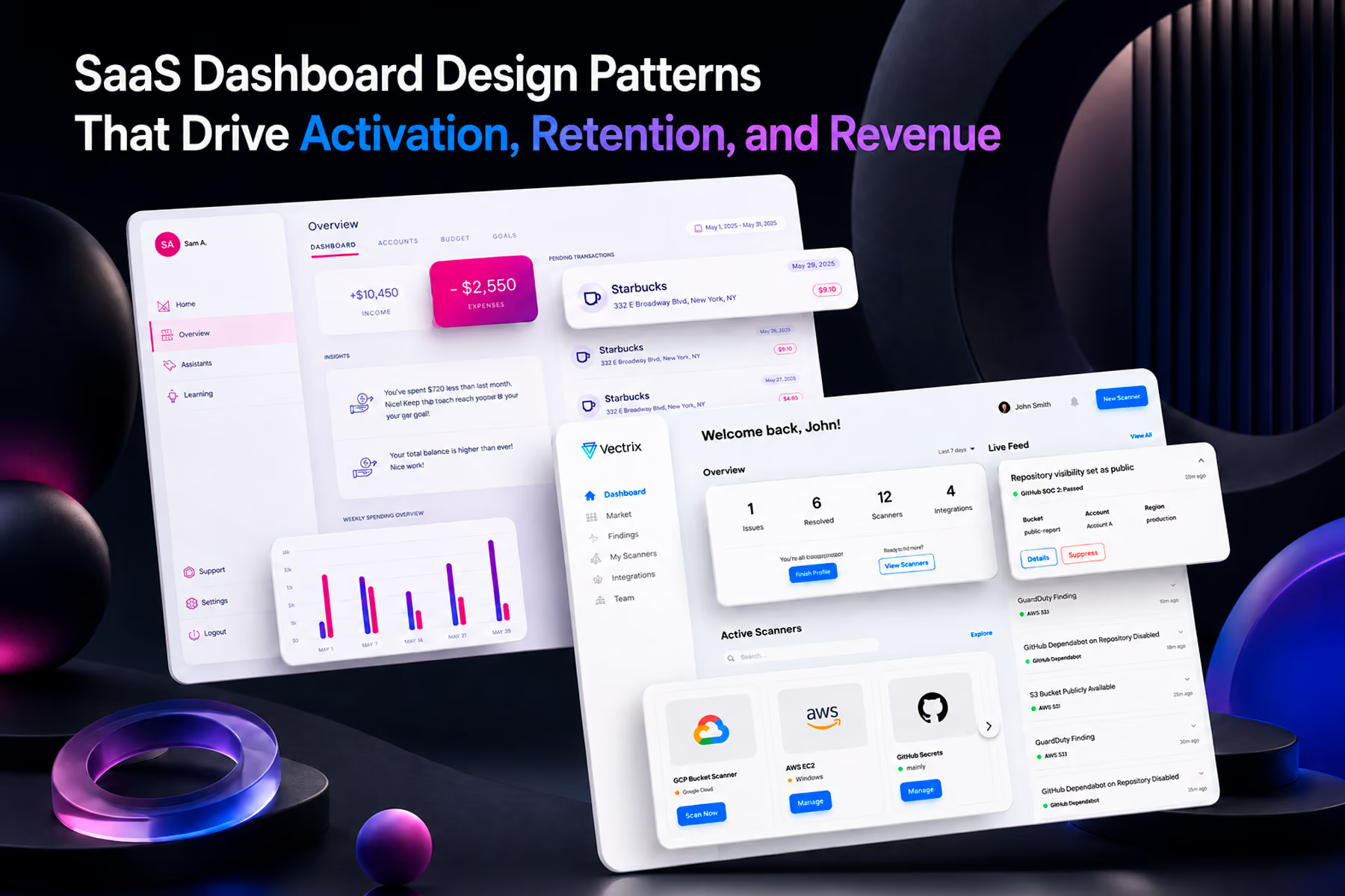
SaaS dashboard design patterns are not visual conventions. They are structural decisions about how information is organized, prioritized, and surfaced that determine whether users activate, develop habits of engagement, and renew. Most SaaS dashboards are designed to demonstrate feature completeness rather than to drive the specific user behaviors that produce the business outcomes SaaS companies depend on. This post covers the patterns that work and why, drawn from Wandr's dashboard design work across security SaaS, fintech, and B2B software.

Why SaaS Dashboard Design Patterns Matter More Than Visual Design
SaaS companies compete intensely on feature sets. The pressure that competition creates on dashboard design is consistent and damaging: surface everything, demonstrate capability, make the product look comprehensive.
The dashboards that result from that pressure look impressive in sales demos and create anxiety in daily use. They front-load complexity that new users are not ready to engage with. They treat all features as equally important, which means no feature is important enough to guide behavior. They optimize for the moment a prospect sees the product for the first time rather than for the moment a user opens it for the three hundredth time.
The SaaS dashboard design patterns that drive retention and expansion are almost the inverse of this. They surface less at each level of the hierarchy while making more available through deliberate navigation. They are designed for the experienced daily user rather than the first-time evaluator. And they are built around the specific behaviors that produce the business outcomes the product depends on: completing the first meaningful action, developing a daily check habit, expanding usage to new features over time.
Getting these patterns right is what separates SaaS dashboards that drive product-led growth from SaaS dashboards that require constant sales intervention to prevent churn.
Pattern 1: The Activation Hook in the Empty State
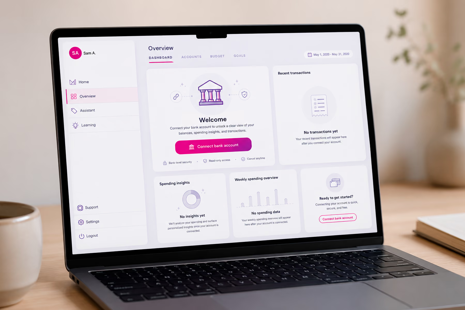
The empty state dashboard is the most consequential screen in a SaaS product and the one that receives the least design attention. It is what every new user sees before they have done anything with the product, and it determines whether they take the action that creates their first moment of value or close the tab and never return.
Most SaaS dashboards show empty state as a visual representation of absence: blank chart areas, greyed-out metrics, placeholder text that says "no data yet." This communicates that the product is not ready to be useful, which is the opposite of the message a new user needs.
The pattern that drives activation is showing the dashboard as it will look when populated, with a single prominent action that generates the first data. The user should be able to see exactly what they are working toward and understand exactly what they need to do to get there in one step.
Modfi's financial platform had a specific activation challenge: the product offered an extensive range of financial management features, but new users needed to connect a bank account before any of them were useful. The empty state was redesigned around that single action, making account connection the visually dominant element while showing the populated dashboard state as the destination. The difference in first-session activation was significant enough to meaningfully change the trial-to-paid conversion rate.
Pattern 2: The Daily Check Pattern
The most valuable habit a SaaS product can build in its users is the daily check: the two-to-three minute session where someone opens the dashboard to verify that everything is on track before moving on with their day.
This habit is the behavioral foundation of retention. Users who check a SaaS dashboard daily are dramatically less likely to churn than users who access it only when they have a specific task to complete. Daily checkers develop a relationship with the product that makes switching feel costly. Episodic users do not.
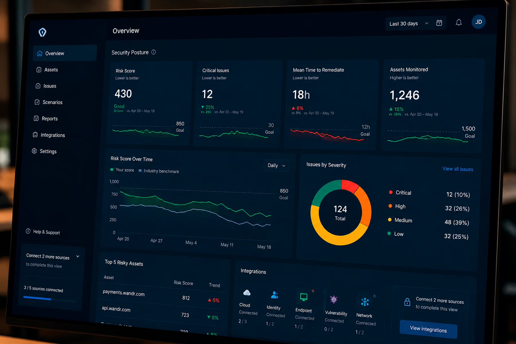
The SaaS dashboard design pattern that builds the daily check habit is the status summary view: a single screen that communicates the current state of everything the user cares about in under thirty seconds, with clear signals when something requires attention and no signals when everything is on track. The user arrives, scans for red, finds green, and leaves satisfied. That experience is worth two minutes of their time. A dashboard that requires three clicks and two minutes of interpretation to arrive at the same answer is not.
Vectrix's security dashboard was built around this pattern explicitly. Security engineers needed to know within seconds of opening the dashboard whether there were active policy violations requiring response. The daily check pattern surfaced that status signal immediately, with the detail available one level down for users who needed to investigate. The engineers who used the dashboard daily developed the monitoring habit that made Vectrix's value proposition, proactive security rather than reactive investigation, into a daily operational reality rather than a theoretical benefit.

Pattern 3: Contextual Depth on Demand
SaaS dashboards serve users at different levels of engagement simultaneously: the user doing a quick status check, the user investigating a specific anomaly, and the user doing a structured analytical review. Designing for one of these at the expense of the others consistently produces dashboards that work well for one user type and frustrate the rest.
The pattern that serves all three is contextual depth on demand: the primary view is optimized for the quick status check, one level of navigation reveals the breakdown that enables investigation, and a further level provides the full analytical view for structured review. Each level is available without friction, but none is forced on users who do not need it.
The implementation details that make this pattern work are: the navigation between levels should require minimal interaction (one click, not three), the visual language should remain consistent across levels so users know they are still in the same surface, and the primary signal at each level should be immediately visible without requiring the user to interpret the layout from scratch.
Pattern 4: Metric Framing That Creates Urgency Without Anxiety
The way a SaaS dashboard frames metrics determines whether users feel informed and in control or anxious and overwhelmed. Both responses are design outputs, not user characteristics.
The framing pattern that creates the right response is comparison plus direction: every primary metric is accompanied by whether it is moving toward or away from the target, and by a clear signal of whether that movement requires action or is within acceptable bounds.
A conversion rate of 3.2% with a downward trend arrow and a red threshold indicator communicates urgency clearly. The same rate with an upward arrow and a green indicator communicates that the trend is healthy and no action is required. Both versions of the same number produce completely different responses in the user, and that difference is entirely a function of the framing, not the number.
The failure pattern is surfacing numbers without framing and expecting users to supply the context from memory. This is particularly damaging for SaaS products that serve users who are managing multiple metrics simultaneously. Users who have to remember the target for every metric they are monitoring are carrying unnecessary cognitive load that accumulates across sessions and contributes to dashboard abandonment.
Pattern 5: The Expansion Trigger
SaaS products grow revenue primarily through expansion: existing users adopting new features, upgrading to higher tiers, or adding seats. The SaaS dashboard is the primary surface where expansion opportunities can be surfaced in context, but most dashboards are not designed to do this.
The pattern that drives expansion without feeling sales-aggressive is the contextual expansion trigger: a signal that appears when user behavior suggests they are approaching a natural expansion point, framed as a capability the user does not yet have access to rather than as an upsell.
A user who has connected three data sources and is looking at a partial view of their analytics is at a natural expansion point. A dashboard that surfaces "you are missing data from these sources, connect them to complete this view" is providing a genuinely useful signal. A dashboard that shows a locked feature teaser in a prominent position regardless of whether the user's behavior suggests readiness for it is creating noise that users learn to ignore.
The design discipline required for this pattern is restraint: showing expansion triggers only when user behavior or data context makes them genuinely relevant, and framing them as capability gaps rather than upsells. This requires connecting dashboard design to product analytics in ways that most SaaS teams have not invested in, but the conversion impact of contextually relevant expansion triggers versus generic upgrade prompts is substantial.
Pattern 6: Notification Architecture That Earns Attention
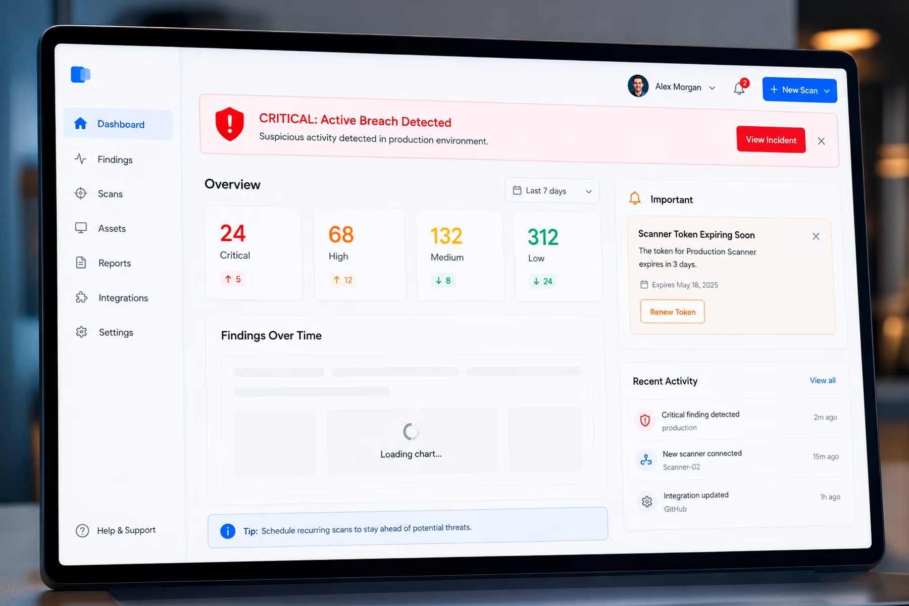
SaaS dashboards that surface every notification at the same urgency level train users to ignore all notifications. This is the SaaS equivalent of the alarm fatigue that affects operators of monitoring systems: when everything signals urgency, nothing signals urgency.
The pattern that maintains the signal-to-noise ratio in SaaS dashboard notifications is a clear severity hierarchy with distinct visual treatment at each level. Critical notifications (system failures, security events, threshold breaches that require immediate action) use the highest visual weight and appear in the primary view. Important notifications (approaching limits, performance degradation, scheduled maintenance) use secondary visual weight and appear in a dedicated notification area. Informational notifications (feature announcements, usage summaries, tips) use minimal visual weight and are accessible without being foregrounded.
The practical implementation requires defining the notification taxonomy before building any notification UI, and enforcing the taxonomy discipline through the product development process. Notification hierarchy degradation, where developers add high-urgency visual treatment to new notifications because it gets user attention, is one of the most consistent quality erosion patterns in SaaS dashboard design, and preventing it requires explicit governance rather than general guidelines.
Pattern 7: Performance as a Design Pattern
SaaS dashboard load time is a design problem as much as an engineering problem. A dashboard that takes five seconds to load will not be checked as a daily habit regardless of how well it is designed. Users calibrate their behavior to the cost of checking the dashboard, and when that cost feels too high, they check less frequently.
The design patterns that support performance are structural rather than visual. Loading sequences that surface the primary status signal first while secondary data loads in the background feel faster than loading sequences that show a spinner until everything is ready. Skeleton states that maintain the visual structure of the dashboard during loading feel faster than blank screens. Optimistic UI patterns that show the likely state of a metric while confirming the exact value reduce the perception of load time even when the actual duration is unchanged.
These are design decisions that need to be made in collaboration with engineering during the information architecture phase, not during visual design. The loading sequence is part of the dashboard experience, and designing it as an afterthought consistently produces dashboards that feel slower than they technically are.
Final Thoughts
SaaS dashboard design patterns are the structural decisions that determine whether a product builds the user habits that produce retention, expansion, and advocacy. They are harder to get right than visual design decisions and less immediately visible in demos and design reviews. They show up in activation rates, daily active use, and net revenue retention.
The SaaS companies that invest in getting these patterns right treat dashboard design as a product strategy discipline rather than a visual design exercise. They define the user behaviors they need to produce before they define the interface that produces them. They design the empty state with the same rigor as the populated state. They build notification hierarchies that maintain signal quality over time. And they measure the dashboard's performance against the behavioral metrics that matter rather than against the visual quality of the deliverables.
Work With a SaaS Dashboard Design Team That Designs for Behavior, Not Just Screens
Wandr has designed SaaS dashboards for Vectrix, Synchrony, Modfi, and other products where the dashboard is the primary driver of activation, retention, and expansion. If your SaaS dashboard is not producing the user behaviors your business depends on, schedule a free consultation with our team and let us show you where to start.