Persona 01

First-time moviegoer.
New to the app, buying a ticket for tonight. Resists creating an account and just wants to pay and get in fast.
NEW USER
Guest checkout
Speed-first
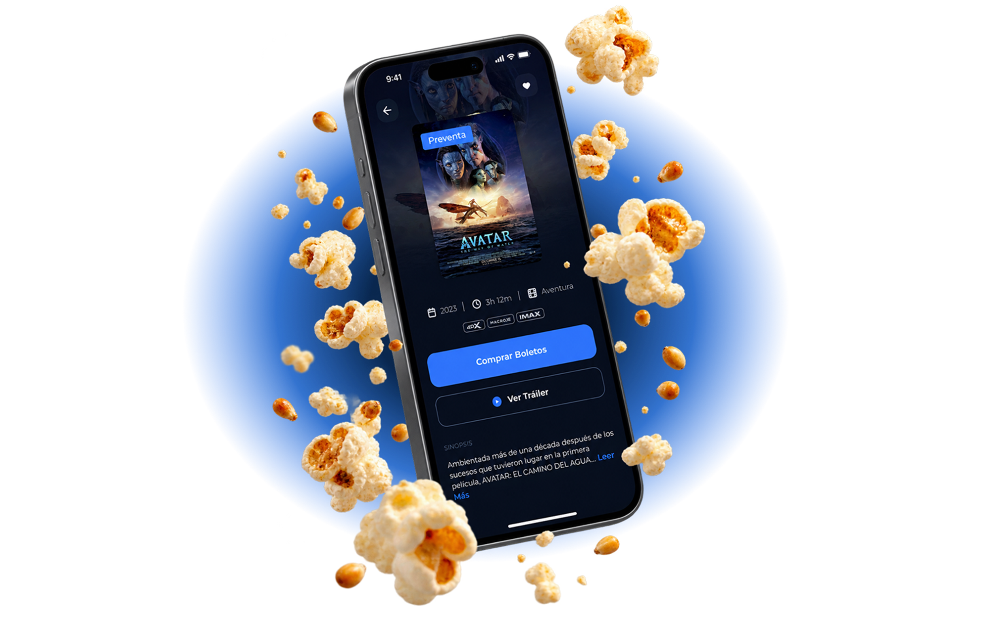
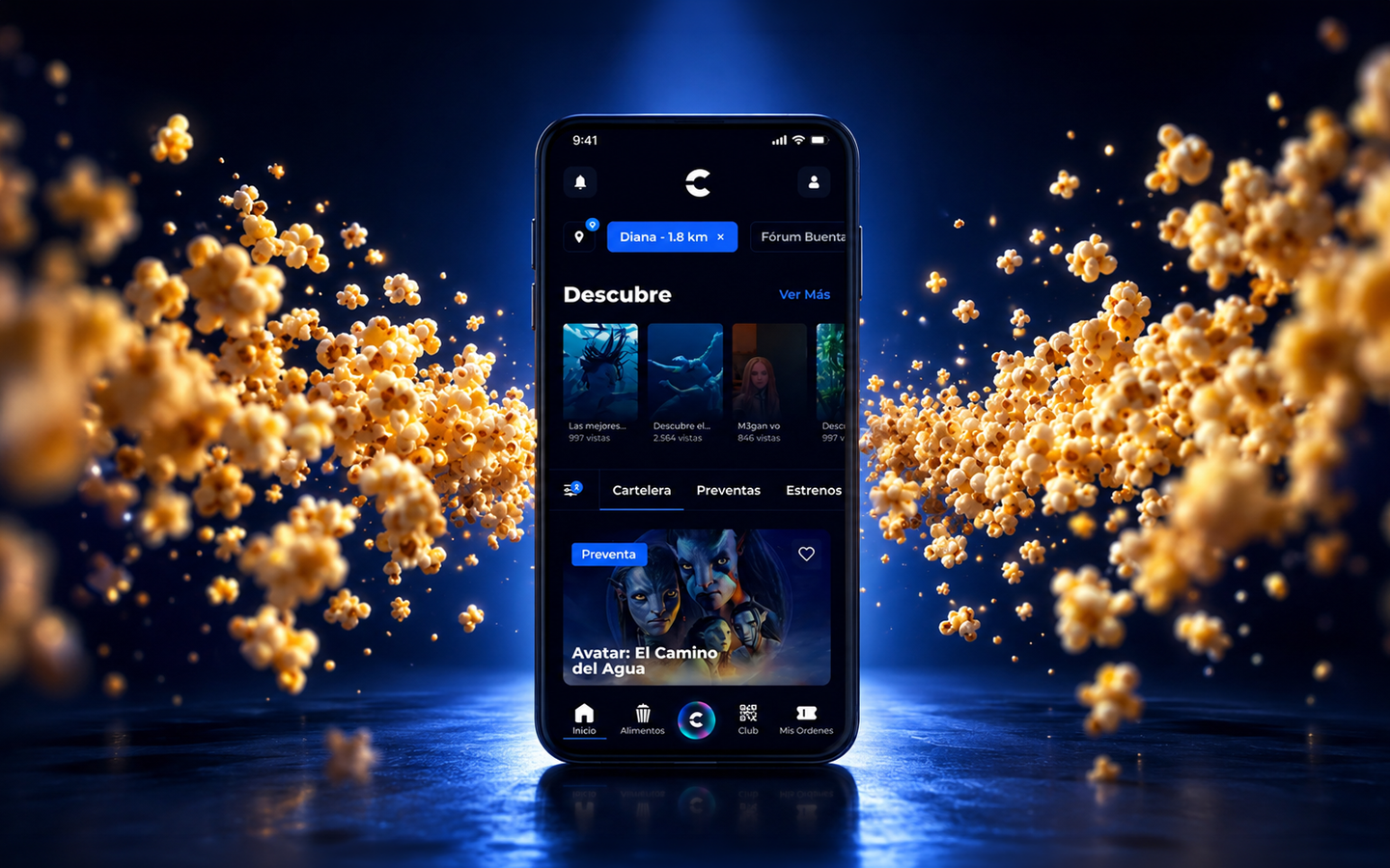
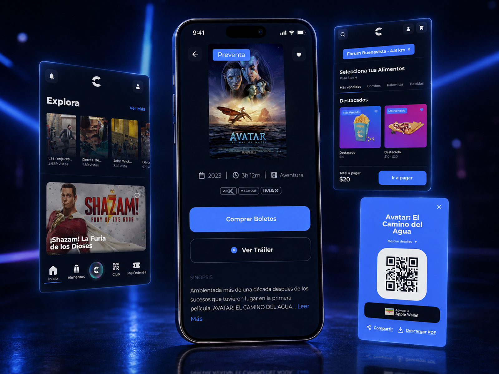
Our redesign of the ticket-buying flow lifted Cinépolis' online ticket sales 25%, then scaled into a global design system across five markets.
5 markets. 5+ Years of Partnership
Cinépolis is the fourth largest film exhibitor in the world. It runs roughly 6,800 screens across about 335 complexes in more than 17 countries, employs over 31,000 people, and holds more than 60% of the cinema market in Mexico.
Despite that scale, Cinépolis came to WANDR with a business problem hiding inside a design problem. Its mobile app and website were outdated and unreliable, and the friction was measurable at the till. Customers who could not buy a ticket online simply bought it somewhere else, or drove to the theater early to secure a seat in person. At Cinépolis' volume, small percentages of abandoned carts add up to real revenue walking out the door.
Customers were abandoning the purchase at the exact moment They were ready to pay.
A market leader with millions of moviegoers was running on a digital storefront that could not reliably complete its core transaction, and the friction was pushing customers, and their spend, straight to a competitor.
Stakeholders described the original website and app as "very old-style design" with "broken UX." Customers frequently could not complete basic tasks like buying a ticket, and some had to physically arrive at the theater early just to secure a seat. The digital storefront of a market leader was failing at its core job.
Internal data showed customer loyalty shifting to Cinemex, driven by the friction in Cinépolis' own digital products. Poor usability was not just an experience problem, it was measurable revenue walking out the door.
Cinépolis operated with an old-school, family-office structure and minimal design process. There was no user testing, no research practice, and no shared product methodology, and decisions were made almost entirely at the top. That left the company with no internal engine for improving its own experience.
Beyond the app and website sat kiosks, back-office systems, and separate country-specific products, each living in its own disorganized file system spread across multiple agencies and product teams. Nothing communicated with anything else, and engineers routinely rebuilt the same components from scratch because no central, documented, trusted source of truth existed.
Drag the handle to see how the ticket-buying flow changed, from a broken checkout that was sending customers to Cinemex into a modern purchase experience built to convert.
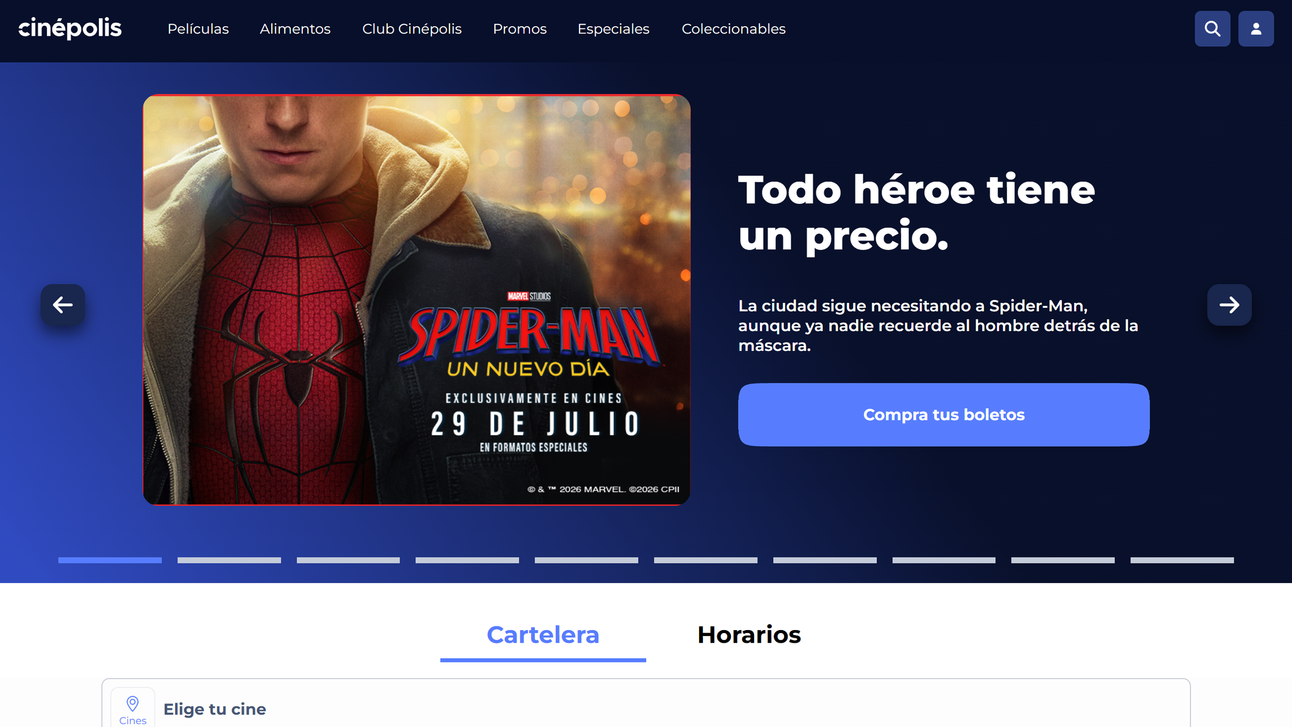


To fix the purchase flow with evidence rather than opinion, WANDR ran a moderated usability study across the entire Cinépolis journey, testing both internal stakeholders and external moviegoers against real task flows. Every screen, from opening the app to managing an order after purchase, was evaluated and tagged by severity: what worked, what was an opportunity, and what was outright friction.
The study covered the full path a customer takes: discovery and location, movie and showtime selection, seat choice, concessions and combo customization, checkout, and post-purchase order management.
Over 60% of users completed the seat-selection task without ever noticing the color-coded room-health indicator meant to signal availability. The one cue that de-risked the choice went unseen, so the redesign had to make availability impossible to miss.
Roughly 30% of users struggled to locate their loyalty points at checkout, and several could not tell whether a discount had actually been applied. The reward that drives repeat visits was nearly invisible at the moment it mattered most.
A user who ordered a single "Combo Clásico" watched it split into five line items in the cart: "Pedí un combo clásico, pero parece que pedí estos 5 productos individuales." Bundles needed to stay legible as one purchase.
New to the app, buying a ticket for tonight. Resists creating an account and just wants to pay and get in fast.
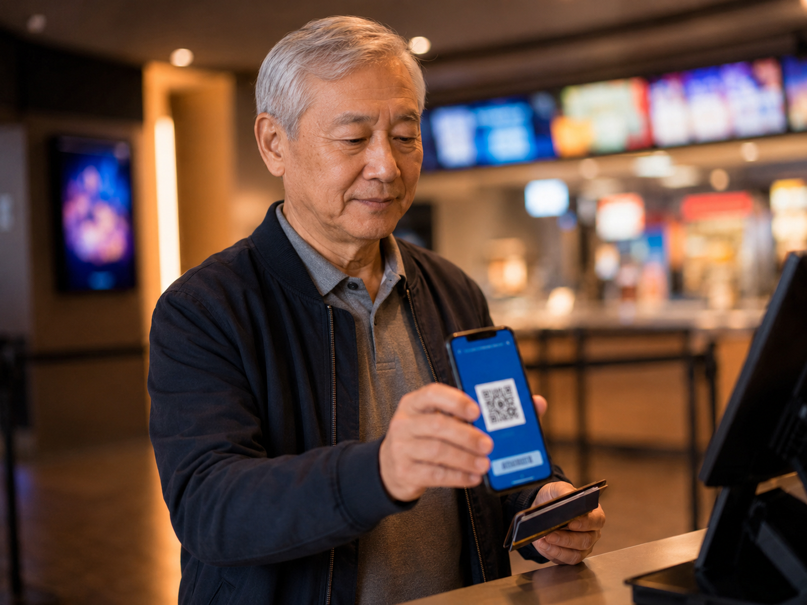
Returning, logged-in loyalty member who buys often. Wants points and rewards visible, and a quick way back in.

Booking for several people and adding food. Needs combos to stay clear and food to attach cleanly to an existing ticket.
Match the user's mental model. Where the flow mirrored patterns people already knew, comprehension was instant, so the redesign leaned on convention wherever a novel pattern was not earning its keep.
Give people a stable frame of reference. Users navigating the seat map wanted to see the whole room and keep their bearings while zooming, so spatial context became a requirement, not a nicety.
Make consistency the default. Selection behavior, visual hierarchy, and CTA copy varied subtly from screen to screen, and every inconsistency added cognitive load. Standardizing them reduced the mental tax of every step.
Cinépolis did not lack talent or ambition. It lacked the operating system that turns both into consistently good products: research, testing, documentation, and a shared source of truth. Redesigning the app fixed the symptom.
Embedding a team that changed how the company designs, decides, and hands off to engineering fixed the cause. That is why the work compounded. A better checkout recovers revenue once, but a modern product practice recovers it continuously.

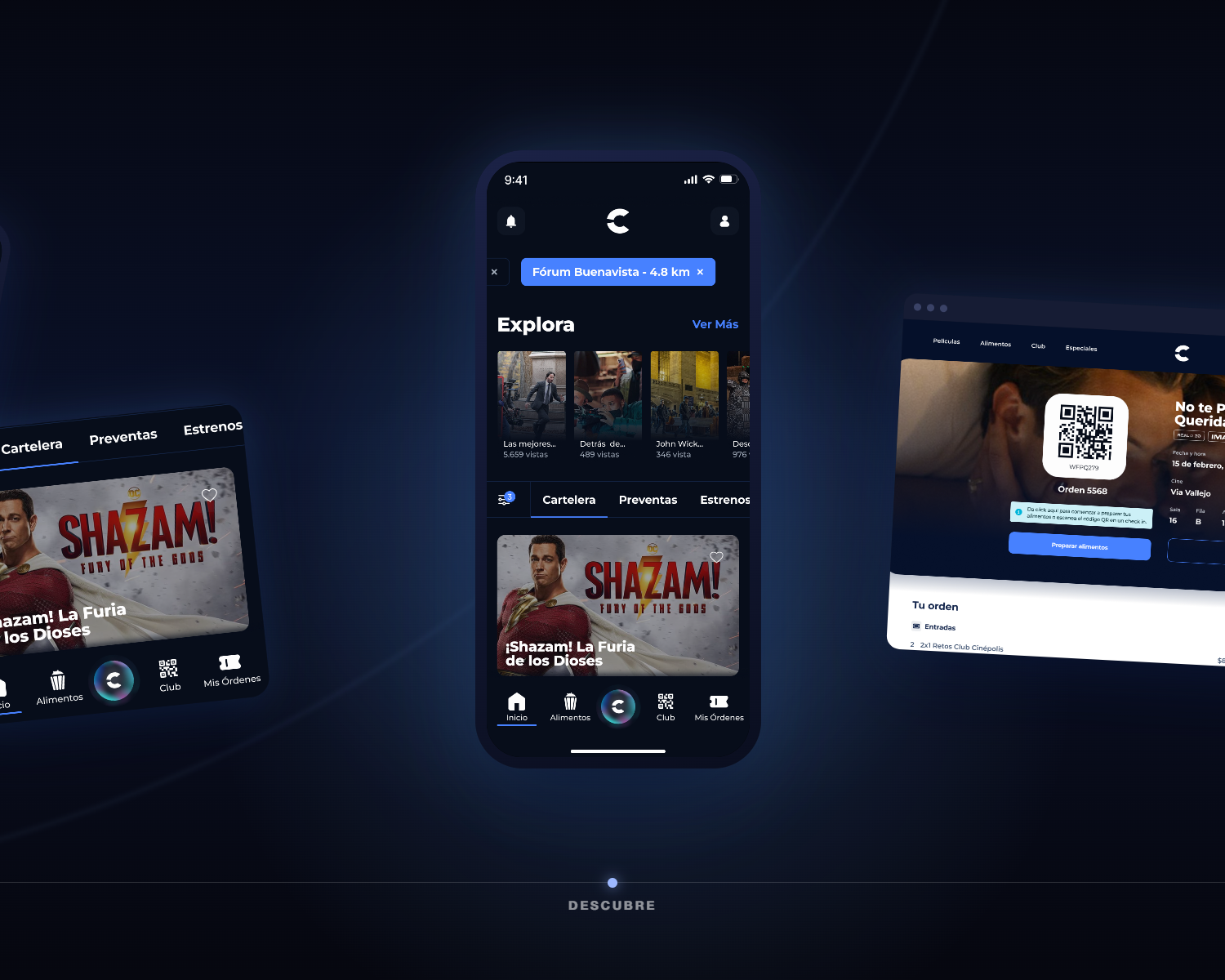


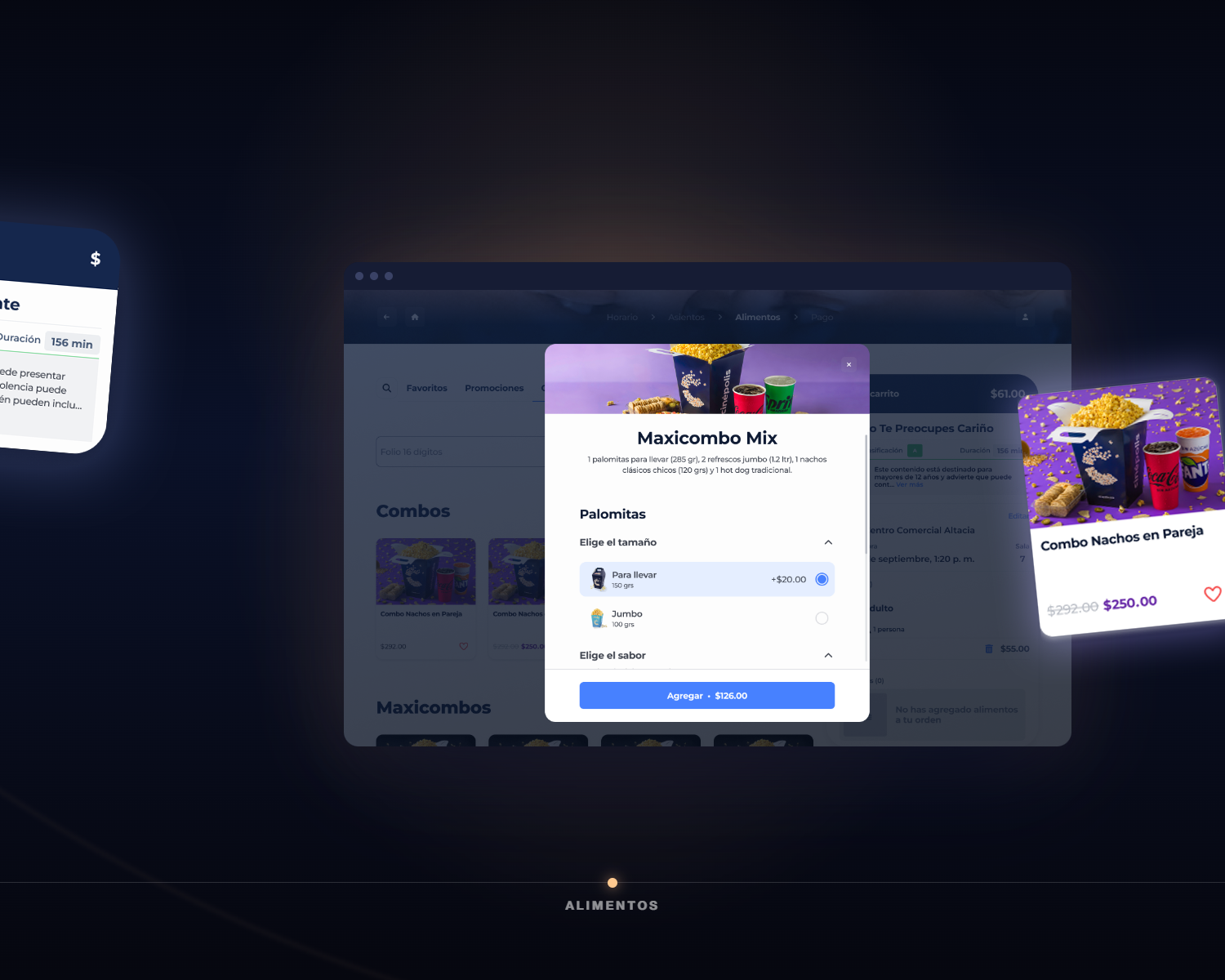

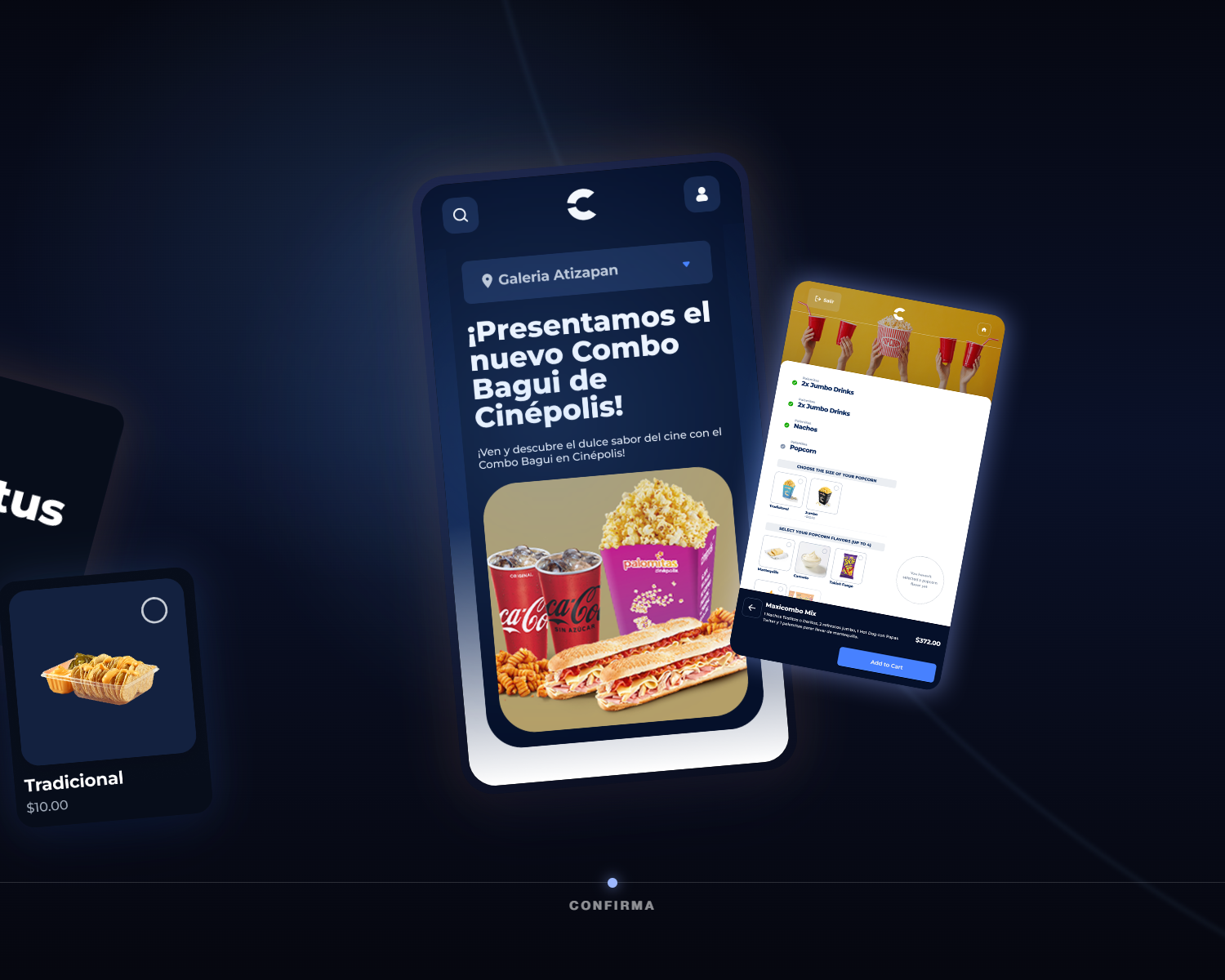
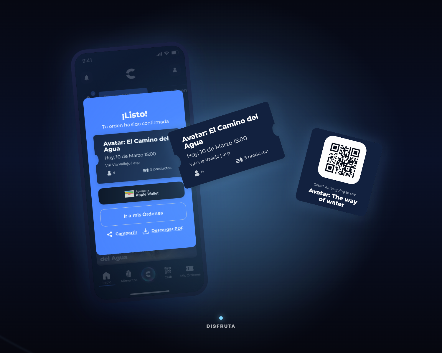
By the end of the engagement, Cinépolis had a modernized purchase flow, a global design system, and, for the first time, a product practice its own teams could run.
Revenue figure reflects Cinépolis-reported impact from the redesigned purchase flow. Usability findings are drawn from WANDR's moderated study of the full purchase journey.
The quality of the design system was impressive, and we found new insights about our own customers that we simply did not have before.