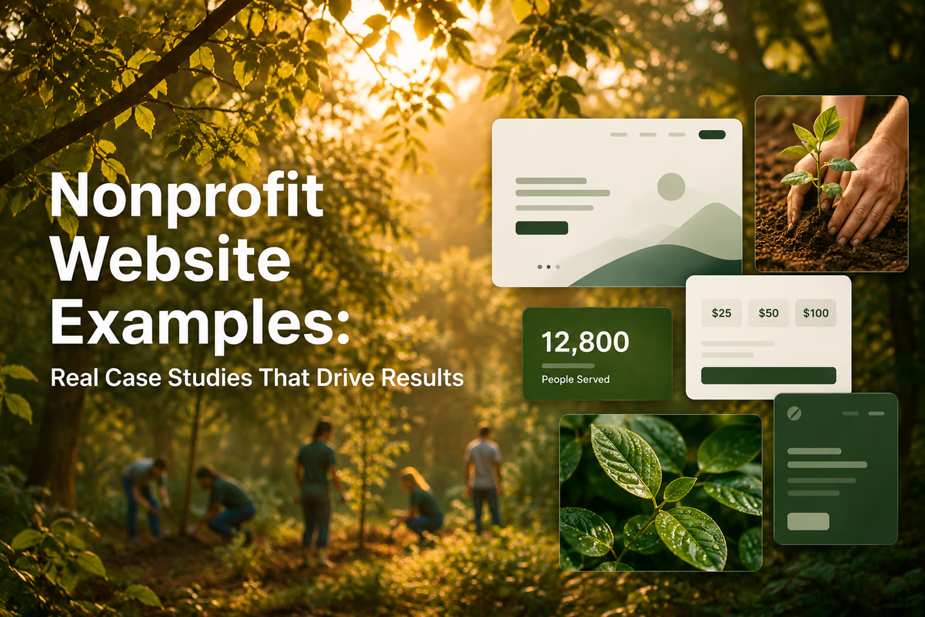
The best nonprofit websites share something that's hard to articulate until you've seen enough of them: they feel earned.
The design doesn't feel like it was applied on top of the mission: it feels like it grew from it. The copy doesn't explain everything at once: it says exactly the right thing at exactly the right moment. The navigation doesn't lead you through the organization's org chart: it leads you toward the action that makes sense for you.
That doesn't happen by accident. It happens through a process that starts with understanding users before touching a single design element.
Here's our annotated breakdown of what great nonprofit website design looks like in practice: drawn from our own work and from the broader space: and what every organization can learn from it.
First, a Note on How We Evaluate These Examples
We're not judging these websites on aesthetics alone. A beautiful website that doesn't convert is a beautiful problem. We look at:
- Credibility architecture: How quickly does trust get established?
- User path clarity: Can each user type find their way in under 10 seconds?
- Conversion design: How frictionless is the path from intent to action?
- Mobile experience: Was this actually designed for mobile, or just not broken on it?
- Copy effectiveness: Does it say the right thing at the right moment?
With those criteria in mind, let's look at what great actually looks like.
Nonprofit Website Examples Worth Studying
WWF Canada — The Standard for Nonprofit Conversion Design
When we redesigned WWF Canada's digital platform, we were working with one of the most recognized environmental organizations in the world. The challenge wasn't awareness: it was conversion. Traffic was there. But too many of those visitors were leaving without taking the action WWF needed them to take.
What we did:
Rebuilt the information architecture around four distinct user types. Redesigned the donation flow from scratch: fewer steps, clearer impact statements, a natural surface point for recurring donation options. Integrated bilingual content architecture (English and French) with a seamless experience across both. Added integrated shop, advocacy platform, and peer-to-peer fundraising.
What to notice in this design:
- The hero section establishes both emotional resonance (WWF photography does extraordinary work) and clear navigation simultaneously
- The donation flow requires minimal decisions before the user reaches payment
- Impact statistics are specific and prominent: not "we've helped many animals" but concrete, verifiable numbers
- The mobile experience mirrors the desktop in quality, not just in structure
The outcome: Transactions up 37%. Unique users up 25%. Time on page up 18%.
Read the full WWF Canada case study →
Mercy For Animals — Architecture for Global Complexity
Mercy For Animals presents a different design challenge from WWF: a global organization running dozens of simultaneous campaigns, with multilingual audiences, advocacy actions, donation flows, and volunteer recruitment all needing to coexist without overwhelming any individual user.
The design risk here was sprawl: a website that tried to surface everything and succeeded at nothing.
What we did:
Consolidated 12+ campaign page templates into three flexible, reusable structures. Rebuilt the navigation to serve user intent rather than organizational hierarchy. Executed a platform migration that preserved over 90% of existing SEO authority, with the remaining recovery completed within four weeks.
What to notice in this design:
- Campaign pages have a single primary action: no competing CTAs within the same screen
- The template system maintains visual consistency across dozens of campaigns without making them feel identical
- Trust signals (accessibility certifications, impact stats, media logos) are woven throughout the experience
- The global architecture allows regional customization without fragmenting the brand
The outcome: Donations up 32% in year one. Full accessibility compliance. SEO fully preserved through major migration.
Read the full Mercy For Animals case study →
Our own projects are only part of the picture. Some of the strongest nonprofit websites belong to organizations we have never worked with, and they are worth studying precisely because they solve the same problems in their own way. None of the six sites below are WANDR clients.
charity: water
charity: water is the site most often held up as the benchmark, and it earns the reputation. Its 100% model, where every public donation goes to the field and the organization covers payment processing itself, is not buried in an About page: it is the spine of the entire experience. An interactive project map lets donors see the specific communities their money reached, some reporting real sensor data on water flow, and the donation flow is stripped down to a one-time or monthly choice with almost nothing in the way.
What to notice: transparency treated as architecture rather than a disclaimer, and a homepage that leads with the donor's impact instead of the organization's ego.
Feeding America
Feeding America has to make a national-scale problem feel both comprehensible and personal. It does that with data-driven visuals paired with a finder that connects the national mission to your local food bank, and a "Take Action" menu that splits cleanly into distinct jobs: volunteer, donate meals, or host a food drive.
What to notice: a utility-first homepage that respects why each visitor actually showed up, rather than forcing four different people down one path.
DonorsChoose
DonorsChoose turns an abstract idea, funding classrooms, into something you can hold. Donors browse real teacher-submitted projects, filter by subject, grade, location, or urgency, and see exactly what a classroom needs and why, in the teacher's own words.
What to notice: giving modeled on shopping, where the donation is attached to a specific, verifiable outcome. It is one of the most reliable ways to convert a first-time donor.
The Trevor Project
For an organization providing crisis support to LGBTQ+ young people, design is safety. A "Reach a Counselor" anchor stays fixed at the top of every page, the site splits into a pathway for youth in crisis and one for the parents, allies, and volunteers who support them, and a "Quick Exit" control lets a user leave instantly and clear their history.
What to notice: the most important action is never more than one tap away, and accessibility and safety are treated as design requirements, not features.
World Central Kitchen
World Central Kitchen has to move fast: when disaster strikes, the story and the ask need to land immediately. The site leans on high-quality photography and video to carry emotional clarity, frames giving around the urgency of the moment, and keeps the path to donate short and prominent.
What to notice: storytelling and urgency working together, with imagery doing the emotional work and a donation path that stays out of its own way when the moment matters most.
Kiva
Kiva makes microfinance personal by giving it a face. Instead of an abstract fund, donors browse individual borrowers with names, photos, businesses, and repayment histories, then follow the loan over time, with live updates showing loans other people have funded.
What to notice: specificity converts, and a clear, repeatable unit of action, funding one borrower, is far easier to say yes to than an open-ended appeal.
Across all six, the pattern is the same one our own projects are built on: lead with the visitor's motivation, make the primary action obvious, and prove impact rather than assert it.
Patterns Across the Best Nonprofit Websites
After reviewing our own work and studying the broader landscape, here are the design patterns that consistently separate high-performing nonprofit websites from the rest.
Pattern 1: The Homepage as Traffic Director, Not Storyteller
The worst nonprofit homepages try to tell the full organizational story above the fold. The best ones do one thing: orient each user type toward their path as quickly as possible.
Think of your homepage as an airport terminal, not a brochure. The terminal doesn't try to explain the destination: it makes it easy to find your gate.
Within the first screen (no scrolling), a great nonprofit homepage answers:
- What does this organization do? (One sentence, specific)
- Who is this for? (User navigation clear)
- Why should I trust this? (At least one prominent credibility signal)
- What do they want me to do? (Primary CTA visible)
Pattern 2: Impact Statistics That Are Specific and Verifiable
"We've helped thousands of animals" is meaningless. "We've rescued 4,200 animals across 15 states in 2024" is a trust signal.
The best nonprofit websites use impact numbers that are specific, sourced, and current. They're updated regularly. They're connected to the donation ask: "Your $50 provides one rescue animal with one month of veterinary care."
Pattern 3: Donation Flows Under Four Steps
Every step in a donation flow is a door the user can walk through on their way out. The best nonprofit donation flows complete in three to four steps from intent to confirmation. Not because brevity is good design: because every unnecessary step is a user you're losing.
Related: How to Design a Nonprofit Website That Increases Donations →
Pattern 4: Social Proof From Real People
Testimonials on nonprofit websites work best when they're specific, attributed to real named individuals, and tied to an outcome rather than a sentiment.
"This organization changed my life": nice, but vague.
"I've volunteered with MFA every weekend for two years. The training is excellent and the community is unlike anything I've experienced.": specific, credible, actionable for a prospective volunteer.
Pattern 5: Mobile-First, Not Mobile-Adapted
The majority of nonprofit web traffic is mobile. The best nonprofit websites were built with mobile as the primary use case, not retrofitted after desktop design was complete.
The practical difference: mobile-first design is constrained and intentional. Every element earns its place because screen real estate is limited. Desktop becomes an expansion of that foundation rather than a compression of a different one.
Pattern 6: Fast Load Times (Under Three Seconds on Mobile)
We've seen analytics from nonprofit websites where the average page load time was over six seconds on mobile. For context, research on e-commerce sites (where the conversion stakes are well-studied) shows that each additional second of load time reduces conversions by 7%. The equivalent impact on donation flows is likely similar.
Fast-loading nonprofit websites are almost always the result of intentional technical decisions: properly compressed images, efficient code, minimal third-party scripts, reliable hosting. These aren't afterthoughts: they're built into the development process from the start.
What the Worst Nonprofit Websites Have in Common
Understanding what great looks like requires being honest about what bad looks like. Here are the most common failure patterns:
The Wall of Copy
Dense, unbroken paragraphs that try to compensate for weak design with volume. Users don't read these. They scan, find nothing to land on, and leave.
The Credibility Gap
An outdated design communicates an outdated organization. Fair or not, donors use visual design as a proxy for legitimacy. A website that looks like it was built in 2010: regardless of the mission quality: loses conversions to organizations with better design.
The Seven-Step Donation Flow
We've audited these. They exist. Every step beyond the fourth is a meaningful abandonment risk. When you add up the combined value of donations lost to a bloated flow, the cost almost always exceeds the cost of fixing it.
The Broken Integration
A user who completes four steps of a donation flow and hits a broken payment integration does not try again. They leave, often for good. And they sometimes tell others about the experience.
No Analytics
You cannot improve what you cannot see. A nonprofit website without conversion tracking is making decisions based on intuition rather than evidence. Given the resource constraints most nonprofits operate under, that's an expensive way to work.
How to Use These Examples to Improve Your Own Site
You don't need to redesign your website from scratch to apply what you see in these examples. Here's a prioritized action list:
Quick wins (no redesign required):
- Review your donation flow. How many steps does it take? Can you eliminate one?
- Check your homepage: can you identify your four user types and find their paths within 10 seconds?
- Verify your donation integration is working correctly across all browsers and devices
- Make sure Google Analytics and Search Console are configured with conversion tracking
Medium-term improvements:
- Conduct a copy audit for redundant, contradictory, or overly dense content
- Set up basic user research: even five user interviews will surface significant insights
- Improve mobile performance by compressing images and reviewing page load time
Full redesign signals:
- Your website can't accommodate your current user complexity
- Donation conversion has plateaued and tactical fixes haven't moved the needle
- You're due for a platform migration
- The design no longer reflects the credibility of your organization
Related: Nonprofit Website Redesign: When, Why, and How to Do It Right →
Ready to Build Something That Actually Works?
We start every nonprofit project the same way: with an audit and an honest conversation about what's working, what's not, and what the right path forward looks like. No pitch, no commitment: just clarity.
Book a free nonprofit website diagnostic →
Wandr Studio has generated over $3.2M in additional donations across 15+ nonprofit engagements. See our services →
Related WANDR case studies: WWF-Canada · Mercy For Animals