You already know where your donors leak away. It is not the homepage, and it is not the mission statement. It is the donation page, the single screen where interest is supposed to become a gift and, too often, quietly does not.
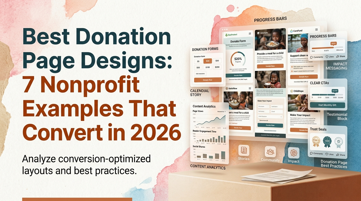
A donation page carries more weight than any other page a nonprofit owns. It is where a warm, motivated visitor either follows through or leaves. And the difference between a page that converts and one that does not is rarely the cause. It is the design. This is a roundup of the best donation page designs in the nonprofit space, what makes each one work, and the principles you can apply to your own page whether you are refreshing a single screen or planning a full redesign.
Why Donation Page Design Decides Whether People Give
Most nonprofit donation pages were not designed so much as assembled. A platform default here, a stock form there, a wall of copy explaining the organization. The result is functional but forgettable, and it treats the most important moment in the donor relationship as an afterthought.
That is expensive. Donors arrive on a donation page at the highest-intent moment they will ever reach, and a page that introduces friction, doubt, or distraction at that moment loses gifts that were already halfway given. Research on form design from the Nielsen Norman Group has shown for years that every additional field and every unnecessary decision measurably reduces completion. On a donation page, each of those small losses is a gift that never happened.
Good donation page design is not decoration. It is the mechanism that turns intent into revenue. Get it right and the same traffic produces more donors, more monthly supporters, and more repeat gifts. That is why our own engagements almost always treat the donation flow as the highest-priority surface on the site, and why our work with WWF-Canada centered on rebuilding the donation experience specifically, lifting digital donations by 37%.
What Separates a High-Converting Donation Page From an Average One
Before the examples, it helps to name the principles they share. These are the elements that consistently separate a high-converting donation page from an average one, and they apply to nonprofit donation page design at any budget.
One clear ask per screen. The best pages resist the urge to also promote the newsletter, the volunteer program, and the annual gala. A donation page has one job. Everything that competes with the gift is a leak.
Suggested amounts and a recurring default. Presenting a few thoughtfully chosen giving amounts removes a decision that otherwise stalls donors, and it tends to raise the average gift. The strongest pages also frame monthly giving as the natural choice rather than an upsell, because recurring revenue is the single most valuable outcome a donation page can produce. Sector data from the M+R Benchmarks study has consistently shown monthly giving growing faster and retaining better than one-time gifts.
A form reduced to essentials. Every field you can remove is friction you can remove. Name, amount, payment, done. Anything else should have to earn its place.
Trust and transparency at the point of decision. Donors give when they feel confident their money will be used well. That confidence has to be visible on the page itself: where the money goes, who is accountable, and what the gift accomplishes, surfaced at the moment of decision rather than buried.
Impact framing tied to the amount. "Your $50 provides clean water for a family for a month" converts better than "Donate now," because it connects the number to a concrete outcome. The best donation page designs make the impact of each amount legible.
Mobile-first, not mobile-tolerated. A large share of discovery and giving now happens on a phone, arriving from social or email. A donation page that is merely not broken on mobile is losing people at the highest-intent moment there is.
For a deeper walkthrough of how these principles come together across an entire site, our guide on how to design a nonprofit website that increases donations covers the full journey.
The Best Donation Page Designs: 7 Nonprofit Examples to Learn From
Two of the examples below are our own projects; the rest belong to organizations we admire but have never worked with. They are grouped together on purpose. What matters here is what each page does well, not who built it.
WWF-Canada: a donation flow rebuilt for conversion
When WWF-Canada came to WANDR, traffic was not the problem. Conversion was. Too many motivated supporters were reaching the donation flow and leaving before completing a gift. We rebuilt that flow from the ground up: fewer steps, clearer impact statements at each stage, and a recurring option surfaced naturally rather than forced. Impact statements were tied directly to giving amounts, all within WWF's strict global brand system. The rebuild lifted digital donations by 37%. The lesson: the donation flow is worth designing as its own product, not treating as the last screen of the website.
Mercy For Animals: one donation system across many campaigns
Mercy For Animals runs dozens of campaigns at once across multiple regions and languages. Their challenge was less about a single page and more about consistency: how do you keep every campaign's donation experience credible and high-converting without rebuilding it each time? Our work with Mercy For Animals built a reusable, accessible donation and campaign system, which contributed to a 32% increase in donations. The lesson: for organizations at scale, the best donation page design is a system, not a one-off.
charity: water: transparency as the whole experience
charity: water is the page most often held up as the benchmark, and it earns it. Its 100% model, where every public donation goes to the field and the organization covers processing fees itself, is not a footnote. It is the spine of the page. The giving flow is trimmed to a one-time or monthly choice with almost nothing in the way, and an interactive project map shows donors exactly where their money goes. The lesson: when transparency is built into the page rather than parked on an About link, trust stops being a claim and becomes the experience.
World Central Kitchen: urgency done well
World Central Kitchen has to move fast, and its donation design reflects that. Strong photography and video carry the emotional weight, the ask is framed around the urgency of the moment, and the path to give stays short and prominent. The lesson: emotional storytelling and a fast, obvious donate path are not in tension. They reinforce each other when the page commits to both.
DonorsChoose: the tangible unit of giving
DonorsChoose turns an abstract cause, funding classrooms, into something you can hold. Donors browse specific projects, filter by subject or grade, and fund an itemized need alongside a note from the teacher who submitted it. The lesson: attaching a gift to a concrete, verifiable outcome is one of the most dependable donation page design ideas there is, because it answers "what will my money actually do?" before the donor has to ask.
Feeding America: pathways over pileups
Feeding America serves donors, volunteers, and people seeking help, and its design keeps those paths separate instead of piling them onto one screen. Clean data visualization conveys scale, a local food bank finder makes the national mission personal, and the "Take Action" menu routes each visitor cleanly. The lesson: clarity of pathway beats cramming every option into the donation moment.
Kiva: specificity and social proof
Kiva makes giving personal by giving it a face. Instead of an abstract fund, donors browse individual borrowers with names, photos, and repayment histories, and live updates show loans others have funded. The lesson: specificity converts, and a clear, repeatable unit of action is far easier to say yes to than an open-ended appeal.
Donation Page Design Ideas You Can Apply This Week
Not every improvement requires a full redesign. If you are working with what you have, a few high-leverage donation page design ideas tend to move the needle quickly.
Lead with a single, specific impact statement above the giving amounts, so the first thing a donor reads connects money to outcome. Reduce your form to the fewest fields your payment processor truly needs, and move everything optional to after the gift is complete. Add a modest set of suggested amounts with monthly preselected or visually emphasized. Put one clear trust signal, a transparency statement or a recognizable payment badge, directly beside the donate button rather than in the footer. And open your own page on a phone, start a donation, and count the taps. If it takes more than a handful, that is your first project.
Once those are in place, the way to know they worked is measurement. Our guide on how to track donation conversions on your nonprofit website walks through setting that up so your next design decision is based on data rather than opinion.
Designing a Donation Page From the Ground Up: The DonateHello Approach
Sometimes a donation page is the entire product. That was the case with DonateHello, a donation platform that nonprofits list their causes on. It is not a nonprofit itself, and it had not launched, which made it a pure design problem: build donor trust from the interface alone, for organizations a donor has never heard of.
We approached it as a trust problem rather than a transaction problem. Cause discovery was designed to build connection before the ask. Transparency was woven into every step rather than confined to a page. The giving flow borrowed patterns donors already trust from e-commerce, letting them fund specific, tangible needs and check out with minimal friction. The DonateHello project is worth a look precisely because it shows what donation page design looks like when trust and conversion are the only things that matter. The principles that shaped it, discovery first, transparency as architecture, a frictionless flow, are the same ones that make any nonprofit donation page convert.
If you want to see how those donation principles extend across a whole fundraising site, our breakdown of fundraising websites for nonprofits is a useful companion.
Final Thoughts: Turning Your Donation Page Into Your Best Fundraiser
The best donation page designs are not the prettiest ones. They are the ones that made a deliberate decision about the single most important moment in the donor relationship and removed everything that got in its way. One clear ask. Suggested amounts and a recurring default. A form reduced to essentials. Trust and impact at the point of decision. A mobile experience built for the way people actually give.
Your donation page is very likely the highest-leverage screen your organization owns. A modest improvement in its conversion rate compounds across every campaign, every appeal, and every year. That is why it deserves real design attention rather than a platform default.
Ready to Redesign Your Nonprofit Donation Page?
WANDR is a woman-owned design, development, and strategy studio that has spent over a decade building high-converting digital experiences for nonprofits, from single donation flows to full platform rebuilds. If your donation page is not pulling its weight, we can help you find out why and fix it. Explore WANDR's nonprofit website design services to start the conversation.
Related WANDR case studies: WWF-Canada · Mercy For Animals · DonateHello