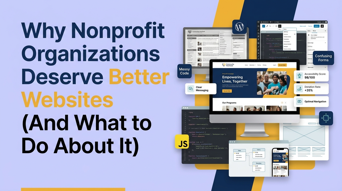
There's a quiet double standard in how we think about nonprofit websites.
For a commercial company, a poor website is a business problem. It costs sales. It gets fixed. For a nonprofit, a poor website is often treated as an acceptable constraint, a consequence of limited budget, a sign of an organization's admirable commitment to keeping overhead low. "We put our money toward the mission, not the website."
That framing is costing nonprofits donations, volunteers, and impact they should be generating. And it's time to challenge it.
The False Economy of Treating Your Website as Overhead
The logic of "we don't spend money on the website because we're focused on the mission" sounds virtuous. It isn't.
Your website is the primary mechanism through which people who've never heard of you become people who support you. It's where potential donors evaluate whether your organization is credible enough to trust with their money. It's where volunteers decide whether the commitment feels manageable. It's where corporate partners assess whether a relationship would be worth pursuing.
If that mechanism is broken, you're not saving money by underinvesting in it. You're losing donors, volunteers, and partners you never knew you could have had.
Here's a concrete way to think about it. If your nonprofit receives 5,000 visitors to your donation pages per month, and your current conversion rate is 0.5%, you're getting 25 donations. If a website redesign brings that to 1.5%, you're getting 75 donations. That's 50 more donations every single month from the same traffic, at an average gift of $75, that's $45,000 in additional revenue per year.
Against a $25,000 redesign investment, the payback period is under seven months. And the improved conversion compounds every month after that.
The website isn't overhead. It's infrastructure. And infrastructure that isn't working is infrastructure that's costing you.
The Credibility Problem Nobody Talks About
There's a specific way that poor nonprofit website design costs organizations that goes beyond raw conversion rates, and it's worth naming directly.
When a potential major donor evaluates your organization for a significant gift, the website is often their first and primary research tool. If the site looks outdated, if the navigation is confusing, if the impact reporting is vague, if the design signals "this organization isn't keeping up," that donor's estimate of your organizational competence goes down. It's not fair. It's how human psychology works.
The same thing happens with foundations evaluating grant applicants. With corporate partners assessing a potential sponsorship. With journalists researching a story.
You're asking people to trust you with their money, their time, and their public association. Trust is built or broken in seconds. Design is the fastest credibility signal you have.
As Lina Silva, WANDR's CEO, puts it: "You're going to ask people to donate and give their money. You're going to ask them to advocate, to become a partner. All the actions and outcomes nonprofits need require a very high component of trust. And the website needs to reflect that."
When it doesn't, the gap between the quality of your work and the quality of your digital presence becomes a hidden tax on everything you're trying to build.
What "Better" Actually Means
Better doesn't mean more expensive or more visually complex. It means more effective at the specific job a nonprofit website has to do.
A nonprofit website that's doing its job:
Establishes trust within the first 10 seconds. The design is professional and current. Impact numbers are specific and visible without scrolling. There's social proof from real people. The organization looks like what it is: serious, accountable, and effective.
Makes each user type feel like the site was built for them. A first-time donor, a recurring supporter, a corporate partner, and a volunteer applicant all have different needs. A good nonprofit site serves each of them from the moment they arrive, not after they've spent five minutes trying to navigate a menu that reflects internal organizational structure rather than external user goals.
Removes friction between intent and action. Donation flows with four steps or fewer. Volunteer applications that don't ask for a resume before a first conversation. Newsletter sign-ups with one field. Every unnecessary step costs real conversions.
Is found by people who are already looking. SEO isn't optional for nonprofits. It's how people who care about your cause but don't know you exist discover you. A site that's invisible in search is an organization that's not growing its supporter base.
Works on a phone. Most of your potential supporters are going to encounter your organization for the first time on a mobile device. If the experience on mobile is inferior to desktop, you're failing the majority of your audience at the first interaction.
Has analytics that tell you what's working. You cannot improve what you can't measure. A nonprofit website without properly configured analytics is operating without evidence, making design decisions based on internal opinion rather than user behavior.
The Most Common Reasons Nonprofit Websites Fall Short
We've audited dozens of nonprofit websites. The same problems appear consistently, and they're rarely about budget.
The site was built for the organization, not for users. Navigation reflects internal department names. Content is organized around how the organization thinks about itself rather than how a visitor would look for what they need. This is the most common problem and the most fixable.
Nobody owns the website. For smaller nonprofits especially, the website is often managed by whoever has bandwidth, which is usually nobody. Without ownership, content goes stale, plugins don't get updated, broken links accumulate, and the site slowly deteriorates until something breaks badly enough to force attention.
The donation flow was never properly designed. Most nonprofit donation flows were set up by whoever was available when the site launched and have never been revisited with conversion design in mind. They have too many steps, ask for too much information, and don't include the impact statements at decision points that actually move people from consideration to completion.
Copy compensates for weak design. When a site doesn't look credible, organizations sometimes try to solve the problem by adding more text. More information, more explanations, more copy. But users don't read. They scan. Dense text reads as a red flag, not a trust signal.
SEO was never built in. Many nonprofit websites rank for their own name and nothing else. The queries that would bring in new supporters, "animal welfare volunteer opportunities Chicago" or "how to support addiction recovery programs," are being searched by people who would give if they found the right organization. Without SEO built into the site structure and content strategy, those searches don't end with your organization.
The Change That Needs to Happen
The shift we're advocating for isn't about spending more. It's about thinking differently.
The website isn't a communications tool that lives in the marketing bucket. It's mission infrastructure that directly affects whether the organization can fund, staff, and expand its work. It deserves the same strategic attention as a program design, a fundraising strategy, or a board development plan.
That shift in framing changes what questions get asked. Instead of "how do we get a new website without spending too much," the question becomes "what would it take for our website to meaningfully increase donations this year, and how do we build that business case?"
The organizations that have made that shift are the ones generating the results we see in our work. WWF Canada, 37% increase in transactions. Mercy For Animals, 32% increase in donations in year one. Not because they had bigger causes than everyone else. Because they invested in the digital infrastructure to connect those causes with the people who were already looking for them.
What You Can Do Right Now
You don't need a full redesign to start. Here are the highest-leverage actions organizations can take regardless of budget:
Set up Google Analytics and Search Console if you haven't. Free, fast, and gives you the evidence base every future decision should be built on. You can't know what to fix if you don't know what's broken.
Test your donation flow yourself, on your phone. Seriously. Open an incognito tab, go to your website on your phone, and try to complete a donation as a first-time visitor. Count the steps. Notice what's confusing. You'll find at least two things to fix immediately.
Audit your top-five pages for copy density. If any page is a wall of text, that's a conversion problem. What's the single most important thing each page needs to communicate? Start there and cut the rest.
Check your site speed. Go to Google PageSpeed Insights and run your homepage and donation page. Anything below 50 on mobile is actively costing you conversions. The most common culprit is uncompressed images.
Ask someone who doesn't know your organization to navigate to your donation page. Watch them, don't help them. What you see in that five minutes will tell you more about your site's usability than any internal review.
If the answers to these exercises confirm that your website is working against your mission, the conversation about investment starts to answer itself.
WANDR's Position
We work with nonprofits because we believe in what they're doing. We're committed to the missions of the organizations we partner with, not just the deliverables we produce.
That commitment shows up in how we structure our engagements: research before design, flows before screens, analytics from day one, and a warranty that means we're accountable for the outcomes. Within year one of launch, you'll see meaningful improvement in the metrics your mission depends on, or we come back and work until you do.
Nonprofits deserve websites that do justice to the work they're doing. Getting there isn't a cost. It's an investment in the mission.
Book a free nonprofit website diagnostic to understand exactly where your site is right now and what it would take to close the gap.
WANDR Studio is a woman-owned design, development, and strategy agency specializing in nonprofit digital experiences. We've generated $3.2M+ in additional donations across 15+ nonprofit engagements.
Related reading: Nonprofit Website Best Practices: 12 Rules From $3.2M in Results | Nonprofit Website Redesign: When, Why, and How | How Much Does a Nonprofit Website Cost?
Related WANDR case studies: WWF-Canada · Mercy For Animals · Swipe Out Hunger
Planning a nonprofit website project? Explore WANDR's nonprofit web design services →