Reading Time:
10 minutes
Category:
Nonprofit
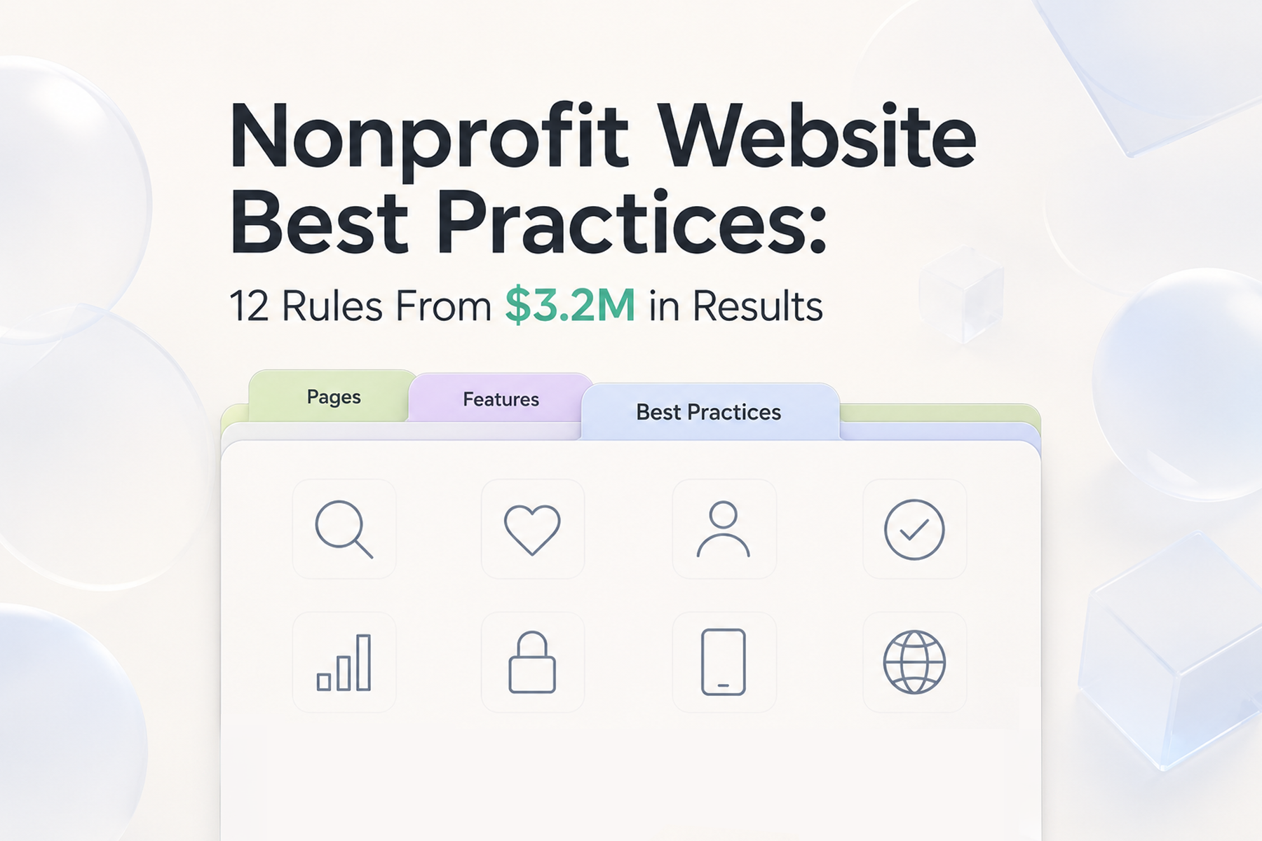
The 12 nonprofit website best practices we've applied across 15+ engagements — not generic advice, but rules drawn from what actually produced $3.2M in additional donations.

The 12 nonprofit website best practices we've applied across 15+ engagements — not generic advice, but rules drawn from what actually produced $3.2M in additional donations.
Best practices in web design are often generic. "Use clear CTAs." "Make it mobile-friendly." "Write good copy."
These aren't wrong, but they're not useful without the context of why they matter and how they apply specifically to the nonprofit use case, where the stakes: credibility, trust, conversion: are higher and the constraints: budget, internal resources: are tighter.
What follows isn't a generic list. It's twelve practices drawn directly from what we've learned building nonprofit websites across 15+ engagements that generated over $3.2 million in additional donations.
Every Wandr project starts with an audit and a period of user research. Not because it's billed time: because skipping it is how you end up with a beautiful website that doesn't work.
Most nonprofit leadership teams have assumptions about their audience that are at least partially wrong. We've seen this consistently. An organization in Alaska assumed that certain geographic regions would reject their cause based on the nature of the work. User interviews revealed a significant untapped population actively seeking an organization exactly like theirs.
If you design from assumptions, you design for the wrong audience. User research validates or corrects those assumptions before they become embedded in the design.
The practice: Conduct user interviews with at least five to ten potential users before designing anything. Use what you learn to challenge your internal assumptions, not confirm them.
User personas are how you ensure the website speaks to actual people rather than a theoretical composite of "supporters." But too many personas create a different problem: over-segmentation.
We've learned through experience that four primary user types is the practical maximum for a nonprofit website. More than that, and you end up building flows for hypothetical edge cases instead of the people who actually drive your outcomes.
Within those four, let users self-identify through natural decision points in the flow rather than forcing categorization upfront.
The practice: Identify your four highest-priority user types based on your organizational outcomes. Design specific flows for each.
A page is static. A flow is a sequence of decisions, actions, and moments between them. The most important design question isn't "what should this page look like?": it's "what journey does this user need to complete?"
Map every step of every user's journey: from entry point to completed action: before designing a single screen. Then design the screens to serve that map.
The practice: For your donation flow, draw it out. Entry → first impression → intent decision → form → payment → confirmation. Challenge every step. What happens if you remove it?
This is the donation flow principle stated as bluntly as possible. Research on digital conversion consistently shows that abandonment rates increase with every additional step in a process. Seven steps in a donation flow is not unusual for nonprofit websites. It's also inexcusable.
The minimum viable donation flow: amount selection → payment information → confirmation. Three steps. Every addition above that needs to earn its place.
The practice: Count the steps in your donation flow. Target four or fewer. For every step above that, ask: whose needs does this serve: the user's or the organization's?
Every visual, copy, and interaction decision in a nonprofit website is either building or undermining trust. Given that nonprofit conversion requires a higher trust threshold than commercial conversion (you're asking for money with no immediate tangible return), this isn't optional.
Trust-building design elements: real photos of real people doing real work, specific and verifiable impact numbers, named leadership with faces, security indicators near payment fields, third-party validation (charity ratings, media logos, accreditation).
Trust-undermining elements: stock photography that could belong to any organization, generic copy ("making a difference"), outdated design, broken functionality, and a bare-bones donate button with no branding standing in for a real donation flow.
The practice: Audit every page of your site specifically for trust signals. Are they prominent? Are they specific? Are they verifiable?
The majority of nonprofit website traffic arrives via mobile. If the design was created for desktop first and adapted for mobile second, the mobile experience is a derivative: and usually an inferior one.
Mobile-first design means designing for the constraints of a small screen first, then expanding. Those constraints: no hover states, touch targets instead of cursor clicks, limited screen real estate: produce more disciplined design that benefits all platforms.
The practice: Every design review, the mobile experience gets reviewed first. Mobile performance is measured on real devices before desktop.
The most common copy failure in nonprofit websites: treating volume as a trust signal. When the design doesn't communicate enough credibility, organizations compensate with more text. More paragraphs. More information. More copy.
But users don't read. They scan. Dense text signals "complicated" and "untrustworthy" rather than "thorough" and "serious."
Effective nonprofit copy is specific, emotionally resonant, and structured to answer the user's most immediate question: right now, at this exact point in their journey.
The practice: For each major page, identify the single most important thing you need the user to understand at that moment. Write that. Cut everything that doesn't serve it.
The most powerful conversion intervention in donation flows is often the simplest: telling donors specifically what their contribution accomplishes.
"Your donation helps animals": heard but ineffective. "$50 provides one rescue animal with one month of veterinary care": specific, credible, and creates a concrete mental image of impact.
Impact statements placed at the moment of decision: just before payment entry: can meaningfully reduce abandonment rates.
The practice: For every donation amount tier, write a specific, concrete impact statement. Include it in the donation form, adjacent to the amount selection.
Related: How to Design a Nonprofit Website That Increases Donations →
SEO is often treated as a marketing activity: something the content or communications team handles. In reality, it's infrastructure that determines whether anyone finds the website at all.
For nonprofits where a significant portion of new supporters find them through search (which is most nonprofits), SEO isn't optional. It's the distribution mechanism for all the other work.
SEO best practices built into the design: clean URL structure, proper heading hierarchy, meta titles and descriptions for every page, internal linking, image optimization, page speed.
And when you're doing a redesign: protect your existing SEO through proper content migration and redirect mapping. We preserved over 90% of Mercy For Animals' SEO equity through a major platform migration. That outcome required intentional process.
Related: Nonprofit Website SEO: How to Get Found Without a Big Ad Budget →
If you launch without analytics configured, you're immediately losing information that can never be recovered. The first weeks and months post-launch are when the highest-value behavior data is generated: users navigating the new experience for the first time, donation flows being tested at scale.
Configure Google Analytics 4 (with conversion events), Google Search Console, and donation platform analytics before the launch date.
The practice: Analytics setup is a launch gate: the site doesn't go live without it. We apply this to every project.
The design doesn't stop when the site goes live. Launch is where the feedback loop begins.
The first 90 days post-launch are critical: you're gathering real user data, identifying friction you didn't anticipate, and making evidence-based improvements to the highest-priority pages. Organizations that treat launch as the finish line plateau. Organizations that treat it as the starting line continue to improve.
The practice: Commit to a 90-day post-launch review process. Look at what the data says. Make changes. Measure the impact.
This is less a design best practice and more an agency selection best practice. But it matters.
Most agencies deliver a website and consider the engagement complete. We operate differently: our commitment is that you'll see meaningful improvement in your key metrics during year one post-launch, or we come back and work for free until you do.
That's not a marketing statement: it's how we approach every project. We're committed to impacting the mission, not just delivering a beautiful asset.
See what that commitment looks like for your organization →
You don't need to overhaul your entire website to apply these. Start with an honest audit:
Sometimes the answer is a targeted fix: optimizing the donation flow, improving impact copy, setting up analytics. Sometimes it points to something more comprehensive.
Either way, the conversation starts with clarity about where you are.
Book a free nonprofit website diagnostic →
Wandr. $3.2M in additional donations. 15+ nonprofit engagements. See our services →
Research before design. Every other best practice depends on having accurate knowledge of who your users are and what they need. Organizations that skip this step make beautiful websites for the wrong audience: and spend money on conversion problems they didn't need to create.
Four maximum. More than four leads to over-segmentation: flows designed for hypothetical edge cases rather than the people who actually drive your outcomes. Within those four, let users self-identify through natural decision points rather than being forced to categorize themselves upfront.
Wandr's warranty is a specific commitment: within year one of launch, you'll see a meaningful increase in your key KPIs: or we come back and work for free until you do. We map the KPIs at kickoff and measure throughout the engagement. It's how we stay accountable to outcomes, not just deliverables.
Minimize steps (target four or fewer), place impact statements at decision moments, remove unnecessary form fields, surface recurring giving naturally mid-flow rather than as a forced upfront choice, and ensure security indicators are visible near payment fields. Test the complete flow on mobile before launch.
Google Search Console and Google Analytics 4 with configured conversion events before launch. Specifically: donation form view, donation started, donation completed, volunteer application submitted, and newsletter sign-up. Without these events configured, you have traffic data but not behavior data.