Swipe Out Hunger
Our redesign and rebrand lifted Swipe Out Hunger's organic search traffic about 375%, from 628 to 2,980 monthly visits, then carried into years of compounding growth.
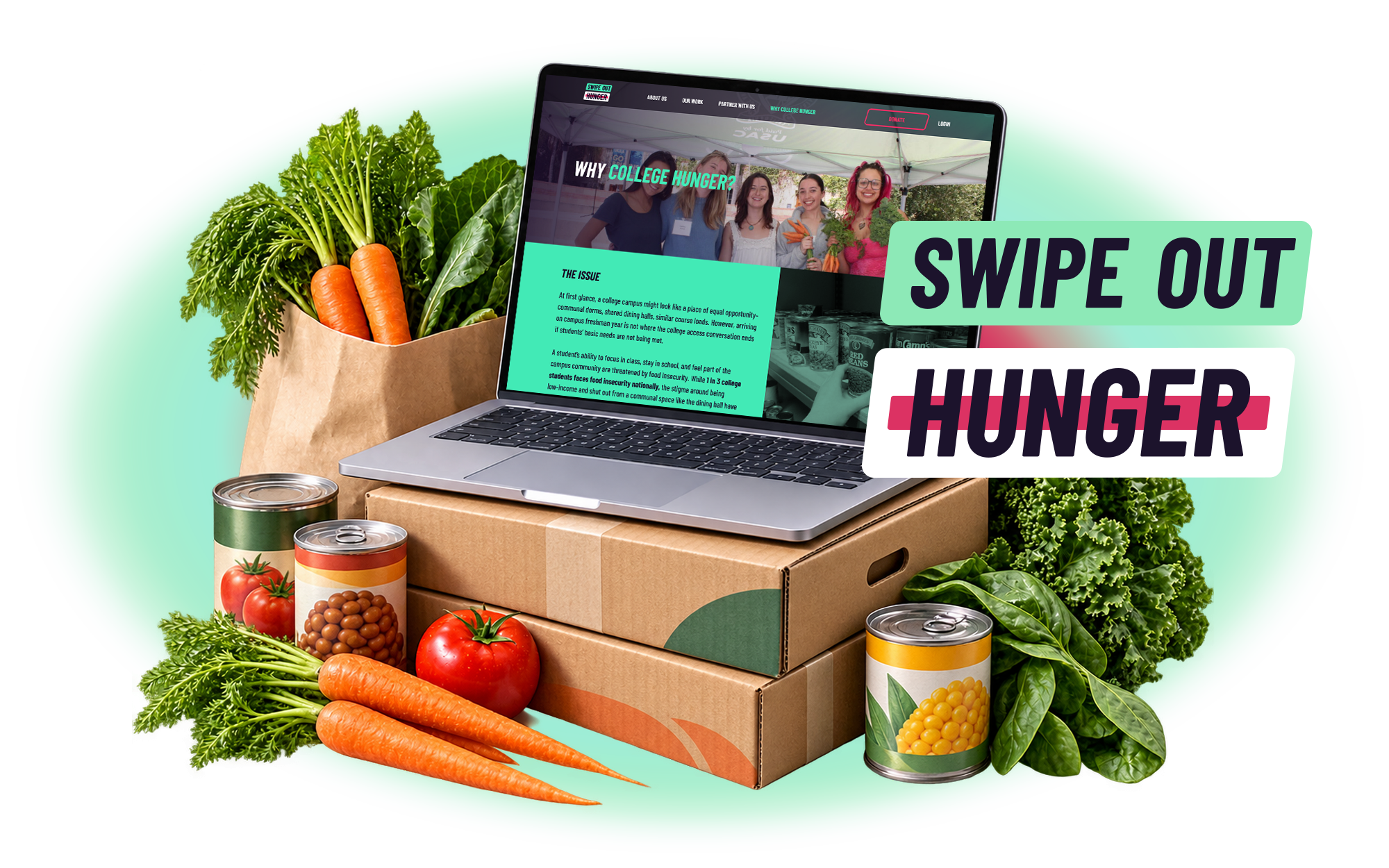
The national nonprofit ending college student hunger.
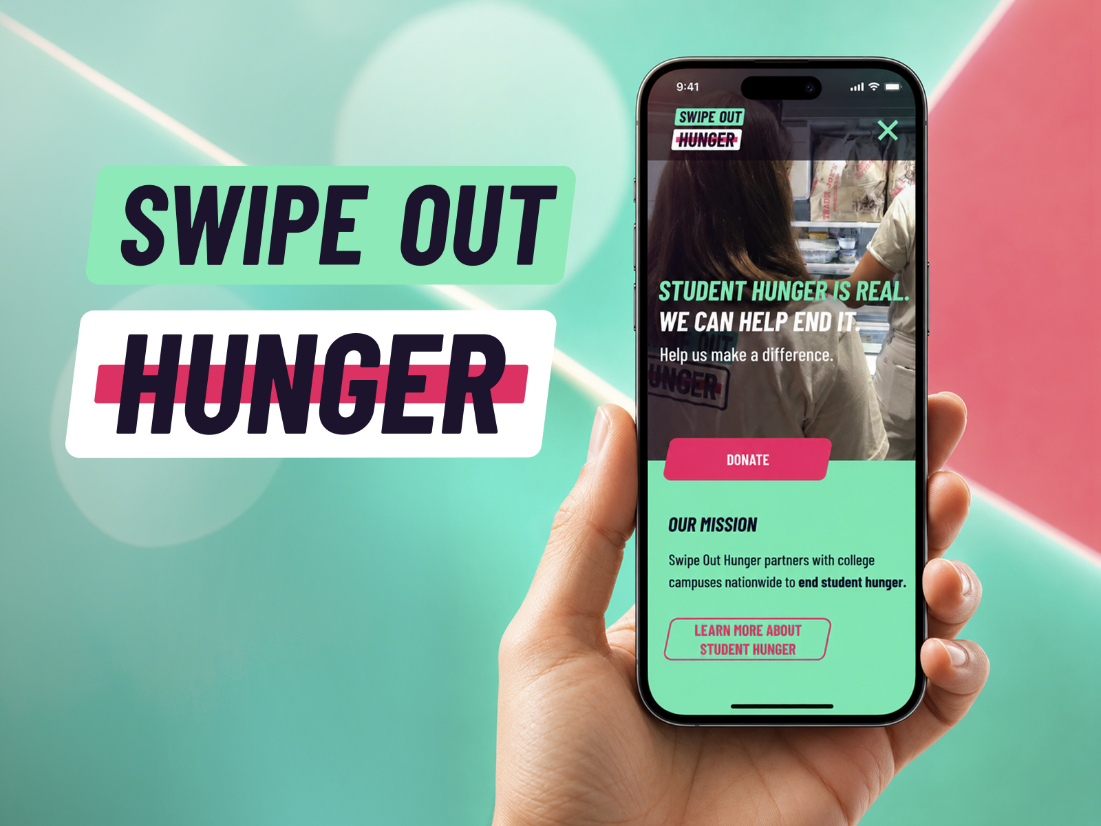
Swipe Out Hunger began in 2010, when a group of UCLA students started donating unused meal swipes to classmates who needed them. It has since become the leading national organization on student food insecurity, working alongside campuses, students, and legislators across North America, where roughly 40% of college students face food insecurity.
By 2019 the organization was scaling fast. Its website was the front door for students seeking help, campuses weighing a partnership, and the donors and legislators funding the work. That front door still looked like the student campaign it had grown out of.
The website had fallen behind the movement.
Swipe Out Hunger was operating at national scale. Its site and brand still read like a single-campus project, and undersold the organization to everyone it needed to convince.
Credibility.
The site looked like a campus project, not a national nonprofit. Campuses, donors, and legislators weighing a partnership found little that signaled institutional weight.
Audience.
Students seeking help, campuses considering partnership, and funders deciding whether to invest all arrived through the same undifferentiated experience.
Identity.
The brand had not kept pace with the organization's growth. Its visual language undersold both the urgency of the issue and the scale of the work behind it.
Same platform,
rebuilt for a new market.
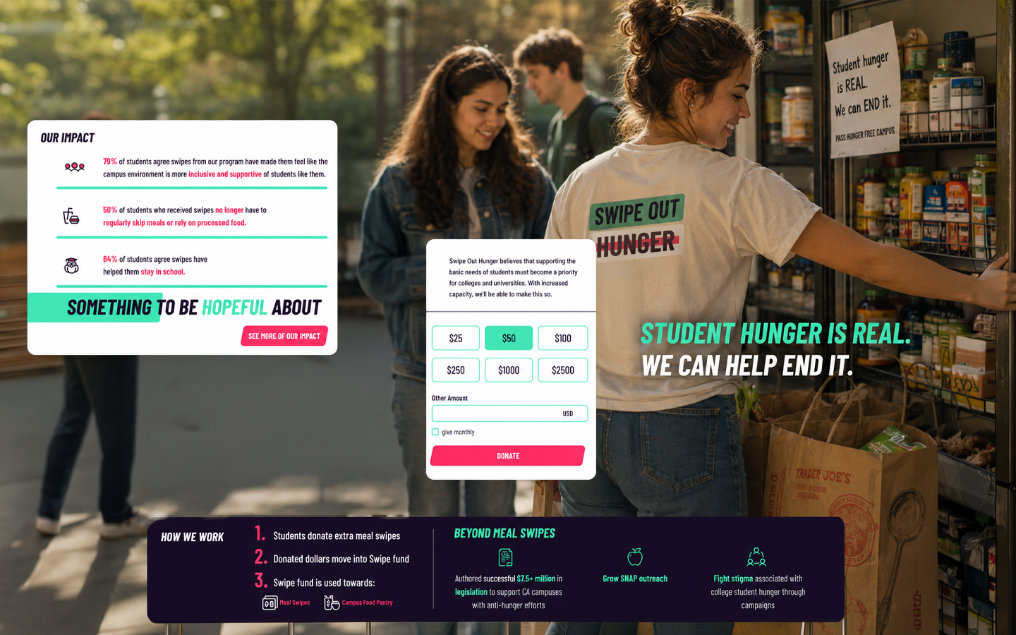
Drag the handle to see how the experience changed, from a site that read like a student campaign into a national platform built to carry the scale of the mission.
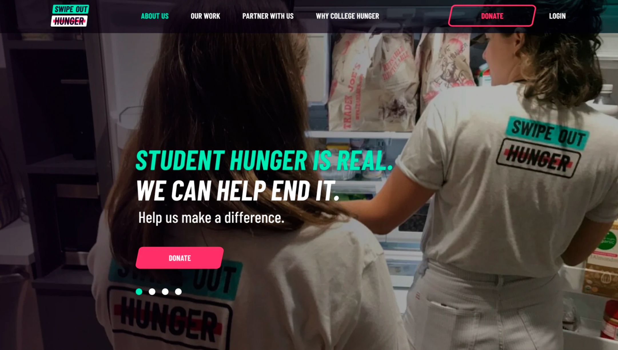

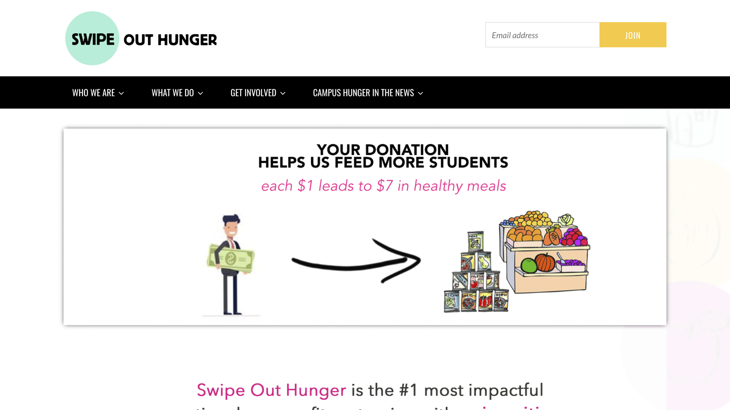

Design, brand, and handoff.
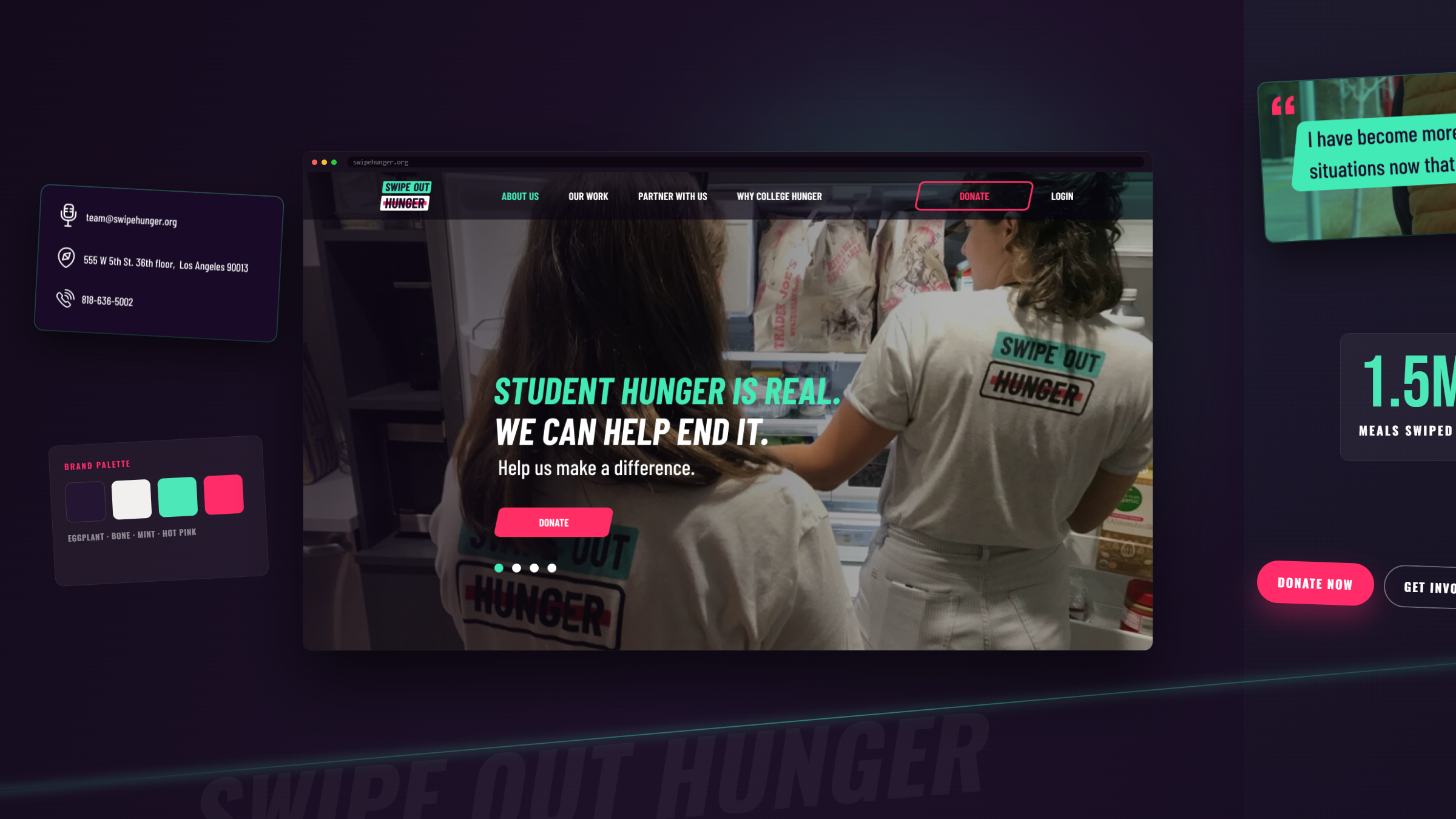
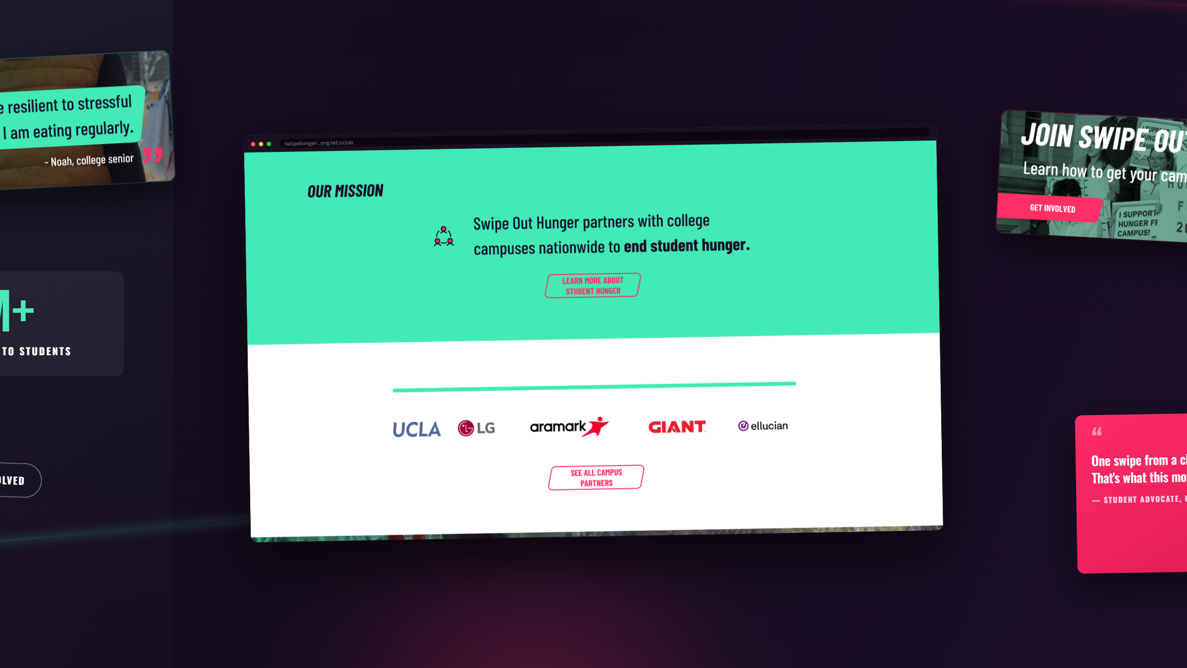
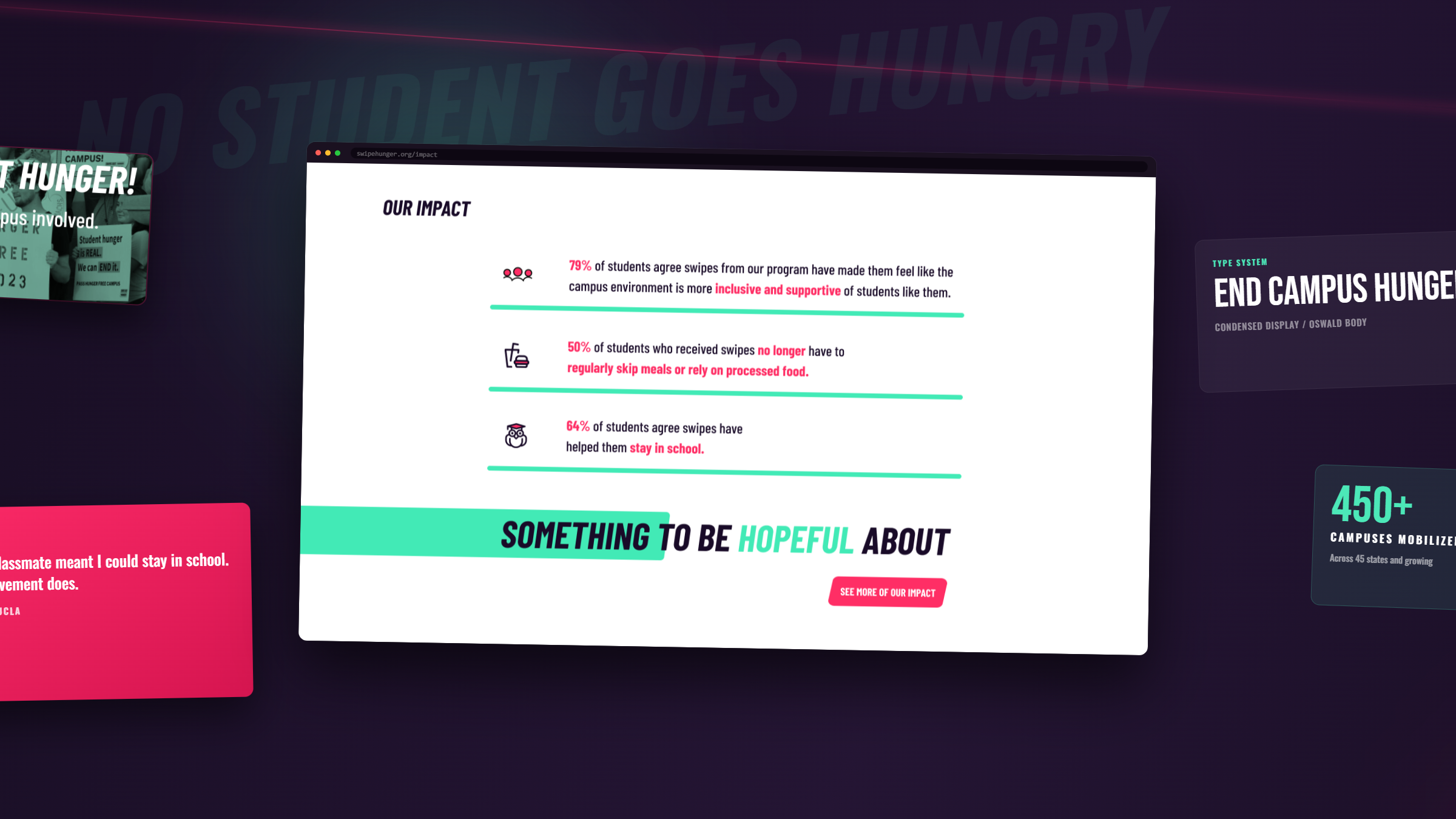
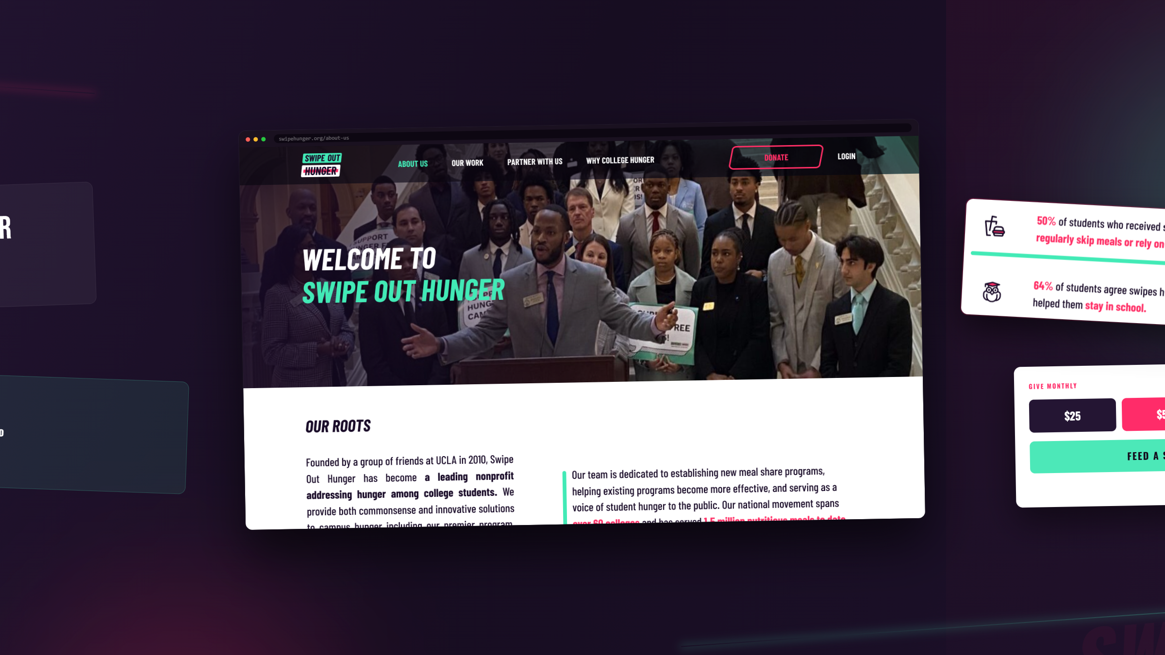
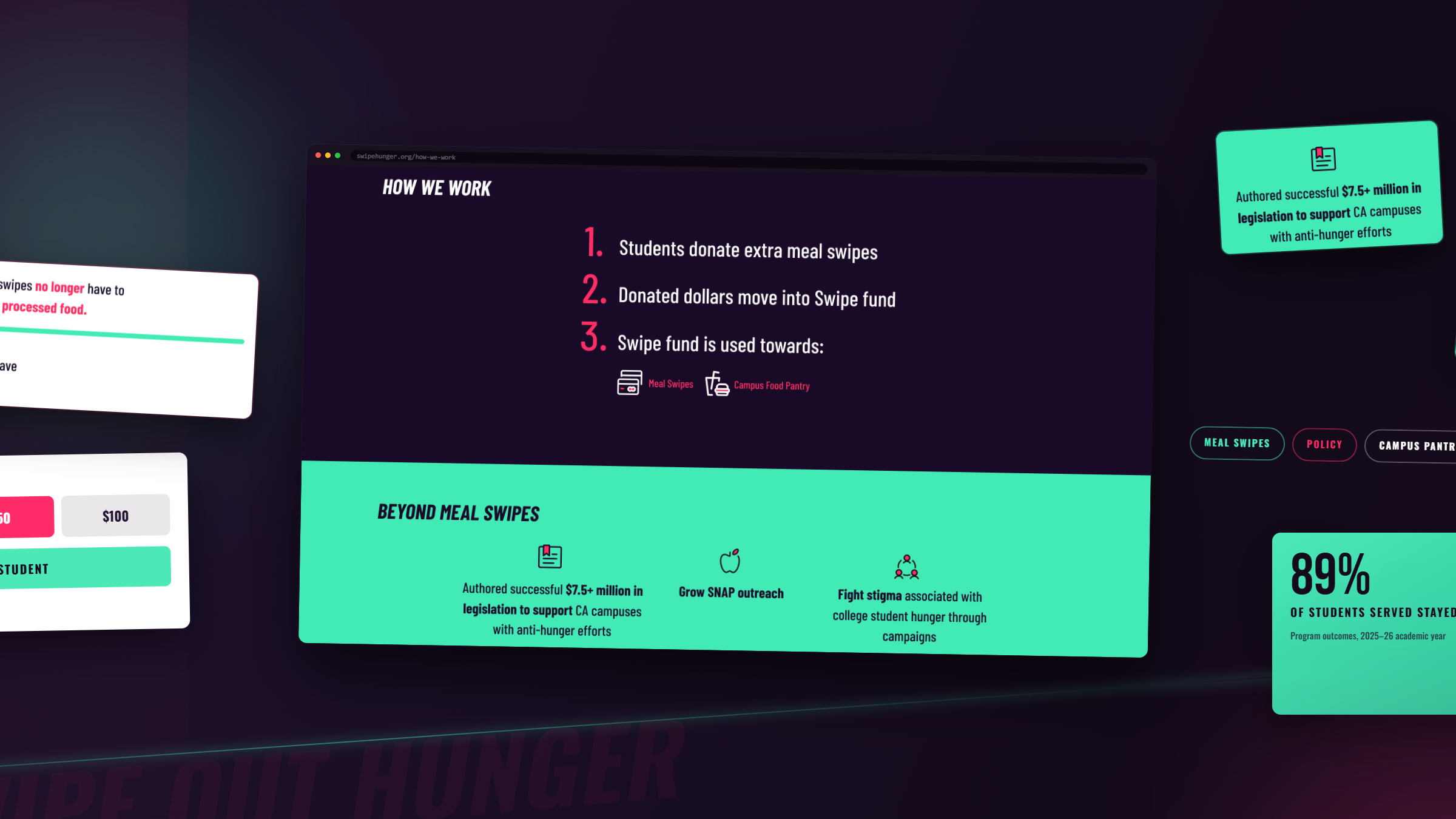

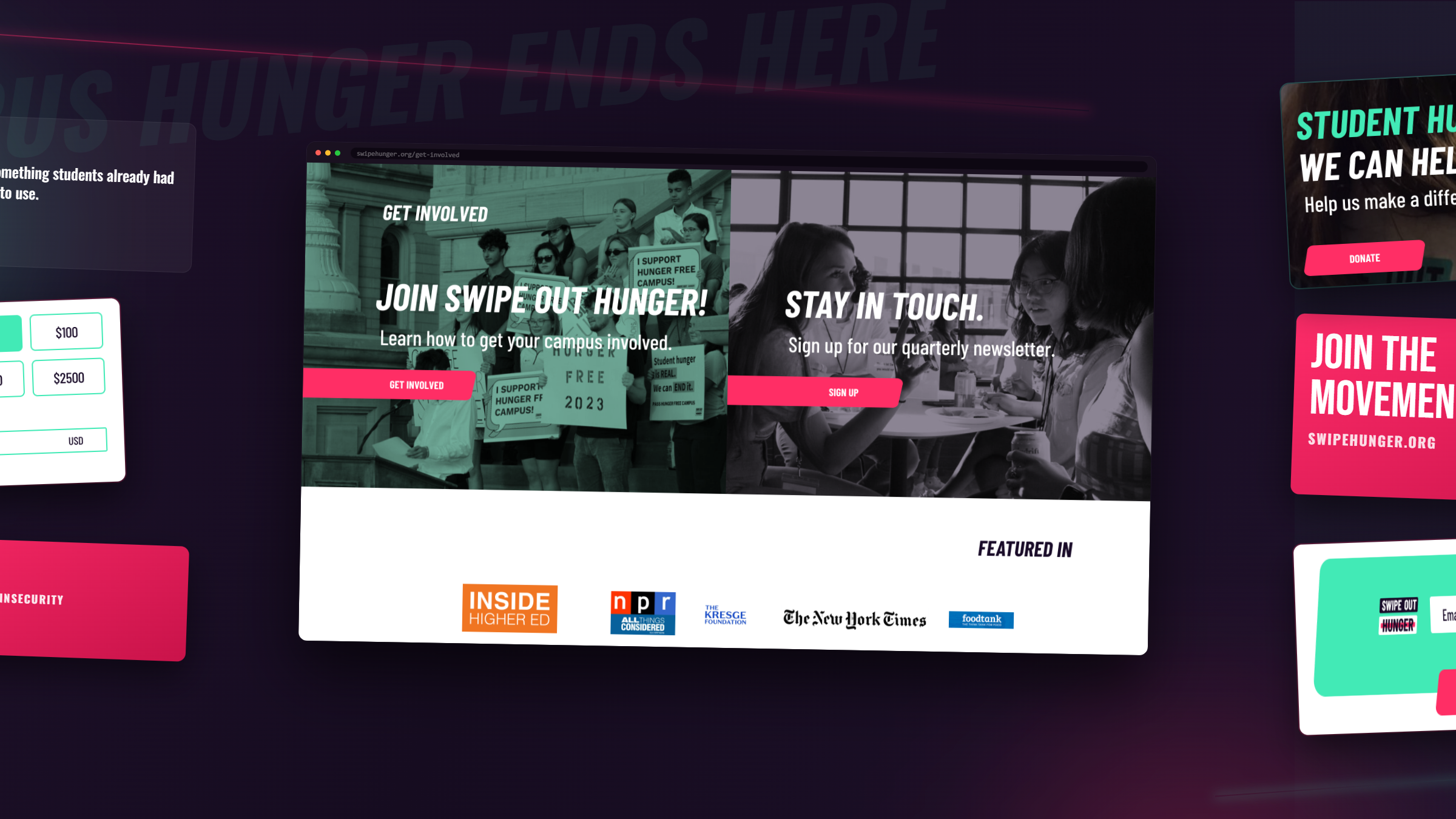
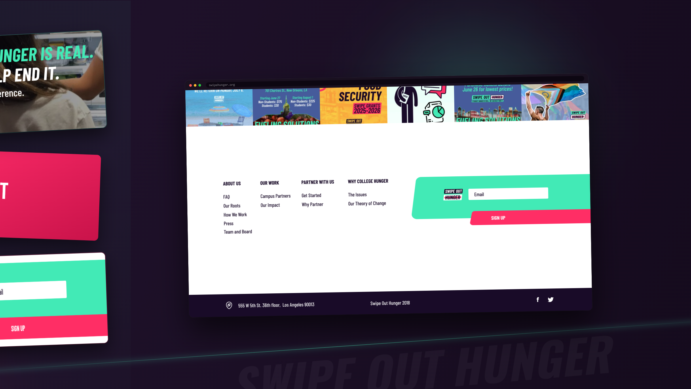
What the redesgin set up.
In the years after launch, the redesigned site grew into the strongest search presence in the organization's history.
628 → 2,980
384 → 2,702
35 → 14
1,412 → 1,878
Traffic figures from Semrush (swipehunger.org), August 2019 to March 2023.
In their words.
WANDR understood that our work is about dignity as much as access. They gave us a website and a brand that finally match the scale of our mission, warm, credible, and built to grow with us.