Persona 01

The donor.
Arrives emotionally engaged, often through a campaign page. Needs to see individual impact before committing, and a direct path to give from wherever they land.
returning
Impact-driven
Direct give
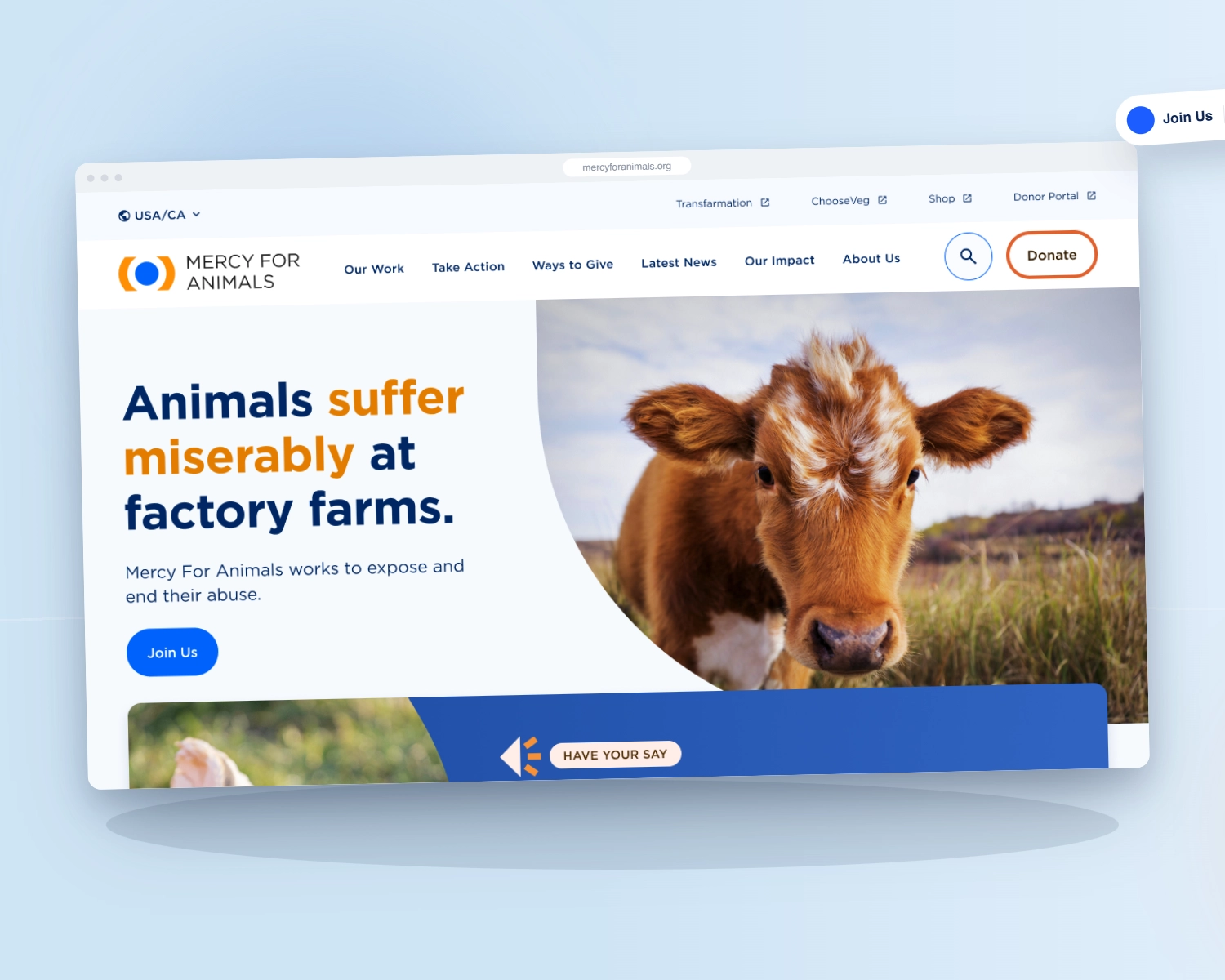
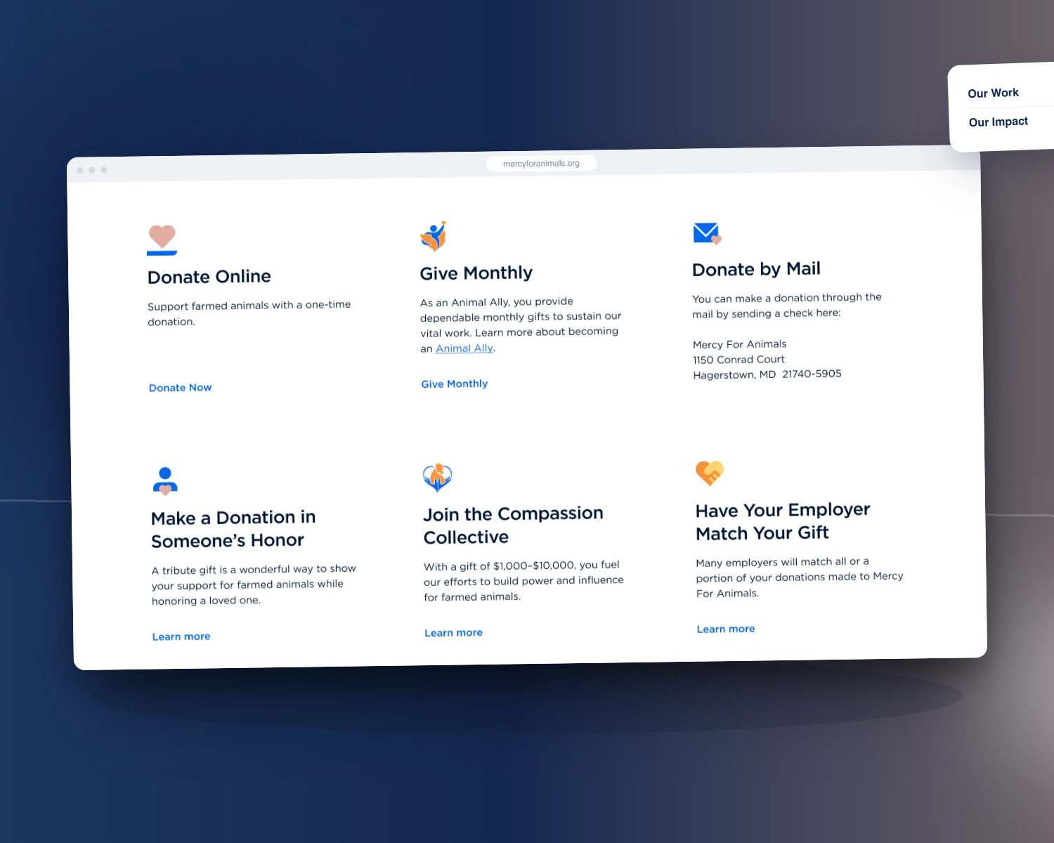
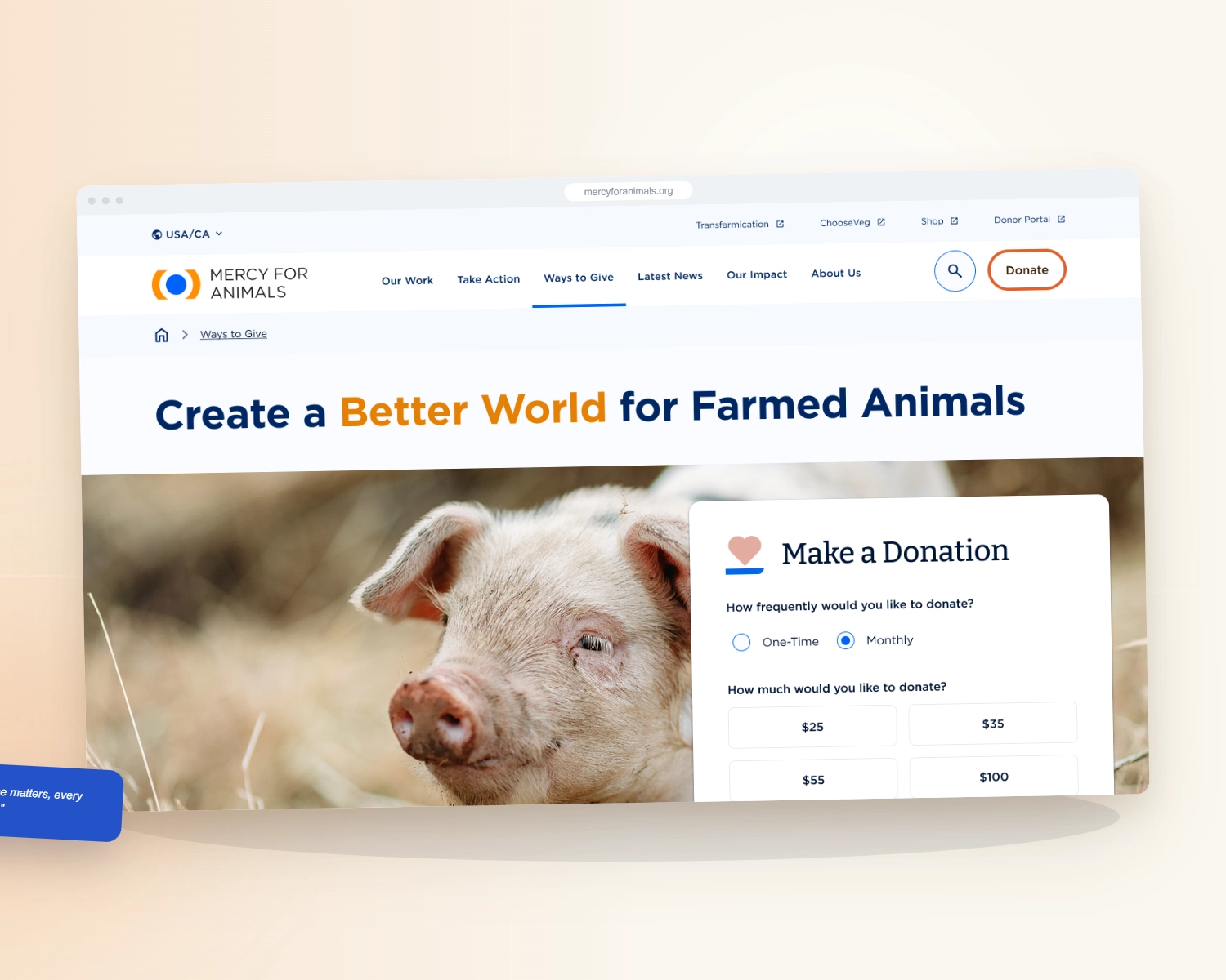
Our redesign of the donor journey lifted Mercy For Animals' donations 32%, then unified six regional sites into one platform, migrating 326 pages with search equity intact.
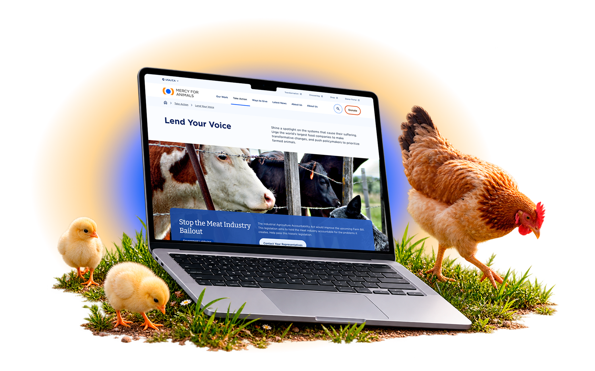
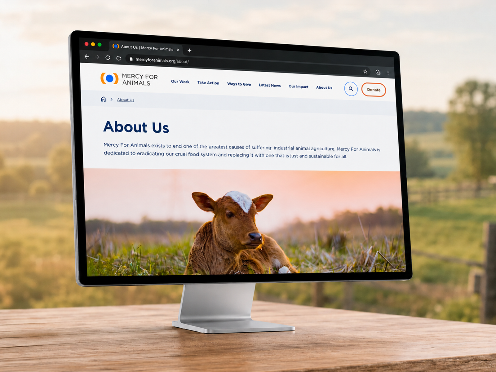
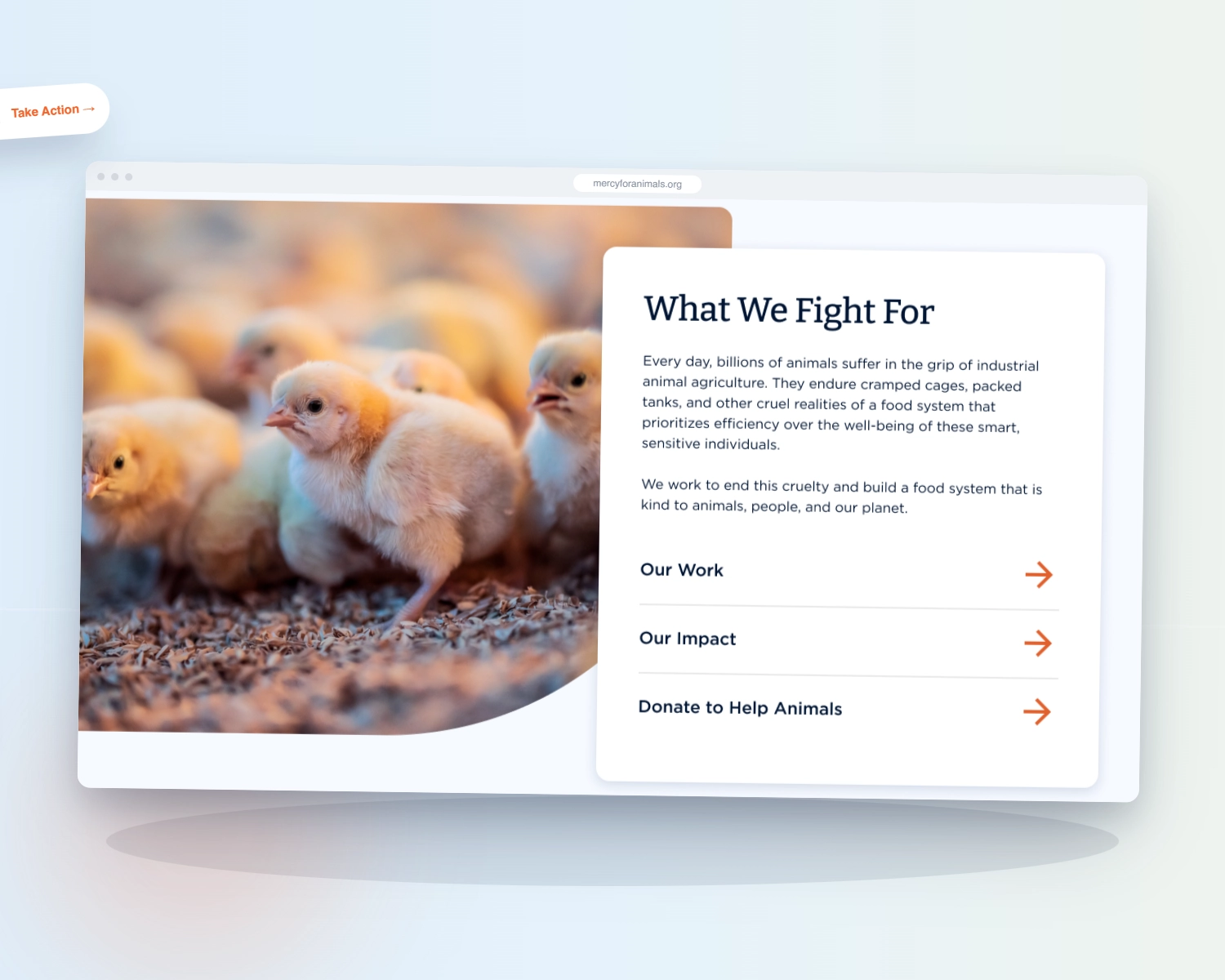
Mercy For Animals works to end industrial animal agriculture through investigation, corporate advocacy, policy change, and grassroots organizing. Founded in 1999, it operates across the United States, Latin America, Brazil, India, and Malaysia, and is executing a ten-year strategy to build a just and sustainable food system.
Its website is not a brochure. It is the front door for donors, the hub for dozens of simultaneous campaigns, and the conversion point for supporters across regions and languages. As MFA scaled internationally, that front door had fragmented into six independent sites that no longer told one story.
Deeply engaged supporters were losing the thread at the moment They decided to Act.
A globally recognized mission was running on six disconnected sites, and donation intent was leaking at the highest-value point in the journey.
MFA had no research-backed picture of donor behavior. The team could see that engaged users were not converting, but not why. Product and messaging decisions ran on assumption rather than evidence.
Six independent regional websites each carried their own UX patterns, narrative, and information architecture. Supporters who encountered more than one met a different organization each time, and internal teams duplicated work across regions.
Messaging created urgency without clarity, and donation flows asked for commitment before trust was established. Analysis surfaced a 90% drop-off at the primary donation decision point. Supporters disengaged exactly when they were ready to give.
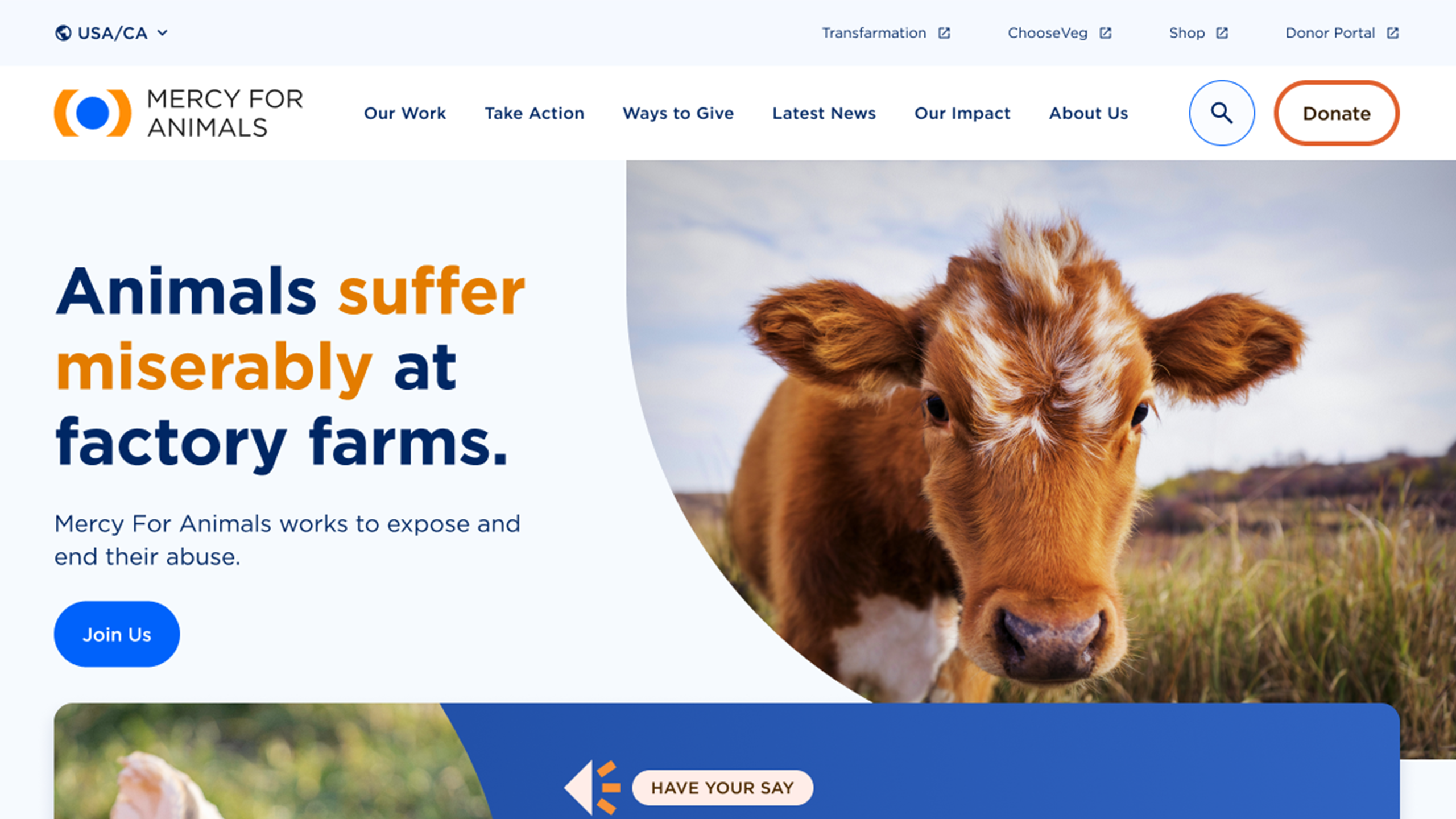
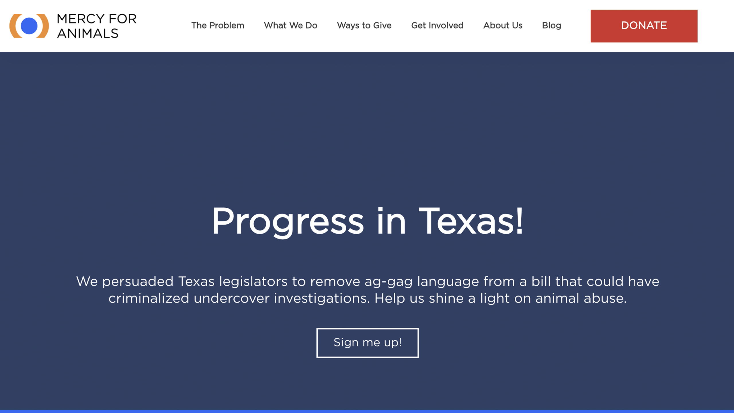
Drag the handle to see how the donor journey changed, from a fragmented experience that lost supporters mid-decision into a unified flow built to convert.


WANDR ran an intensive research phase across the full ecosystem: qualitative user interviews, donor journey analysis, content and messaging audits, and stakeholder workshops built to replace internal assumptions with observed behavior.
Analysis surfaced a 90% drop-off at the primary donation decision point. Not apathy. Architecture. People who had already decided to give were leaving before they finished.
Supporters who encountered more than one region met a different brand, narrative, and information architecture each time. Every inconsistency was a quiet withdrawal from donor trust.
MFA maintained more than a dozen bespoke campaign pages, each built and maintained separately. The sprawl was operationally unsustainable and diluted the brand at exactly the entry points where first impressions form.
Arrives emotionally engaged, often through a campaign page. Needs to see individual impact before committing, and a direct path to give from wherever they land.

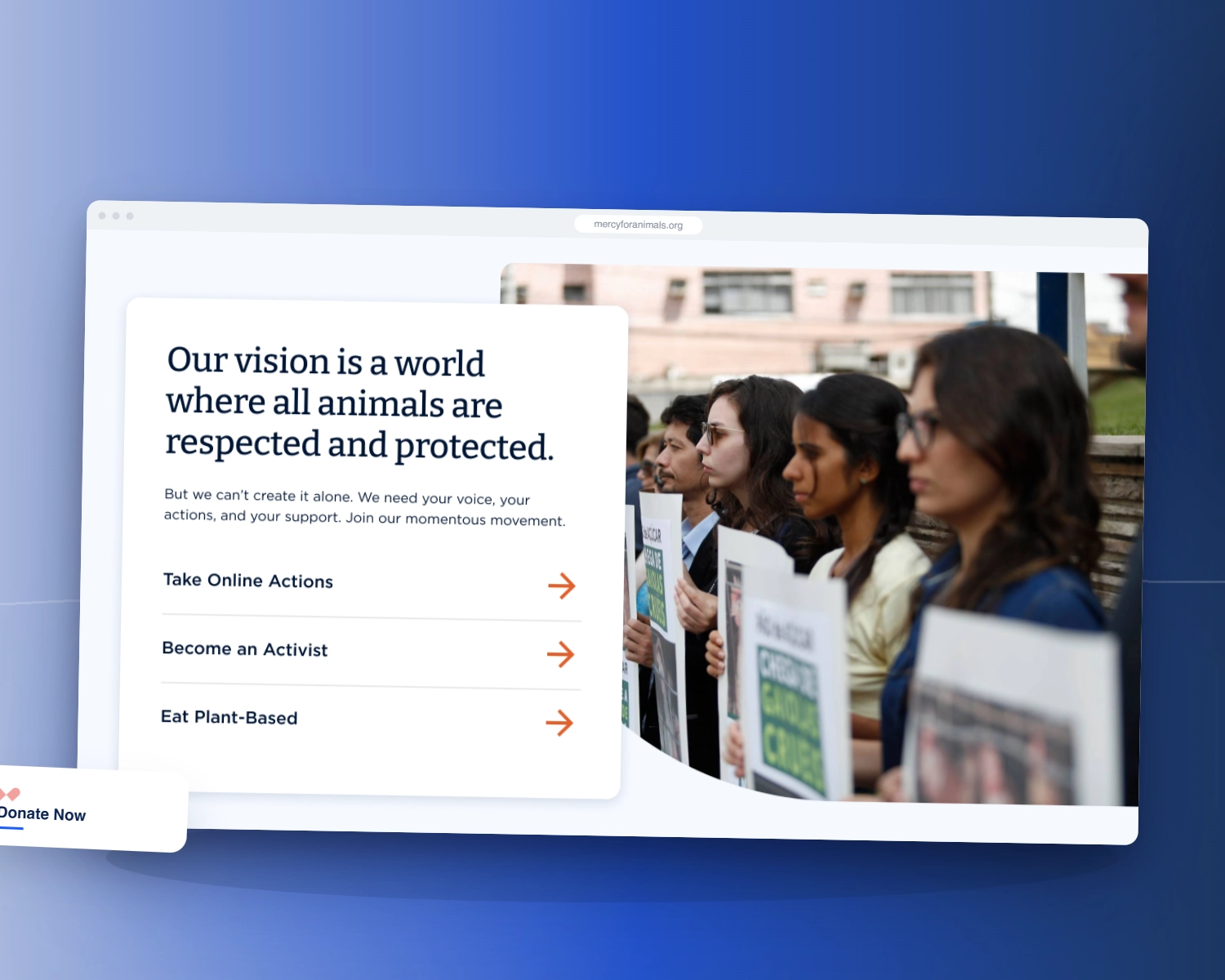
Want to take action, not write a check. Were routinely served donor-facing content instead of the ways in.

Needs clear program information and a low-friction path to apply and get involved locally.

Evaluating supplier commitments or co-branding. Arrives skeptical and needs institutional credibility signals fast.
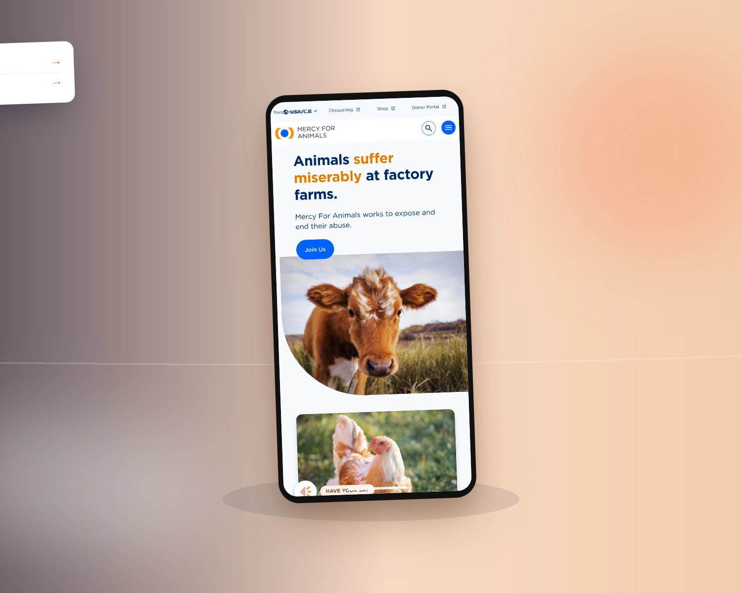
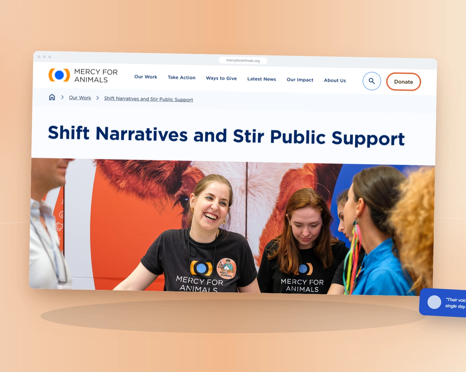
Standardize UX patterns, messaging, and information architecture across all six regional sites inside one modular global framework, so the experience no longer changed depending on which door a supporter entered through, while regional teams kept the freedom to localize.
Rebuild the donor journey around how supporters actually decide. Establish trust before asking for commitment, make individual impact legible at the point of decision, and simplify donation flows without losing the emotional storytelling central to advocacy.
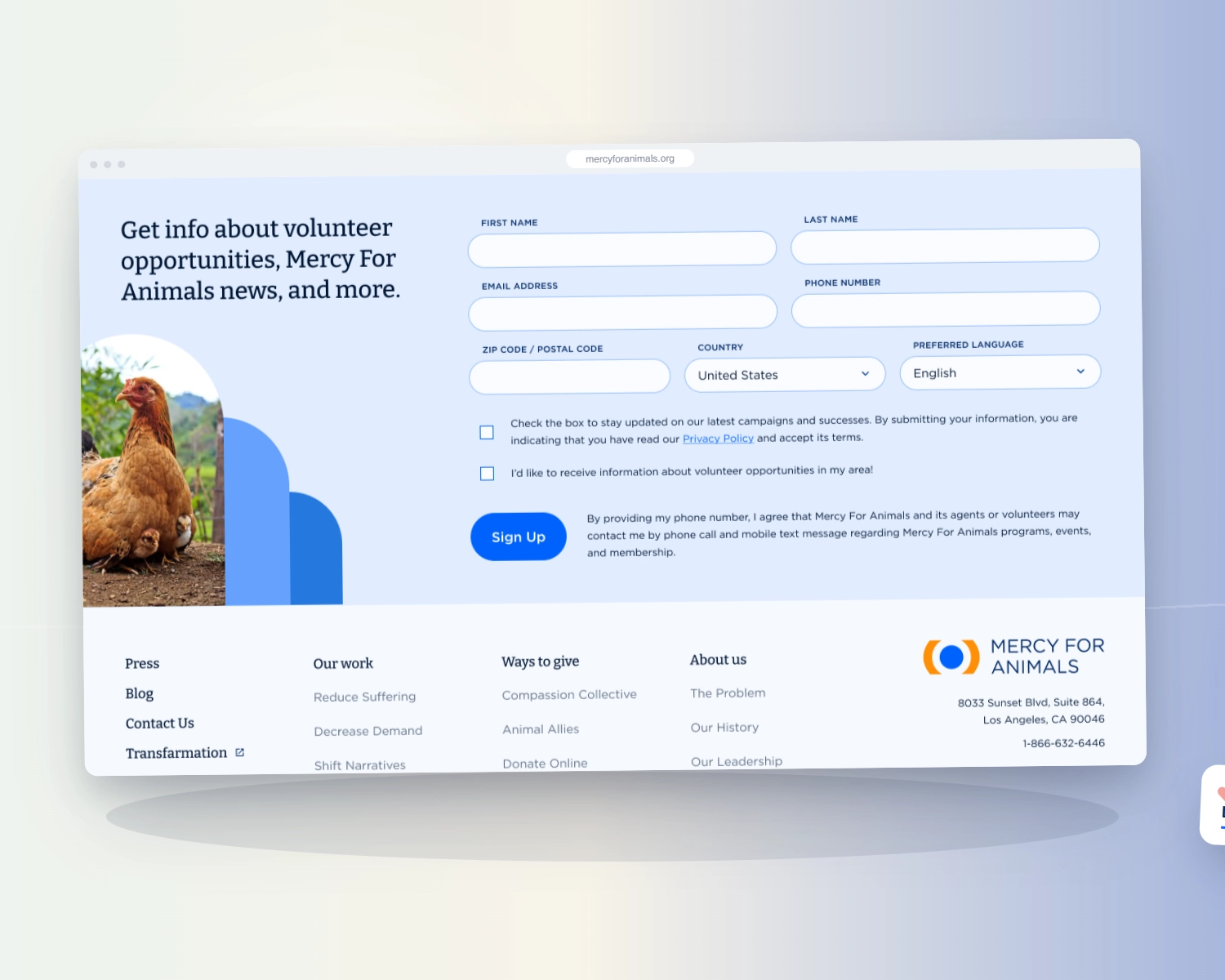
Consolidate 12+ bespoke campaign pages into three flexible templates and ship an atomic, modular design system, so regional teams could launch campaigns and update pages without opening a developer ticket, and consistency held across the platform instead of drifting apart.
MFA had deeply engaged supporters and a globally recognized cause. What it lacked was a coherent path from emotion to action, and one platform instead of six. Redesigning a page recovers a donation once. A unified platform the team can run, with the donor journey rebuilt around real behavior, recovers it continuously.
What the work moved.
By the end of the engagement, MFA had a rebuilt donor journey, a single platform across six markets, and internal teams who could run it.
Donation and conversion figures reflect MFA-reported impact from the redesigned journey. Migration and system figures are from WANDR's project record.
WANDR brought structure, clarity, and research-backed insight to a very complex digital challenge. Their work helped us unify our global sites, improve supporter engagement, and make better decisions grounded in real user behaviour. They felt like a true partner, not just a vendor.