Collected
Fourteen competitor flows and two rounds of user testing rebuilt Collected’s onboarding around one job: getting a first-time user to upload their first document.
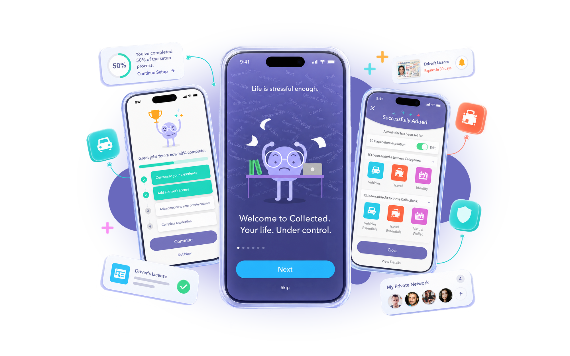
Two weeks. Two rounds of testing. One onboarding.
The paperwork a household runs on, in one place.
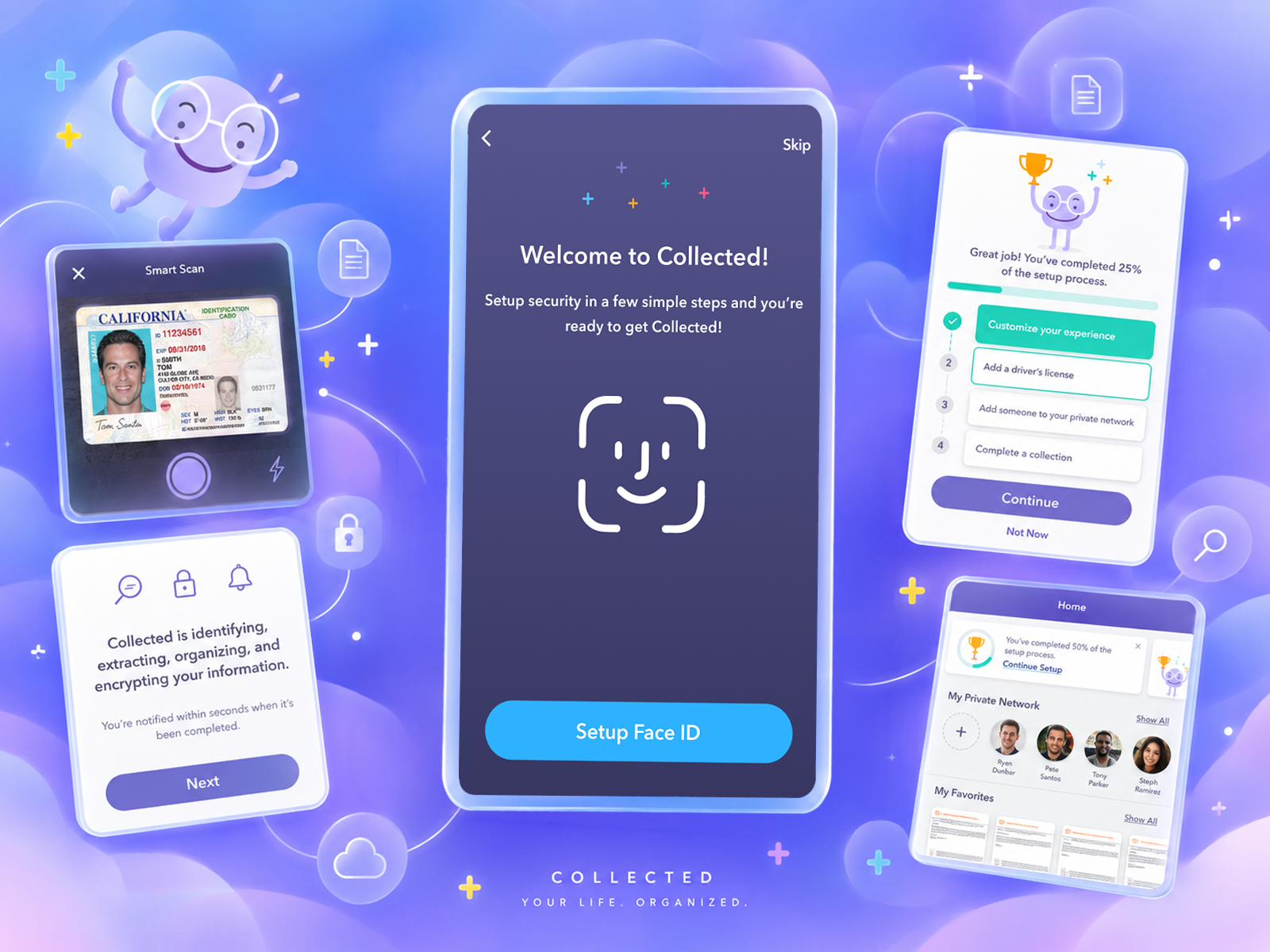
Collected is a Los Angeles consumer software company building a secure, AI-organized home for the information people keep in drawers, inboxes and password managers: IDs, prescriptions, insurance policies, financial logins, legal documents, registrations and membership cards, shareable with the family members and advisors who need them.
It was founded in 2018 by two operators who had built consumer products at scale. Adam Kanner, co-founder and CEO, is a five-time entrepreneur who previously founded and led ScoreBig and held roles at the NBA. Carl Trudel, co-founder and CTO, brought more than twenty-five years as a senior technology executive at companies including Ticketmaster and Soothe. In autumn 2019 the company was privately funded and preparing its first iOS beta.
An app that could hold everything, and no way in.
Collected was weeks from putting its iOS beta in front of real users, and the app that would greet them was a full information vault with no path through it. As the founder put it to the team at kickoff, the onboarding had to showcase what the product could do and why it mattered at a point when the product itself was not yet optimized, not yet simple, and not yet stunning.
The product was full and the first run was empty.
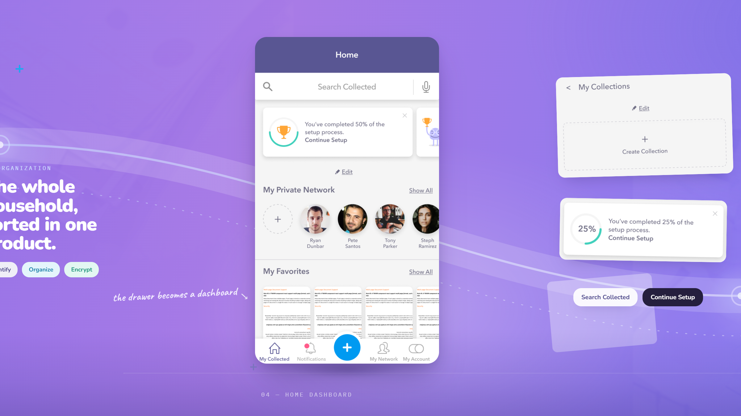
An earlier Wandr review of the app had found information overload and too much navigation complexity for a new user. Once someone reached the dashboard it was unclear what they were supposed to do next, and without a first upload there was nothing to come back for.
It asked for the most sensitive data a person owns.
Driver’s licenses, passports, insurance policies, financial logins and legal documents. Every competitor in the category asks for trust; this one asked for it in the first ninety seconds, before it had done anything for you.
The audience was too broad to design demographically.
The target was heads of household with children at home, but that spanned roughly 25 to 50 year olds across a wide range of profiles. Designing to a demographic average would have produced a flow that fitted nobody.
Growth depended on a flow that did not exist.
The acquisition model leaned on virality, one user inviting family or an emergency contact into their information. There were no screens at all for the person who received that invitation, which is the moment the loop either closes or breaks.
The deadline belonged to Apple.
The beta had to clear App Store review, the engineering team was working from another continent, and every design round had to land early enough to be built. There was no version of this project where the work arrived late and the schedule absorbed it.
Same app, a different first five minutes.
Drag the handle to compare the beta’s original first run with the redesigned onboarding: a dashboard that opened empty on one side, a guided path from why the product exists to a first document uploaded on the other.
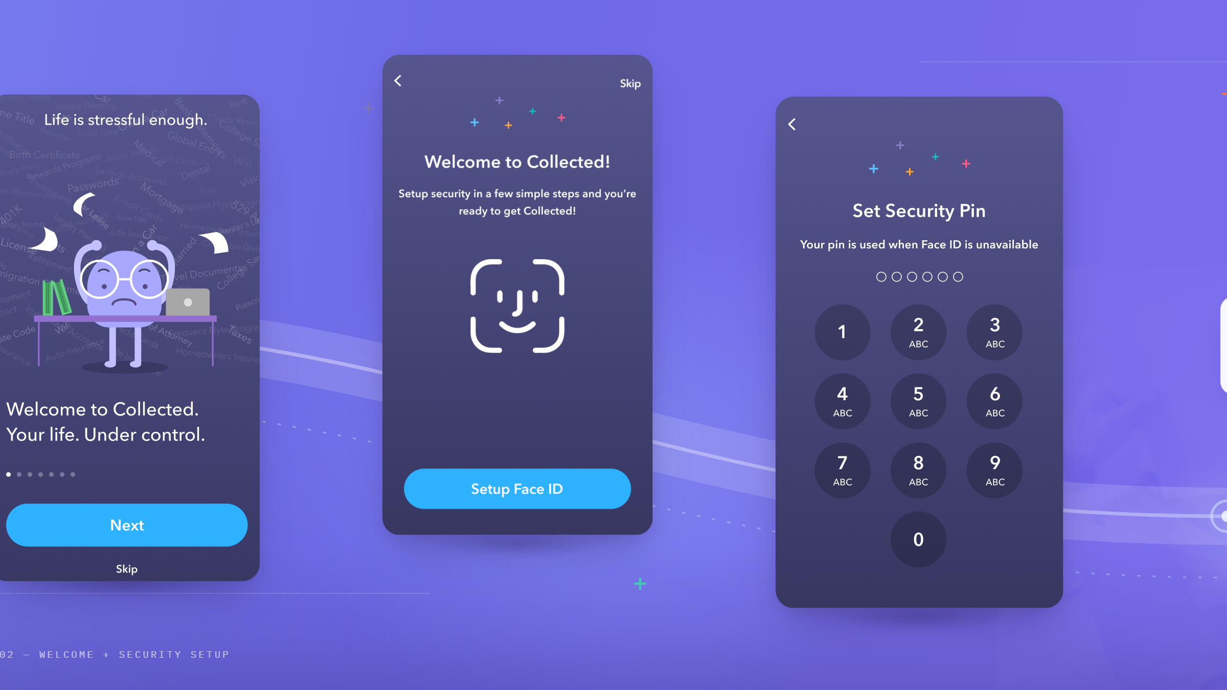

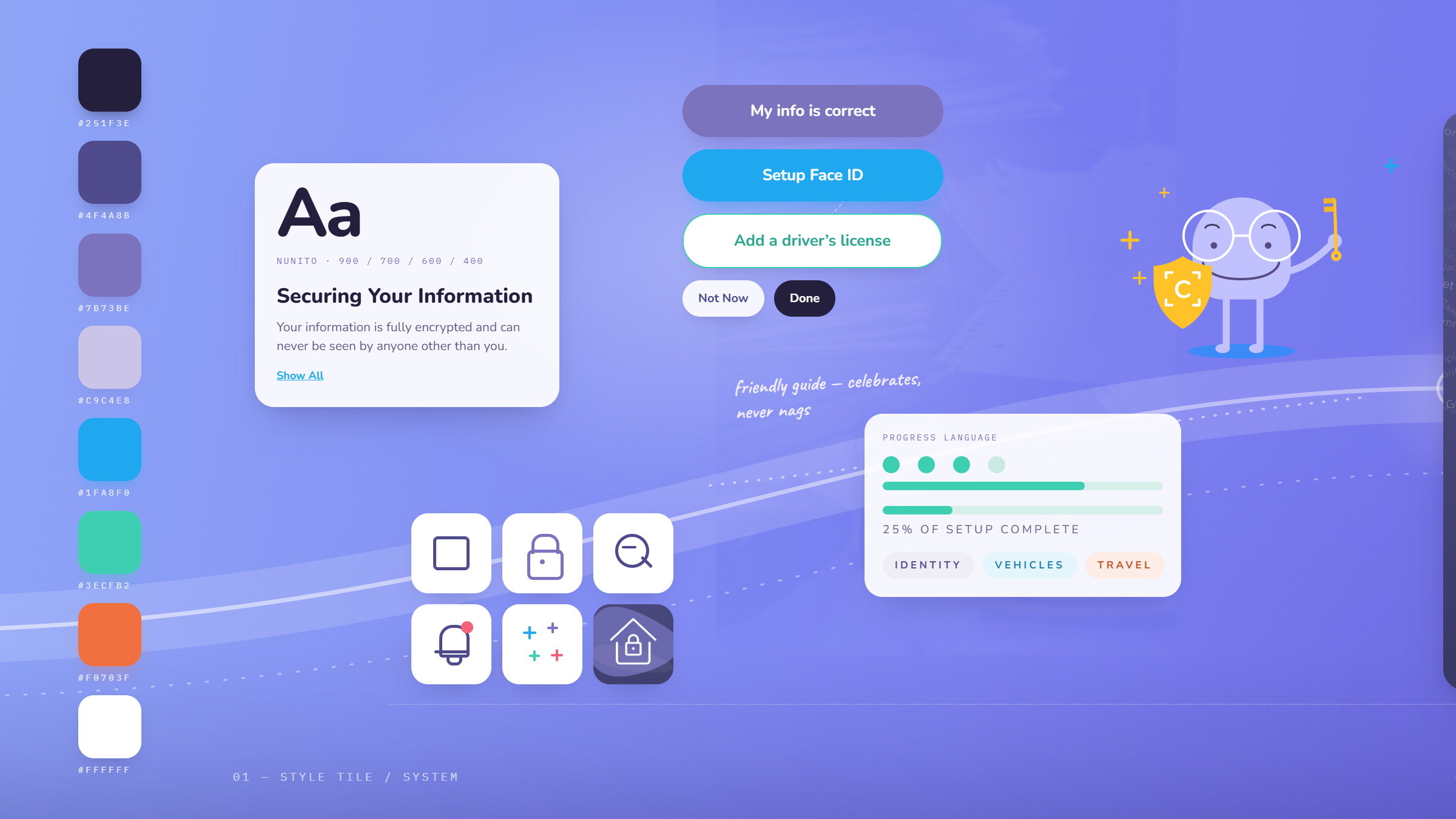

Two weeks to design the front door of a product still being built.
We put the prototype on five phones and listened to the objections.
Five moderated sessions, run over video with the participant holding the Figma prototype on their own phone and thinking aloud. The first half was unguided, to see whether the flow explained itself. The second half named the task, to see whether people could complete it once they knew what it was.
Everyone in the category welcomes you the same way.
We broke down the onboarding of LifeSite, Dashlane, 1Password, LastPass, Evernote, Digi.me, Dropbox, Box, Google Drive, Amazon Drive, DocSend, FidSafe, Everplans and SiftSort. The overwhelming majority ran the same three-to-five image carousel ending in Sign Up and Log In. For a product whose entire premise was trust, that sameness was the opening: nobody in the category had an onboarding anyone remembered, and social proof or recognizable security credentials were the lever none of them were pulling.
The security explanation was the thing breaking trust.
The copy written to reassure people did the opposite. “This machine-learning talk, like, as an old person, what the hell is machine-learning? Is this safe?” Another asked how the company could manage information without accessing it. Underneath the language sat three questions nobody had answered on screen: what happens if I lose my phone, what happens if it is stolen, and what happens if this company gets hacked.
The product’s own vocabulary was unreadable.
Collections, categories and essentials were used interchangeably by every participant who reached them, and the customization step that followed was described as too many options to bother with. Findings were ordered by effort against KPI impact into six problems to solve, and produced one recommendation that went beyond the screens: change the onboarding KPI from uploading a driver’s license to uploading a first piece of information, because two participants said they would start with their health records.
Answer the fear first. Ask for the driver’s license last.
Say what happens to the data, in words a nervous person uses.
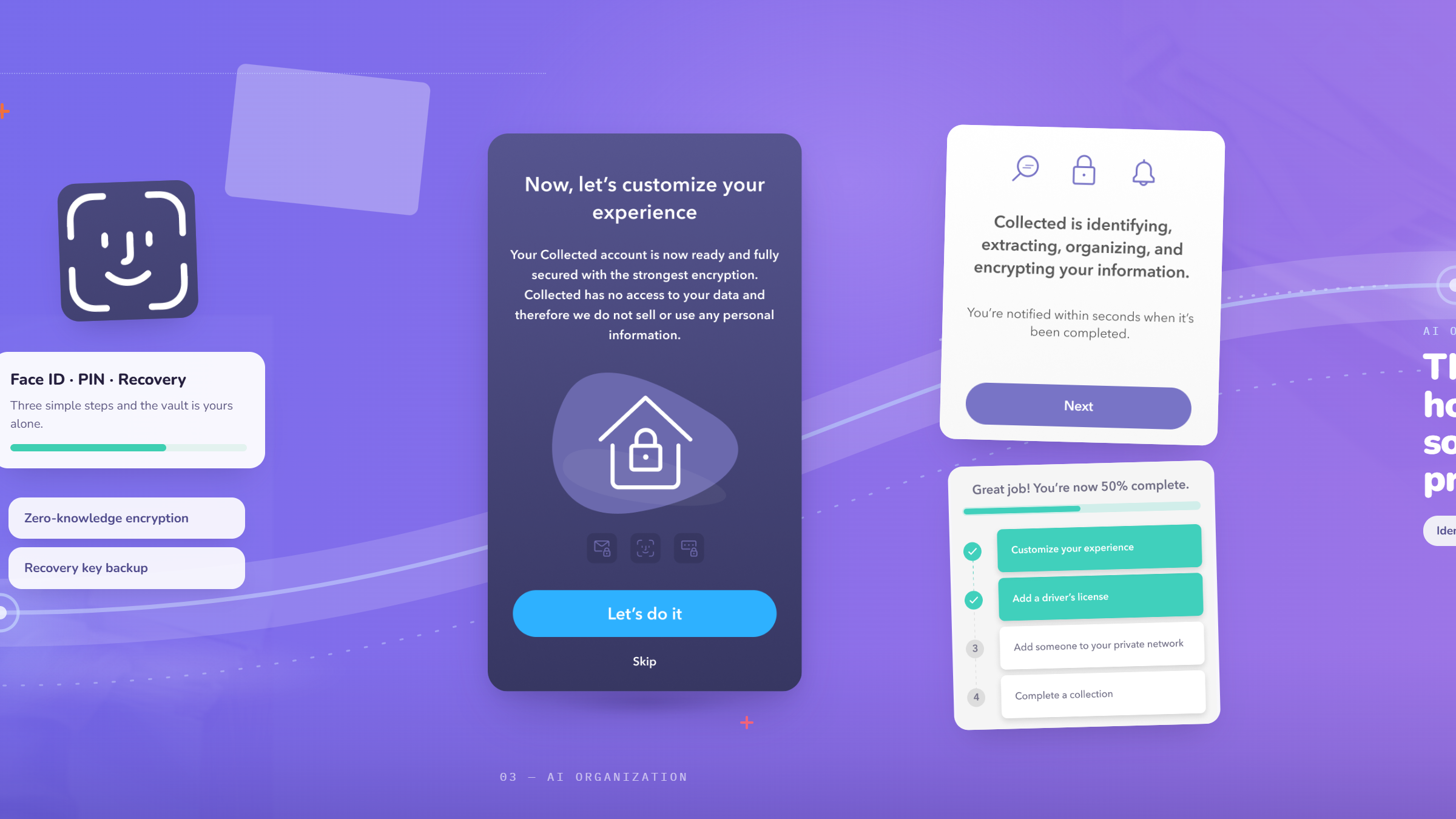
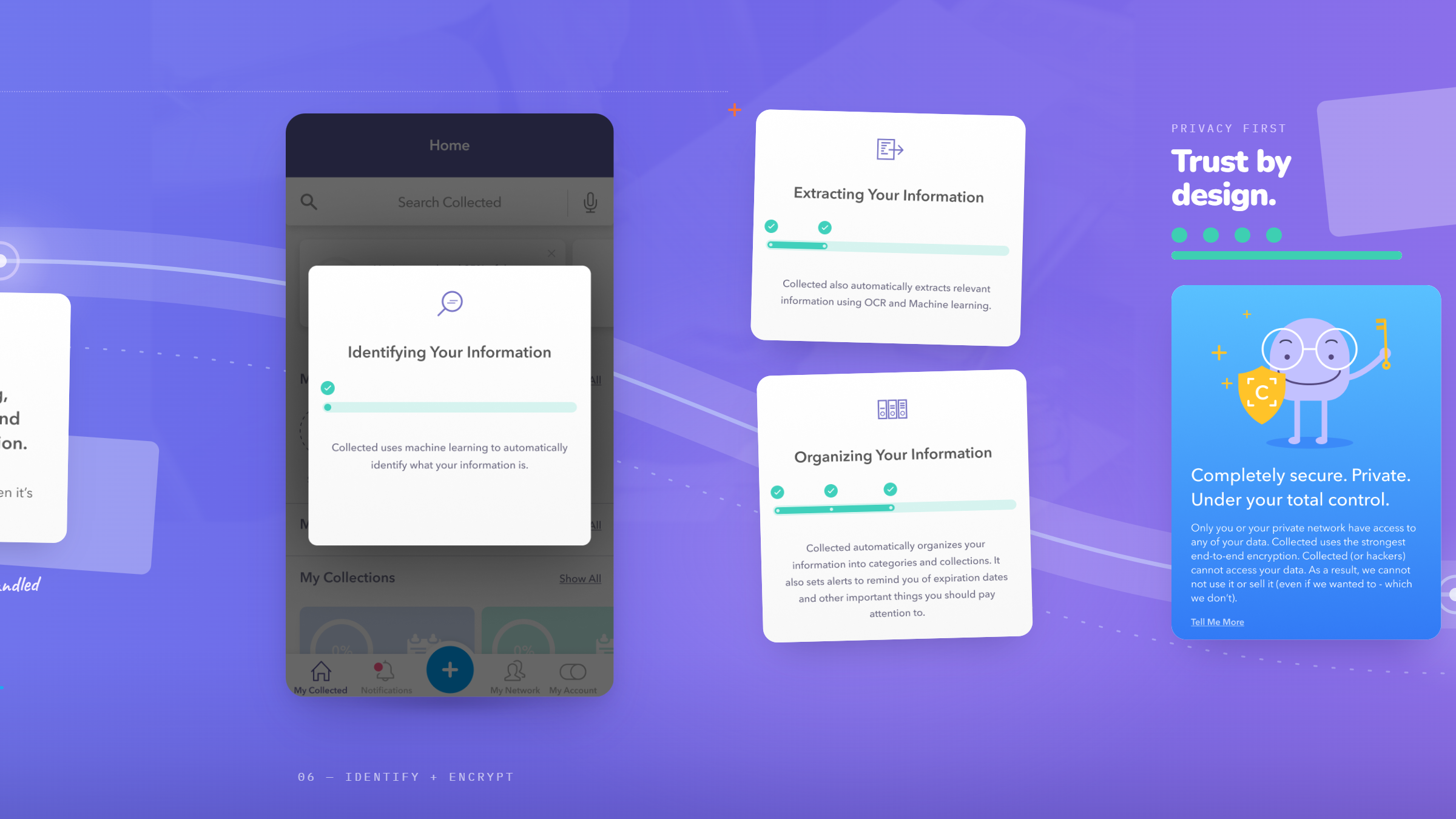
Security copy was rewritten out of technical language and pointed at the three questions users actually asked on camera: the lost phone, the stolen phone, the hacked company. Where the flow had explained its architecture, it now explained its consequences.
Let people try it before they trust it.
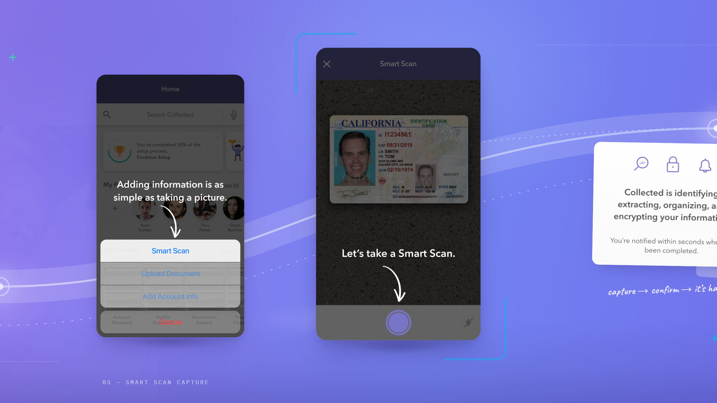
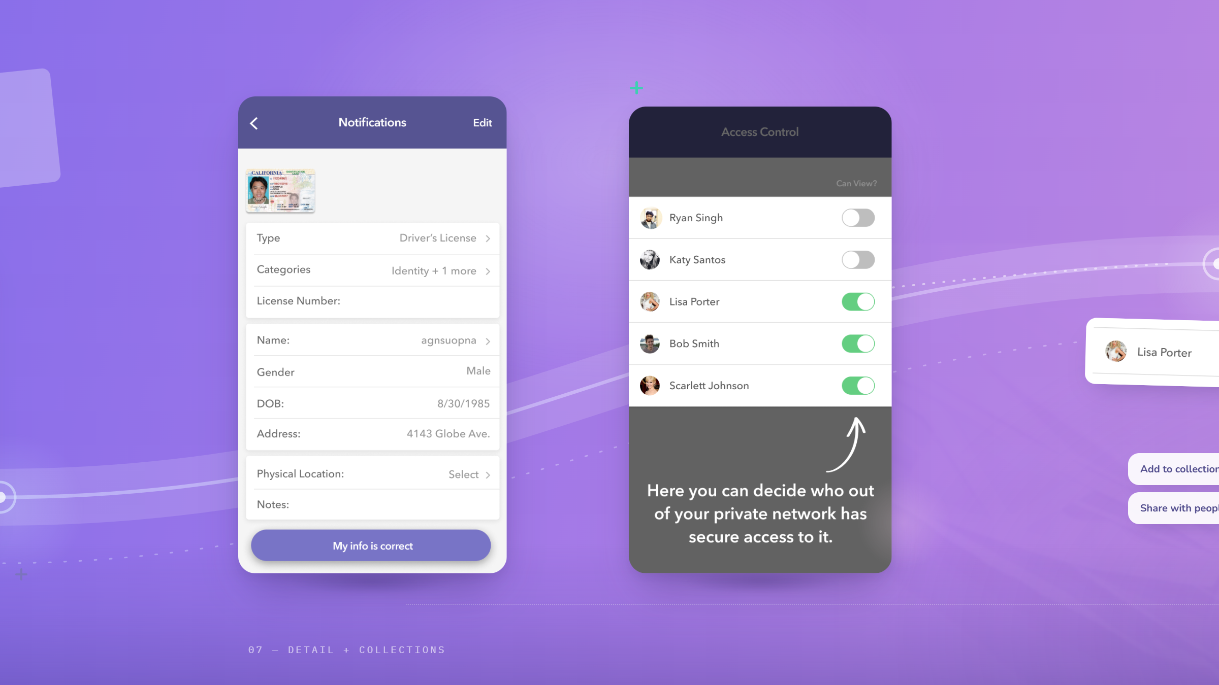
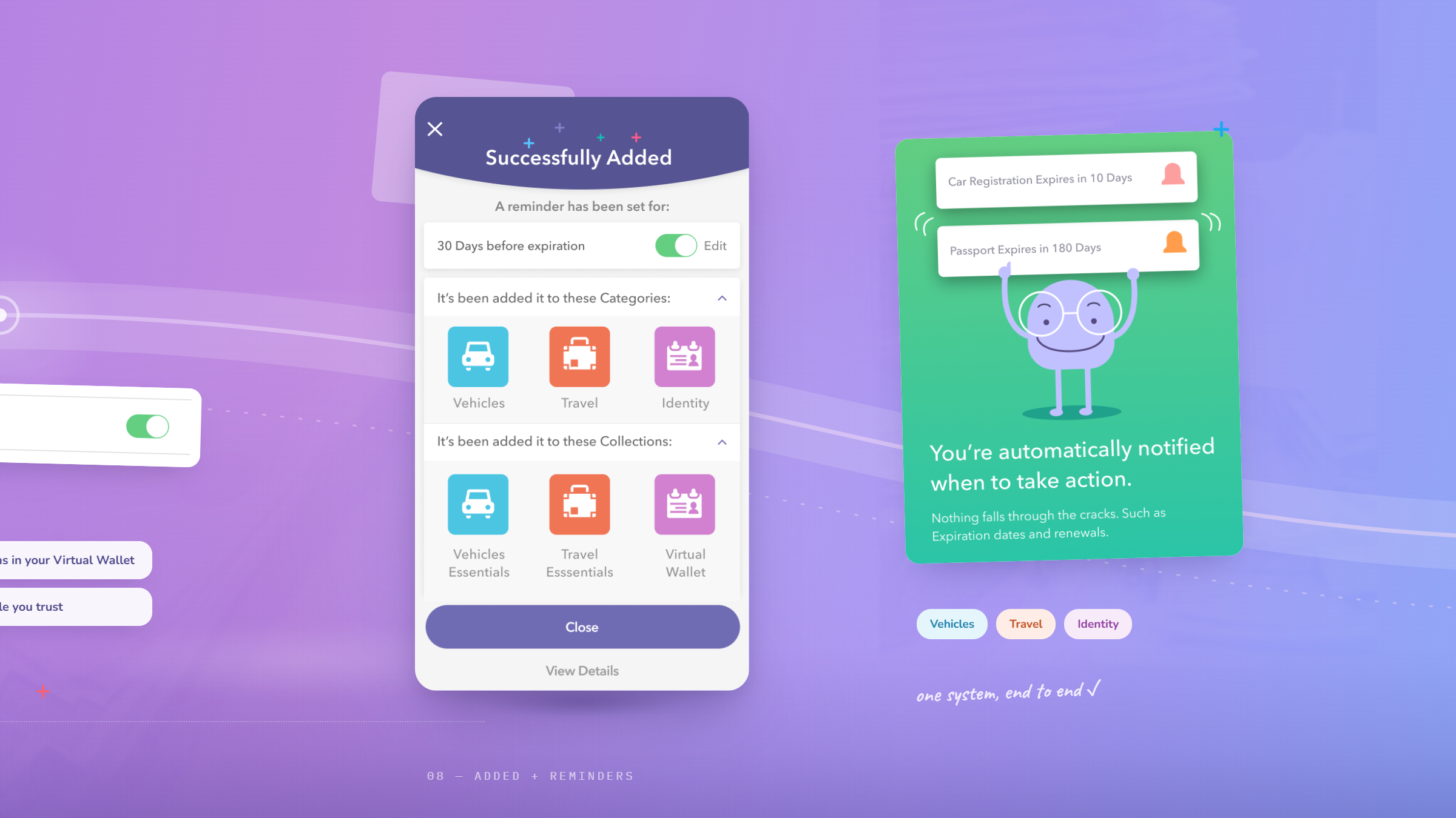
A mock-data flow let a new user watch the product work on information that was not theirs, before any real document was handed over. Only then did the flow ask for a first upload, and it asked for whatever the user already had in their pocket rather than insisting on a licence. Progress indicators and deliberate empty states carried the rest: an unfinished setup is harder to walk away from than an empty one.
Give a vault for legal documents a human face.
Character-led illustration, tested and chosen with the founders against the alternative of product screenshots, in the register of Headspace and Duolingo rather than enterprise software. The brief the founders gave back was the right one: friendly, approachable, anti-serious, because the subject matter is dry enough on its own.
What the engagement produced.
Two weeks from kickoff, Collected had an onboarding designed end to end, tested with real users, revised against what they said, and handed to engineering as production assets in time for the beta.
password managers, cloud storage, legacy planning
why, auth, mock data, customization, first upload
September 16 to September 27, 2019
Outcomes describe what the engagement delivered. Collected has not shared post-beta activation or retention figures with Wandr, so no performance metric is claimed here. The company’s two US patents, granted in 2022 and 2023, are a Collected milestone reached after this engagement, not a design result.
In their words.
We were weeks from our first beta with an app that could do almost everything and explained almost none of it. Wandr put our prototype in front of real users, who told us bluntly that the security language we thought was reassuring was the thing scaring them off. What came back was not a prettier screen, it was a different order of operations: answer the fear first, then ask for the driver’s license. They also argued us out of our own success metric, which nobody enjoys hearing and everybody needs.