Digipare
One app rebuilt to carry nearly 50 city-specific parking regimes, where the closest competitor ran 30 separate apps. Digipare now serves around 5 million registered users.
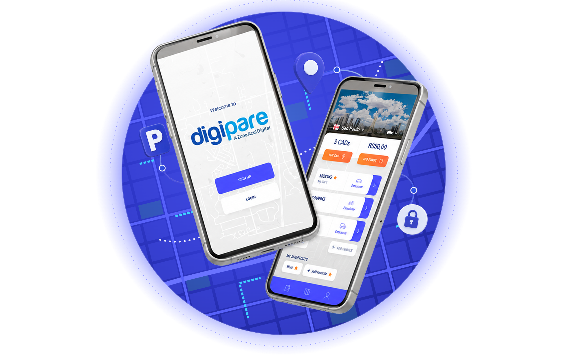
Six years of features, rethought in four tracks.
Thirty years of parking, in a country that never agreed on the rules.
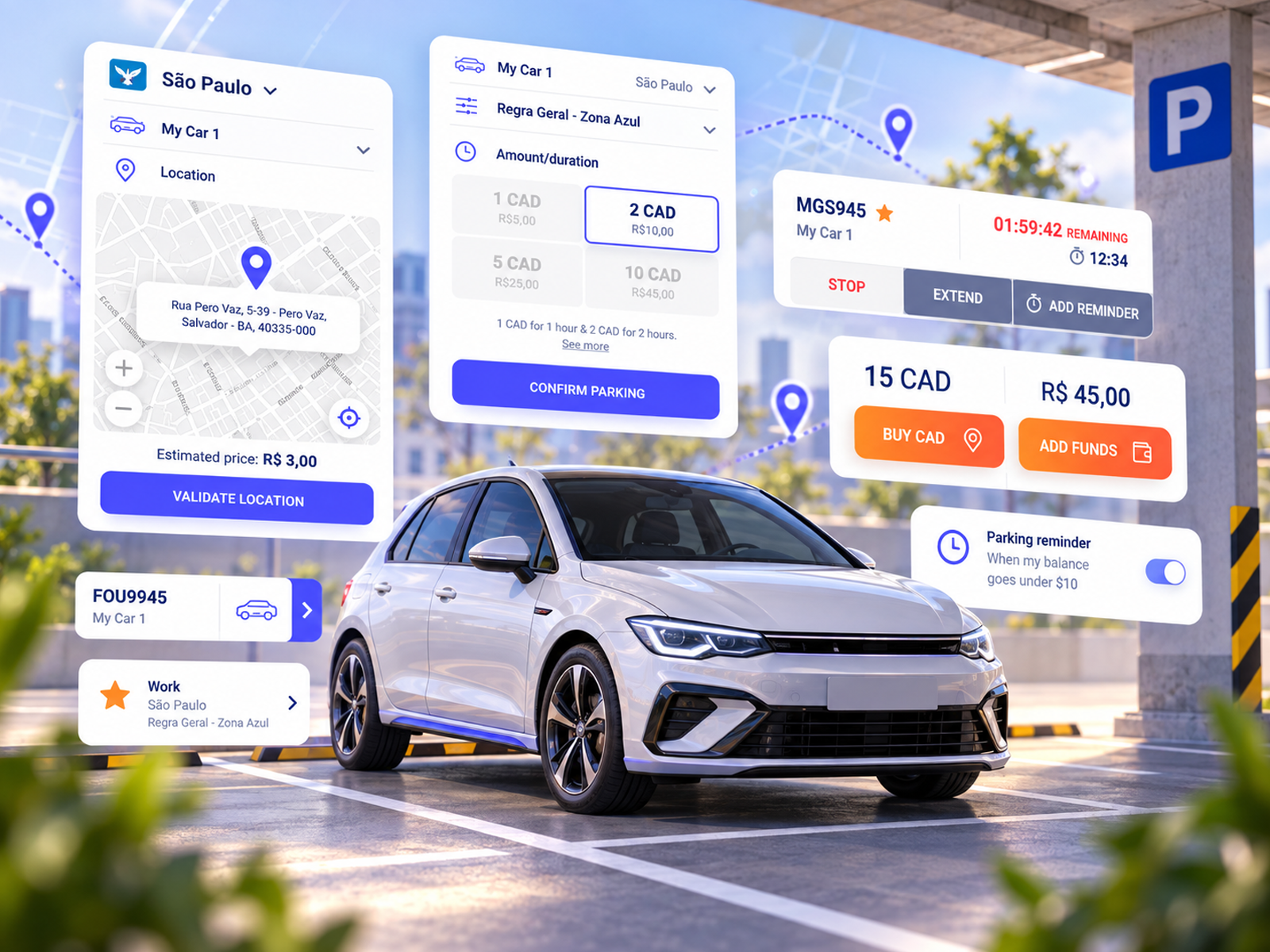
Areatec is a Brazilian traffic engineering and parking technology company based in Araras, São Paulo. Its business is the machinery behind regulated on-street parking: the enforcement systems, the license plate recognition fleets, the municipal integrations. Digipare is the consumer face of all of it, the app a driver opens to pay for a space in Brazil’s zona azul.
What makes Digipare unusual is not the parking. It is the fragmentation. Regulated parking in Brazil is set city by city: each municipality writes its own tariffs, time limits, extension and cancellation rights and accepted payment instruments, and several run on their own credit unit rather than on reais directly. By 2019 Digipare was operating across dozens of them, with a Costa Rican operation alongside, and one app carrying all of it.
One app, fifty cities, and no two cities alike.
Digipare worked. That was part of the problem. Six years of shipping had produced an app that handled an enormous amount of municipal complexity and asked the driver to absorb most of it, at exactly the moment the company wanted to add a second business to it and take the brand somewhere new.
An interface carrying six years of accumulated rules.
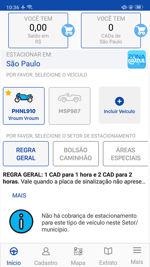
The app in market had been built in 2013 and extended ever since, one municipality and one feature at a time. Paying for a space ran through thirteen distinct stages, and the screens had grown to hold every case rather than the common one.
Fifty local realities under one icon.
Every city Digipare entered brought its own tariff structure, its own time limits, its own rules on whether a driver may extend or cancel a session, and in several cases its own credit unit. The interface had to be right in all of them without becoming a different app in each.
A competitor running one app per city.
Digipare’s closest competitor had solved the same problem by shipping more than thirty separate apps, one per municipality. Digipare’s bet was the opposite, and the design had to make that bet survivable.
A second business bolted onto the first.
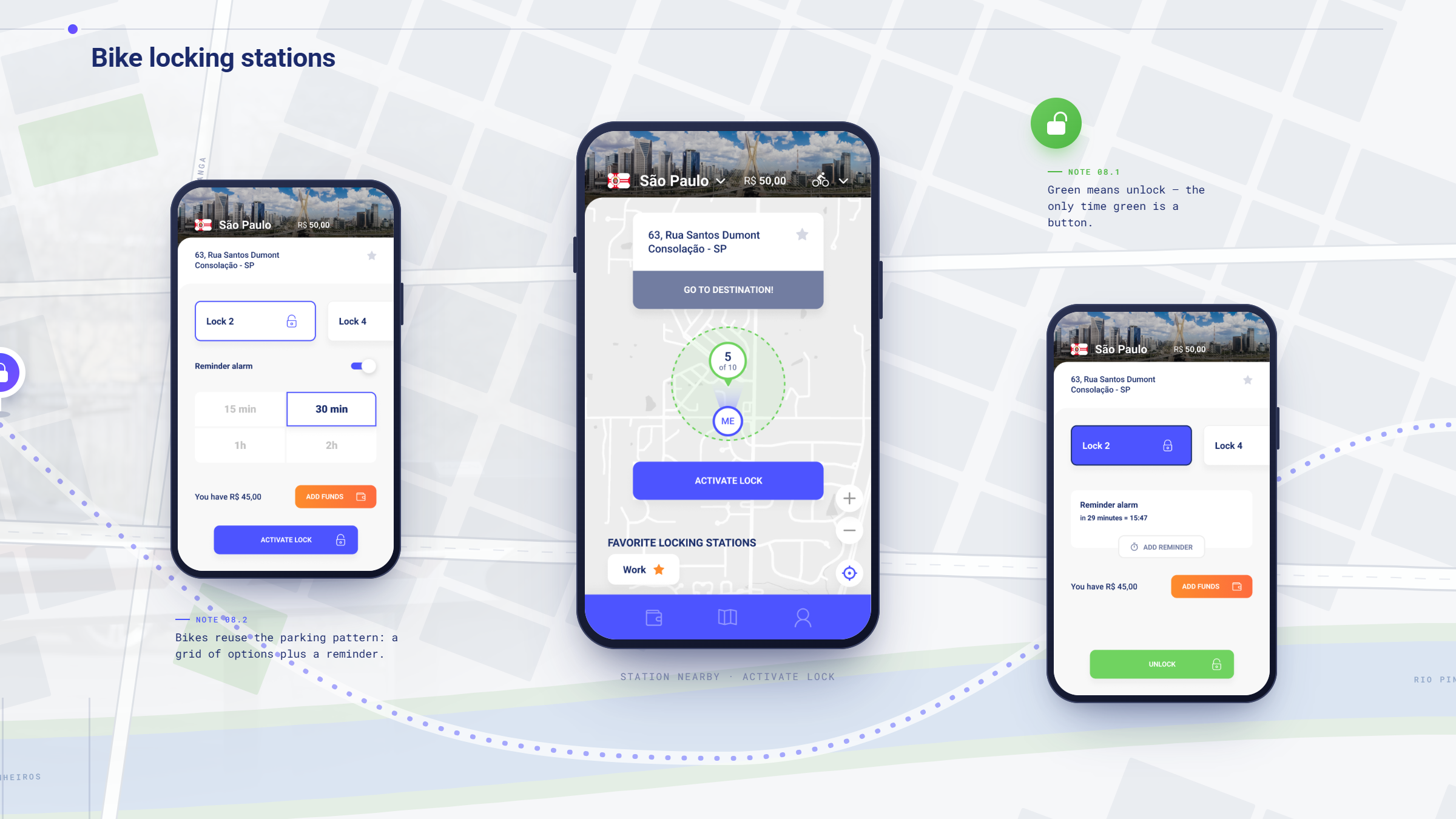
Areatec was integrating Bikeep bike locking, and looking at scooter charging after it. A parking app was about to become an urban mobility app, and the two experiences could not read as strangers to each other.
Same blue zone, rebuilt for the way people actually park.
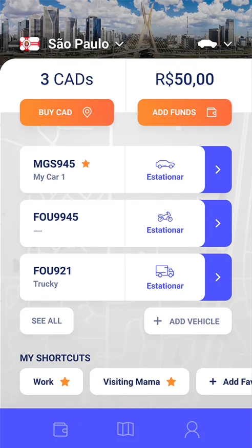
Drag the handle to see the shift on the home and confirmation screens: an app that made a driver assemble a parking session from municipal rules, beside one that opens on the city they are in, the vehicles they own and the shortcuts they use every day.
Four deliverables, about seven weeks.
The market had already answered this question. We disagreed with the answer.
Areatec did not commission primary user research, and the engagement did not include usability testing. What it did include was a two-day workshop with the people who run the business, a competitive study of how every other Brazilian parking app handles municipal fragmentation, and a full reconstruction of Digipare’s existing flows.
The market solved fragmentation by giving up on one app.
Digipare’s closest competitor shipped a separate app for each city it served, more than thirty in all. Every new municipality meant another build, another store listing and another release cycle, and a driver crossing a city line needed a different app. Wandr’s brief was to make the single-app model work better than thirty apps did.
The rules change at the city line, and the interface has to know it.
Across Brazil and Costa Rica, roughly fifty municipalities each set their own tariffs, durations, extension and cancellation rights and payment instruments, with several running on a local credit unit rather than currency directly. Wandr mapped which parts of the interface had to flex per city and which could stay fixed everywhere, so localization became a set of rules the design absorbed rather than a set of screens engineering had to fork.
Paying for a parking space had grown into a thirteen-stage journey.
Reconstructing the existing product end to end, from download and registration through location, vehicle, parking rules, tariff, confirmation, transaction, receipt and active session, showed how much of the municipal rule set had been pushed onto the driver. The redesign was scoped against that map: which stages had to stay, which could be pre-filled, and which existed only because the rules were being explained rather than applied.
Make one app feel local in fifty places.
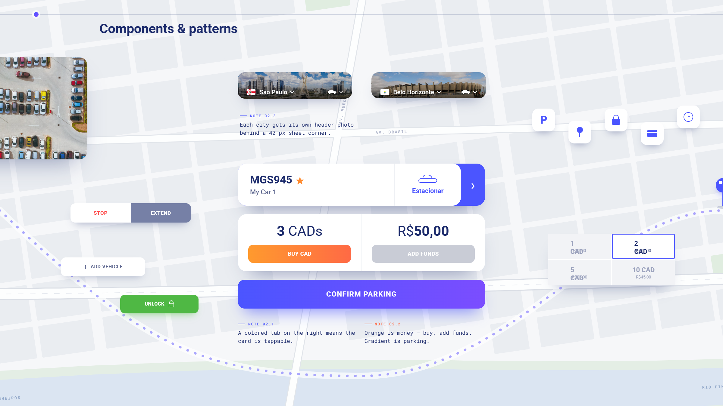
Put the city at the top of the screen
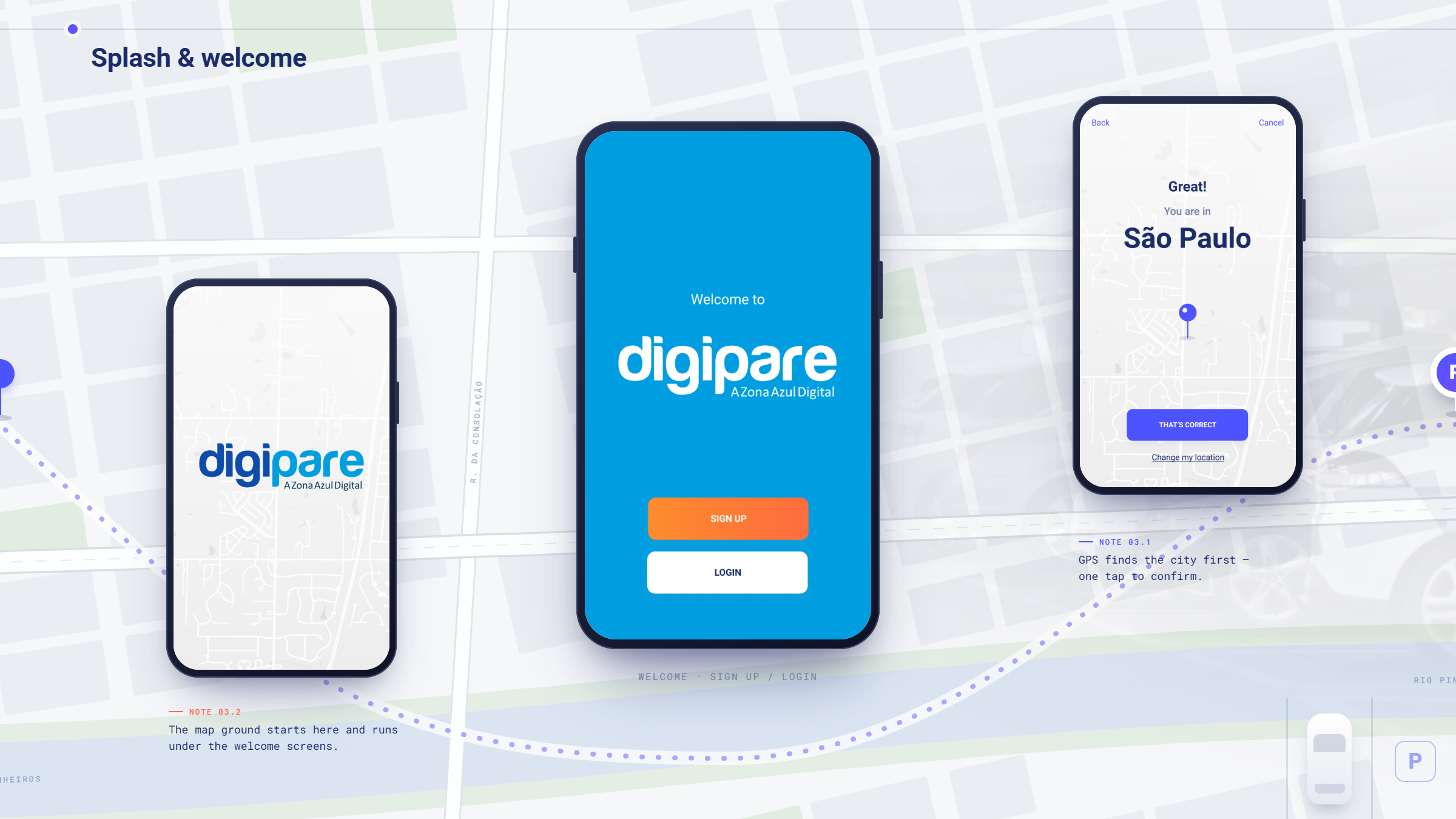
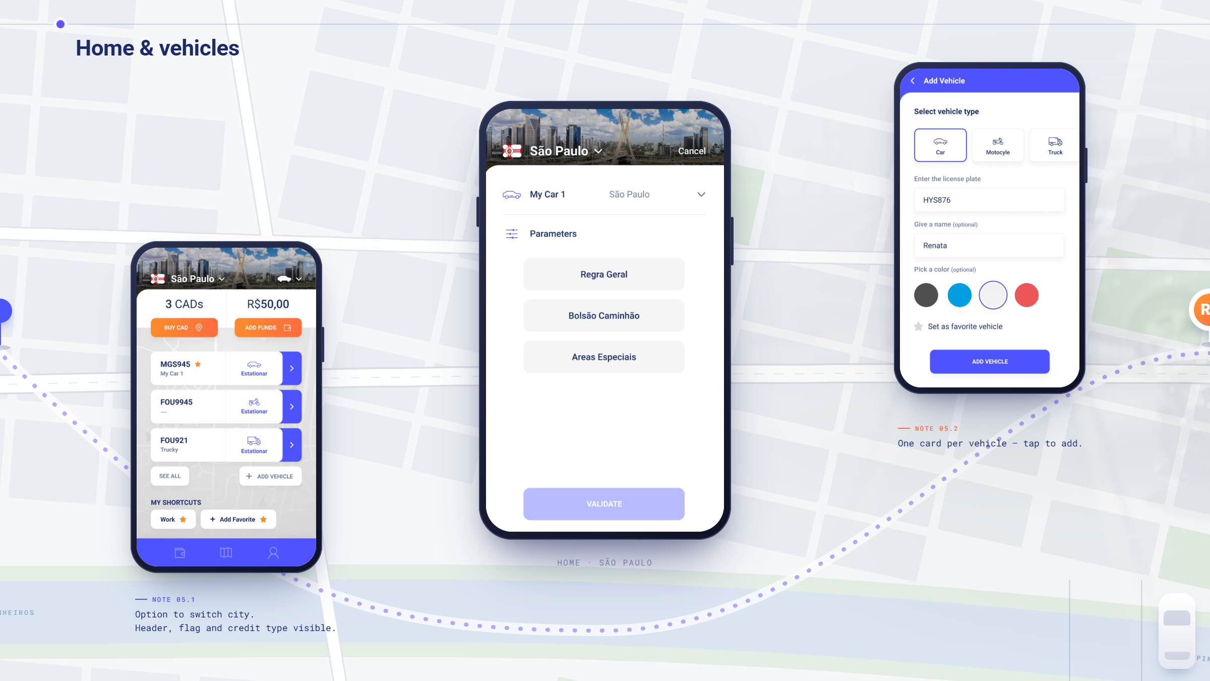
The home screen opens on the municipality the driver is in. Everything below it, tariffs, durations, the rules that apply, follows from that single anchor, so a driver always knows which rule set is in play before they commit to anything.
Design for the rules, not around them.
The interface was built to absorb per-city variation in content rather than in layout: the same components carry a different tariff table, a different set of durations, a different credit unit. That was the constraint that let one codebase serve every municipality.
Give people shortcuts to the way they actually park.
Most parking is repeat parking. Saved vehicles by plate and nickname, and named shortcuts for the places a driver goes back to, turned a thirteen-stage flow into a couple of taps for the cases that make up most of the volume.
Make the money legible.
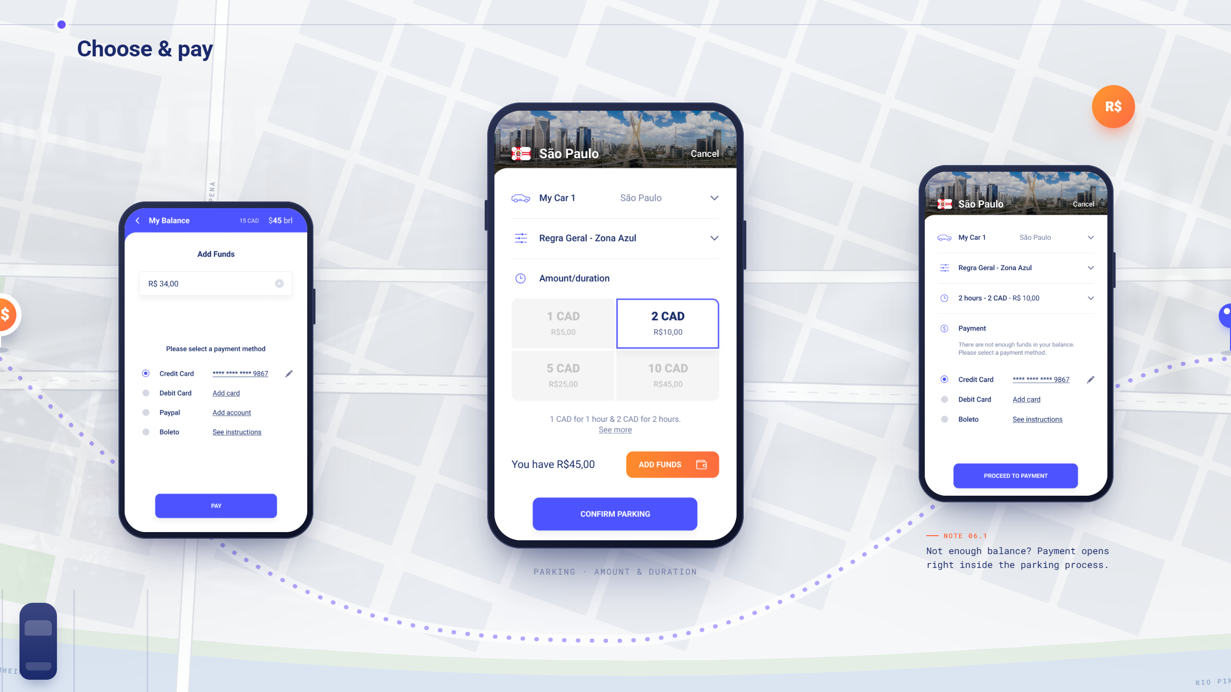
Balance is shown in both currency and credits together, so a driver never has to convert in their head, and adding funds was designed in two versions, preset amounts and direct keyboard entry, so the client could choose between the familiar pattern and the faster one.
Let the alarm do the worrying.
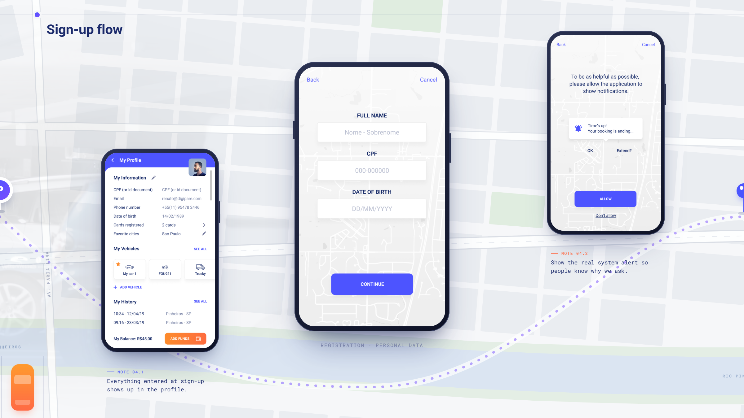
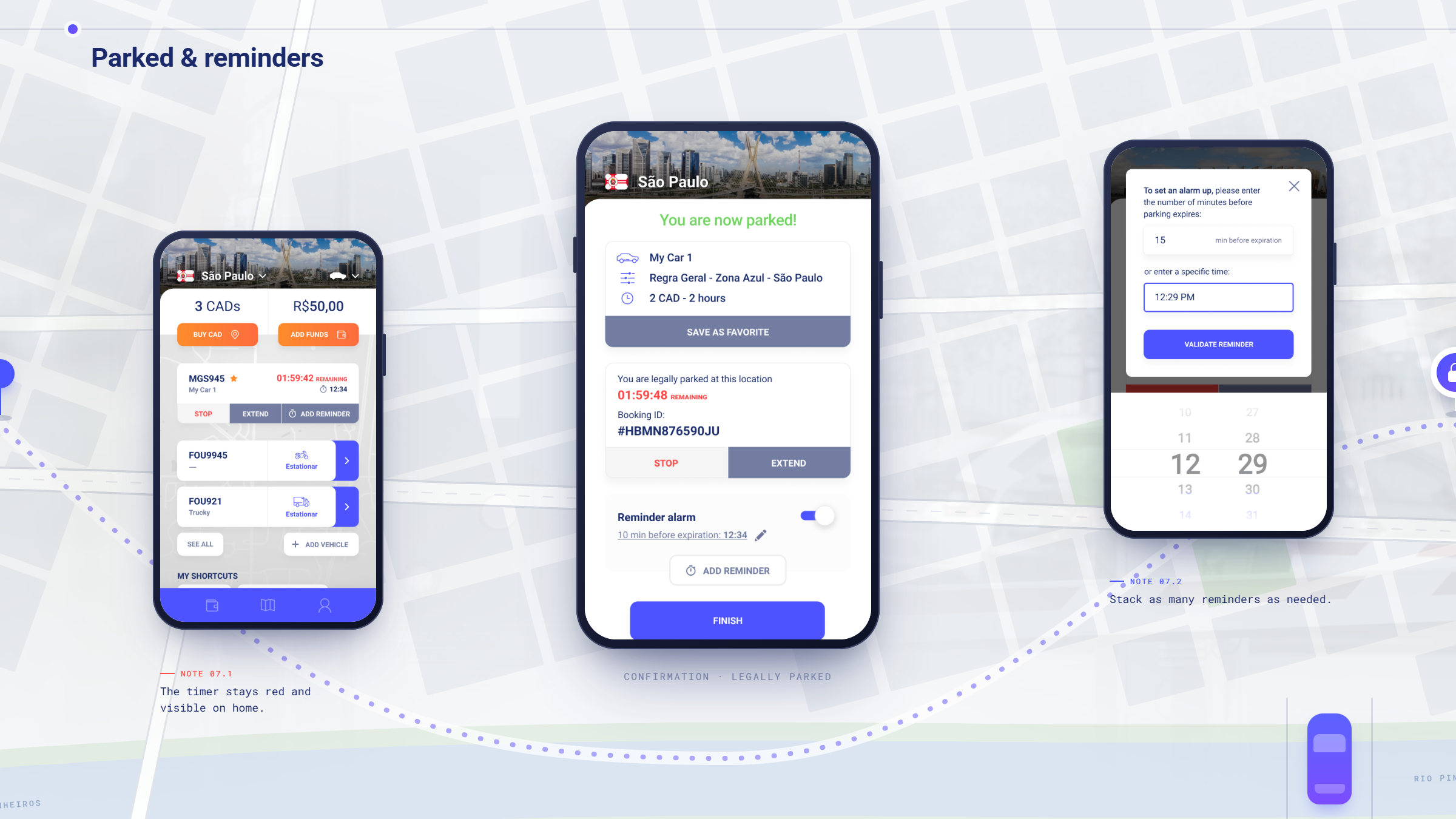
An expiry reminder set by default before the session ends, with snooze, moves the anxiety of an expiring meter out of the driver and into the app. It is the feature that makes the difference between paying for parking and managing parking.
Localization is an interface problem long before it is a language problem.
Thirty apps for thirty cities is not a distribution strategy. It is a design failure that got expensive enough to become an engineering strategy. The competitor forked the product because the interface could not hold more than one set of rules at a time, and every fork made the next city harder.
What the work moved.
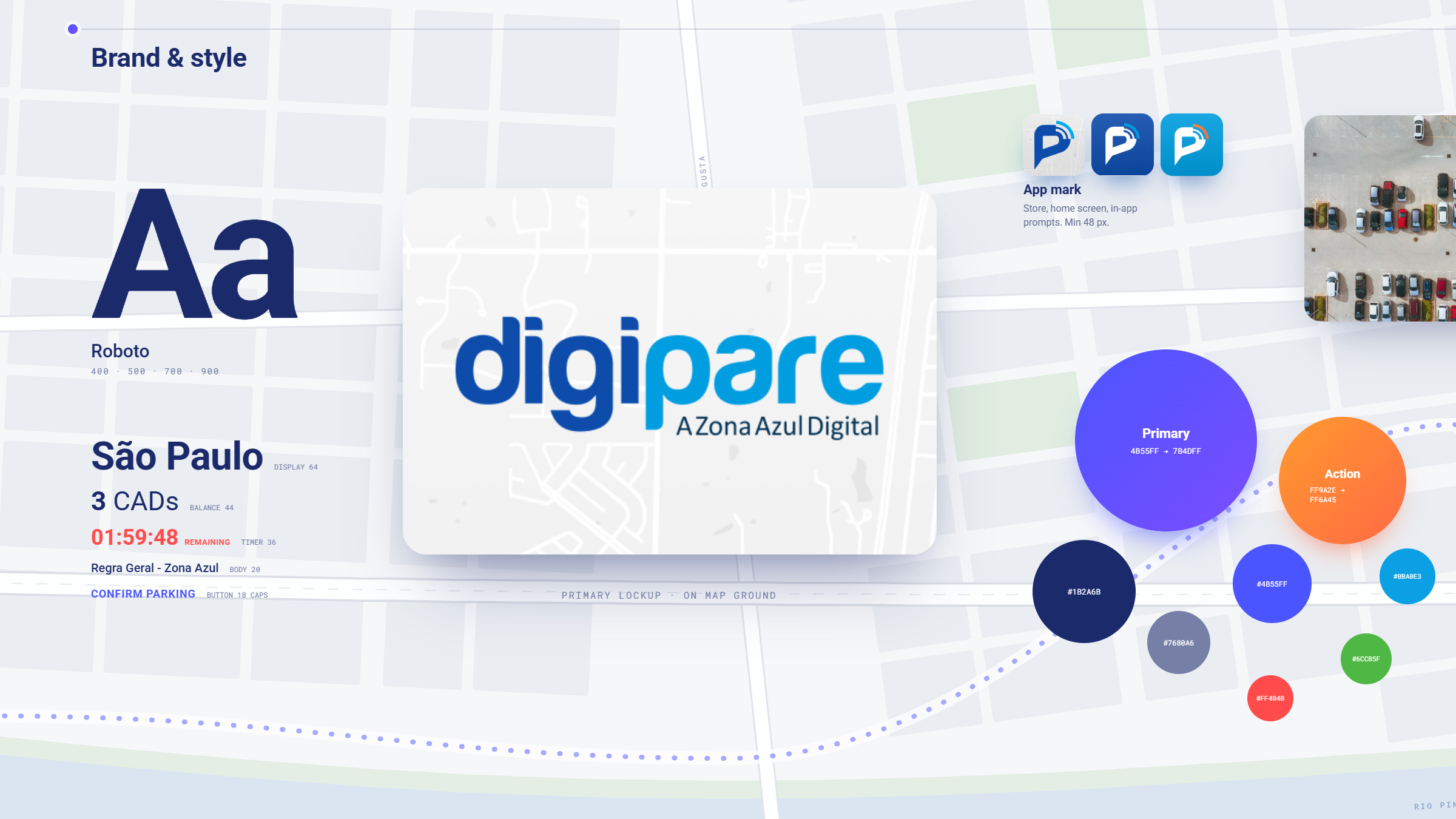
Areatec came out of the engagement with a single design language for Digipare, a brand that described the business it was becoming, and a specification complete enough that the company chose to rebuild the product underneath it.
In their words.
We always expect excellence from people we work with, but I got really impressed with their interest in helping us with the project. It's fantastic when you find engaged people that really commits to what you need, and WANDR met every expectation. That's why I said before, we got our project amazingly done and got new friends!