Persona 01

The retail broker.
Adam Campbell, 43, lives in Outlook and Excel. Wants less manual data entry and more time to advise clients.
Client-facing
Deadline-driven
Speed-first
Uvation
We redesigned Uvation's marketing site end to end, from UX audit and information architecture to enterprise-grade visual design and content, built to pull in enterprise buyers.
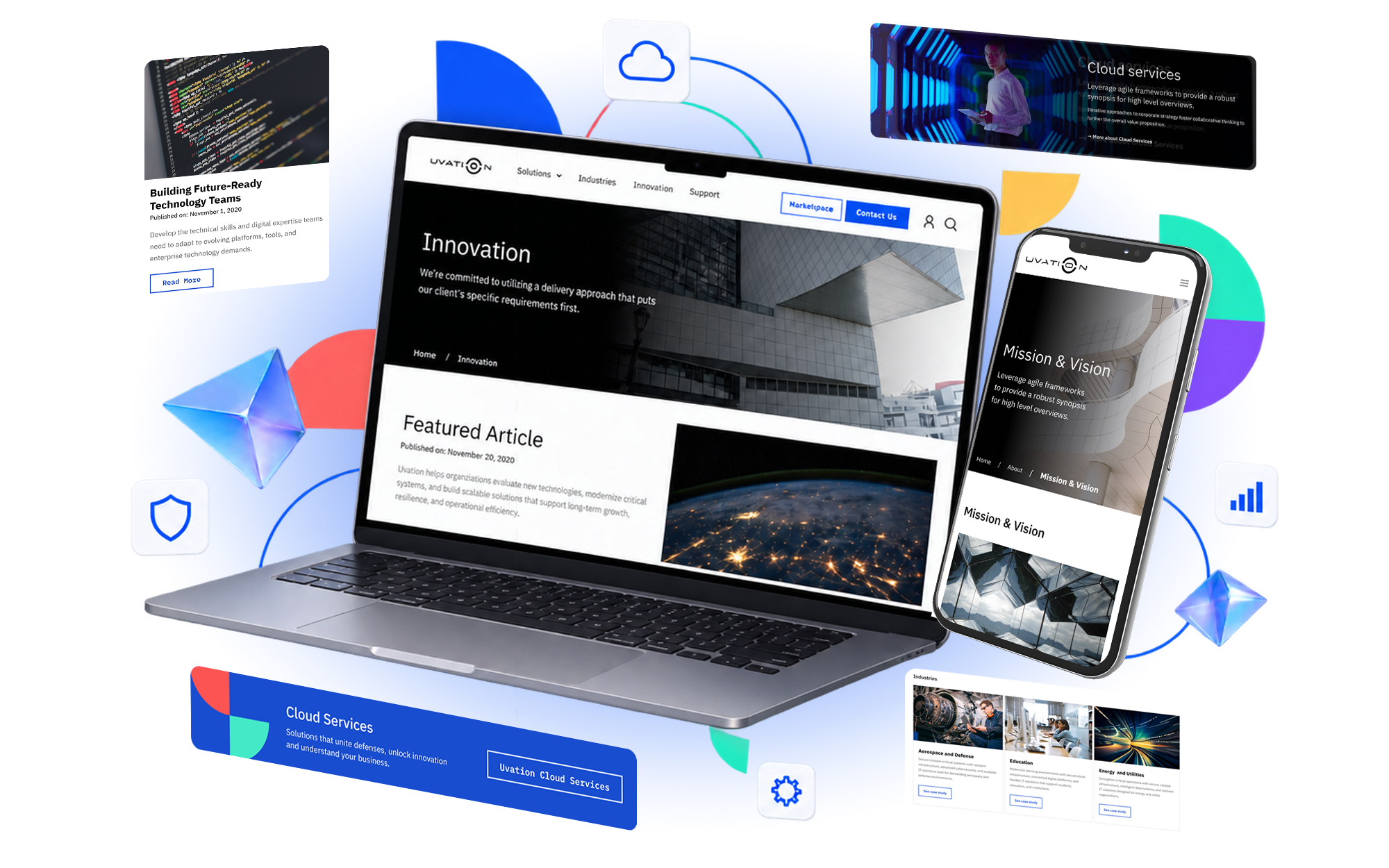
A five-week redesign, workshop to handoff.
A global IT, security, and cloud company, selling to the enterprise.
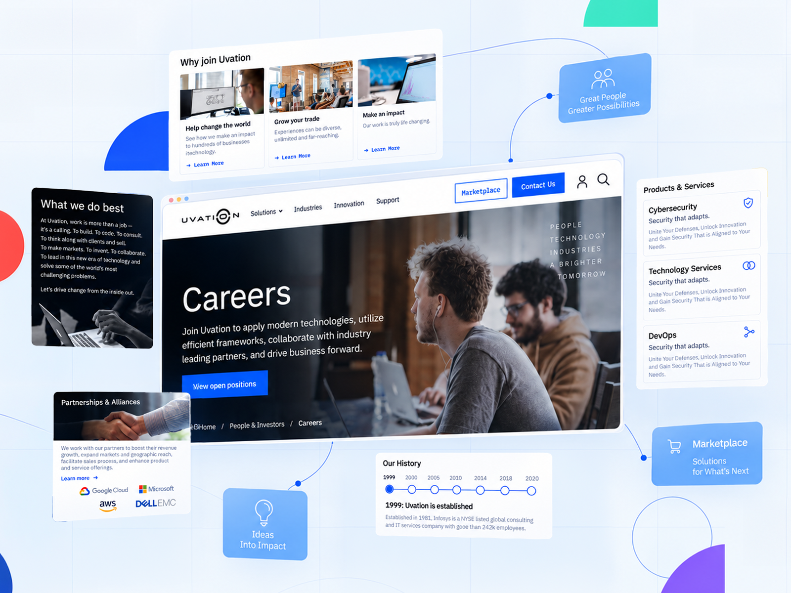
Uvation is a Dallas-based technology company, founded in 2010, that sells personalized IT to enterprise buyers: managed security, data-center and SOC-as-a-service, cloud hosting, and hardware, alongside an online marketplace.
At the time of our engagement it ran a lean, engineering-heavy operation with a global footprint and benchmarked its digital presence against enterprise players like IBM. Its marketing site, though, had not kept pace with the company behind it.
A capable company with a marketing site that undersold it.
Uvation was competing for enterprise technology budgets with a dated WordPress site that generated few leads and told no clear story.
The marketing site did little to capture or qualify enterprise leads. Uvation needed a clear path that turned visitors into a pipeline of new business.
Uvation's strongest services, from managed security to cloud hosting and data centers, sat buried. Prospects couldn't quickly see what the company offered or why it mattered.
With no in-house design function, Uvation's pages and products had drifted apart. They wanted one visual system, credible enough to stand next to enterprise players like IBM.
Arqu recruited the people who live in this market. We interviewed six in discovery, then kept testing with brokers through every sprint, so the redesign started from their reality rather than our assumptions.
Across two retail brokers, two wholesale brokers, and two carrier-side leaders, the same pains surfaced: manual data entry, too many middlemen, and no transparency. “Everyone is overworked because they are all doing manual data entry.”
In moderated testing, the Programs sub-flows scored 2.5 or higher out of 3 on efficiency. Users singled out the side-by-side bind scenarios: “simple, and all presented graphically in an easy way. Just pick the option and that’s it.”
Every user confirmed the platform was unlike anything they’d used, and better than the tool they default to. “We use Excel, and this is a lot more intuitive than that.”
Adam Campbell, 43, lives in Outlook and Excel. Wants less manual data entry and more time to advise clients.

The market-maker in the middle, juggling programs, submissions, and carriers at once. Every manual step is time taken from placing business.

Underwriting the risk. Wants clean, well-packaged submissions and transparency into why a deal was won or lost.
Meet existing mental models. Users came from Excel and Outlook, so the redesign borrowed the structure and language they already trusted rather than inventing new patterns.
Order the work by impact. We started where the value was highest, the Programs and Submissions flows, so the earliest design moved Arqu closest to first revenue.
Test every flow, then iterate. Each sprint ended in moderated user testing with brokers, so discoverability issues were caught and fixed before handoff, not after launch.
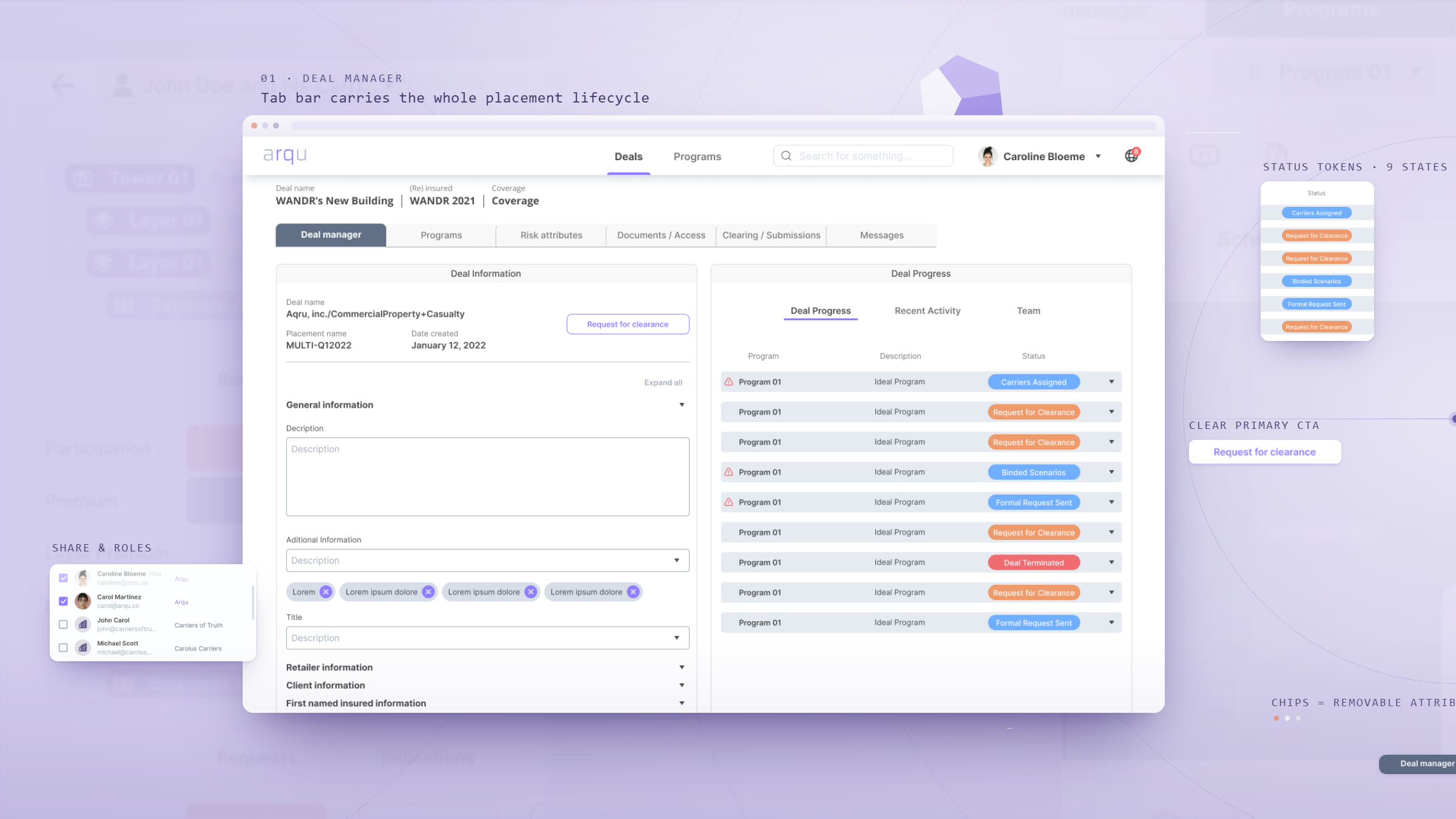
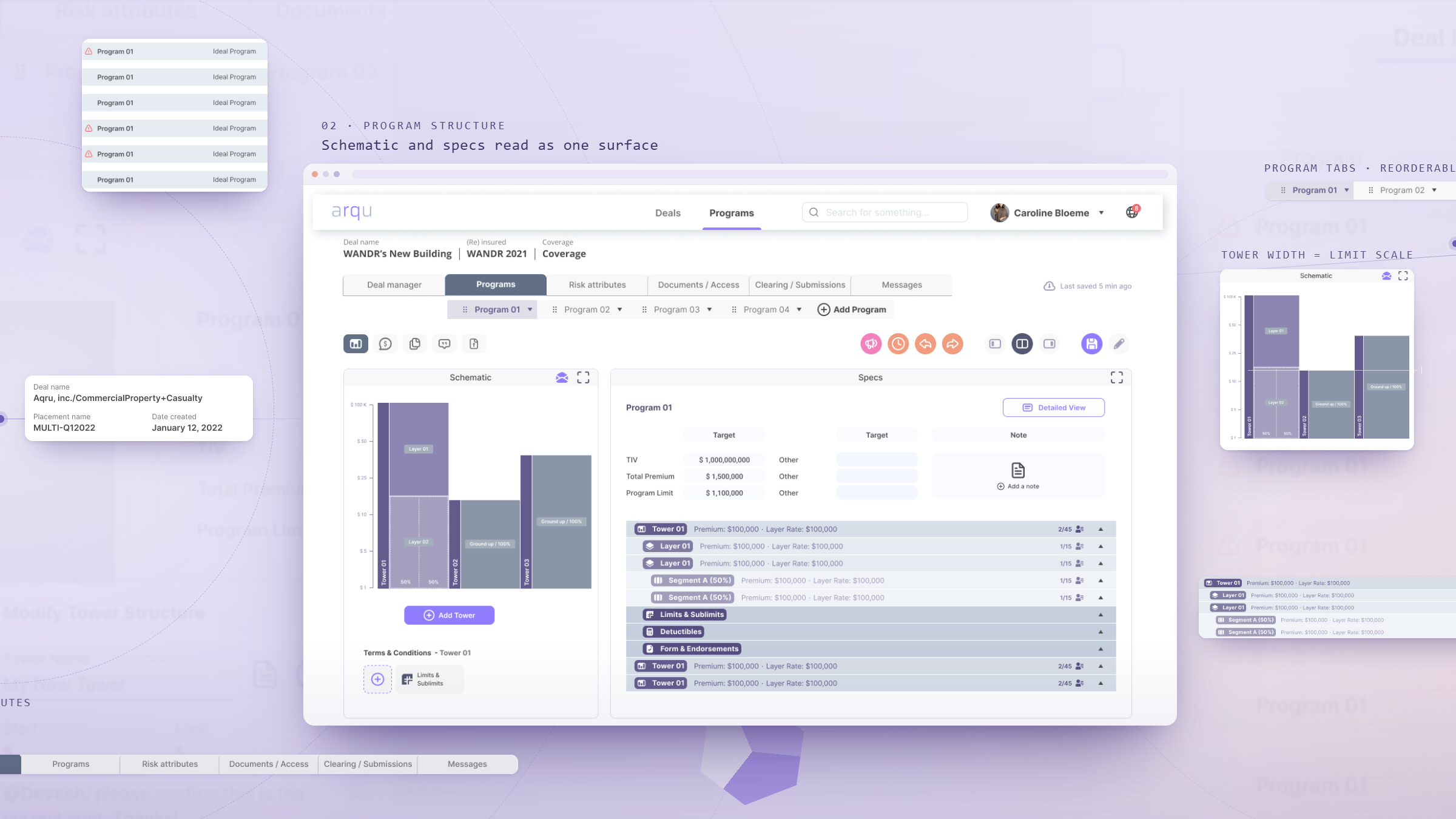
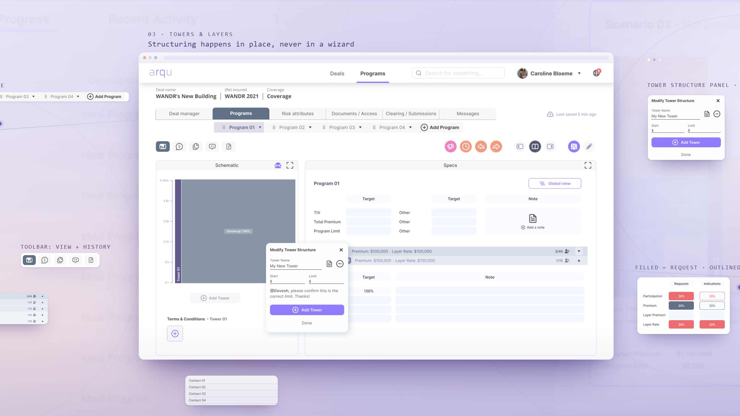
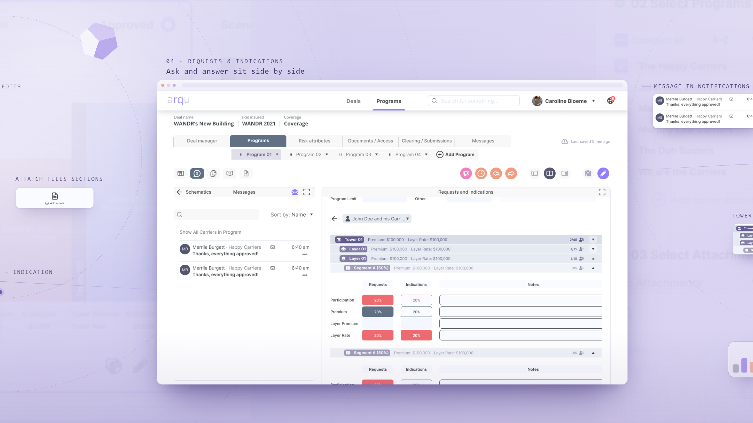
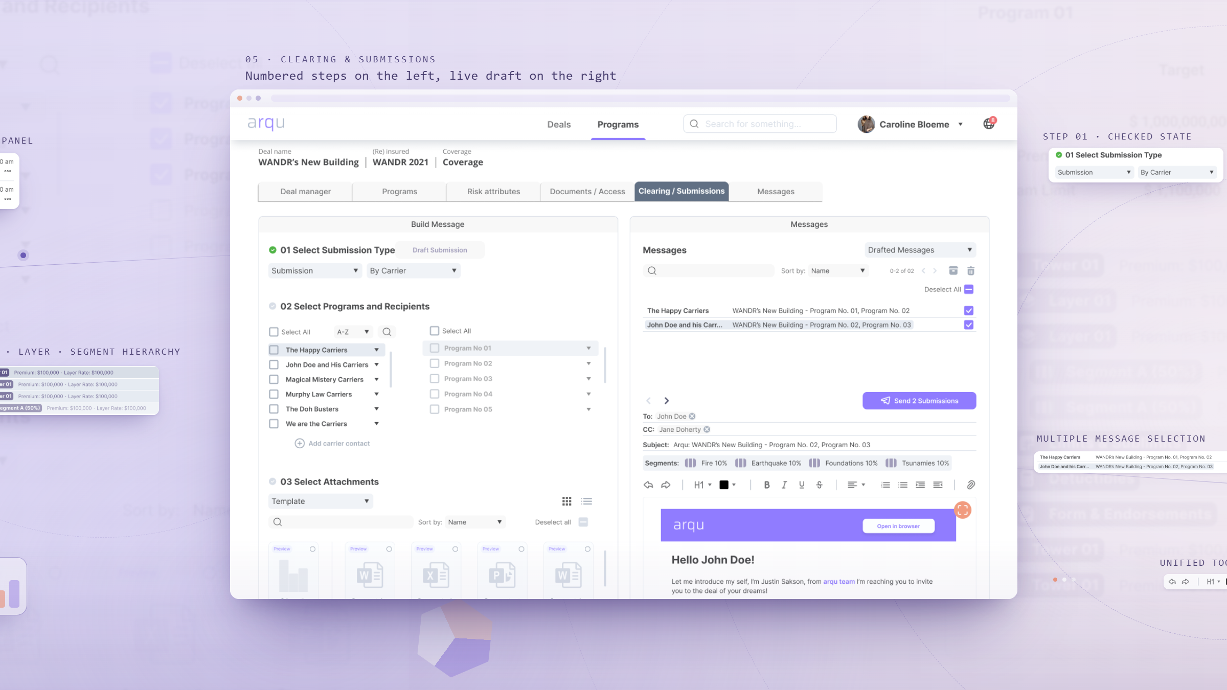
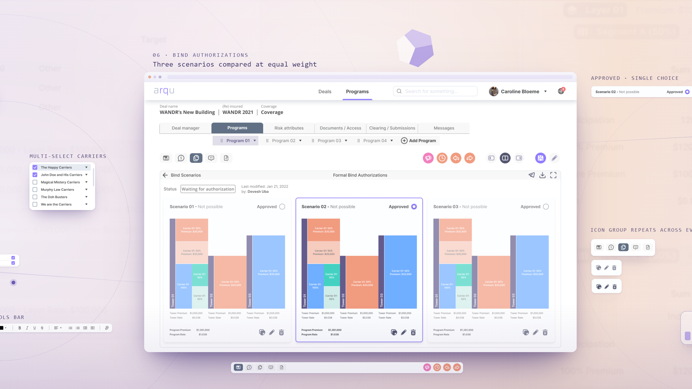
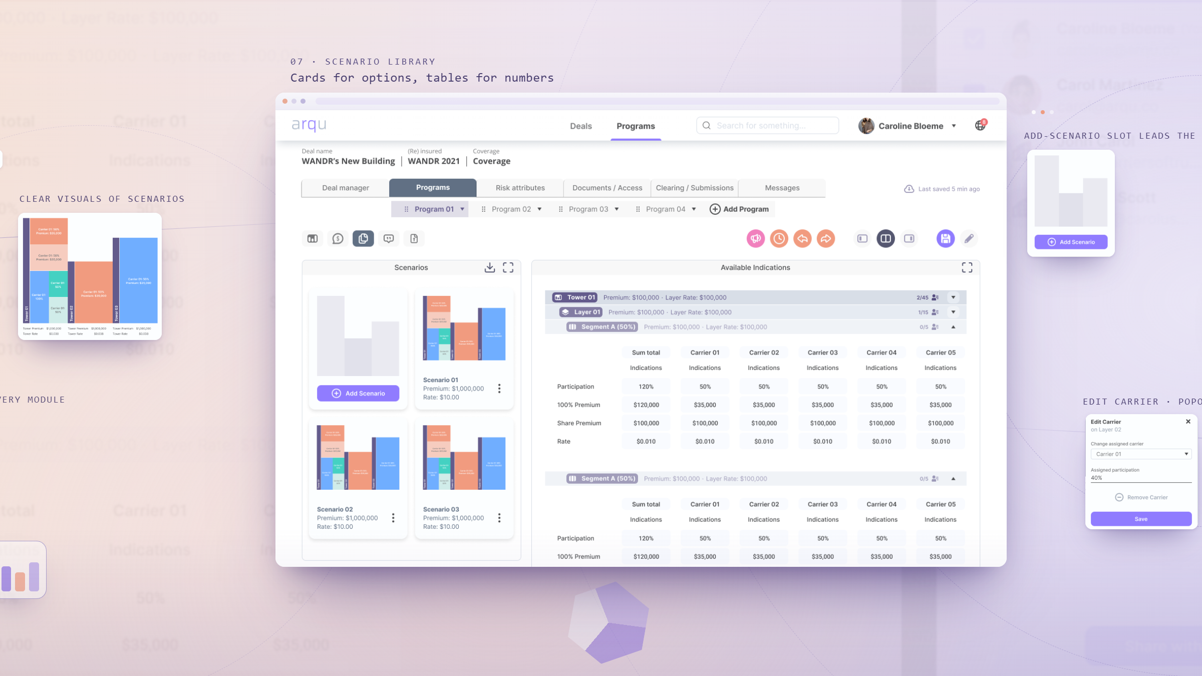
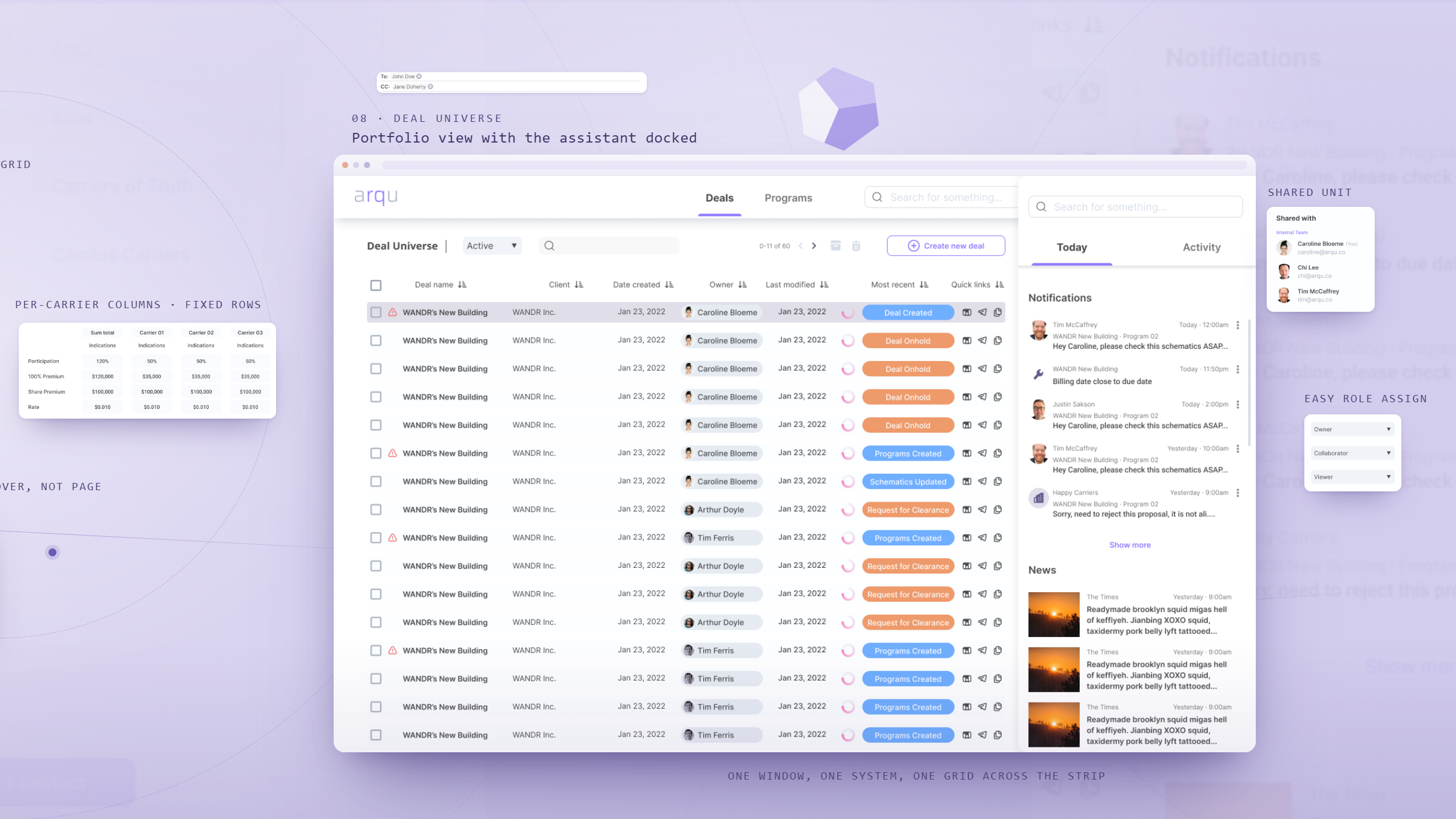
By the end of the engagement, Arqu had a research-backed redesign of its core flows, a reusable design system, and a marketing site built for the raise ahead.
Efficiency figures are from Wandr's moderated user testing of the Programs flow with five wholesale brokers. The Series A is a company milestone reached after the engagement, not a design-attributed result.
Today was the last day of our engagement and I wanted to thank you for putting together such an amazing team. We could not have asked for a better experience and outcome. We look for long-term partnerships, and we hope to engage again in the not-too-distant future.