Persona 01

The first-time prospect.
New to Zoe, "Chelsy" wants to grow her money and find a trusted advisor fast, and needs proof before sharing sensitive details.
New user
Trust-first
Speed
Zoe Financial
Our redesign of Zoe's onboarding lifted self-scheduling conversion 175%, from 8% to 22%, clearing the company's own 20% target.


Two products, one trust problem, one system.
A modern way to find a trusted advisor.
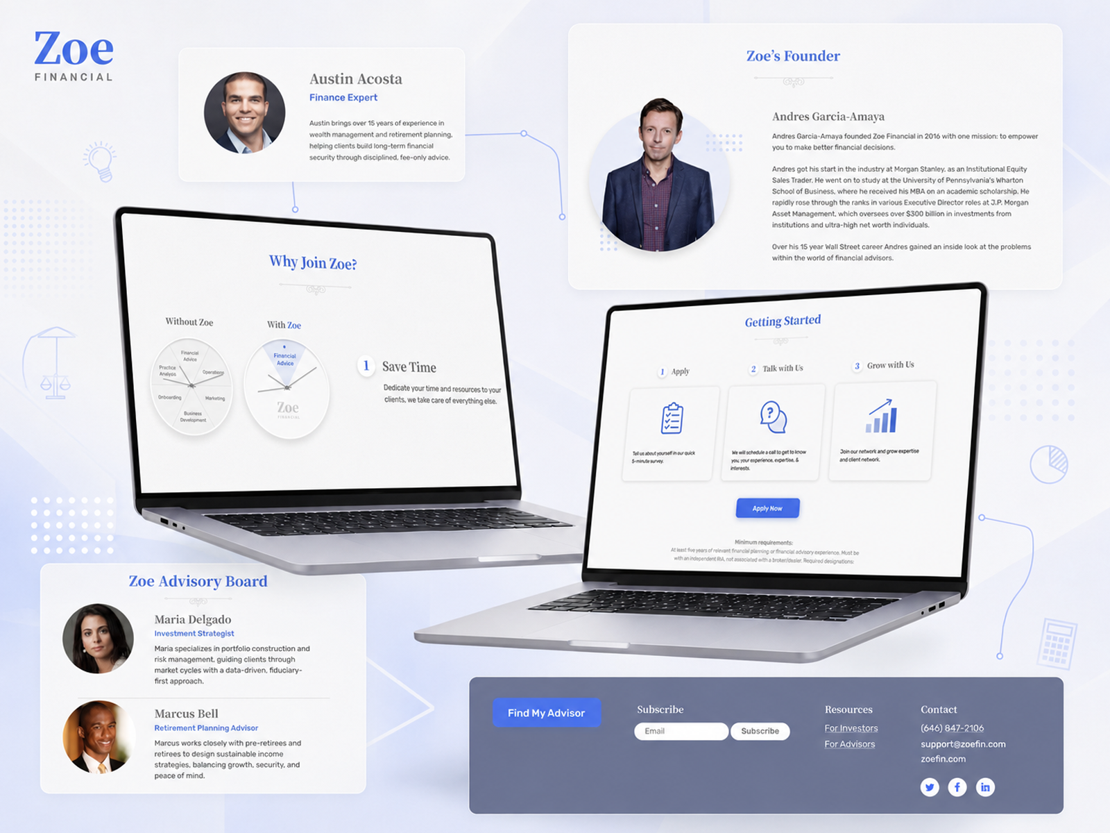
Zoe Financial is a modern wealth-planning platform that matches individuals with a curated network of independent, fee-only financial advisors, vetting for the top few percent of planners nationwide. Founded in 2018 and led by founder and CEO Andres Garcia-Amaya, CFA, it set out to make expert financial advice feel trustworthy and accessible online.
In a category where people hand over their financial lives, trust is the whole conversion. Zoe had product-market fit and a growing advisor network, but its digital experience did not yet earn that trust at first glance, or hold it through a sign-up flow that asked for sensitive details too soon.
Users hesitated at the moment they were asked to trust Zoe.
A fast-scaling fintech in a trust-sensitive category was converting well below its target, with a brand and onboarding that did not yet match the quality of advice behind them.
The site lacked the authority, elegant visuals, and clean imagery a sophisticated audience expects. In a category built on credibility, the experience launched without visual proof of it.
Zoe's own product reviews put self-scheduling conversion around 10% against a stated 20% goal. The onboarding asked for sensitive financial details early and read as a plain form, so prospects dropped off before reaching an advisor.
Prospects, the top-5% advisors, and Zoe's own team each needed a different path and message, but the product spoke to them in a single voice that served none of them fully.
Past product-market fit, Zoe was shipping quickly with no shared design system, so consistency and speed were slipping as the product grew.
Before redesigning, Wandr researched Zoe's audiences and mapped the full journey, from discovering the site and the find-an-advisor form to matching, the intro call, and onboarding. The work segmented users by intent, not demographics.
New to Zoe, "Chelsy" wants to grow her money and find a trusted advisor fast, and needs proof before sharing sensitive details.

One of the top 5% of independent, fee-only advisors. Needs tools to grow and service clients while remaining a fiduciary.

Client and advisor success, sales, and support. Needs a consistent system to run and scale the experience.
Design for trust, not just taste. Every visual choice was measured against one question: does this make a first-time client trust Zoe with their money?
Order the ask. The onboarding gave people value and context before requesting anything sensitive, so fewer dropped off at the form.
Build a path per person. Prospects, advisors, and the Zoe team each got a tailored persona, message, and set of proof points.
In wealth planning, the design is the trust. Prospects judged Zoe's credibility in seconds and resisted handing sensitive details to a flow that had not earned it yet. Polishing the brand mattered, but the real unlock was sequence: give people confidence and context first, then ask. A prettier form converts once. An experience that earns trust, held together by a system that keeps it consistent, converts as the company scales.
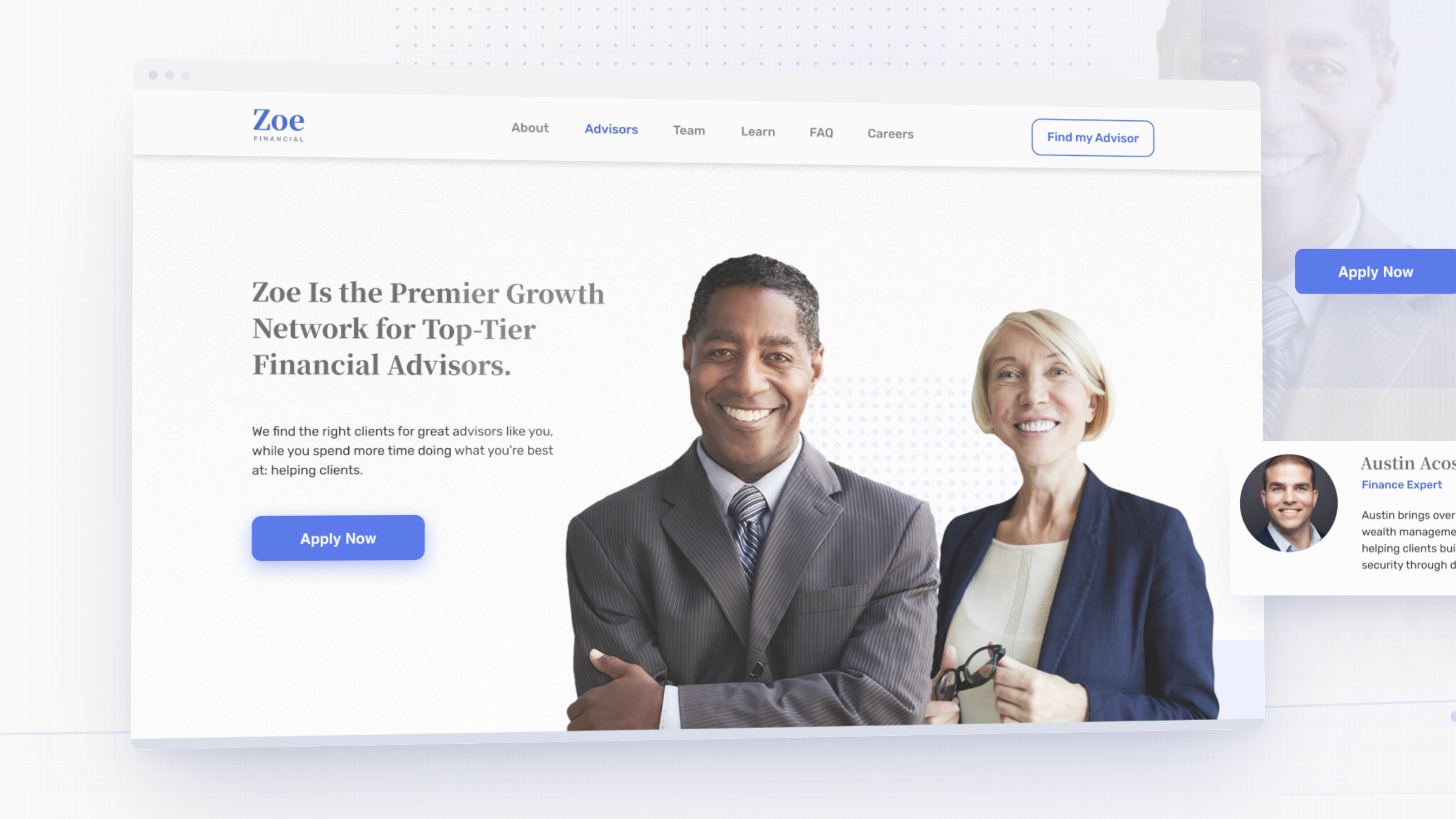
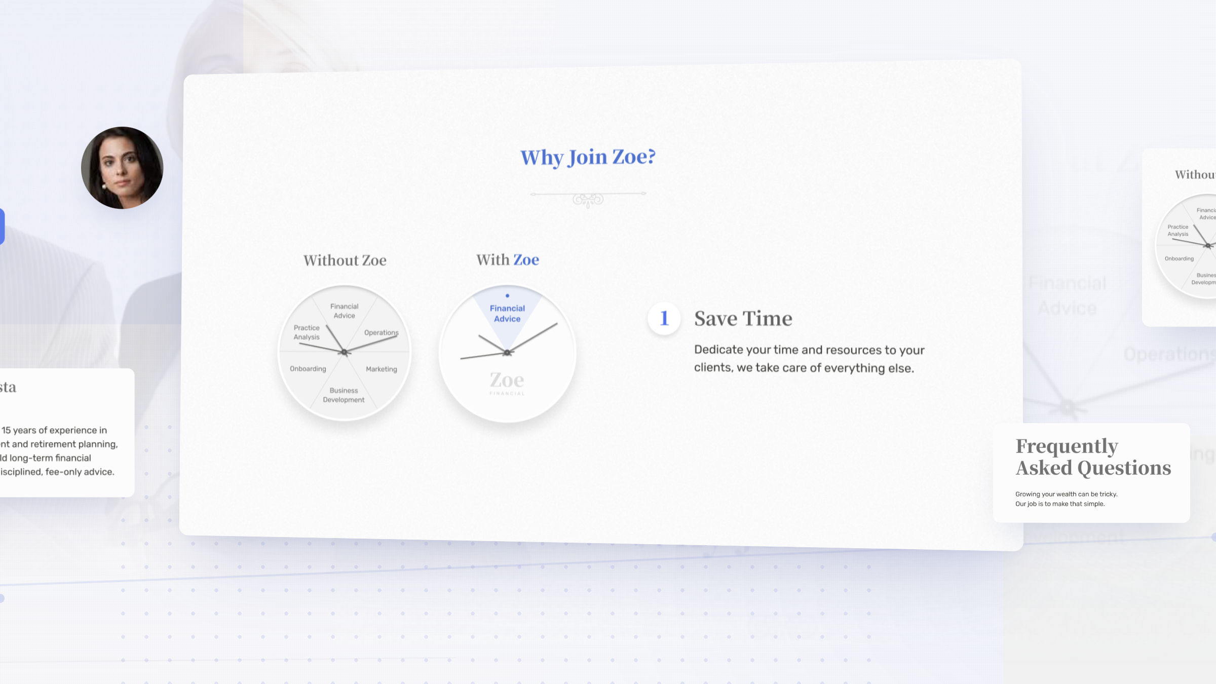
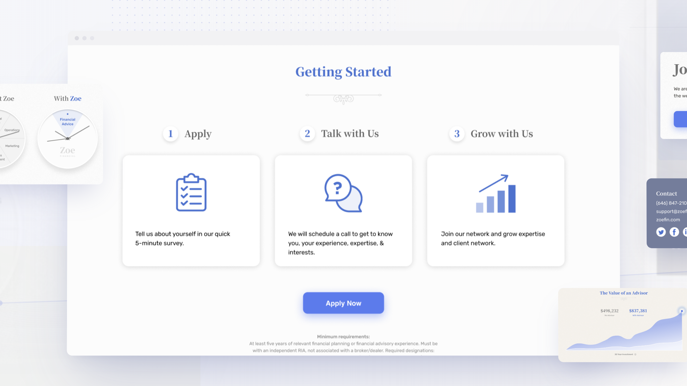
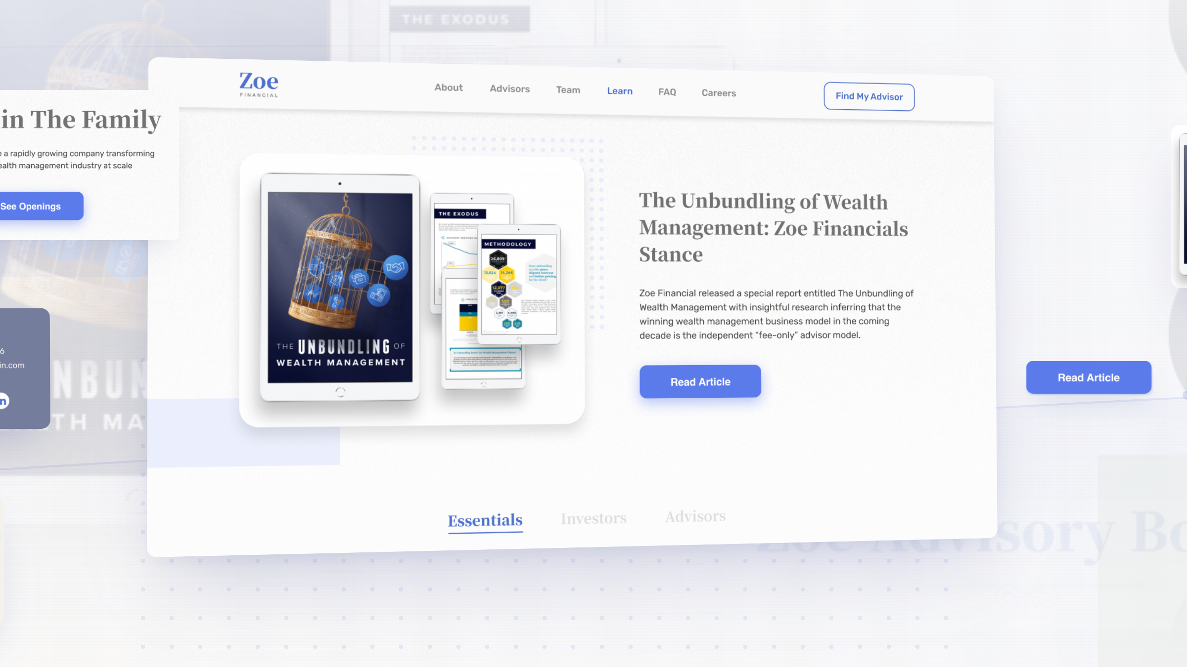
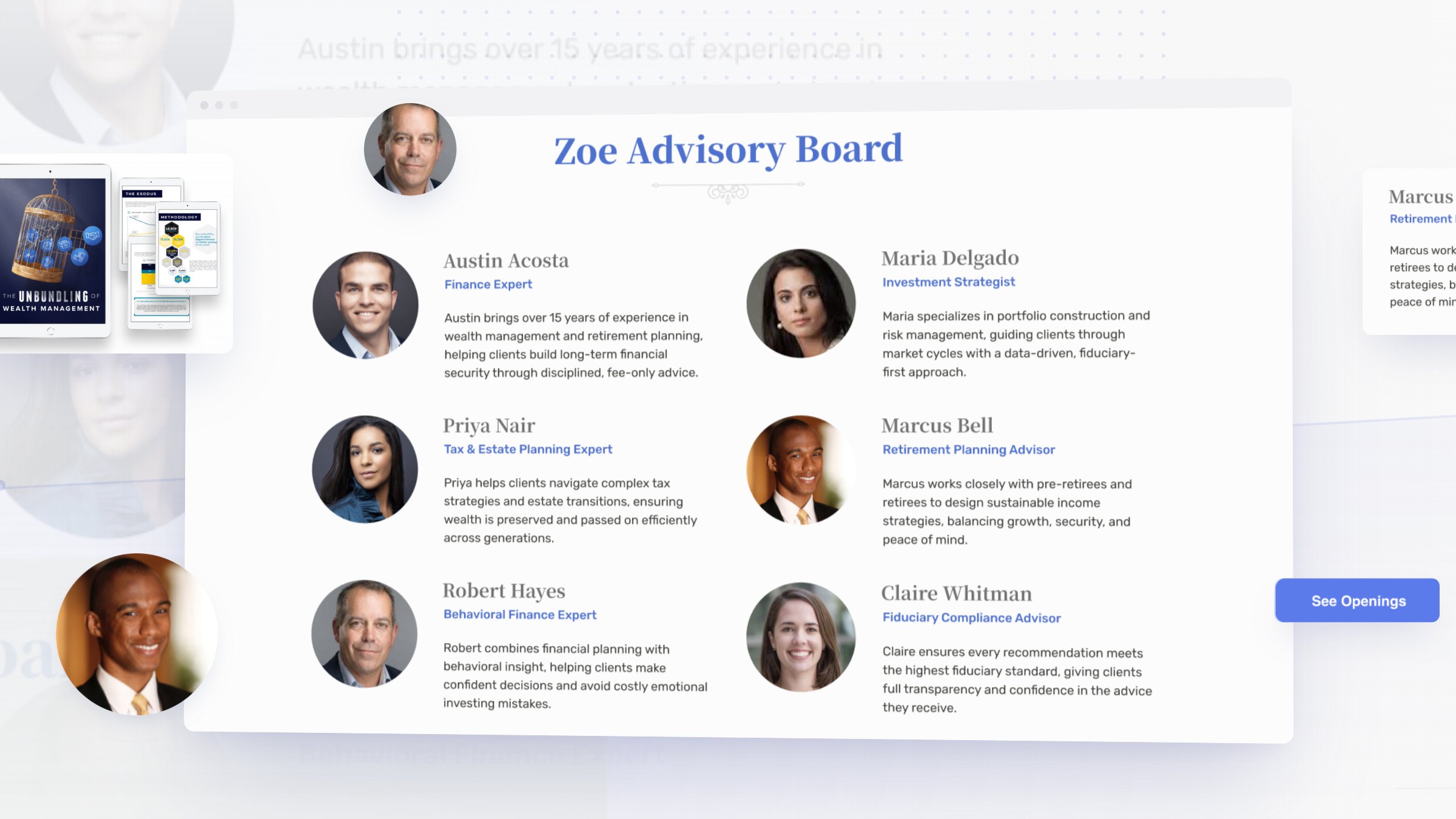
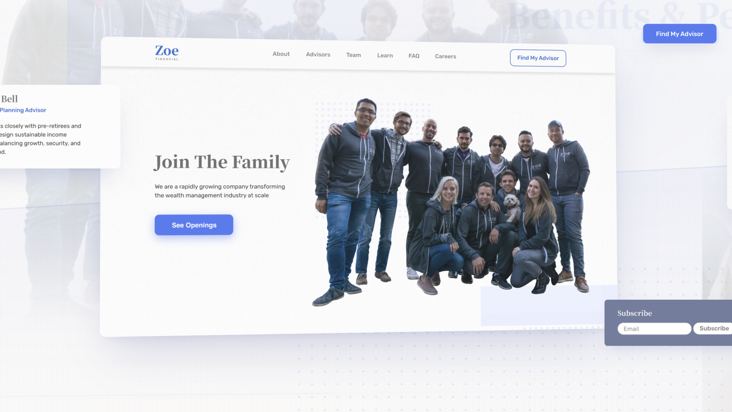
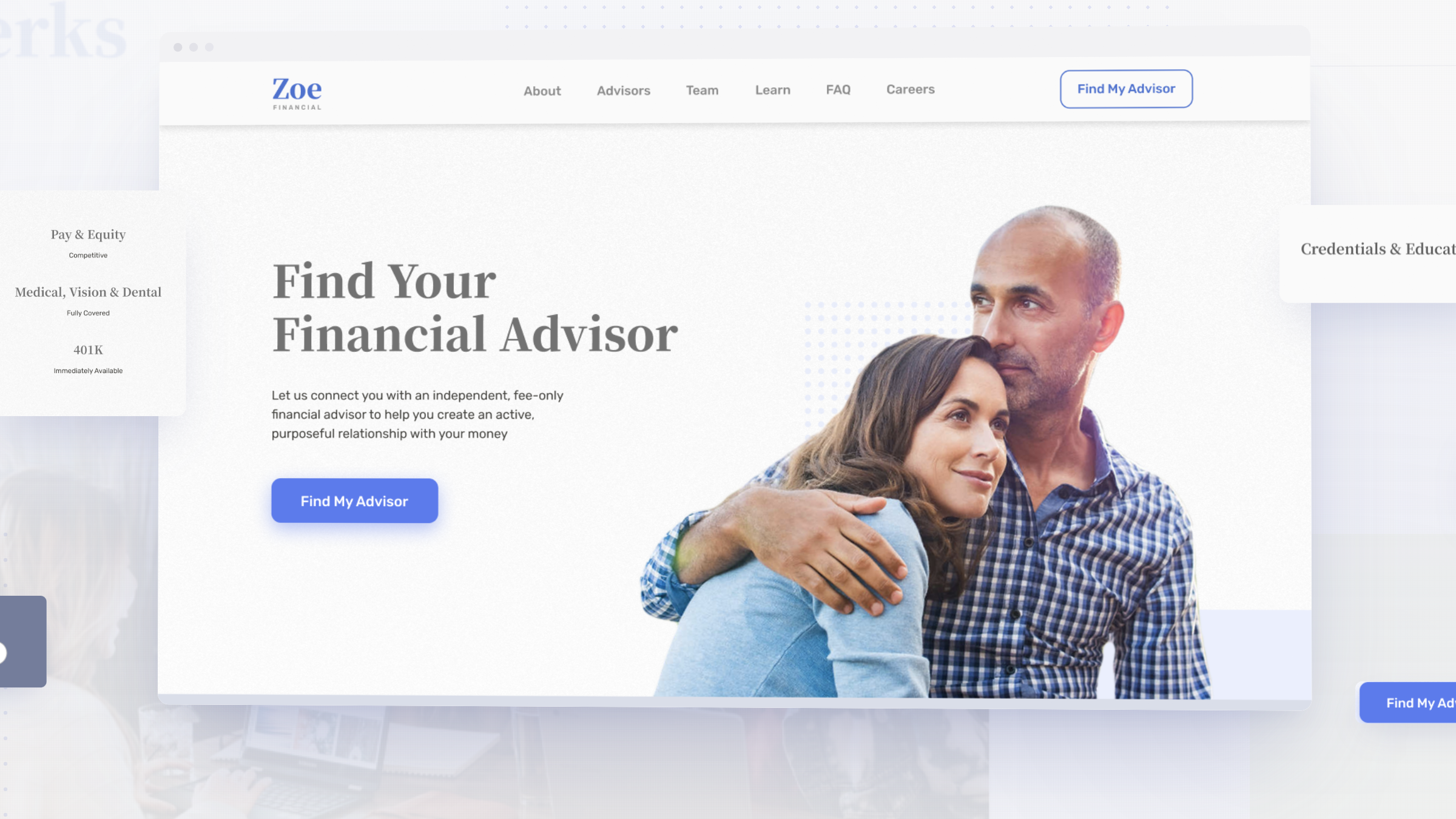
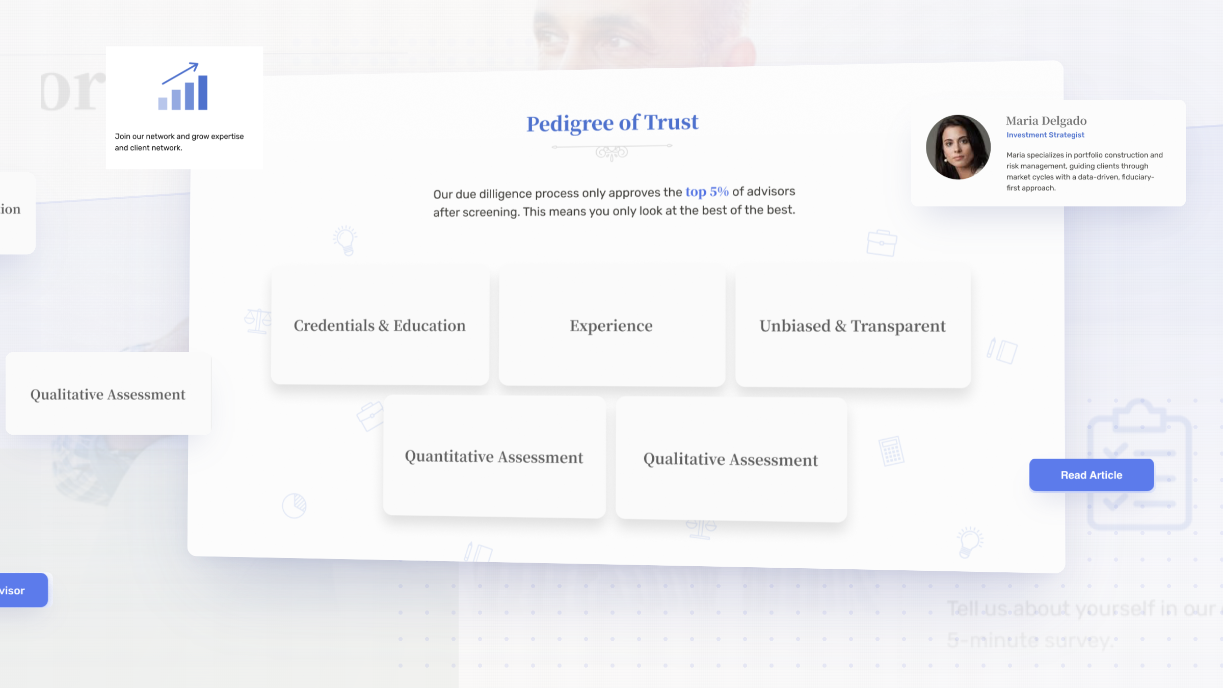
By the end of the engagement, Zoe had a credible brand, a rebuilt onboarding flow that cleared its conversion target, and a design system its growing team could run.
The communication and support were top-notch, and that made for an enjoyable experience.