Reading Time:
8 minutes
Category:
Nonprofit
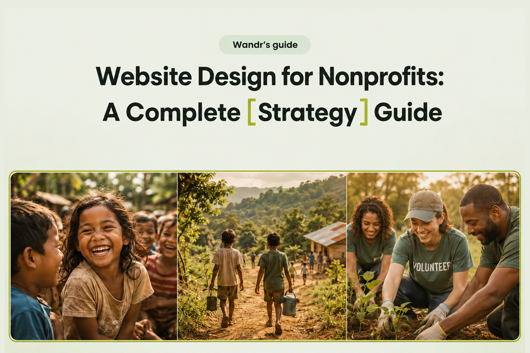
An annotated breakdown of the best nonprofit website designs in 2025, including WWF Canada, Mercy For Animals, and DonateHello — with the design principles behind their results.

An annotated breakdown of the best nonprofit website designs in 2025, including WWF Canada, Mercy For Animals, and DonateHello — with the design principles behind their results.
Some nonprofit websites make you want to take action the moment you land on them. Others make you wonder how the organization is still operating.
The difference usually isn't budget. It's design thinking.
We've audited dozens of nonprofit websites at Wandr, and what separates the best from the rest isn't just how they look: it's how intentionally every design decision is tied to the organization's actual goals. The best nonprofit websites know exactly who they're talking to, make it effortless to take action, and build trust so fast that users barely notice it happening.
Here's our breakdown of what the best nonprofit websites in 2026 are doing right: and what every organization can learn from them.
Before we get into examples, let's establish the criteria. A nonprofit website earns a spot on this list by doing at least three of the following:
With that in mind, here's what we're seeing from the best in the space.
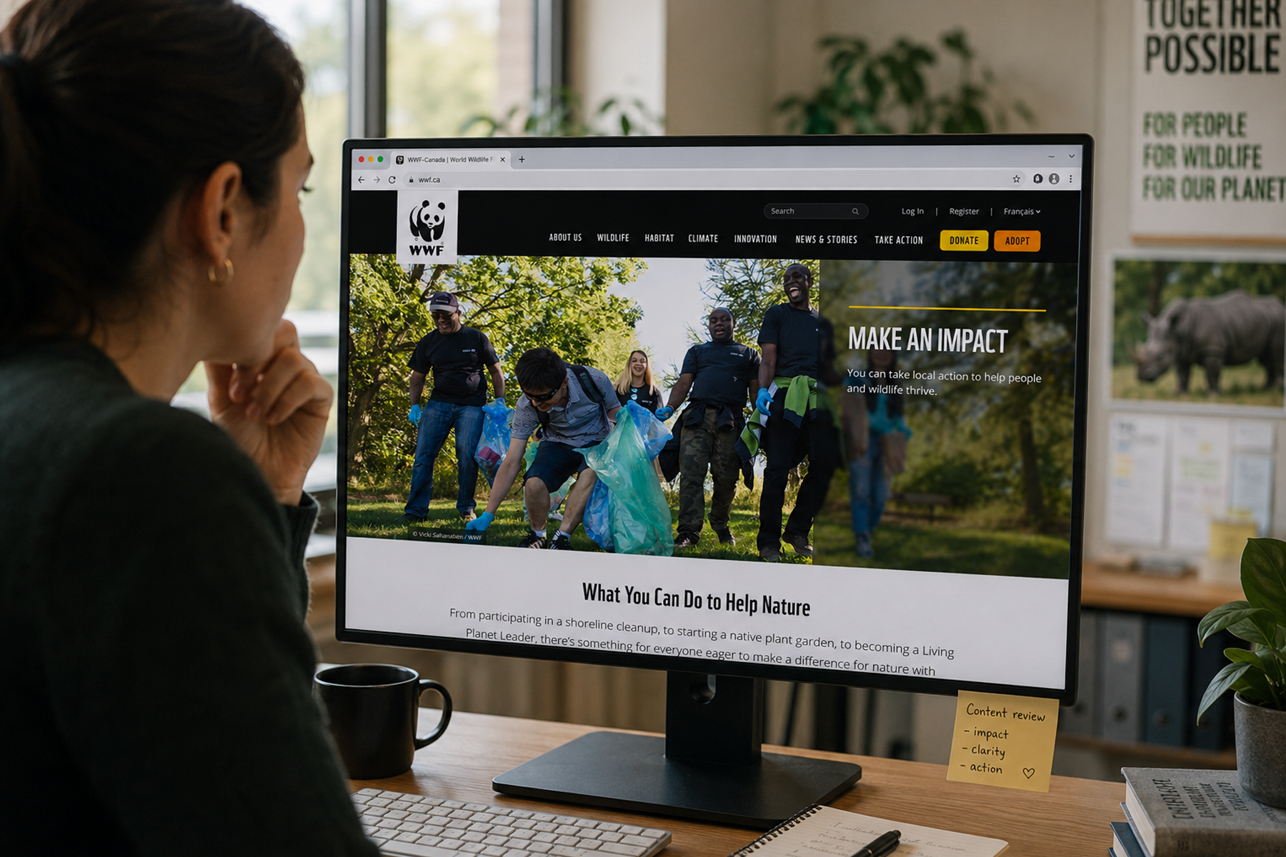
WWF Canada is a masterclass in what happens when a nonprofit invests in its digital experience seriously.
When Wandr redesigned their digital platform, the mandate was clear: the website needed to serve multiple distinct user types: online donors, advocacy supporters, shop customers, peer-to-peer fundraisers: without making any of them feel like an afterthought. The redesign also had to work in both English and French, across all device types, without friction.
What makes it work:
The hero section doesn't waste a single pixel. The visual impact of WWF's photography does the emotional heavy lifting immediately, and the navigation is structured so that a first-time visitor can orient themselves in seconds. The donation flow was rebuilt from the ground up: fewer steps, clearer impact statements at every stage, and a recurring donation option that's surfaced naturally rather than feeling like an upsell.
The results validated the approach: transactions increased by 30%, unique users were up 25%, and time on page improved by 18%.
"We've seen a lot more traffic coming to WWF.ca since the redesign... and our conversion rate on our donor forms is up.": Vanessa Turpin, Sr. Manager Digital, WWF Canada
Read the full WWF Canada case study →
Mercy For Animals operates across multiple regions and languages, running dozens of campaigns simultaneously. Their website challenge was less about aesthetics and more about architecture: how do you maintain a consistent, credible brand identity when your digital footprint is genuinely that complex?
The answer, as Wandr found, was consolidation and system-building. Over 12 separate campaign pages were consolidated into three flexible templates. The platform migration preserved over 90% of existing SEO authority: and recovered the remaining 10% within four weeks.

What makes it work:
MFA's site earns trust through specificity. Impact stats are concrete and recent. Campaign pages are clearly structured with a single primary action. The multi-region architecture means a supporter in one country gets a localized experience that still feels like it belongs to the same organization they already trust.
The result: donations increased by 32% in year one post-engagement.
Read the full Mercy For Animals case study →
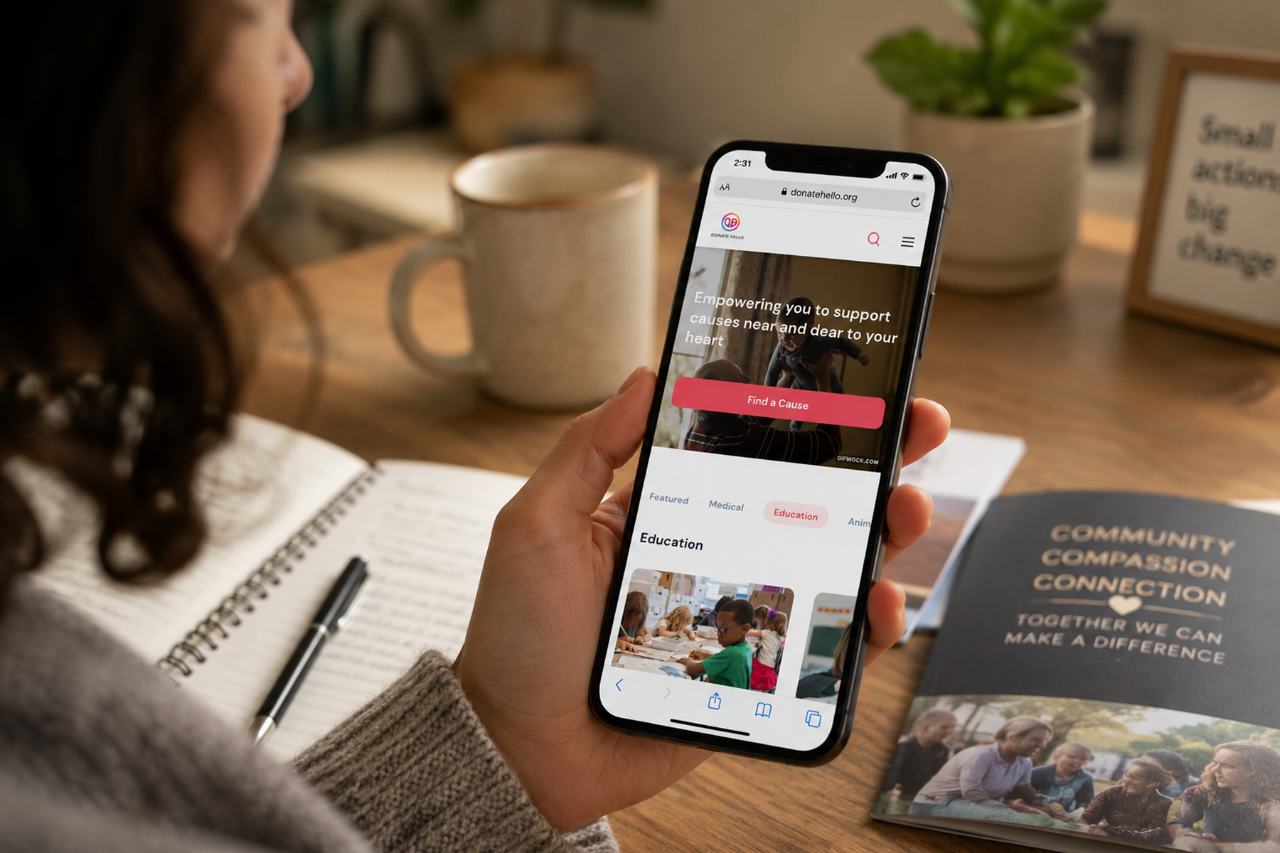
DonateHello is a donation platform built for nonprofits: so the trust bar here is exceptionally high. Donors need to understand not just where their money is going, but how it gets there and what it actually achieves.
The Wandr redesign of DonateHello's platform centered transparency as a design principle, not just a copy point. Cause discovery, donation flow, and impact reporting were all rebuilt with the user's need for clarity at the center.
What makes it work:
The donation flow is lean and logical. Users can discover causes, understand their impact before they commit, and track what their contributions accomplished. There's no ambiguity in the process: which removes the most common reason people abandon donation flows before completing them.
Read the full DonateHello case study →
After reviewing these examples and dozens of others, here are the design patterns that consistently show up on the best nonprofit websites.
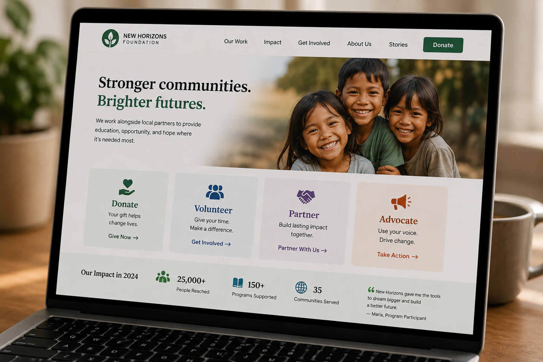
The homepage of a high-performing nonprofit website doesn't try to tell the whole story. It serves as a traffic director: getting each type of user to the right place, fast.
We recommend limiting primary user types to four. More than that and the navigation becomes a choose-your-own-adventure with too many branches, and users start making the wrong choices for the wrong reasons. The best sites make it obvious: if you want to donate, here. Volunteer, here. Partner, here. Advocate, here.
Every step in a donation flow is a door the user can walk out of. The best nonprofit websites treat this seriously. We've seen organizations cut donation abandonment rates dramatically simply by removing one form field or eliminating a confirmation page.
The goal: get from "I want to donate" to "thank you for your donation" in as few steps as possible, with clear impact messaging at every stage.
There's a significant difference. Mobile-compatible means "it doesn't break on a phone." Mobile-optimized means "it was designed for a phone first, and the desktop version was derived from that." The best nonprofit websites fall into the second category.
Given that the majority of nonprofit site traffic arrives via mobile, this isn't optional: it's the primary use case.
The best sites don't make users scroll to find social proof. Impact numbers, partner logos, media mentions, and testimonials appear within the first screen: because if you haven't established credibility before the user has to scroll, you've already lost a portion of them.
A slow nonprofit website communicates the same thing as a cluttered donation flow: this organization doesn't value your time. Load time is a trust signal, not just a technical metric. The best sites load in under three seconds on mobile: and they're often faster.
The best nonprofit copy doesn't speak in generalities. "Help us make a difference" is weak. "Protect 50 acres of old-growth forest this month" is strong. Specificity creates urgency and credibility simultaneously.
It's worth being honest about the other side of this. The worst nonprofit websites share a common set of characteristics:
Related: What Should a Nonprofit Website Include? →
Here's a quick self-assessment to see where you stand:
User Clarity
Conversion Optimization
Trust and Credibility
Technical Health
If you answered "no" or "I don't know" to most of these, it's time for a conversation.
Related: Nonprofit Website Redesign: When, Why, and How to Do It Right →
The best nonprofit websites in 2026 share one thing above everything else: they were built with a clear understanding of who they're talking to and what they need that person to do. They didn't start with design. They started with users.
At Wandr, that's exactly how we build every nonprofit website. We start with an audit, move to user research, build the flows, and then design to serve them. The results: real increases in donations, volunteers, and conversions: follow from that sequence.
Ready to see what that process looks like for your organization? Book a free diagnostic →
Wandr is a woman-owned, woman-led product strategy and UX design studio that helps mission-driven organizations — alongside startups and enterprise teams — design digital experiences that build trust and drive action. Our nonprofit work has generated over $3.2M in additional donations across 15+ engagements, including WWF Canada, Mercy For Animals, and DonateHello. See our nonprofit services →
They were built from user research, not assumption. Each serves multiple user types clearly, removes friction from donation flows, establishes trust immediately, and is fully optimized for mobile. The best ones also have analytics configured so they keep improving after launch.
Ask: can a first-time visitor identify their path in 10 seconds? Is the donation flow four steps or fewer? Do impact statistics appear above the fold? Does it load in under three seconds on mobile? If you answer no to most of these, there's meaningful room for improvement.
A single-sentence mission statement, clear navigation for each user type, one primary CTA visible without scrolling, and at least one specific credibility signal: an impact number, a partner logo, or a media mention: all above the fold.
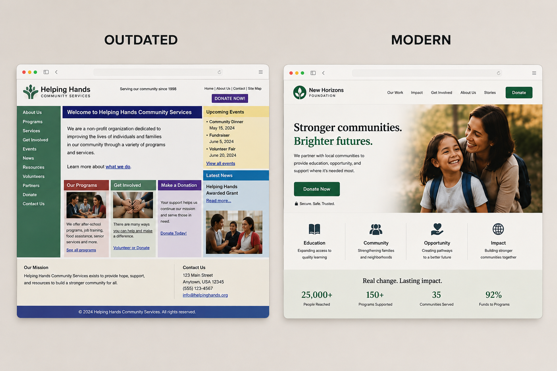
Design is a credibility signal. If a site looks like it was built a decade ago, visitors question whether the organization is still active and trustworthy: before reading a single word. Trust drives donations, and outdated design undermines trust immediately.
Absolutely. Great nonprofit website design is about strategic clarity, not budget size. Knowing who your users are, building clear flows for each, and removing friction between intent and action produces results at any scale.