Reading Time:
12 minutes
Category:
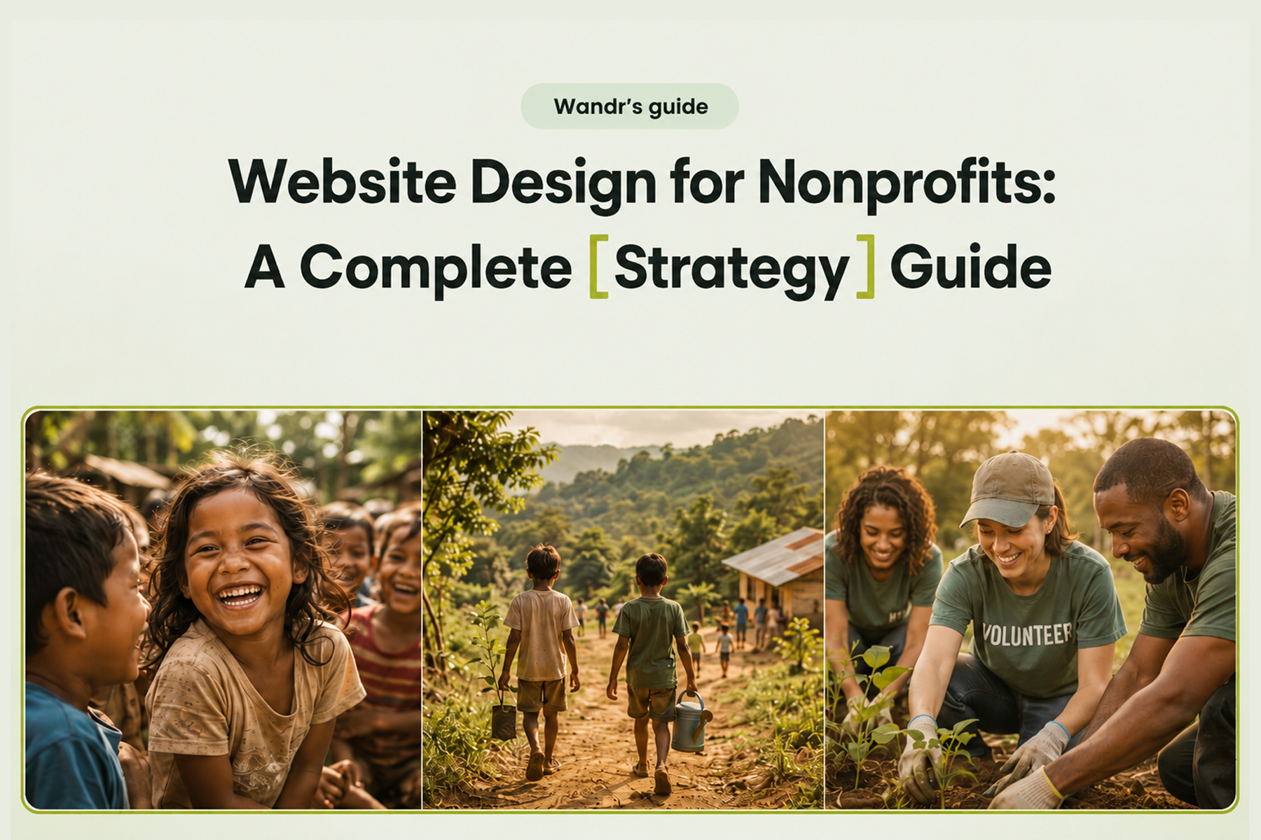
Nonprofit
The process behind real donation increases: from user persona development to donation flow optimization, platform selection, and post-launch analytics.

The process behind real donation increases: from user persona development to donation flow optimization, platform selection, and post-launch analytics.
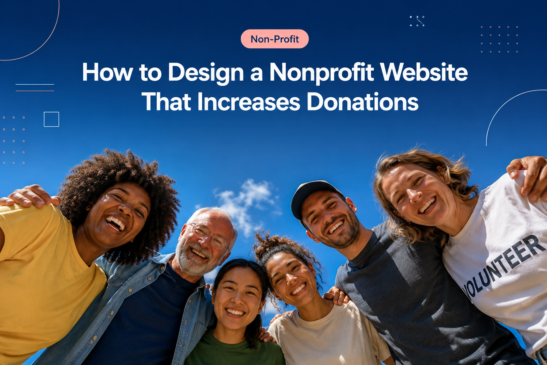
We get this question a lot: "How do we make our website actually bring in more donations?"
The honest answer is that there's no single fix. Donation conversion is the end result of dozens of design decisions made correctly: or incorrectly: at every stage of the user's experience. But there is a clear, repeatable process for getting those decisions right, and that's what we're going to walk through here.
At Wandr, WWF Canada saw a 30% increase in online transactions post-redesign. Mercy For Animals saw a 32% increase in donations in year one. Those results came from a process, not from luck or from finding the perfect color for the donate button. Here's that process.
Before we talk about how to fix donation conversion, let's be clear about why it's broken for most organizations.
The root cause, almost every time, is the same: the website wasn't designed for the user. It was designed for the organization. It says what the organization wants to say, organized the way the organization thinks about itself, in a flow that made sense to the team that built it.
The user: the potential donor: lands on the site with a completely different set of questions, concerns, and decision points. And when the site doesn't answer those questions at the right moment, in the right way, the user leaves.
Conversion is about alignment: making the website match how donors actually think and behave, not how organizations wish they would.
This is where we start every single project, without exception. Not with design, not with copy: with users.
Most nonprofits come to us thinking they know their donors. And most of them are at least partially wrong about their own assumptions. We've learned this over and over in stakeholder interviews: leadership often has significant blind spots about who is actually interested in supporting them, and why.
One example: we worked with an organization supporting addiction recovery programs. Their leadership was convinced that certain geographic regions would never donate to a cause associated with drug addiction. We challenged that assumption with user interviews and found a significant, untapped population that was not only willing to donate: they were actively looking for organizations like this one and simply couldn't find them.
This happens more than you'd think. Assumptions about who donors are often cause organizations to miss entire audiences of willing supporters.
The goal is a maximum of four primary user personas across your full audience. More than four and you start over-segmenting: which creates its own conversion problems, as we'll cover next.
Related: Nonprofit Website Design: The Complete 2026 Guide →
Here's a mental model shift that changes everything: stop thinking about your website as a collection of pages and start thinking about it as a collection of flows.
A page is static. A flow is a journey: from a user's first impression to a completed donation. Every page, every element on every page, and every moment in between is either supporting that flow or interrupting it.
When we design nonprofit websites, we map every flow before we design a single screen:
The answers to these questions drive every design decision that follows.
We mentioned limiting user types to four. Here's a more specific application of that principle: don't ask donors to categorize themselves before they've had a chance to engage with the donation experience.
We've seen organizations present donors with a choice immediately: "Are you a one-time donor or a recurring donor? High-amount or low-amount?" The intention is personalization. The effect is that you're biasing the donor's decision before they've had a chance to consider what they actually want to give.
Someone who lands on a well-designed donation flow might see that a $50/month recurring commitment is more achievable than they expected. They might read the impact statement and decide to give more than they planned. But if you ask them to categorize themselves in step one, they default to the smallest, least-committed option: and that's where they stay.
Build one strong donation flow. Let donors self-identify within it through natural decision points, not forced categories.
This is where the data gets specific. Research on nonprofit donation forms consistently shows that abandonment rates climb steeply with every additional step. Most organizations have at least two or three steps they could eliminate without any negative impact on conversion.
Questions to ask at every step in your donation flow:
Specific optimizations we commonly implement:
Reduce form fields. Most donation forms collect more information than they need. Name, email, payment information, and amount are the essentials. Address, phone number, date of birth: consider whether you truly need these before the donation, or whether they can be collected during onboarding.
Eliminate the confirmation page redirect. Some donation processes send users through a series of pages: donation form → summary → external payment processor → confirmation. Each transition is an opportunity to lose the donor. Where possible, consolidate.
Surface recurring donation naturally. Don't hide recurring donation options or force a choice between one-time and recurring upfront. Present the one-time amount first, then gently surface the recurring equivalent ("That's $X/month: want to make that automatic?") after the initial commitment.
Add impact statements at every stage. At every step of the donation flow, remind the donor what their contribution will do. Not generic ("Your donation helps animals") but specific ("$50 provides a rescue animal with one month of veterinary care"). Impact specificity is one of the highest-leverage copy interventions in nonprofit donation design.
Every visual and copy decision in a donation flow is either building or undermining the donor's trust. The more money you're asking for, the higher the trust threshold.
Trust signals that should be visible throughout the donation flow:
Trust killers to eliminate:
Related: Fundraising Websites for Nonprofits: Design That Converts Donors →
Your donation platform is the technical backbone of your conversion flow. The choice matters more than most organizations realize.
We've developed deep expertise across virtually every major donation platform through our client work. Our general guidance:
Platforms we recommend:
Platforms we recommend moving away from:
Our approach to donation platform integration: we understand the constraints of every platform before we design around them. No surprises at launch. The integration is built into the roadmap from day one, with the developer who specializes in that platform.
You cannot improve what you do not measure. This seems obvious, but the majority of nonprofit websites we audit have either no analytics or analytics that aren't set up to capture what actually matters.
Here's the order we recommend:
1. Google Search Console Set this up first. Understand what people are searching for when they find you, which pages they're landing on, and what queries you're ranking for. This shapes your content strategy and helps you identify which pages deserve conversion optimization attention first.
2. Google Analytics (GA4) Set up conversion tracking for every meaningful action: donation started, donation completed, volunteer form submitted, newsletter subscribed. Without conversion events configured, you have traffic data but not behavior data.
3. Heatmapping (Post-Launch) Heatmaps are valuable: but save them for after the redesign is live and traffic is meaningful. Looking at heatmaps on an outdated design tells you how people navigate something you're about to replace. Wait until the new experience is live.
Related: How to Do a Nonprofit Website SEO Audit (Free Checklist) →
The majority of nonprofit website traffic arrives via mobile. If your donation flow was designed for desktop and adapted for mobile, you're starting the wrong way around.
Mobile-first design means: design the donation experience for a 375px-wide screen first. Then adapt for larger screens. The constraints of mobile: no hover states, touch targets instead of mouse clicks, smaller screen real estate: force design discipline that benefits every platform.
Specific mobile donation optimization checklist:
A donation flow is never finished. It's improved continuously based on real data from real users.
Post-launch, we work with clients for a minimum of three months to review what the analytics are showing and make evidence-based improvements to the highest-priority pages. The goal is to establish a feedback loop where every design iteration is grounded in data rather than assumption.
This is what separates organizations that sustain conversion improvements from those that see a post-launch bump followed by a plateau.
We want to be realistic and honest here, because results vary based on starting conditions, organizational readiness, and ongoing investment.
That said, based on our experience across 15+ nonprofit engagements:
These aren't guarantees: they're patterns. And we back our work with a warranty: if you don't see meaningful improvement in your key metrics during year one post-launch, we come back and work for free until you do.
Book a free diagnostic to see where your donation flow stands →
More donations don't come from a better design. They come from a better process that produces a better design. User research comes first. Flows come second. Design serves both.
If you're ready to take donation conversion seriously, that's where the conversation starts.
Talk to Wandr about your nonprofit website →
Wandr is a product strategy and design studio building custom digital experiences for nonprofits, NGOs, and mission-driven organizations. See our case studies →
Understanding your donors before you design anything. Most conversion problems trace back to a site that was built for the organization's internal logic rather than how donors actually think and navigate. User research before design is the single highest-leverage investment.
Four or fewer from intent to confirmation. Every additional step increases abandonment risk. The essentials are: amount selection, donor information, payment, and confirmation. Everything else should be evaluated critically before being added.
Asking donors to choose between one-time and recurring at the very start biases them toward the lower-commitment option before they've seen what giving looks like. Surfacing recurring giving after they've selected an amount: once they're already committed: produces significantly higher recurring adoption rates.
Purpose-built platforms like Fundraise Up, Give Butter, and Donorbox consistently outperform generic options like PayPal or Stripe links. They provide better donor UX, stronger analytics integration, and credibility signals that generic payment tools lack.
Typically 30 to 90 days for initial trend data. Meaningful statistical significance usually emerges over three to six months. Wandr's post-launch support includes three months of analytics review to catch and respond to early signals.