
Dakota

Dakota's email campaigns landed on one page, and 85% of that traffic left without seeing another. Research, an audit and a tested prototype returned 28 fixes for that funnel.

INDUSTRY
Finance
PLATFORM
Website
SIZE
Growth
goal

UX Research & Website Redesign

MPL Gaming
·
Real-money Platform
·
U.S. Market
At a glance

Three months of research that changed what Dakota thought it was selling.

01
Align on the problem.
A full-day kickoff workshop on January 11, 2021 with Dakota's founder, CTO, CFO and marketing director, covering problem topology, a scoping canvas, empathy maps for both buyers and a guided tour of the live site.
02
Audit and research.
A UX audit of the marketing site read against Google Analytics behavior flow, HubSpot engagement data and Lucky Orange heatmaps, alongside competitor benchmarking and five in-depth interviews, synthesized into two personas and three experience maps.
03
Rebuild the funnel.
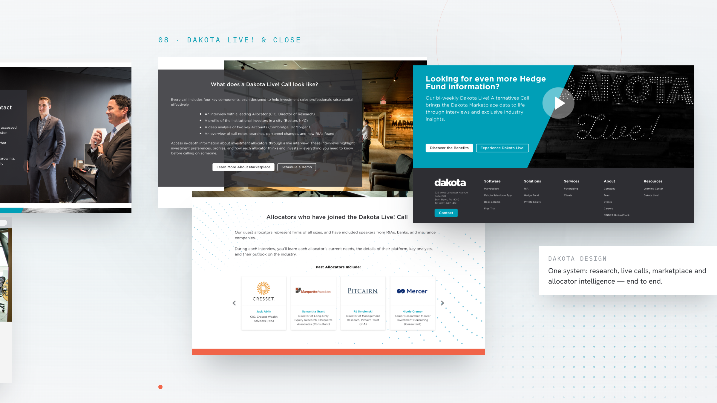
A sitemap and page-by-page section strategy covering six page templates, wireframes and copy direction, plus a branding workshop in March that set the art direction.
04
Test before building.
Moderated usability testing of the prototype with four participants, two current Dakota users and two non-users, across three conversion flows, delivered as a 28-recommendation report in March 2021.
Drag / scroll →
ENGAGEMENT
3 months
Kickoff January 11, final research delivered March  21
Evidence
5 interviews
Sales leaders and the salespeople who use the product daily
BLUEPRINT
6 templates
Sitemap, section strategy and page wireframes
VALIDATION
28 fixes
Ranked recommendations from three tested flows
The Client

A fundraising firm that turned its own prospect list into a product.

MPL Gaming player base

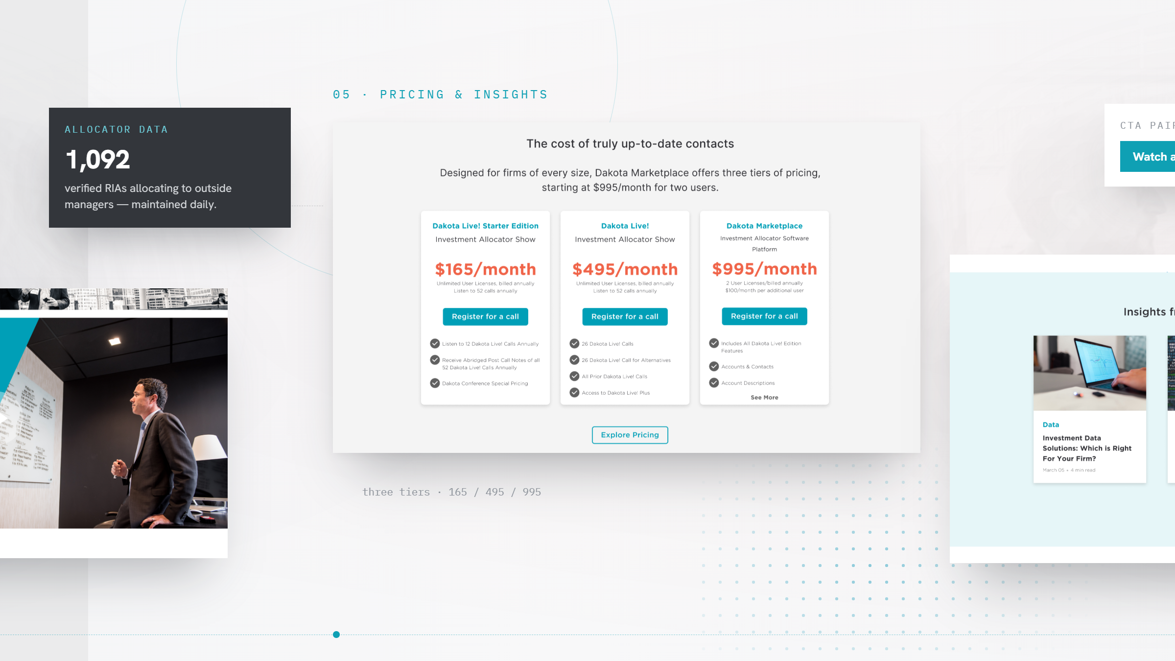
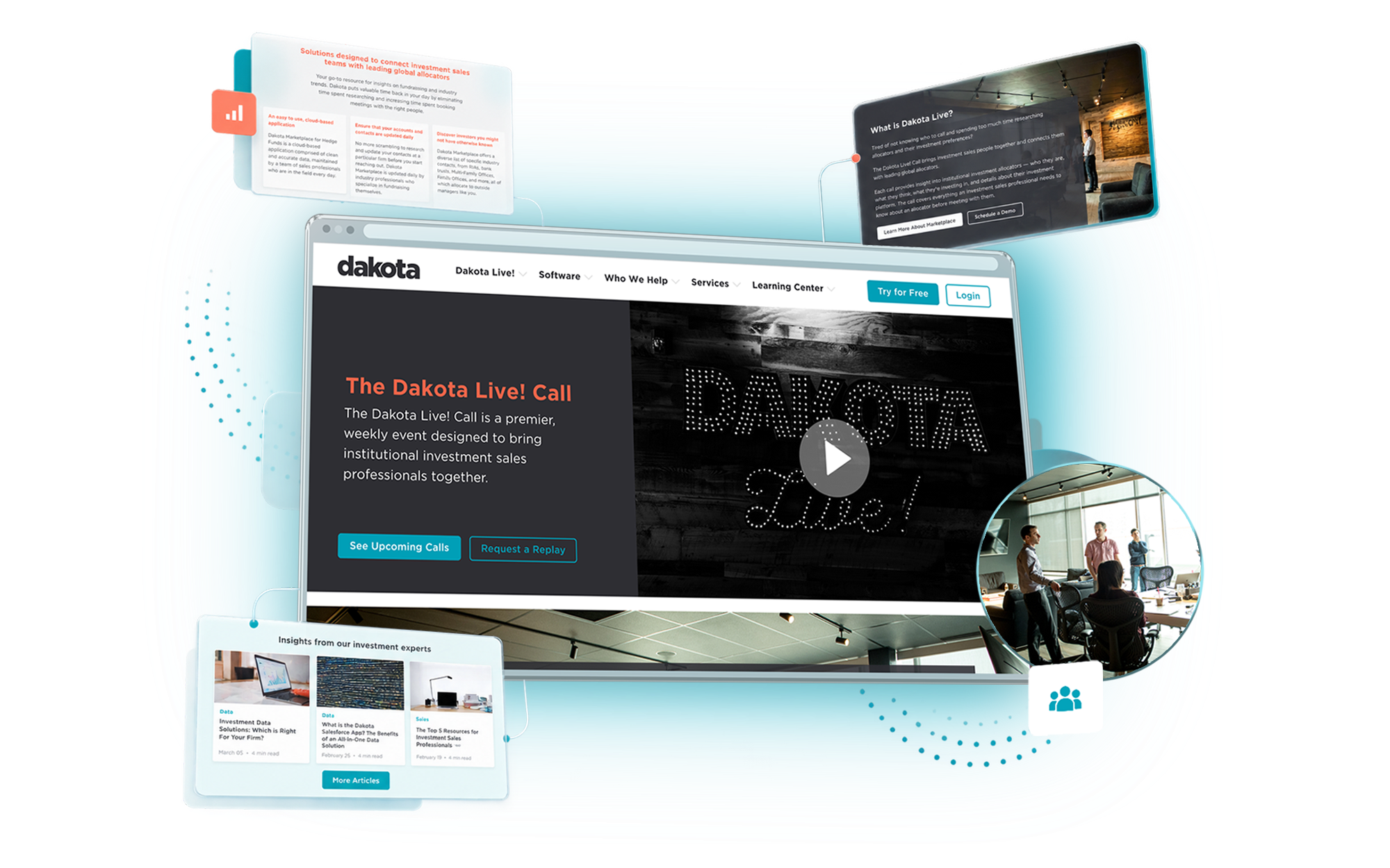
Dakota started in 2006 as a boutique fundraising firm, raising capital for investment managers. Doing that work for a decade meant building and maintaining something its competitors were selling as a product: a clean, current record of who allocates capital, where, and to whom. In the late 2010s Dakota turned that internal asset outward as Dakota Marketplace, an institutional investor and RIA database, and paired it with Dakota Live, a recurring call where its own fundraisers walk subscribers through specific allocators and accounts.

When Wandr came in at the start of 2021, the software side of the business was working. The website in front of it was not. Dakota was spending on content and email to generate demand, and could not explain why so little of it turned into a booked call.

‍

2006
Bryn Mawr, Pennsylvania
11,000+ contacts
Across roughly 3,300 institutional and intermediary accounts, 2021
$35B+
Capital raised by Dakota's fundraising team by 2021
The Challenge

A website selling a database, for a business that closed on a call.

Dakota had strong content, a growing subscriber base and a sales team that knew exactly what converted. The marketing site was doing none of that work, and the audit turned the gap into five specific failures.

Problem 01

Navigation described the company, not the offer.

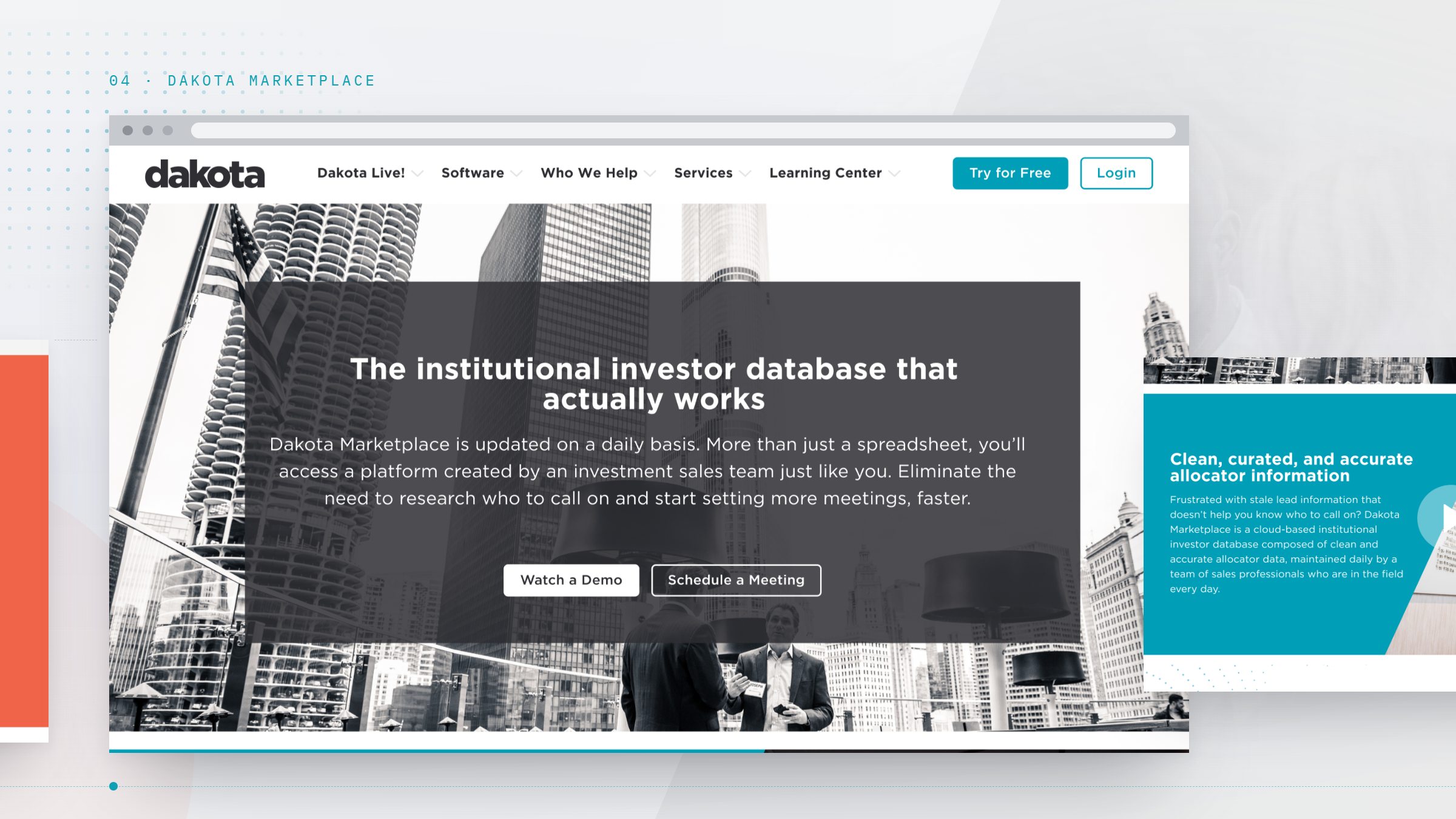
The Services section read like an About page. Dakota Live subpages carried internal labels that meant nothing to a newcomer. A first-time visitor could not tell from the menu what Dakota sold, or which of its three business lines applied to them, which is the moment a prospect is supposed to self-qualify.

Problem 02

The best traffic landed on a dead end.

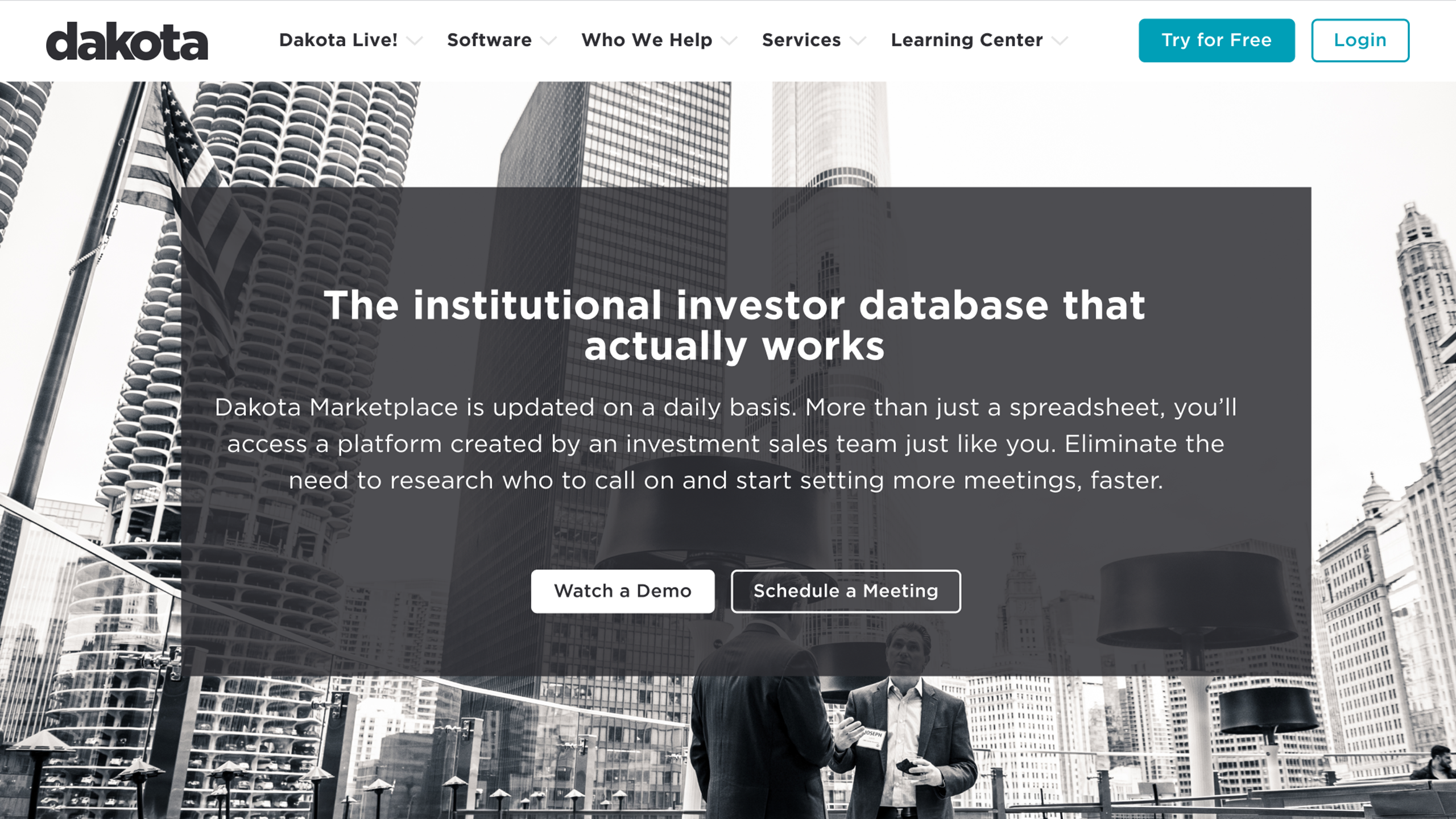
Email campaigns delivered qualified prospects straight to the Dakota Live page, and 85% of them left without viewing another page on the site. Meanwhile, behavior flow showed that visitors arriving through organic search almost never reached that page at all. The highest-intent audience and the highest-converting page were never meeting.

Problem 03

Readers stopped at the first screen.

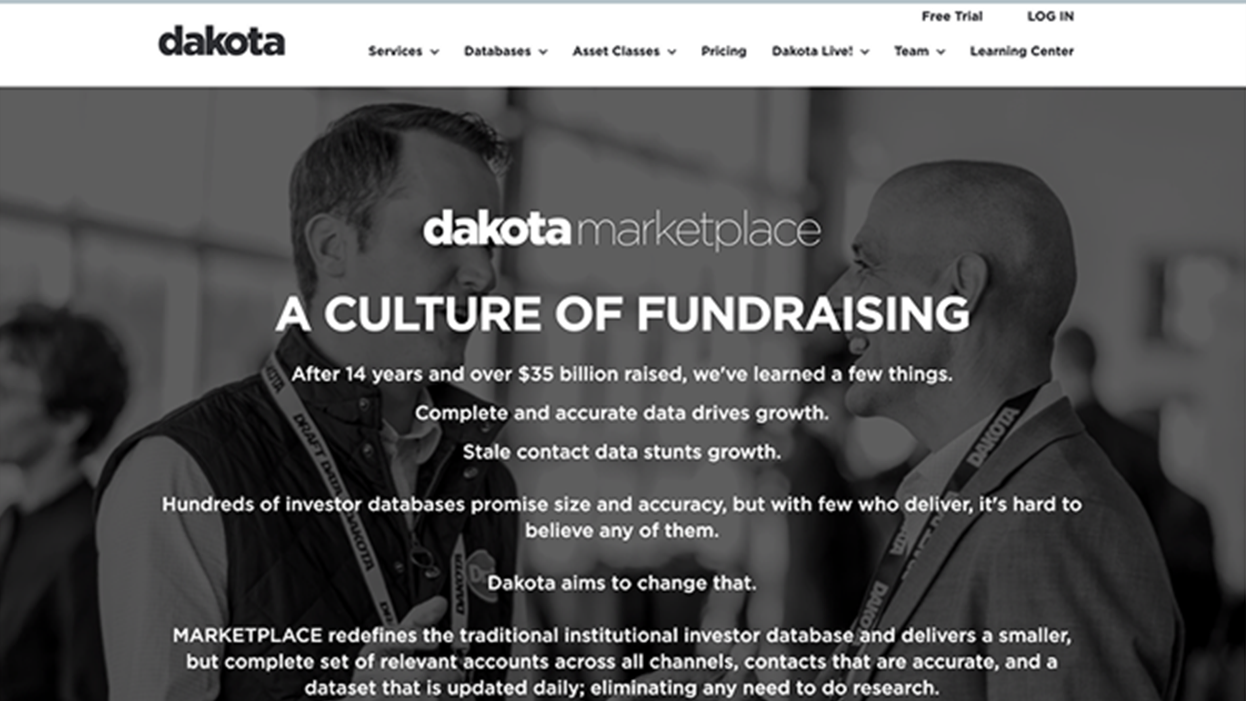
14% of visitors never scrolled past the opening section. Copy ran in long, center-aligned blocks, the primary calls to action fell below the fold, and sessions averaged 3.18 pages over 3 minutes 59 seconds. The homepage already carried the strongest proof Dakota had, over $35 billion raised in 14 years, set as one line inside a centered wall of text that the heatmaps showed nobody read.

Problem 04

Every call to action competed with the others.

Free trial, watch a demo, schedule a meeting and log in all appeared on the same screens, frequently as two primary buttons side by side. None of them pointed at the event Dakota's own sales team treated as the real qualifier.

Problem 05

Proof was buried.

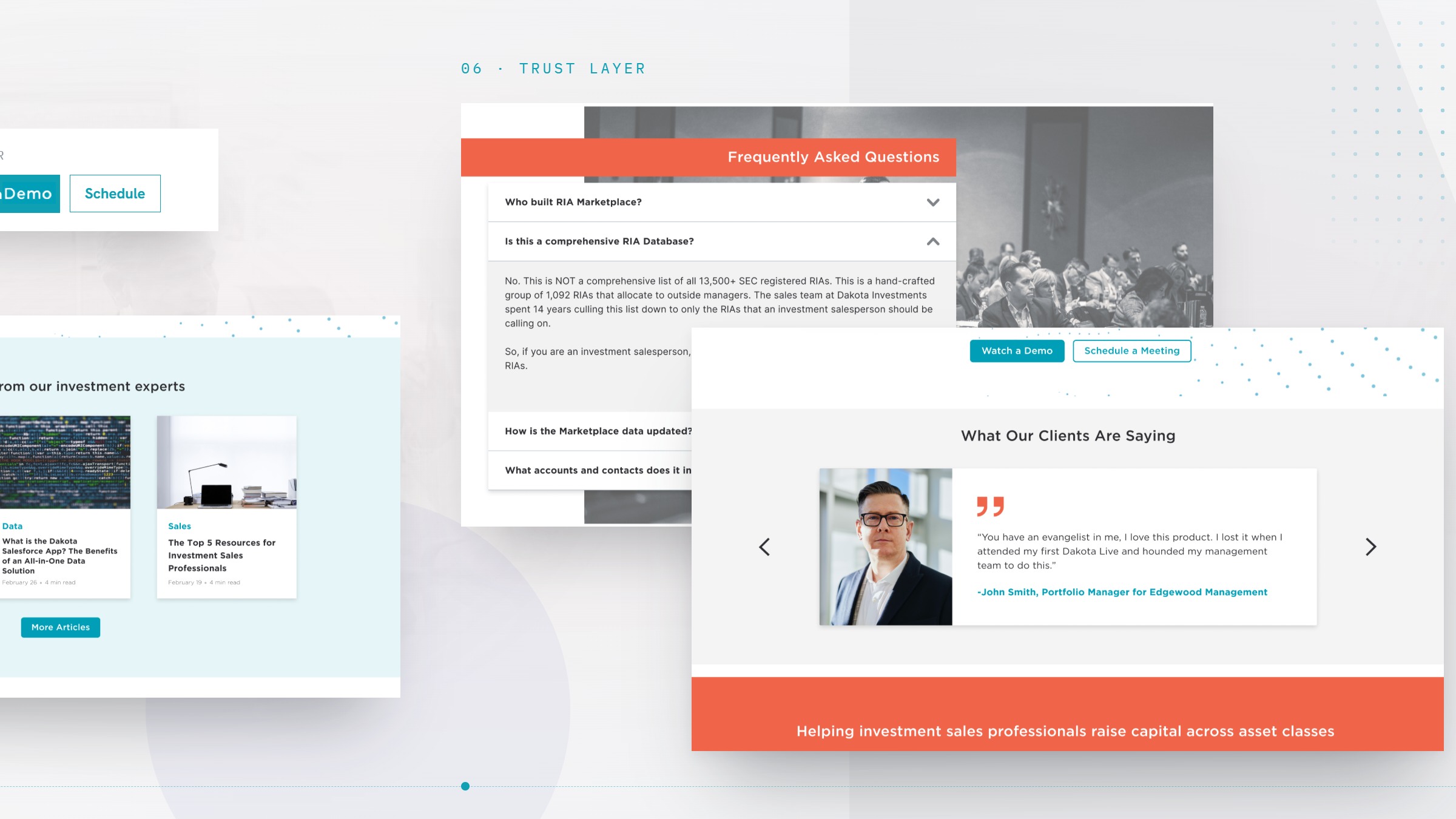
The team bios page was the second most visited page on the entire site, because prospects were going there to work out whether Dakota actually knew the industry. The testimonials, client proof and hard figures that would have answered that question sat at the bottom of the homepage or nowhere at all.

Drag / scroll →
Before / After

The same content, reordered around the thing that actually converts.

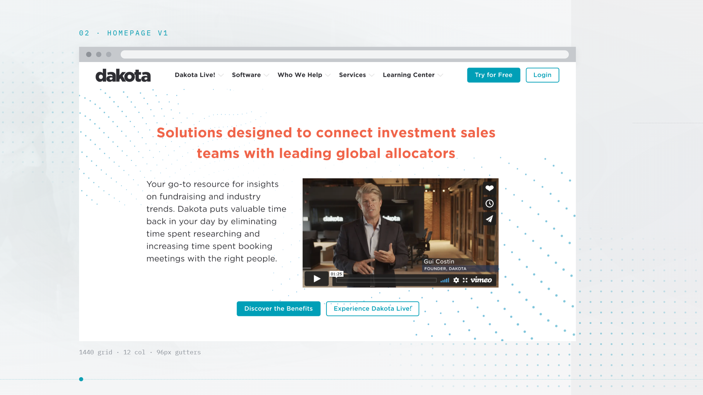
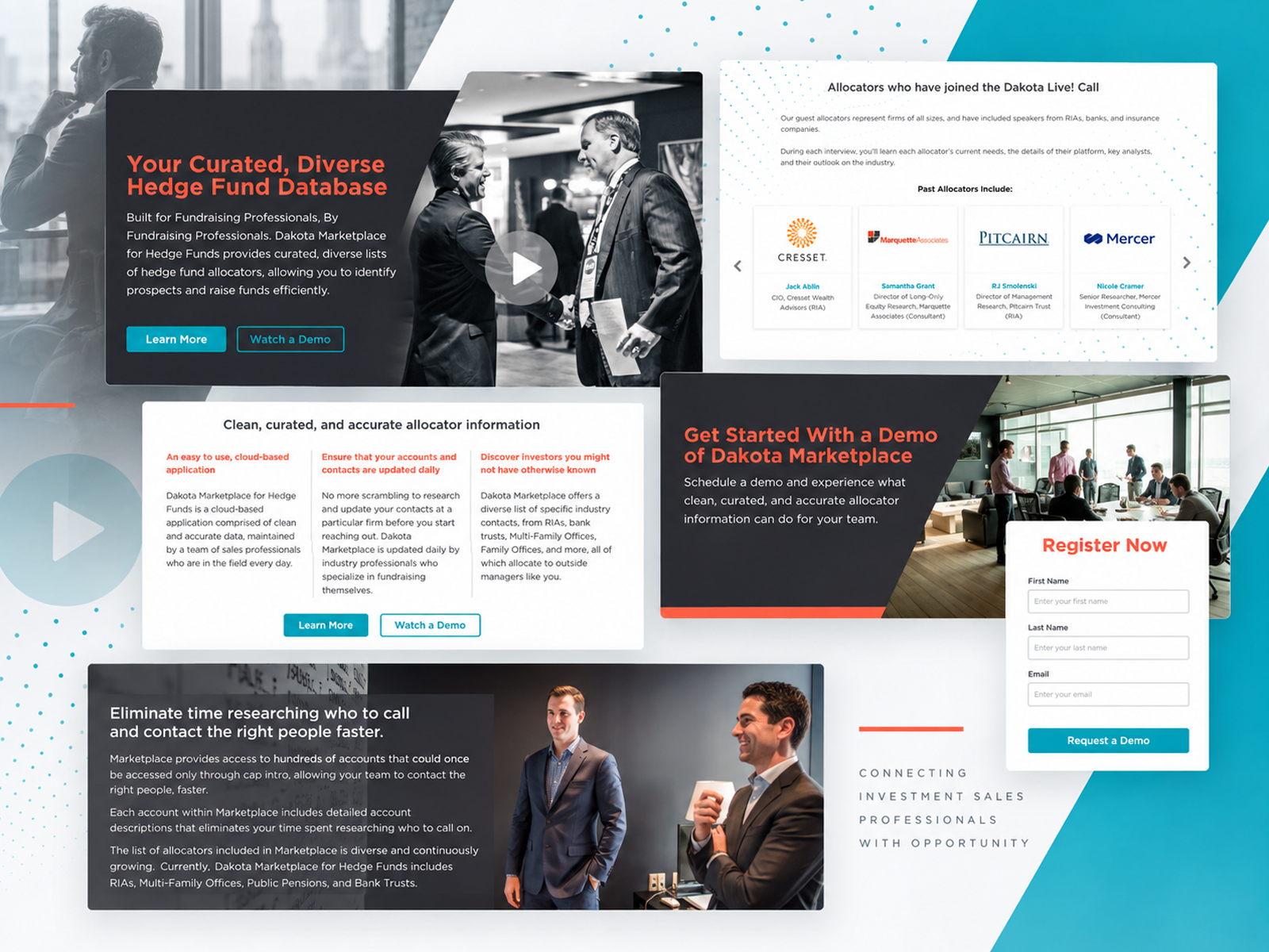
Drag the handle to compare the live 2021 homepage, a center-aligned wall of text with the offer below the fold and four calls to action splitting the click, against the tested wireframe direction: value proposition first, three clearly separated solutions, proof above the fold, and one repeated route to the Dakota Live call.

Before redesignBefore redesign
After redesignAfter redesign
Before
After WANDR
Our Role

Find the conversion that already worked, then build the site around it.

01
A full-day stakeholder kickoff workshop: problem topology, scoping canvas, empathy maps and a guided tour of the live site
02
A UX audit of the marketing site read against Google Analytics, HubSpot and Lucky Orange heatmap data
03
Competitor benchmarking across the institutional investor and RIA database market
04
Five in-depth interviews with sales leaders and investment salespeople, debriefed and clustered for patterns
05
Two research-based personas, plus experience maps for organic arrival, email arrival and the future state
06
A sitemap and page-by-page section strategy covering six page templates
07
Wireframes and copy direction, with a branding workshop that set the art direction
08
Moderated usability testing across three conversion flows, delivered as a 28-recommendation report
Research

We asked the people who raise money for a living what makes them buy.

Five in-depth interviews: three with sales leaders who approve the budget, two with the investment salespeople who would use the product every day. They ran alongside an analytics and heatmap review of the live site and a benchmark of the competing databases, so what users said could be checked against what they did.

01
85%   · Analytics review

Dakota's best traffic landed on a dead end.

Email campaigns delivered qualified prospects directly to the Dakota Live page. Only 15% went on to view another page of the site. At the same time, Google Analytics behavior flow showed organic visitors almost never discovered that page. The audience most likely to convert and the page most likely to convert them were never in the same place.

02
5 interviews   · Sales leaders and specialists

Nobody was shopping for a database.

Salespeople described losing hours a week to manually researching prospects, and needing a case strong enough to convince a boss to pay. Leaders said cost and timing decided it, and that they would not trust a claim without a number attached. Both groups asked for the same thing: proof, quickly, with as little reading as possible.

03
1 of 4   · Usability testing

Registering for the call was still the hardest thing on the site.

Four participants, two current Dakota users and two non-users, ran three flows on the prototype. The homepage and Marketplace tasks each completed 3 of 4. Registration for the Dakota Live call completed 1 of 4, because the calls to action on that page still competed with each other. That single finding drove the largest block of the 28 recommendations.

2 very different buyers.

Persona 01
Casual gamer persona

Christopher, the sales boss

Fifty-five, a managing partner who approves the budget and is not a naturally digital buyer. He runs on LinkedIn, a CRM and a lot of Excel, and decides on cost and timing. He needs a figure before he trusts a tool, and he thinks his salespeople already spend too much time on work that does not raise money. “Timing is big. Four or five other marketplaces are global and have annual subscriptions, so they are locked in.”

Budget owner
Numbers-first
Skims, never reads

Persona 02
Committed player persona

Jacob, the investment sales specialist

Thirty-five, carrying an aggressive quota after narrowly hitting last quarter's. High technology adoption, lives in Slack, Zoom and professional networks, and loses hours every week to manually assembling prospect information. He wants the tool, and he needs something he can hand his boss to justify it. “Hours spent on research, going to the right conferences, trial and error of what resonates with the investor too.”

Daily user
Time-poor
Needs internal ammunition
Persona 03
Office-context player persona

The vendor.

On the supplying side of the assessment, asked to upload the same evidence into multiple platforms multiple times, with no visibility into what happens to it next.

Supply-side
Evidence-heavy
Needs status
Persona 03
Office-context player persona

The insurance carrier.

Underwriting risk across the same supply chain and reading the same data for an entirely different purpose: comparability across a portfolio

Third-party
Risk-pricing
Needs comparability
The Strategy

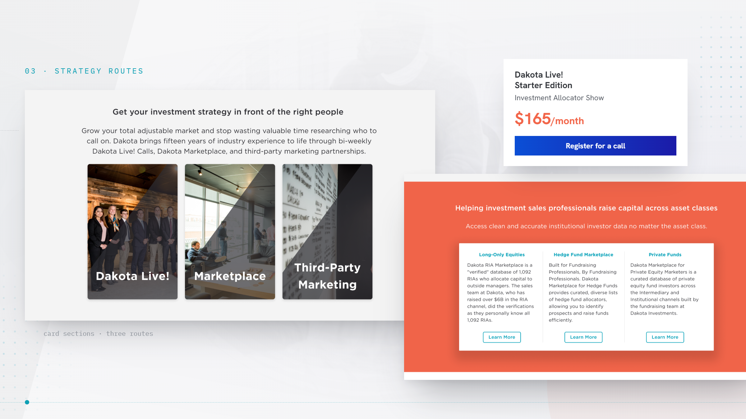
Make the Dakota Live call the destination, and every page a route to it.

The research pointed at one job. Dakota closed in the room, not on the site, and the site was pointing everywhere except the room. Three moves closed that gap before a single final screen was designed.
01

Reorder the site around the conversion that already works.

Dakota's head of sales put it plainly: if a prospect has not been on a call, the deal does not get signed. So the architecture introduced Dakota's services first, then the call, and gave every page a route to it. The demo and the free trial stopped competing with the qualifier and started feeding it.

02

Write for a skimmer, and put a number behind every claim.

Interviews and heatmaps agreed that these buyers do not read paragraphs. Sections were rebuilt around short highlighted phrases and hard figures up front, and the credibility content, testimonials, client proof and case studies, moved up the page instead of sitting at the bottom where the heatmaps showed nobody reached.

03

One call to action, repeated.

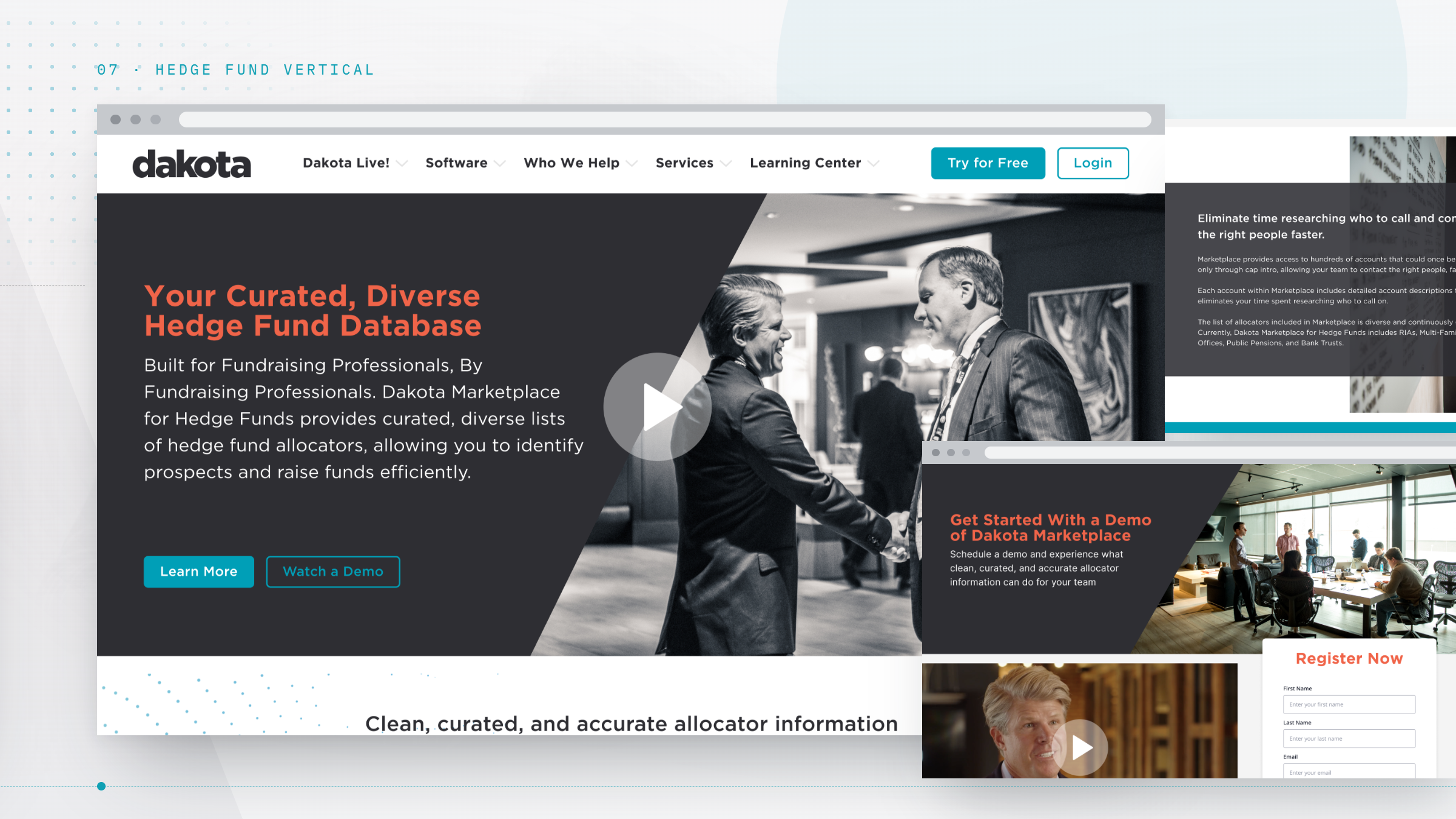
The Marketplace page already worked this way, and it was the flow that tested best. That pattern was applied across the site: a single primary action per page, repeated at the top, the middle and the close, with secondary actions demoted so they no longer split the click

Principle 01 of
→ Continue scrolling
THE KEY INSIGHT

Dakota was not selling a database. It was selling a room.

Every competitor in the category sells the same promise: a bigger, cleaner list of contacts. Dakota's own customers described something else. What they valued was the Dakota Live call, an hour with people who raise money for a living, talking about specific allocators, specific moves, specific accounts. The head of sales treated attendance as the real close, and prospects who had been in that room signed. The website, meanwhile, was arguing about data quality with every other database on the market and pushing visitors toward a free trial that handed them a spreadsheet with no guide. Reframing the site around the call was not a marketing tactic. It was the difference between competing on a feature Dakota could be beaten on and competing on a room nobody else had.

MPL redesign surface
Screen 01 of 08
→ Scroll horizontally
Outcomes

What the engagement produced.

Three months from kickoff, Dakota had a documented funnel: where the traffic leaked, who was on the other side of the screen, a rebuilt architecture across six page templates, and a ranked list of fixes validated with real users before any of it was built.

01 · DIAGNOSIS
85%
Drop-off traced to a single page
analytics, heatmaps and behavior flow
02 · EVIDENCE
2 personas
A buyer defined by research, not assumption
from five in-depth interviews
03 · BLUEPRINT
6 templates
Sitemap, section strategy and wireframes
04 · VALIDATION
28 fixes
Ranked and tested before build
three conversion flows, four participants

Client Voice

In their words.

“
We came to Wandr because our website was not converting and nobody could tell me why. They read our own analytics against interviews with the people we sell to, and showed us that the traffic we were paying to generate was landing on one page and leaving. Our sales team has always known that nobody signs without getting on a Dakota Live call, and Wandr was the first outside team to look at our site and say the whole thing should point at that. Then they tested it with our own customers and non-customers before anyone built anything, which is not how this usually goes.
Replace · First Last
Title · MPL Gaming
Up next

Another story worth reading.

Buildbox case study preview
Next Case Study

Synchrony/loop

No code gaming
·
SAAS
Read next case