Do A Dollar
Three weeks into development, ten core features were standing on staging. Nine months from design kickoff, Do A Dollar was live in production and moving real dollars.
Fifteen months, from a founder’s sketch to a platform taking dollars.
A giving platform built on the smallest amount nobody would miss.
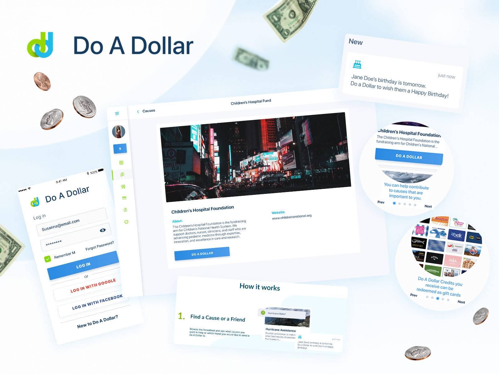
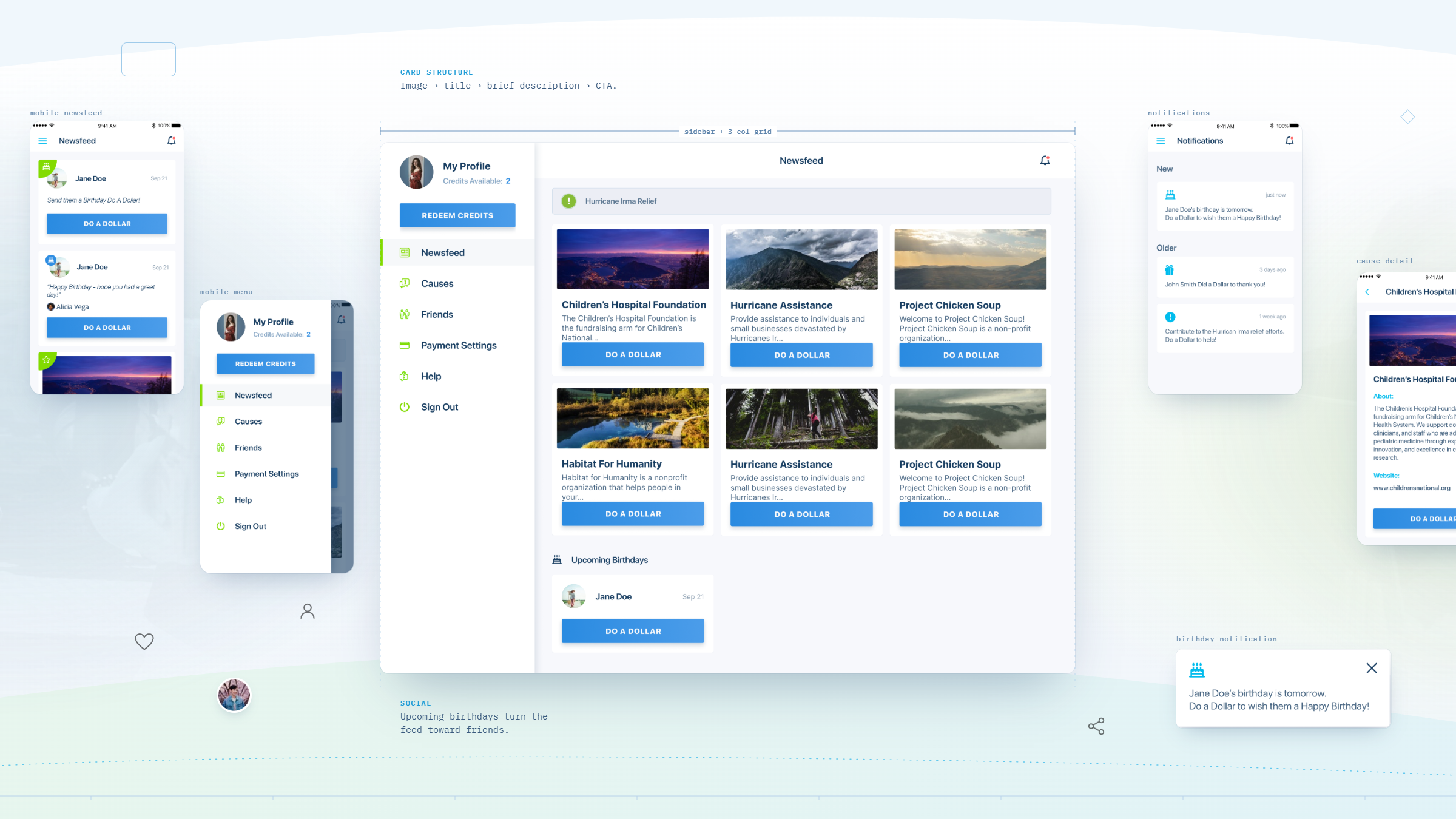
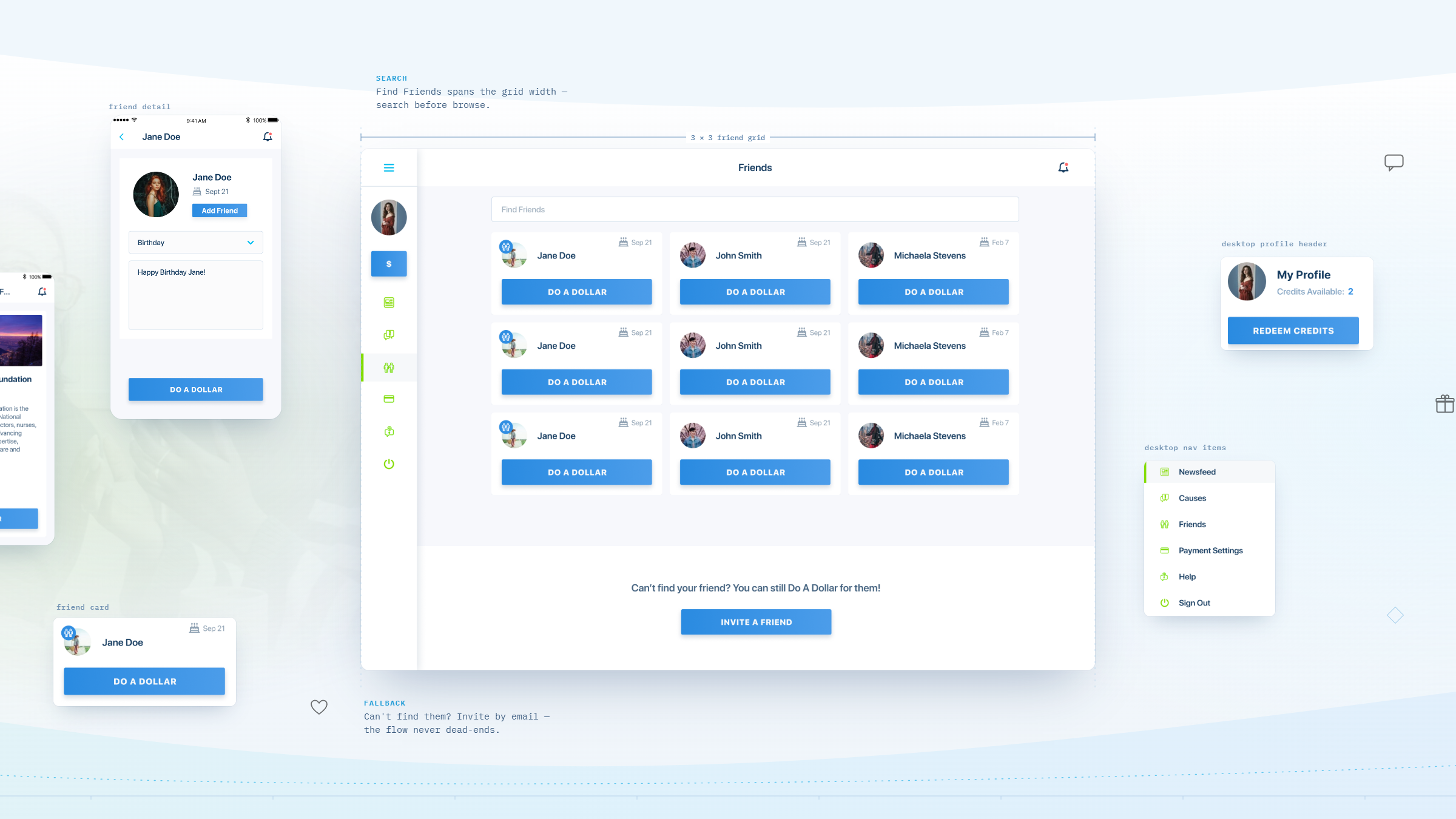
Do A Dollar was built on a single conviction, printed under its CEO’s name on every email he sent: the power of a dollar can change the world. The product turned that line into a mechanic. Users browse a feed of causes, tap once to give a dollar, and see the giving their friends are doing. A dollar is small enough that nobody has to think about it, and repeatable enough that it can compound.
Jeffrey A. Sesol and Ronald Vergara came to Wandr in January 2018 with an NDA, an Adobe XD file, and an investor conversation that had not closed yet. They had the conviction and the concept. What they did not have was a product anyone could use, or a demo anyone could believe.
A conviction, a static file, and a fundraise that depended on both becoming real.
Do A Dollar had to solve two problems at once: build a platform that could actually move money to nonprofits, and produce something convincing enough to fund the build in the first place.
The product existed only as a static file.
What arrived in January 2018 was an Adobe XD file and a pitch. There were no flows, no states, no sense of what happened after a user tapped give, and nothing a developer could estimate against. Everything downstream, the build quote, the timeline, the investor demo, was waiting on somebody turning a concept into a product.
The money to build it depended on the design of it.
Through the spring of 2018 the kickoff was pushed back repeatedly while the founders waited on investor funds that kept not arriving. The design was not a deliverable that would follow the funding. It was the asset that had to go and get it.
A dollar is easy to give and hard to move.
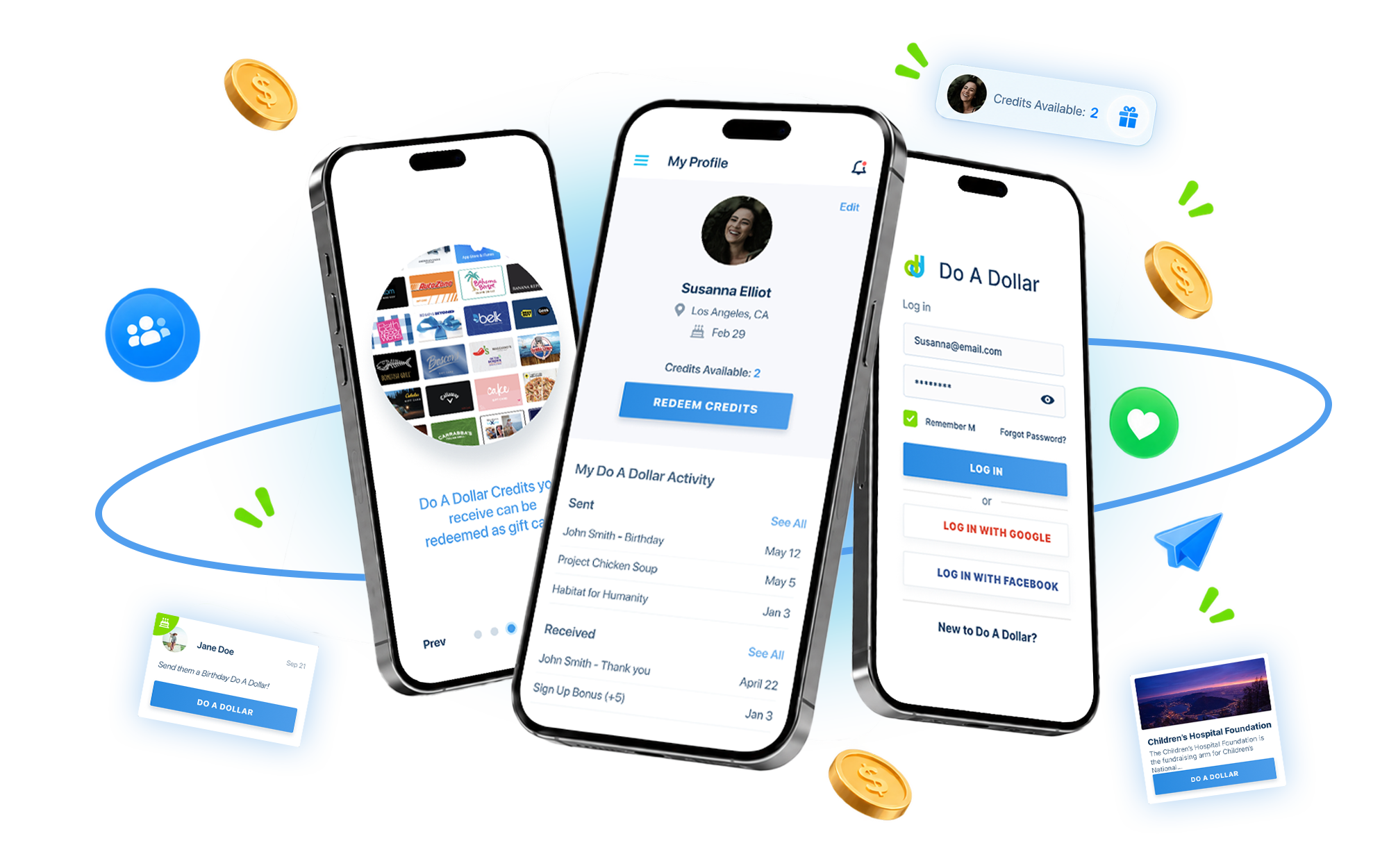
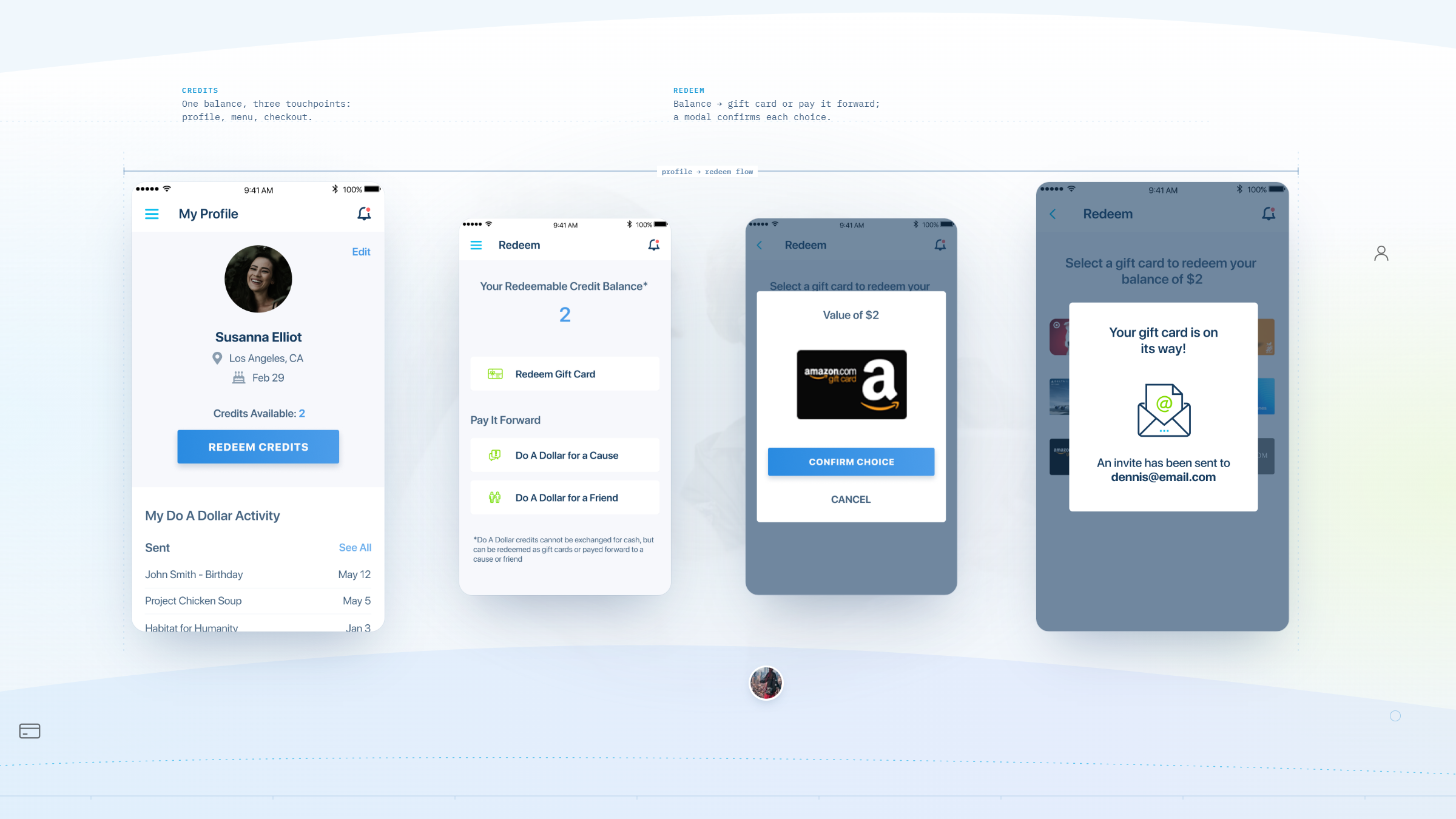
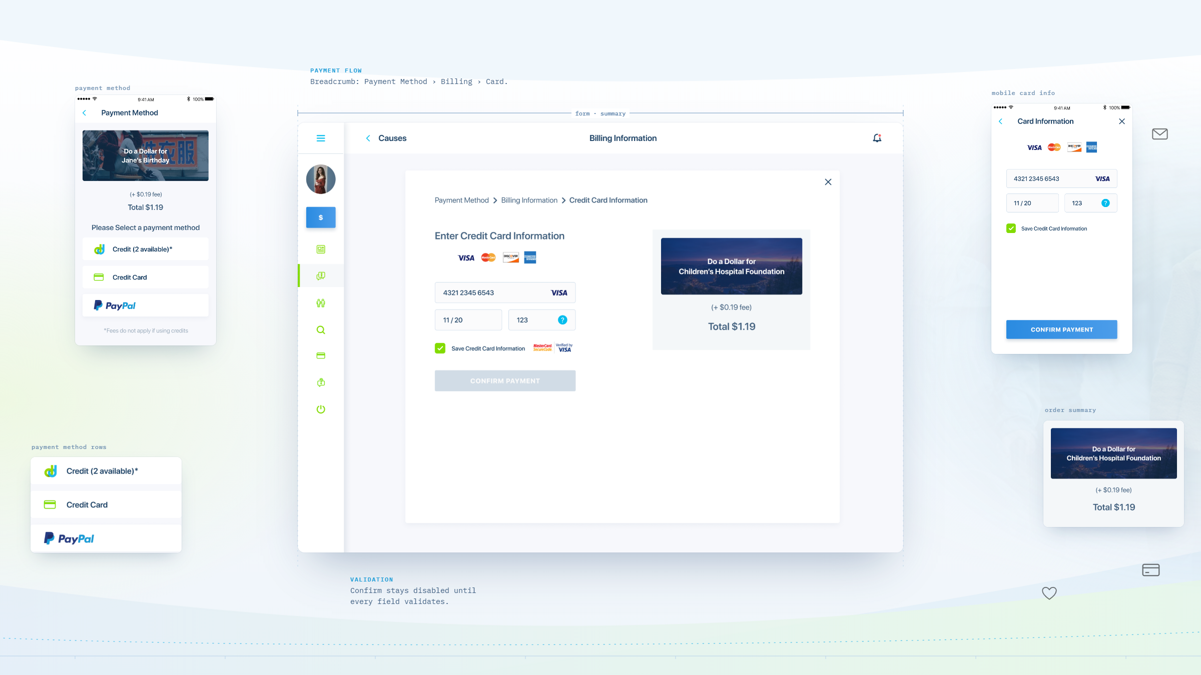
Behind a one-tap gift sat real payments infrastructure: a central account managed through PayPal, funds disbursed out to individual causes, payout details validated per cause, and a redemption path through Tango Card. The simplest possible gesture on the surface required the full apparatus underneath it.
New users were stalling at the front door.
Once the platform was live, the founders watched people arrive and stop. “When they go to the login page, people are getting confused as to what to do to register,” Jeff wrote in March 2019. The flow never told them plainly to enter an email and set a password, and never told them to go look for a confirmation email. Every user lost there was lost before they had given anything.
Giving had to feel like something.
The other feedback was blunter. Shown around to friends and prospective partners, the early interface landed flat: it needed “more pop, something that makes people go wow,” because right now “they find it boring and drab.” For a product whose entire proposition is emotional, a competent interface was not a passing grade.
Same platform, rebuilt around the moment someone decides to join.
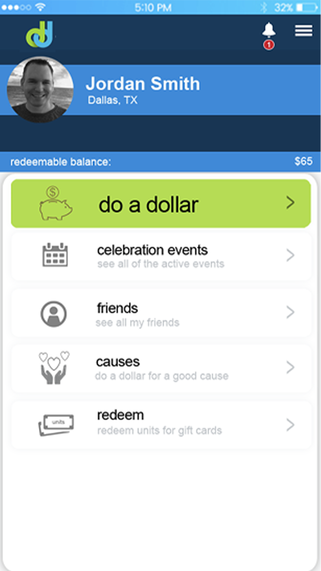
Drag the handle to compare the original login and registration screen with the redesigned onboarding, where signing in with an account people already have comes first and email signup sits clearly on its own.
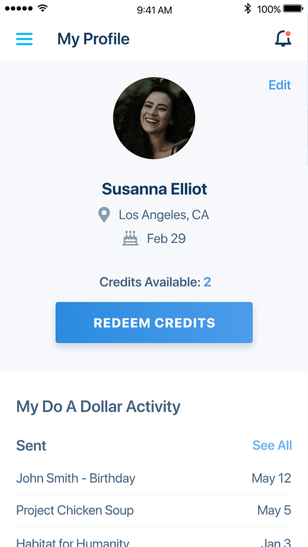
Design the product, prove it to investors, then run the build that followed.
Make the dollar effortless, and make the sign-up feel like somewhere people have already been.
Design the pitch before the product.
With funding unresolved, the first job was not a build-ready spec. It was a prototype convincing enough to close the round that would pay for the build. Design led, and the money followed it.
Borrow the front door people already know.
When registration was losing users, the fix was not more instruction. It was fewer decisions. The rebuilt onboarding put one-tap social sign-on first, in the order the founders’ own audience actually used those accounts, with email signup separated cleanly beneath it and an explicit prompt to go check for the confirmation email.
Keep the dollar one tap from wherever the user is.
The give had to be reachable from the feed, from a cause page, and from a shared link, without a detour. Sharing controls were embedded where causes were being read, not filed away in a menu.
Give the causes their own front door.
Nonprofits were given manager accounts scoped to their own cause page, with a custom URL they could send people to, so the platform could grow through the organizations on it rather than only through its founders.
The prototype was not a deliverable. It was the fundraise.
Startups usually treat design as something that happens after the money. Do A Dollar could not afford that order. The round would not close on a conviction and an XD file, and the build could not start until the round closed. So the design became the instrument of the raise: the screens that let two founders show an investor a product instead of describing one. Everything that followed, the eight workstreams, the ten features on staging in three weeks, the platform in production nine months later, sat on top of that. When a company has more belief than capital, the fastest path to a build is often a prototype good enough to pay for it.
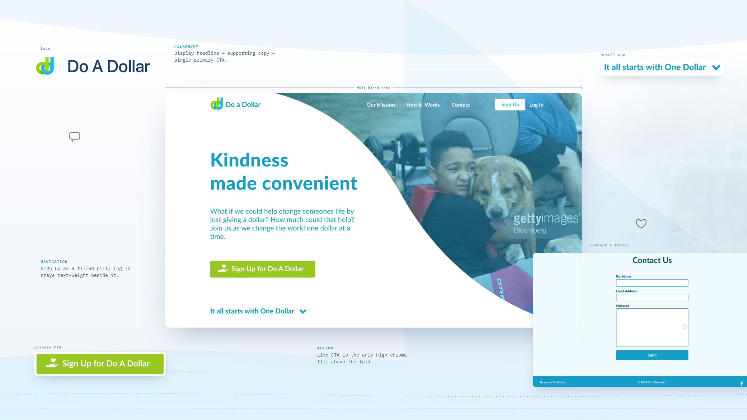
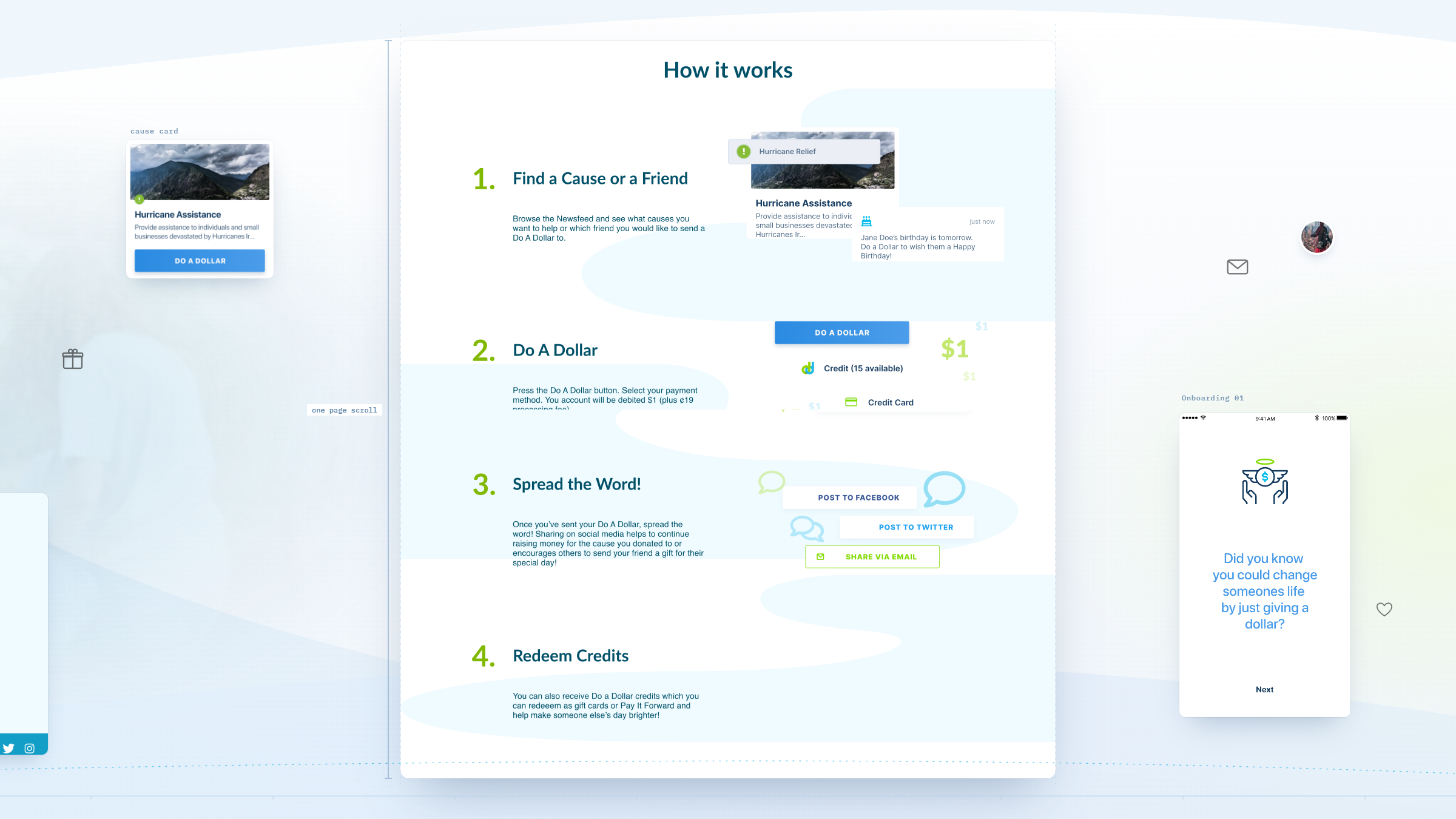
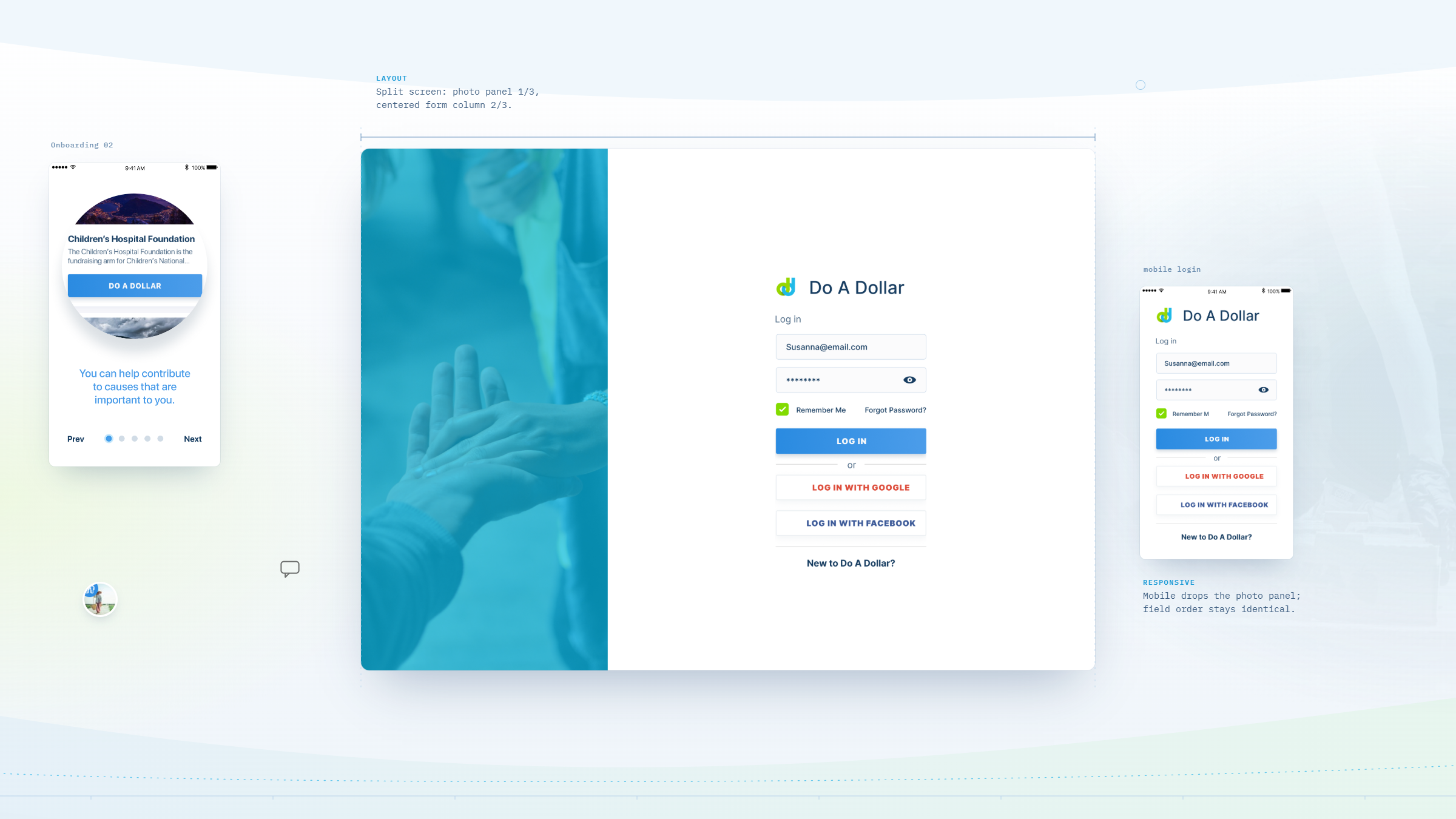
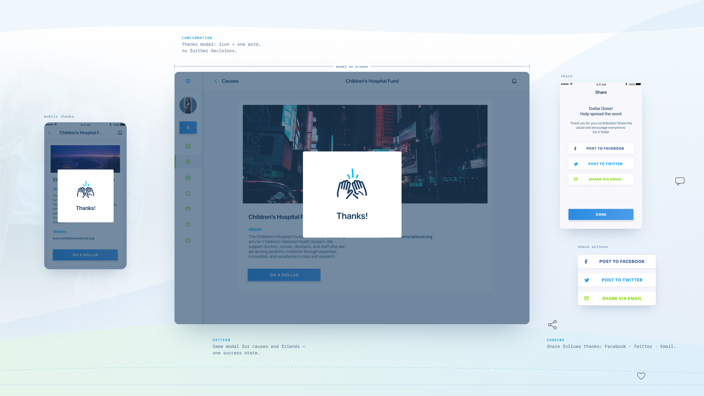
What the engagement delivered.
By the middle of 2019 Do A Dollar had gone from a static concept file to a live giving platform with real transactions running through it.
In their words.
Wandr is wonderful! I mean that. I came to them with a belief and an Adobe file and not much else, and they took it seriously from the first call. Three mornings a week we were on the phone going through screens, and not once did I feel like the small client. The prototype they built is what I walked into my Round 2 conversations with. I am not sure I close that round without it. Three weeks after development started I was clicking through the real thing on staging. And when I came back and told them our sign-up was confusing people and the look was falling flat, nobody argued with me. We were on a call the next morning and they rebuilt it. The power of a dollar can change the world. They were the first people who acted like they believed that too.