Persona 01

The performance-marketing merchant.
Hands-on and speed-first. Wants to launch fast and sell hard, and will work around rough edges to keep moving.
SPEED-FIRST
HANDS-ON
Growth-driven
A 5/5 “willing to refer” from a CTO-led team: we researched and rebuilt Sticky.io’s merchant onboarding around how merchants think, not how the platform was built.
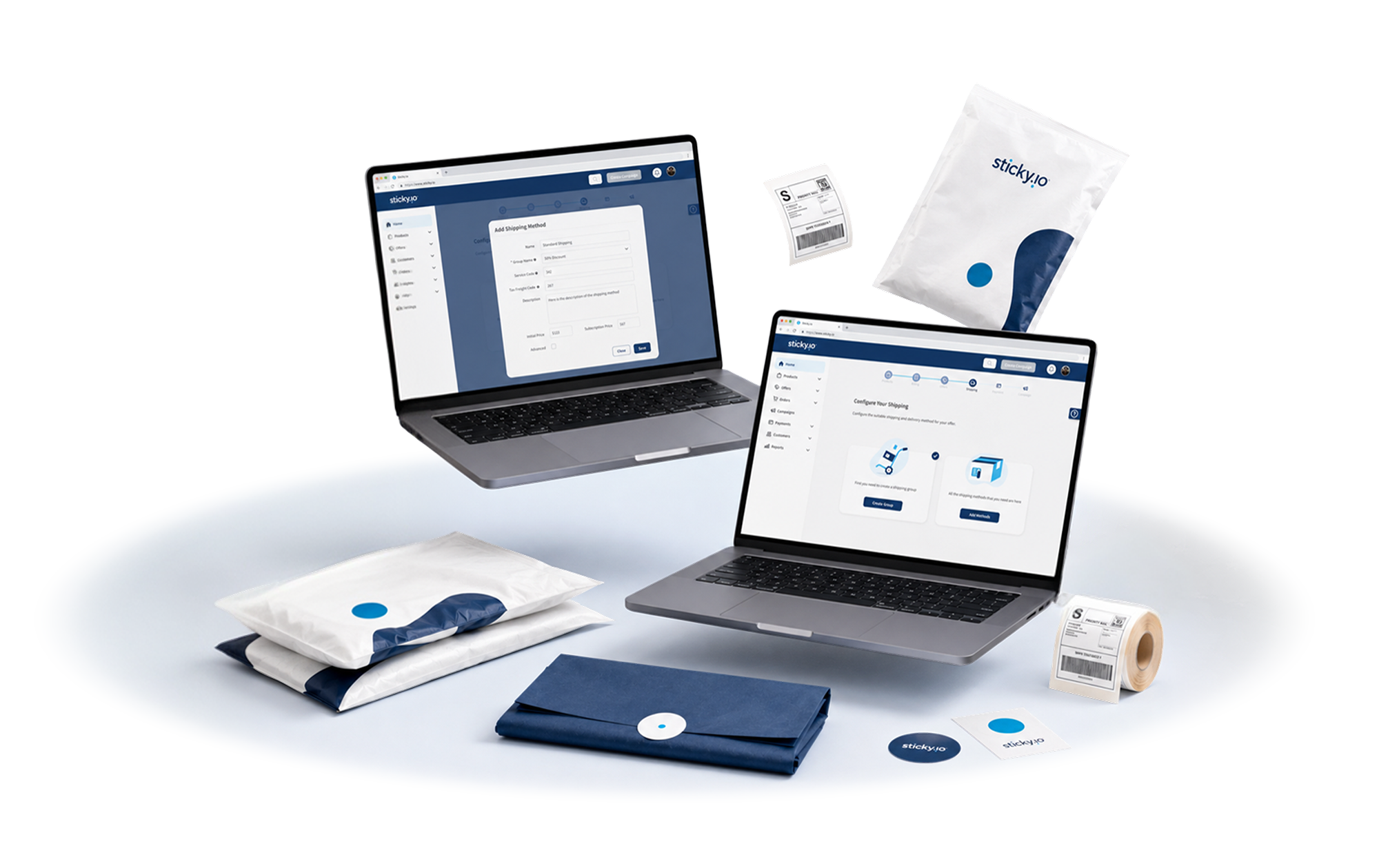
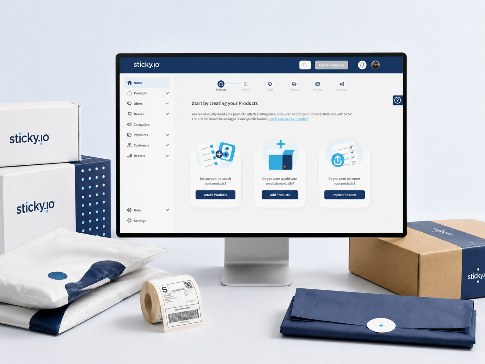
Sticky.io is a San Francisco subscription-commerce and payments platform. Founded in 2009 as LimeLight CRM and rebranded in 2020, it gives thousands of merchants the tools to run recurring billing, subscriptions, checkout, offers, and customer management from one system, with hundreds of integrations behind it. In June 2021, during our engagement, sticky.io closed a $90 million facility with Goldman Sachs Asset Management to accelerate its platform and growth.
That depth is what merchants value, and also what made the platform hard to start. Standing up a store meant configuring products, billing models, offers, payment providers, and campaigns before going live. Sticky.io asked WANDR to fix the part of the experience where that complexity hit hardest: merchant onboarding.
The onboarding was organized around the platform, Not The Merchant.
Sticky.io is powerful, and it exposed that power at setup. The team came to WANDR for hands-on help making the first-run experience clearer, evaluated by people who could also raise the bar on usability.
Merchants had to set up in the order the software was built, campaign first, then offers, then product, rather than the order a business owner thinks. Small mismatches compounded the confusion, like clicking “Customers” in the menu and landing on a “Contacts” page.
A merchant reached value through a chain of sales, discovery, and kickoff calls, a curated demo, webinars, and training, often with a solutions engineer doing the setup for them. Benchmarked rivals let merchants self-serve from a trial the same day.
Performance-marketing merchants wanted speed and were willing to work around rough edges. Branded-account merchants wanted polish, support, and no back-and-forth. One onboarding had to serve both without dumbing the product down.
The platform had features many merchants did not know existed, category names that caused confusion, and analytics they had learned to distrust. Too much was surfaced at once, and what the platform could and could not do was unclear.
MPL needed a system, not a one-off page. Without a shared design language and component library, every new segment, promotion, or market would mean rebuilding from scratch. The experience had to scale as fast as the roadmap.
Same platform, resequenced around How merchants think.
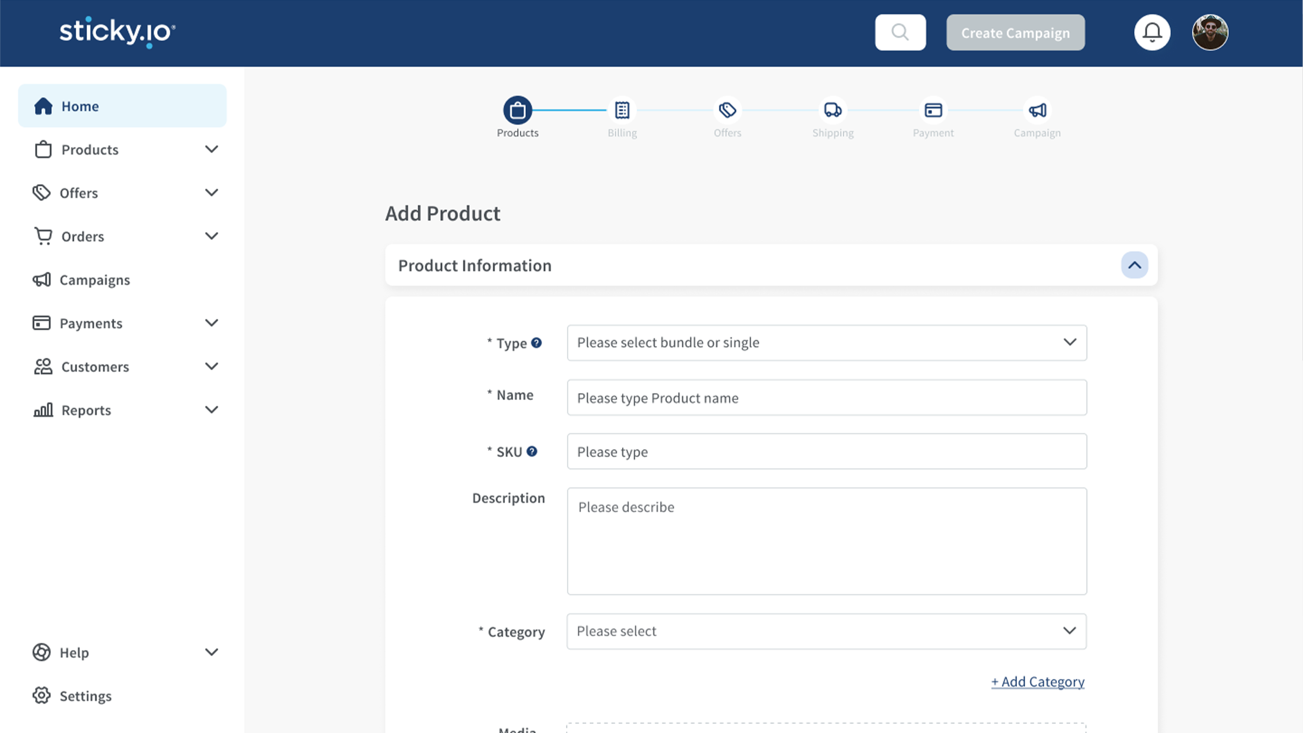
Drag the handle to see how merchant onboarding changed, from a configuration-heavy setup that followed the data model into a guided, wizard-led flow that walks a new merchant from sign-up to a live campaign.

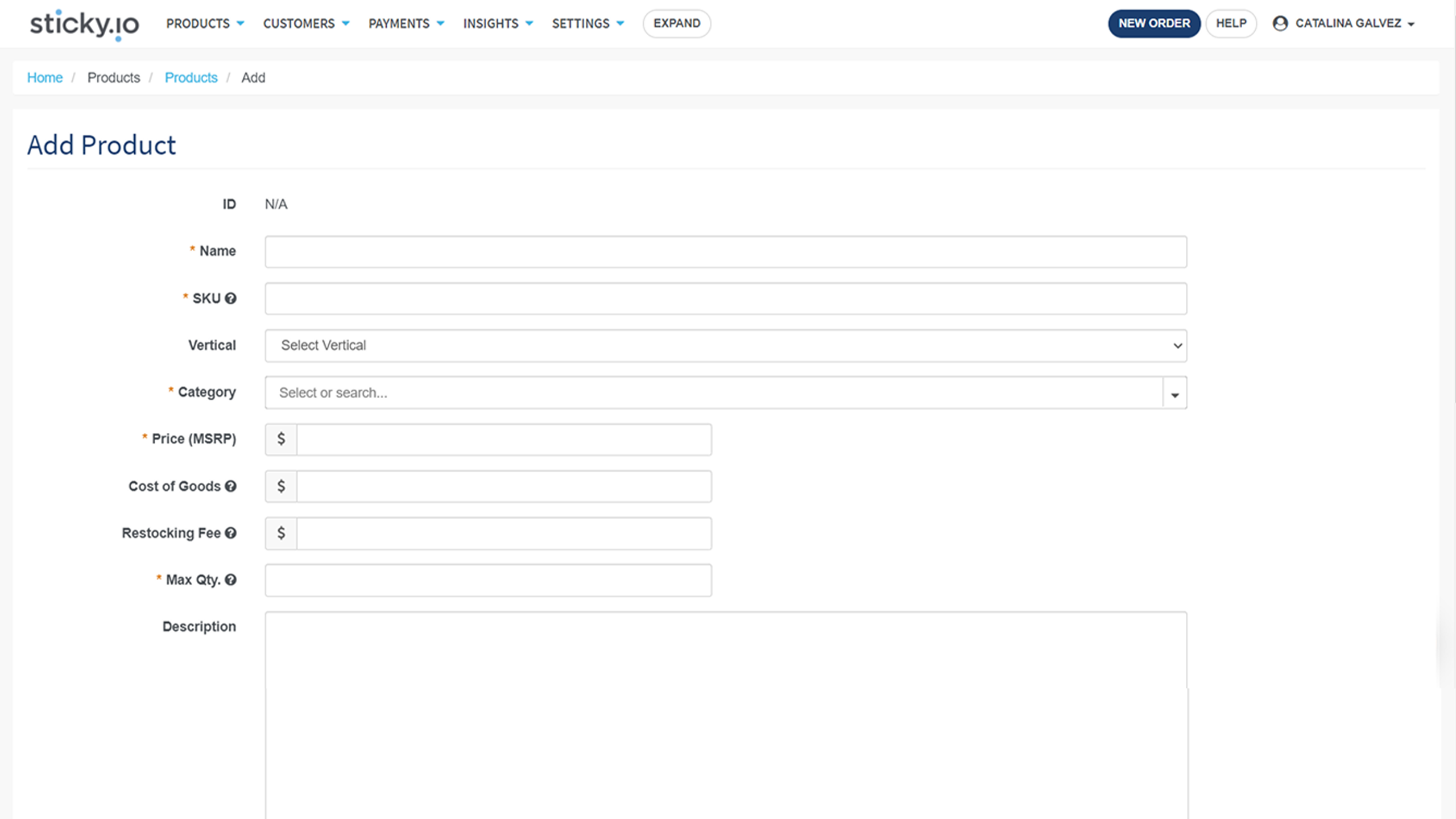

We spent the first phase of the engagement doWANDR interviewed the people closest to the problem, the internal specialists who set merchants up and often do the setup for them, then benchmarked how the best self-serve platforms handle a first run.ing three things in parallel — user research, competitive benchmarking, and an audit of the current site.
Across implementation, client support, sales, training, and engineering, the pattern was the same: getting a merchant live leaned on human hand-holding rather than the product guiding the way.
Shopify, BigCommerce, and PrestaShop start from a trial with guided onboarding, empty-state prompts, and test products, and no sales call. Stripe and PrestaShop also separate developer and non-technical paths in plain language.
Settings, products, billing models, offers, providers, campaigns, then testing. The redesign turned that shared mental model into a wizard the platform could walk merchants through.
Hands-on and speed-first. Wants to launch fast and sell hard, and will work around rough edges to keep moving.

Mature and sophisticated, with high expectations. Wants an intuitive system, real support, and no back-and-forth, and is focused on brand and lifetime value.
A wizard and help tour that walks merchants through setup in the order a business needs, so a new merchant can move from sign-up toward a live campaign without having to understand the whole platform first.
A step-by-step side navigation that follows the logical order of standing up a store, with clearer category names, so “Customers” no longer opens a “Contacts” page.
One experience that fits performance-marketing and branded accounts, with a consistent naming convention and a Stripe-style split between technical and non-technical paths so every merchant finds their footing.
The onboarding mirrored the database, not the merchant.
As one sticky.io stakeholder put it in discovery, the platform “requires users to start with creating a campaign, then offers, then product... the UX reflects the technology and data model, not how clients might think about their business.” The power was never in doubt.
The fix was to resequence the first run around the merchant’s mental model and guide it, so setup felt like running a business rather than navigating a database. And with a demanding, technical buyer, earning that redesign took senior client management as much as strong design.
The engagement was reshaped from a high-level audit into hands-on execution, and a CTO who had moved to wind the work down ended it thrilled.
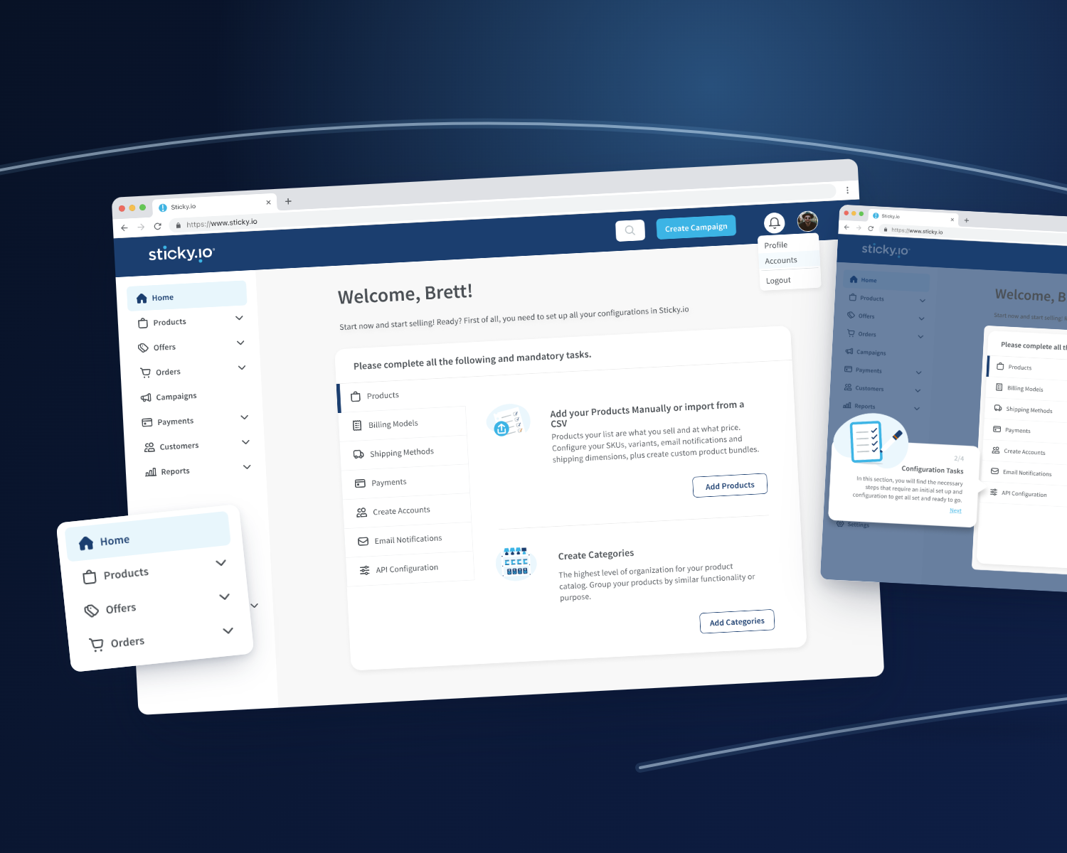
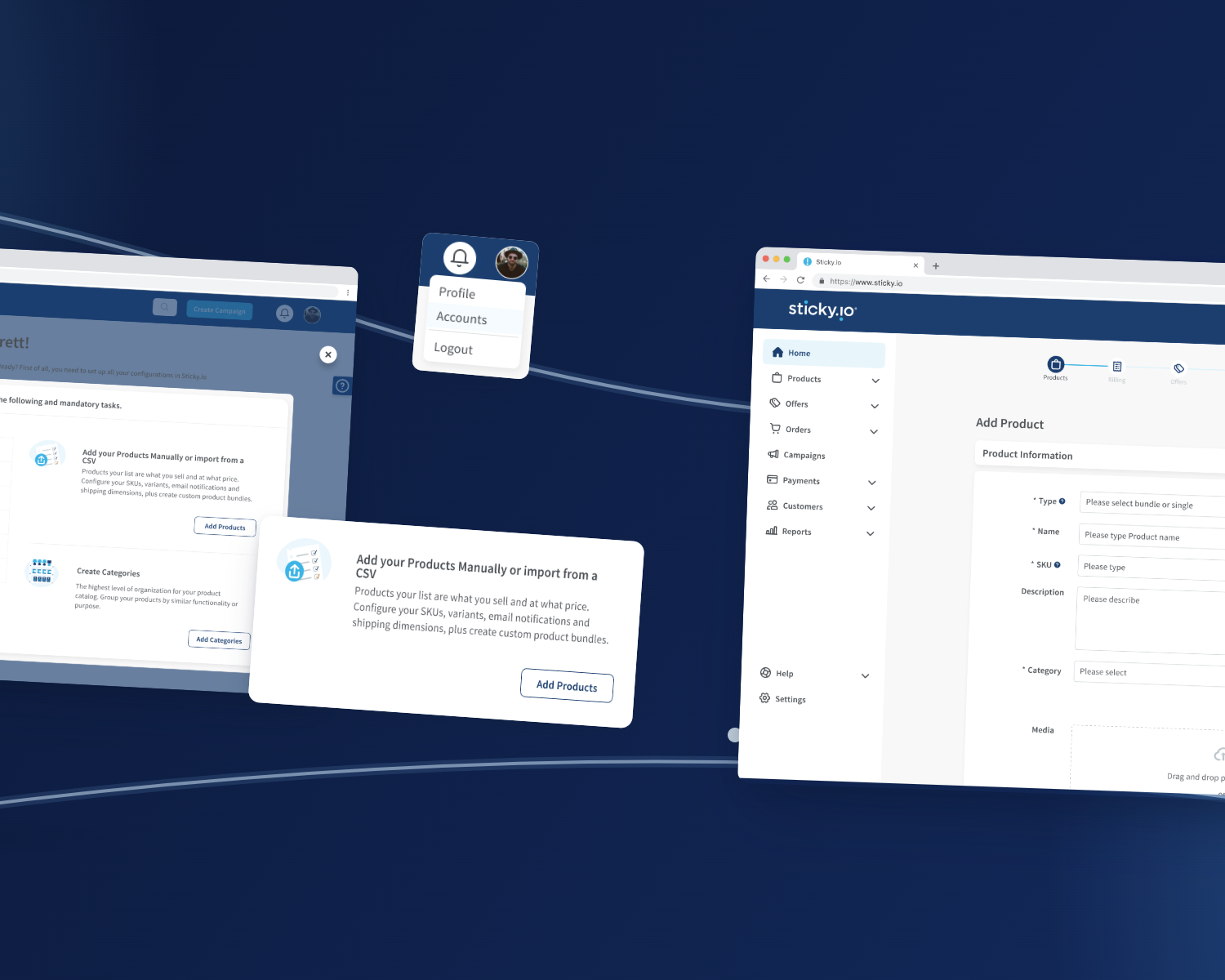
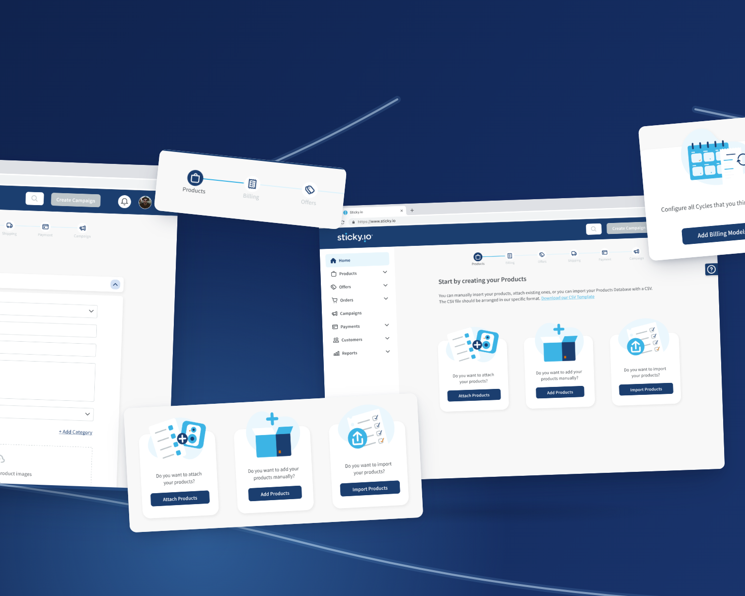
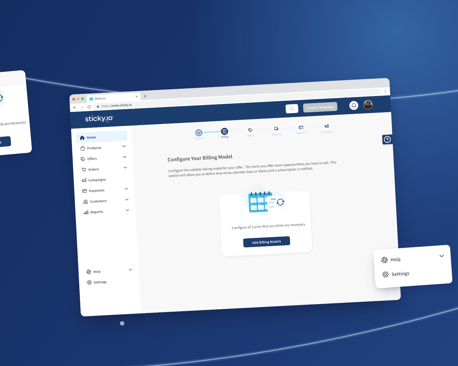
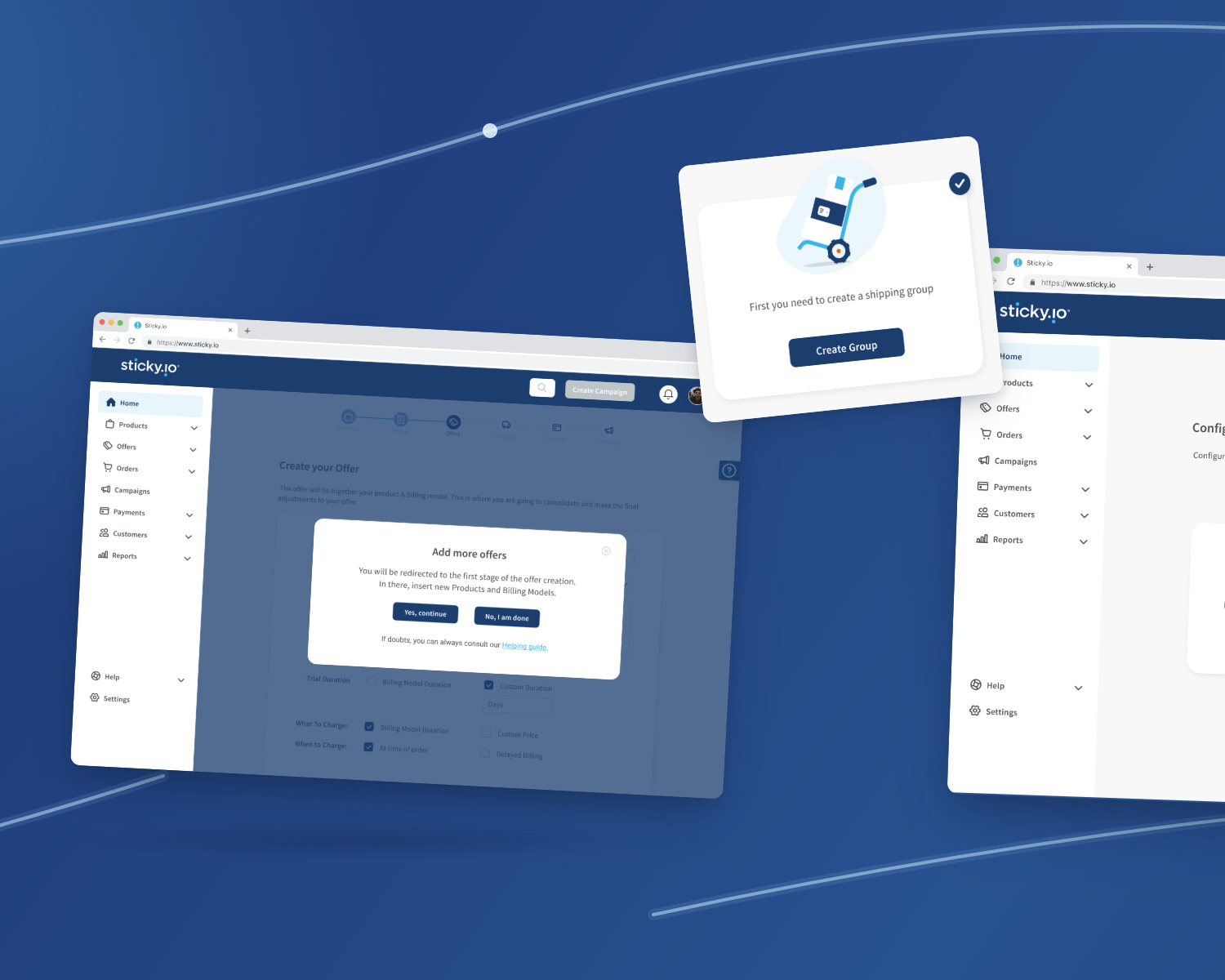
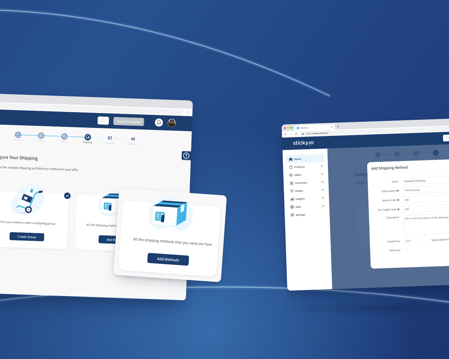
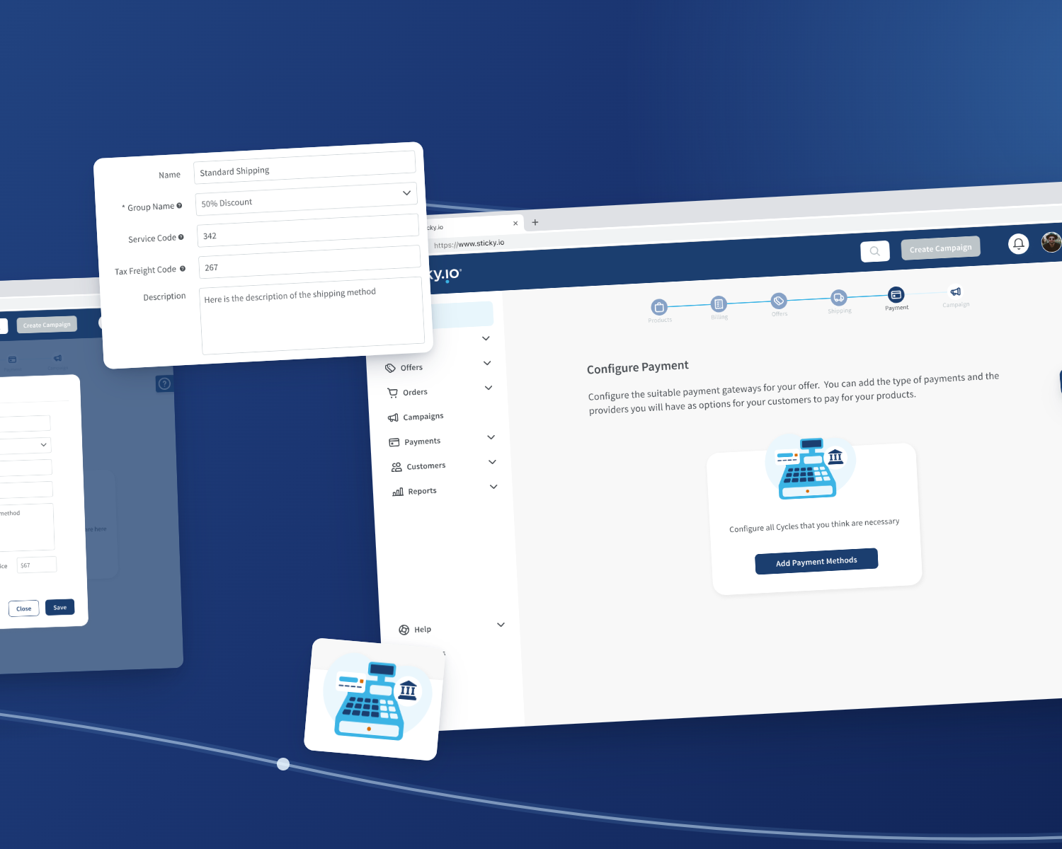
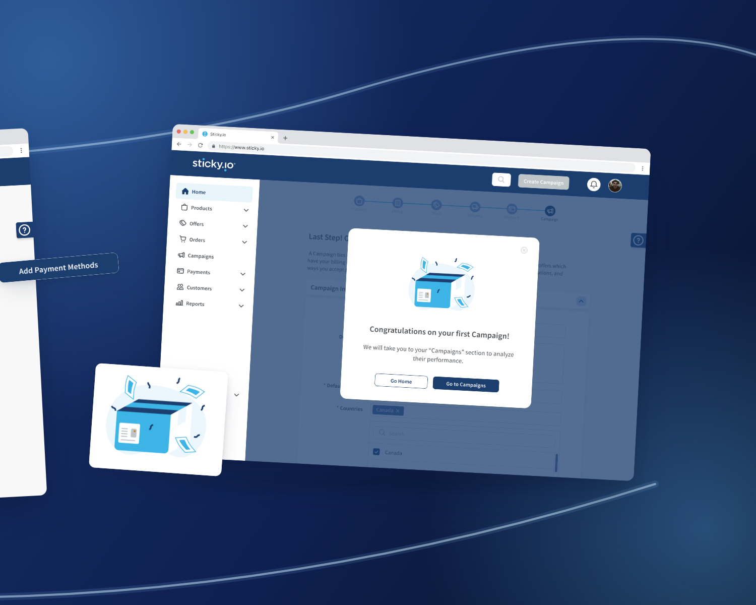
By the end of the engagement, sticky.io had a rebuilt merchant onboarding experience, a delivered design system, and a relationship its CTO wanted to continue.
While their skills were valuable, it was ultimately their client management and interaction that impressed us.