Persona 01

Consistent.
Donating is routine, part of the monthly outgoings, budgeted or not.
habitual
budgeted
monthly
80% of usability testers mistook DonateHello for a personal fundraising site. We rebuilt its identity around the fix, and the corrected MVP won over investors in its raise.
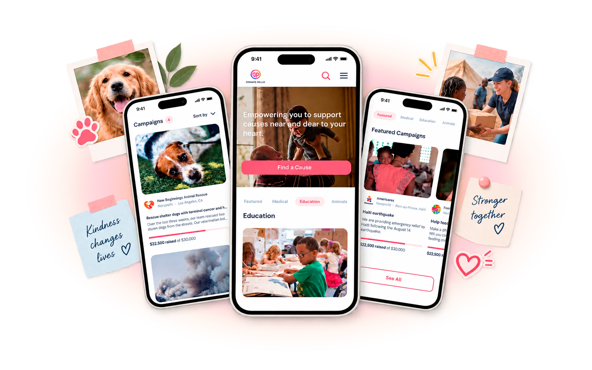
DonateHello is a donation platform built for nonprofits. Organizations list their causes on it, and donors discover, give, and track their impact through it.
That distinction sets the design bar. A donor on DonateHello makes two trust decisions at once: whether to trust the cause, and whether to trust the platform moving the money to it. The platform has to earn trust twice, once for itself and once for every organization it hosts. DonateHello arrived with a sharp point of view: beneficiaries receive 100% of the donation, and donor attribution quantifies each giver's share of the impact and credits it back to them.
A startup betting on a premise no donor Had Ever Tested.
DonateHello came to WANDR with a concept, a business model, and no evidence. Nearly 40% of donors do not fully trust nonprofits, and the platform's original answer to that, giving in cryptocurrency, was itself unproven.
Donors lacked visibility into where their money went. Without proof of impact or accountability, confidence eroded and willingness to give dropped. Trust markers existed, but read as supporting information rather than the core of the experience.
Donors met a flat list of causes with too little context to feel motivated by any of them. Functionally informative, emotionally cold. A donor who does not feel connected to a cause before being asked to give is a donor who does not give.
After donating, users received little to no update, tracking, or recognition. With no visible sense of impact, there was no incentive to return, no path to a recurring relationship, and no compounding value for the nonprofits on the platform.
WANDR ran seven scripted interviews over Zoom, four donors and three nonprofit staff, alongside a nine-platform benchmark scored on donor and nonprofit portals, e-commerce, impact reporting, and crypto payment. Asked what would earn their trust, donors converged on one thing: total visibility into how their money is spent.
All four donors interviewed hesitated on crypto. Some saw it as an investment rather than disposable income; one would give only if it converted to cash immediately, because volatility meant his gift could arrive worth less than intended. DonateHello's stated differentiator was the thing donors were most wary of.
Giving was rarely deliberate. It was set off by spare cash on a weeknight, by religious obligation, or by a piece of content that landed. One donor gave because something on a website reminded him of his grandmother. Emotional media is the trigger, not decoration.
Nine platforms including GoFundMe, Kickstarter, Indiegogo, and Cuddly were scored across ten capability dimensions, from proof of impact to crypto payment, to find the white space DonateHello could own.
Donating is routine, part of the monthly outgoings, budgeted or not.

Open to giving but without the habit. A trigger sparks it, news or a link from a friend.

Bound to one cause, usually personal. Giving is remembrance as much as generosity.
Lead with connection, not a catalog. A structured but flexible system lets donors search, filter, and explore causes by their own values, interests, and urgency, so they arrive at the giving decision already invested.
Make transparency the product, not a page. Verified profiles, real-time tracking, clear fund breakdowns, and donor attribution were embedded across the journey and surfaced as first-class features, shifting donors from blind giving to informed participation.
Strip the giving flow to essentials. Because research showed donors give on emotional triggers, engaging media was pulled above the fold, and an e-commerce-inspired “Most Needed” model let donors fund specific items a cause needs, add them to a cart, and check out.
DonateHello did not hire us to question its business model. It hired us to design one. But research kept returning the same signal: the crypto-first premise the company was built on was the single thing donors trusted least, while transparency, which the founders treated as a supporting feature, was the entire reason a donor would give. Redesigning the screens would have produced a prettier version of the wrong product. Testing the premise is what let the MVP lead with the thing donors actually wanted, and that is the version investors backed.


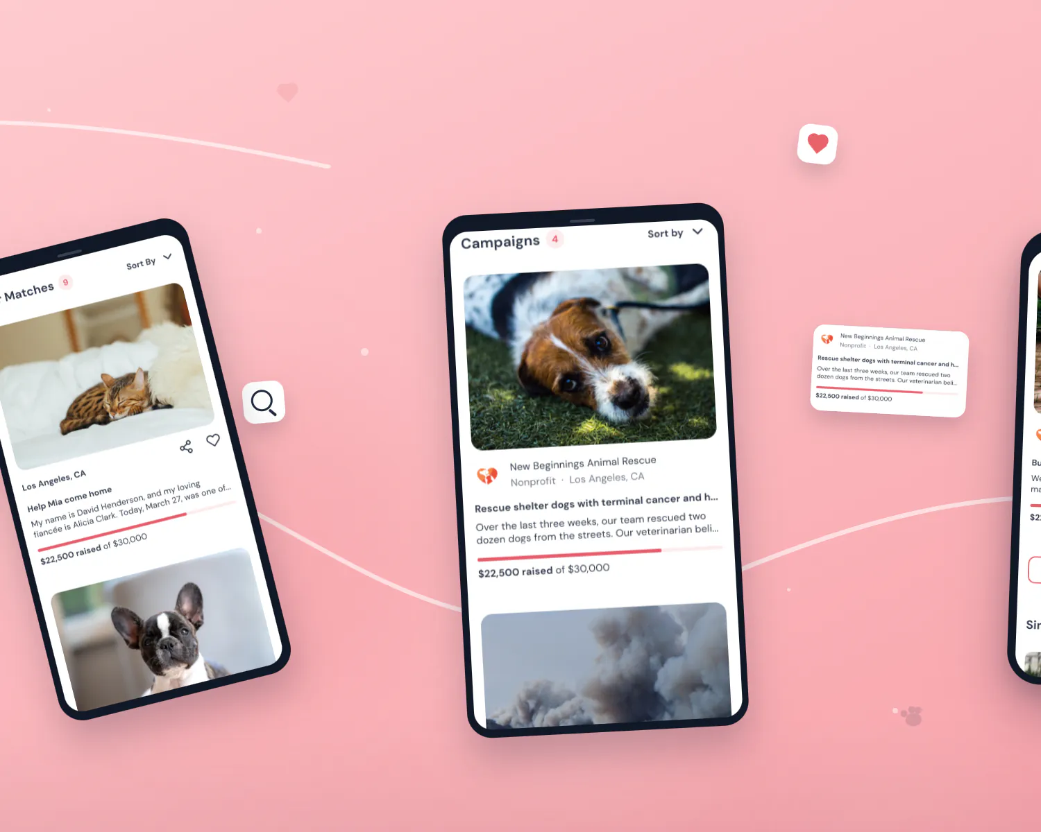


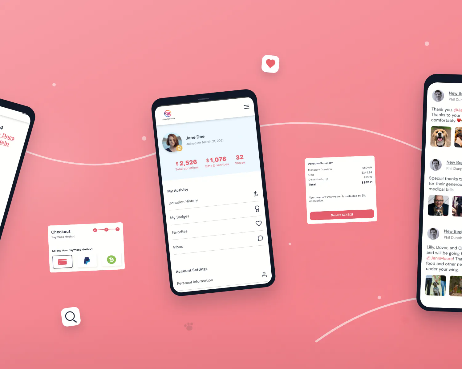
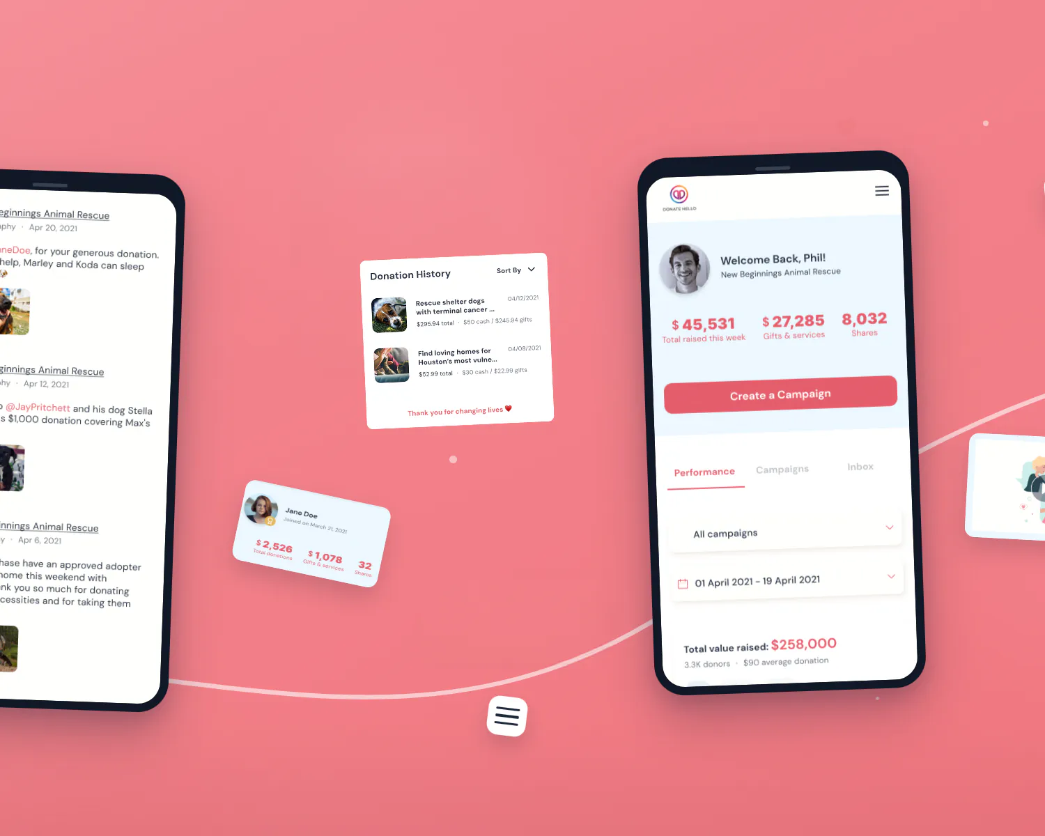

Five usability sessions turned a set of assumptions into an MVP with a corrected identity, a defensible model, and a story investors could follow.
Figures are from WANDR's five-session usability study and seven research interviews, 2021. Percentages are shown with raw counts. No post-launch business metrics exist for this MVP engagement.
Working with WANDR changed how we think about product design entirely. They didn't just execute on what we asked for, they pushed our thinking further than we expected and brought a perspective we didn't know we were missing. The result was a product experience that resonated immediately with our investors.