Glidian
At eight paying customers, Glidian hired us to design the website and investor deck it would grow into. It now runs over 1 million prior authorizations a year, inside Infinx.
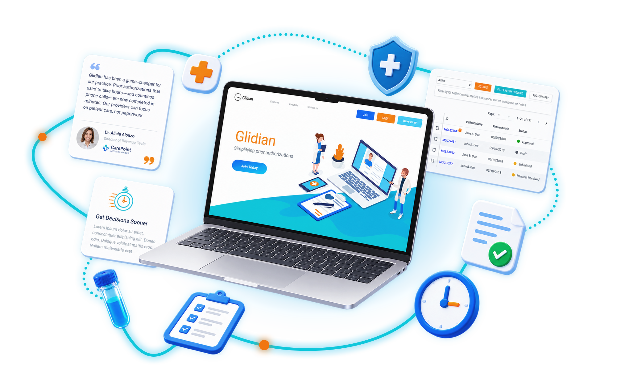
Two engagements. One company that kept growing.
The paperwork standing between a patient and their treatment.
A prior authorization is the approval an insurer must give before a high-cost treatment goes ahead. Without it the provider does not get paid and the patient does not get treated. Glidian was founded in 2016 by repeat entrepreneurs out of Johns Hopkins and Stanford to automate that approval, submitting and tracking authorizations electronically through one dashboard instead of a fax machine and a hold queue.
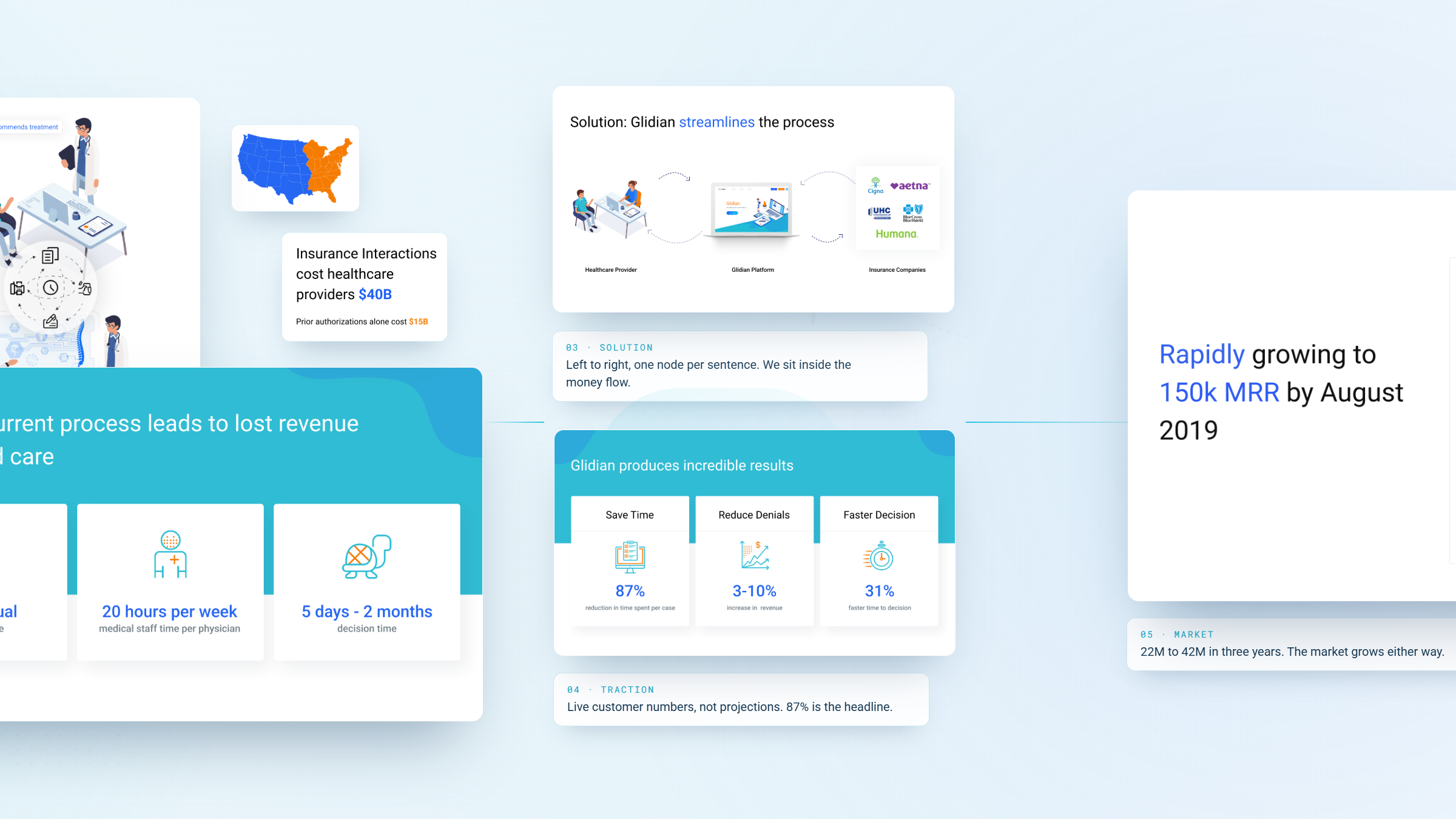
The numbers Glidian was selling against were brutal. By the company's own market analysis, insurance interactions cost United States healthcare providers roughly $40 billion a year, about $15 billion of it in prior authorizations alone. The process was 82% manual, ran on fax and phone, consumed around 20 hours of medical staff time per physician per week, and took anywhere from five days to two months to return a decision.
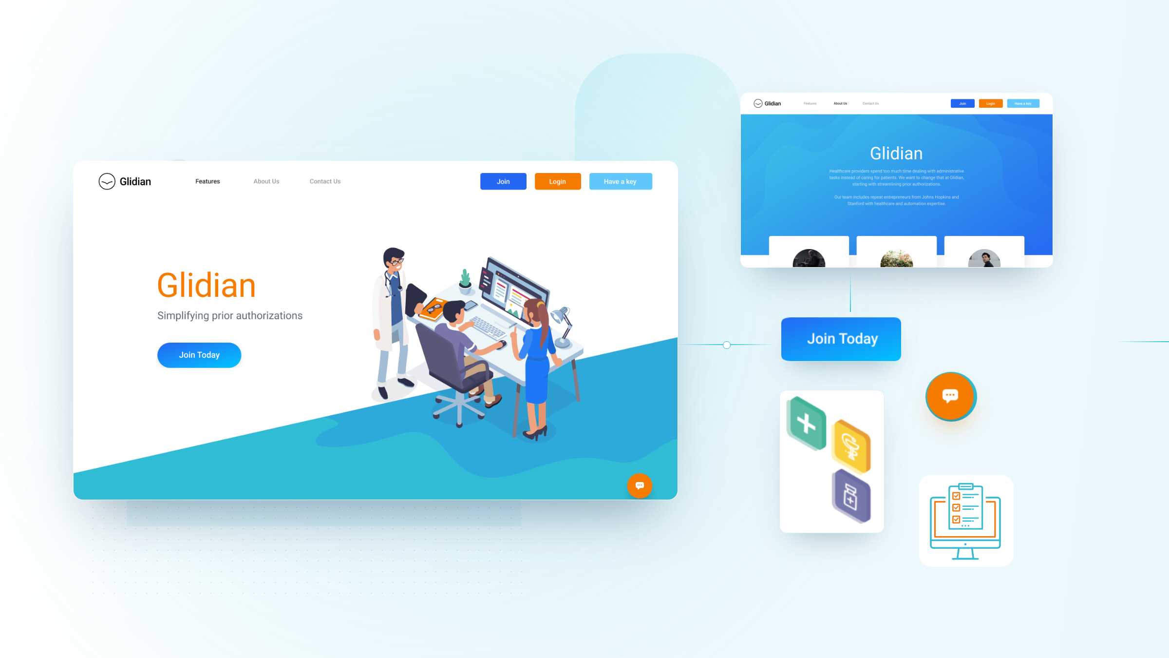
When WANDR was engaged in April 2018, none of that was visible on glidian.com.
A platform that solved a real problem, on a website that could not explain it.
Glidian had a working product, paying customers, and a website that failed the one job it had: making a skeptical healthcare buyer understand an invisible, multi-party process and trust the company removing it, in a single scroll.
An invisible product.
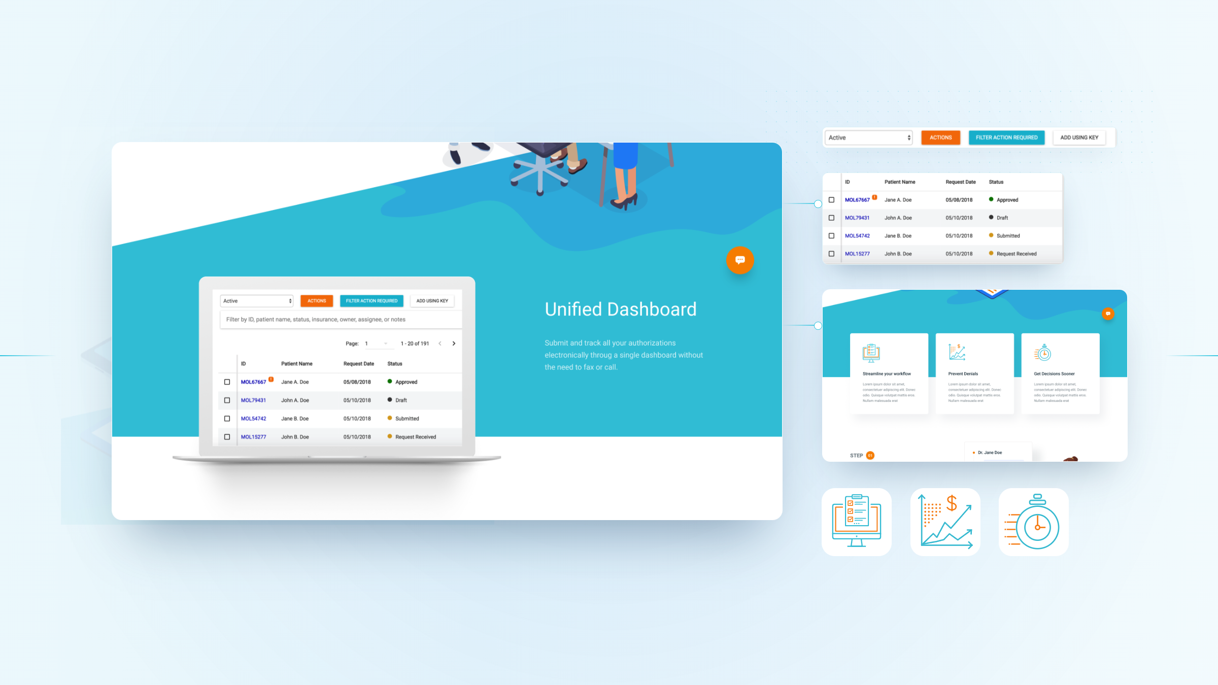
Everything valuable about Glidian lived behind a login, in a dashboard no prospect could see. The site described features in words when the only convincing argument was the interface itself: authorizations from multiple insurers in one queue, each with a live status. The redesign had to put the product on the page.
A category most buyers cannot picture.
Prior authorization is a three-way conversation between a provider, a payer, and a patient's treatment, conducted largely by fax. Nothing on the old site mapped who talks to whom, so the value of sitting in the middle of that exchange never landed. The client's brief asked directly for a graphic that showed a provider connecting through Glidian to nationwide health plans.
No customer proof to lean on.
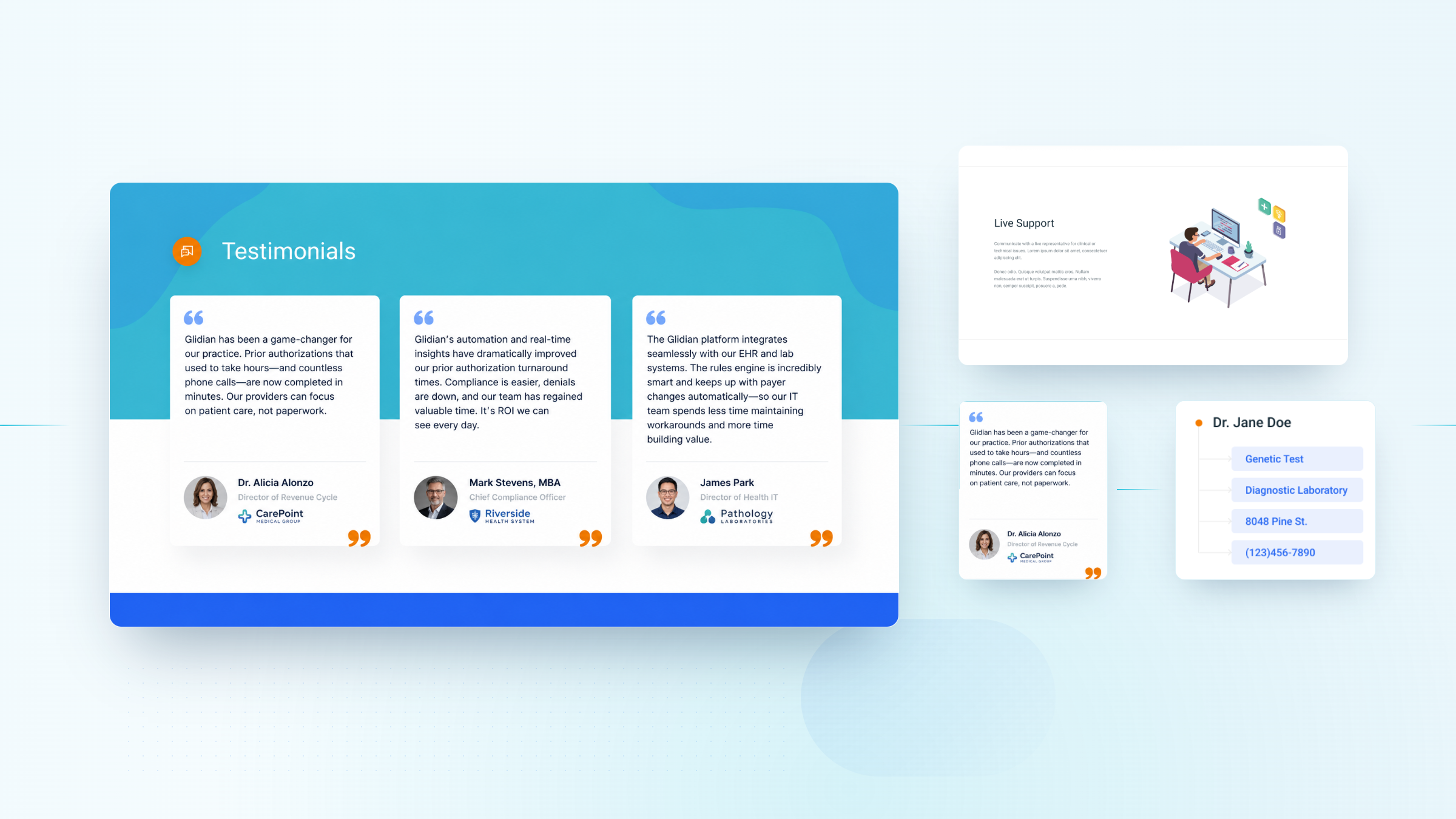
At eight paying customers, Glidian had no marquee logos, no published results, and nothing quotable from a named client. The testimonial slot in its own mockup was still a placeholder. Every signal of credibility had to come from the design instead: a founding team page carrying real credentials, security and HIPAA compliance made visible, and an interface that looked like it already ran at scale.
Selling into healthcare, judged against fintech.
The reference sites Glidian admired were Stripe, Gusto, Color, and Sumo Logic. The site had to hit a modern software bar for a founding team pitching Silicon Valley investors, while signaling HIPAA-grade security and clinical seriousness to a compliance-minded hospital buyer. Those two audiences pull a design in opposite directions.
Same platform, rebuilt to be understood.
Drag the handle to see how glidian.com changed, from a page that described a prior authorization platform into one that showed the process it replaces.
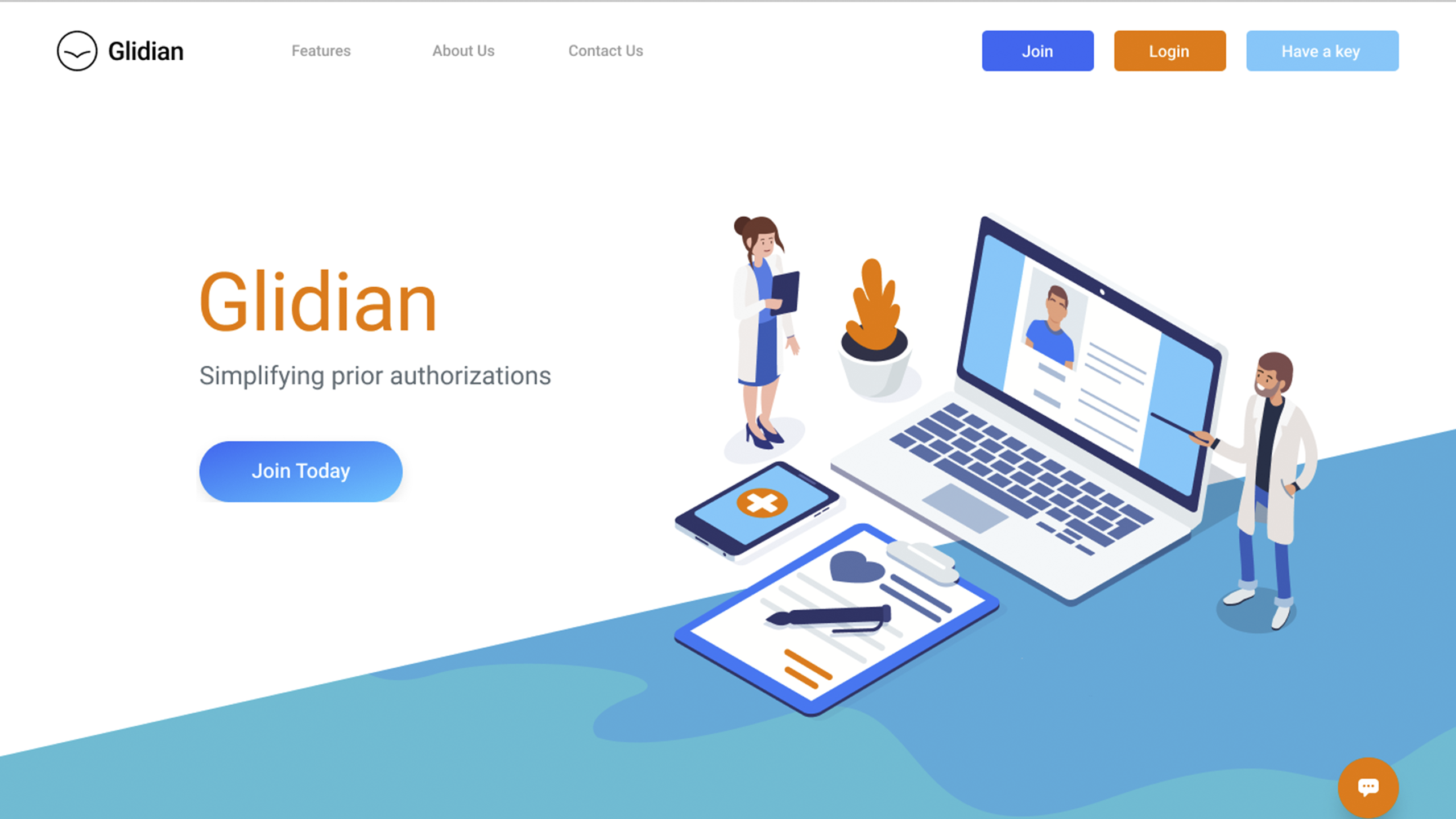

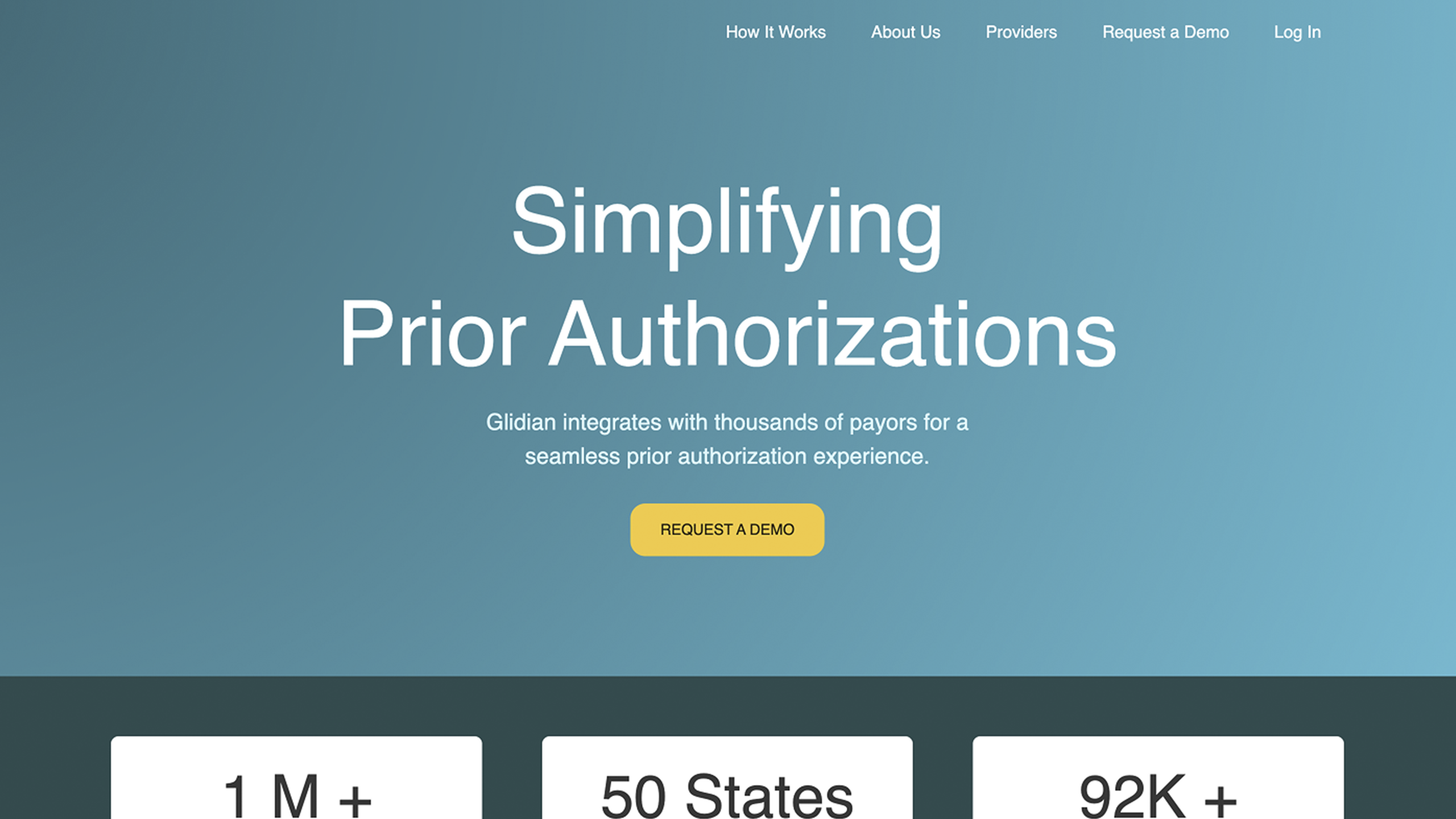

Website first. Then the investor deck.
We designed against the client's own numbers.
There was no user study to work from on a four-week build. What Glidian had instead was a market it understood cold, documented in its own brief and investor materials and sourced to the CAQH Index and a 2017 MGMA physician poll. Three figures set the design brief: the process was manual, it was expensive in staff time, and it was slow. Every graphic on the site was built to make one of those three visible.
Prior authorization still ran on fax and phone.
Glidian's analysis put 82% of prior authorizations as manual, handled by fax and telephone between provider offices and payers. That is what the site's central platform graphic was drawn to replace: a picture of a provider connecting once, through Glidian, to nationwide health plans.
Twenty hours a week, per physician, on paperwork.
Medical staff were losing roughly 20 hours per physician per week to authorization admin instead of patient care. That framed the landing page's three promises, streamline your workflow, prevent denials, get decisions sooner, as time returned rather than features shipped.
A decision could take five days, or it could take two months.
Turnaround ran from five days to two months, and a denial meant the provider went unpaid and the patient went untreated. The approvals and denials analytics graphic, and the payer-questionnaire graphic showing a requirement satisfied and cleared, were designed to make that risk legible on the page.
Show the platform. Draw the process. Look like software people trust.
Show.
Lead with the product, not a description of it. The dashboard, its live authorization statuses, and the payer questionnaire were pulled out from behind the login and made the visual spine of the landing and platform pages.
Draw.
Make the invisible process visible. A custom graphic system mapped the provider, Glidian, and the nationwide payer network as one connected path, with encryption and HIPAA compliance sitting on the line between them, so the value of the middle layer was obvious before a word of copy was read.
Trust.
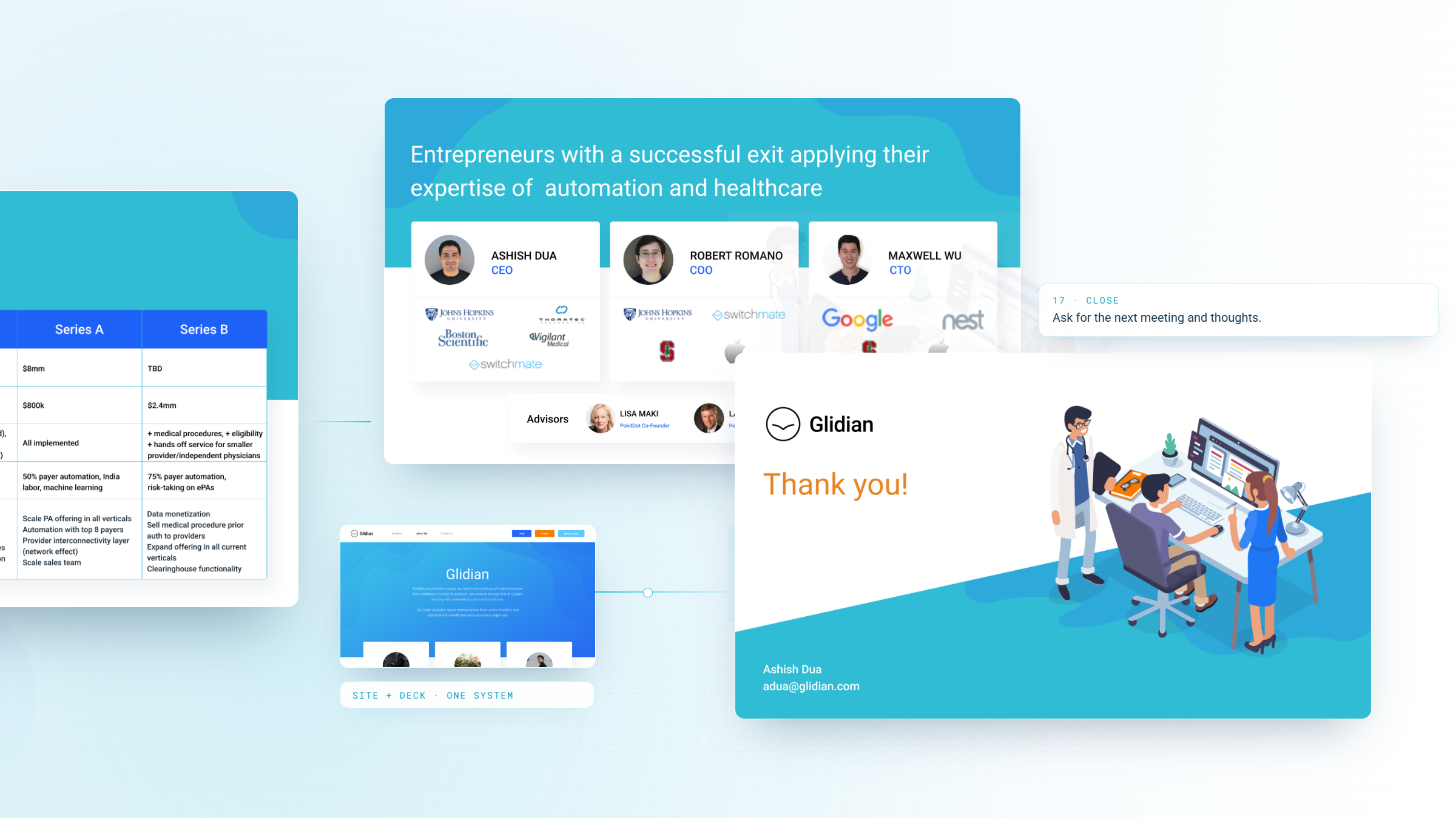
Borrow the visual grammar of the software the founders were benchmarking against. Light, minimal, generous white space, restrained color, and a clean credibility page carrying the founding team, advisors, and partners, so an early-stage company read as an established platform.

What the work moved.
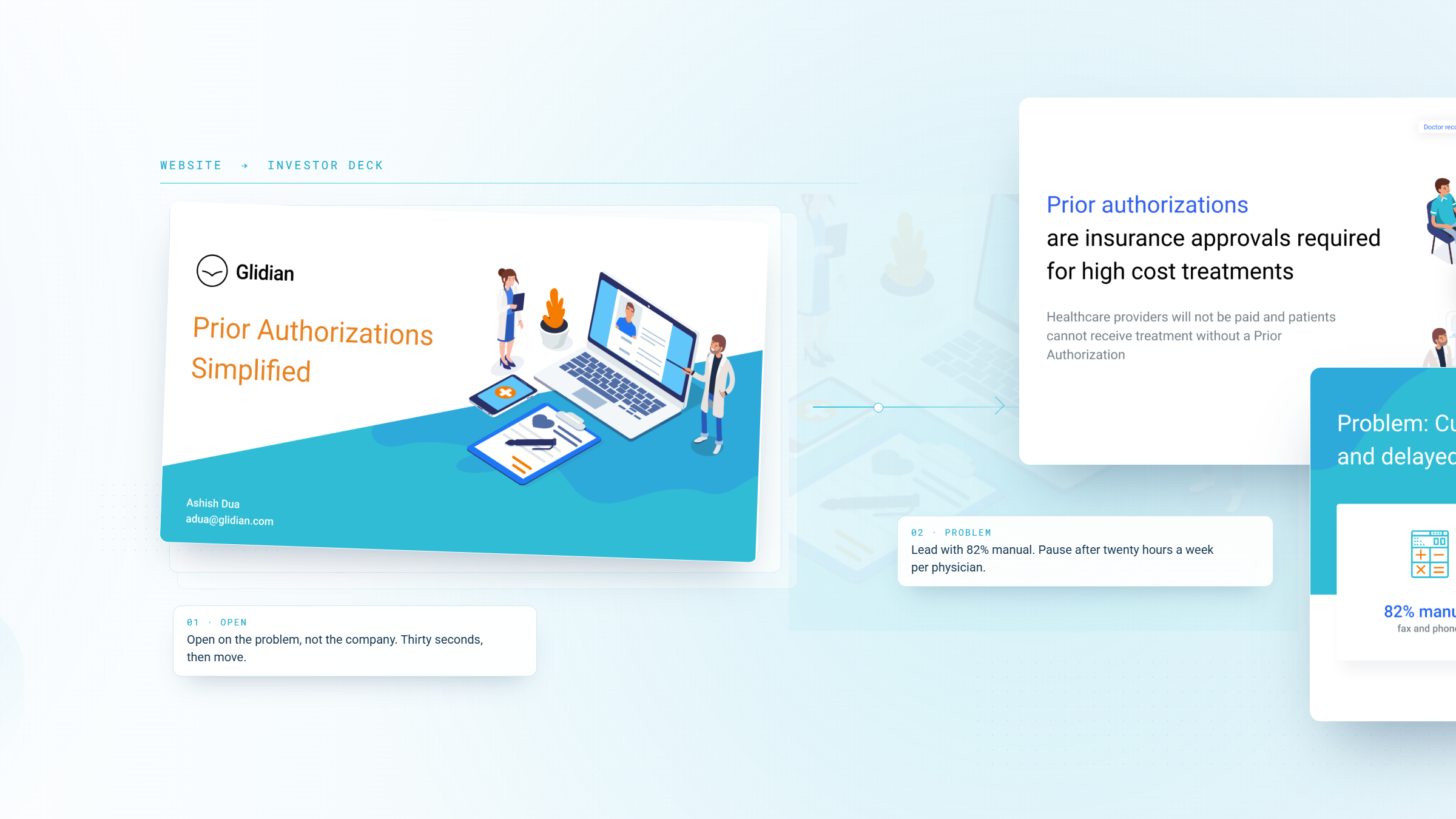
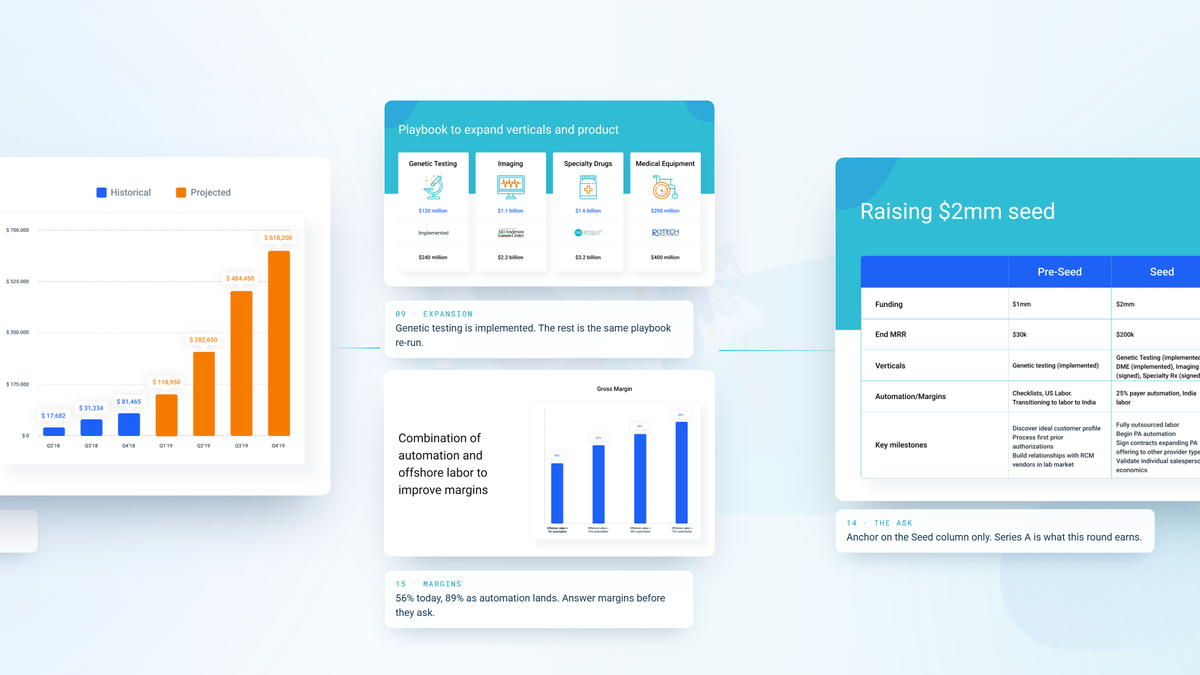
Glidian went to market with a site that showed its product and mapped its category, owned the source files and the code, and returned the following year for its seed-round deck.
designed, built, and handed off with source files
the client came back
Glidian-reported, company milestone
acquired by Infinx, March 2025
Delivery and engagement figures are drawn from WANDR's project record. The 92,000+ provider and 1M+ authorization figures are Glidian's own, reported at the time of the Infinx acquisition in March 2025, and reflect seven years of company growth rather than a direct result of the design work.
In their words.
We came to WANDR with a slide mockup and a list of sites we admired, and they came back with something better than what we asked for: they wireframed, designed, and coded the whole site in about a month, and handed over the source files and the codebase without us having to chase anything. When we put the seed deck together the following year, we did not look anywhere else.