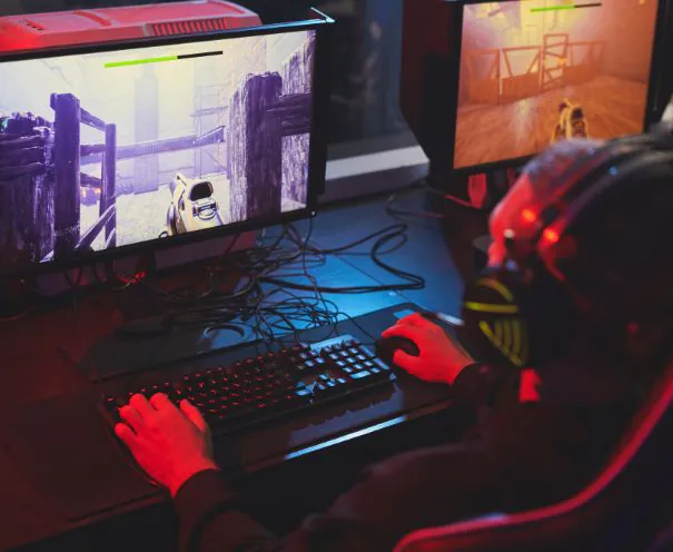
Game UX design has an identity problem. Half the industry treats it as a synonym for UI. The other half treats it as a research function that produces slide decks nobody reads. Both readings are wrong, and both cost studios money in ways that are hard to see until the retention curve arrives.
This is a working definition of the discipline, what it actually produces, and why the studios that fund it properly tend to outperform the ones that fold it into art.
What Game UX Design Actually Covers
User experience design in games is the set of decisions about what happens to a player, in what sequence, and at what density. It is upstream of the interface. It is upstream of the art. In a well-run team it is not far downstream of the game design itself, and the boundary between those two is genuinely blurry in a way that makes some designers uncomfortable.
Concretely, game UX design owns questions like these.
What is the first thing a new player does, and how long does it take them to feel competent? What gets introduced in session one, and what is deliberately hidden until session four? Where is friction intentional, because the game is supposed to be hard, and where is it accidental, because a menu is three levels deep? What does the player need to know at any given moment, and what are they currently being told instead? When a player fails, do they understand why?
None of those are answered by choosing a font. All of them determine whether the font ever gets seen.
Game UX Versus Game UI: The Distinction That Costs Money
Here is the clean test. If the fix is a colour, a size, a position, or a piece of motion, it is a UI problem. If the fix requires changing what appears, when it appears, or whether it appears at all, it is a UX problem.
Now the commercial version, which is the one that matters to whoever signs off on budget.
UI failures are visible. Somebody notices in review. Someone posts a screenshot. They generate complaints, and complaints are cheap because they are legible and actionable.
UX failures are invisible. The game just underperforms. Nobody writes a review saying "the information architecture of your progression system exceeded my working memory in session two." They just stop playing. And because the failure is silent, it gets attributed to whatever is easiest to blame, which is usually user acquisition.
This asymmetry is why studios systematically overinvest in UI and underinvest in UX. One of them produces feedback. The other produces a number that has a dozen plausible explanations. We break down the interface side in our guide to game UI design, but the sequencing is not negotiable: UX decides, UI executes.
Why Game UX Design Is Harder Than Product UX
Designers moving in from SaaS or consumer product work usually assume this is the same job with better art. It is not, and the differences are structural.
Friction is sometimes the product. In a banking app, every point of friction is a defect. In a game, some friction is the entire reason anyone showed up. Difficulty is a feature. Confusion is not. Telling those apart is the whole skill, and there is no heuristic that does it for you. A player struggling with a boss is having a good time. A player struggling with your inventory sort is not. Both look identical in the analytics.
The goal is not efficiency. Product UX optimises for task completion speed. Game UX optimises for something much slipperier. Nobody wants their game completed efficiently. You are designing for engagement, mastery, and a feeling, and none of those reduce to a funnel.
You are competing with the game itself. Every second in your interface is a second not playing. Product UX has no equivalent to this. The interface is the app. In a game the interface is a tax the player pays to reach the thing they came for, and the job is keeping the tax low without making the game illegible.
The audience is not who you think. This one is the killer, and it is not a hypothetical. Claudia Mérigo, a UX researcher on our team, described a gaming project where the research revealed the client had misunderstood their own users entirely. The product was designed for casual gamers. The people who would actually use it were professional gamers, and those two audiences have completely different behaviours, needs, and expectations. The finding redirected the product. Everyone in the room had been confidently designing for the wrong person.
She also noted something that will resonate with anyone who has run game research: gamers are unusually easy to interview, because they enjoy talking about games so much that the hard part is ending the conversation. The raw material is right there. Most teams just never go get it.
The Core of Game UX Design Is Deciding What to Withhold
If there is one thing this discipline is really about, it is subtraction.
Every studio is structurally good at adding. Every system has a champion. The economy designer wants the currencies visible. The progression lead wants the XP bar visible. The social lead wants the friends list visible. Each is advocating correctly for their area. Nobody in that room is representing the player who has been in the game for ninety seconds and has no idea what any of it means.
Eric Lee Smith, a game designer who has shipped award-winning titles and worked on financial applications used by millions, described this to us on our Visionaries podcast as a simple law of development: the longer a product is in development, the more complicated it becomes. He framed it as a truth rather than a failure, which is exactly right and exactly the reason it is so dangerous. Nothing drifts toward simplicity. It has to be forced.
Sidney Rhoads, a product designer on our team, described the mechanism underneath it in a conversation about applying psychology to UX design. She explained that cognitive load is the thing you are almost always trying to decrease, because when too much stimulus or too much choice is presented at once, people get fatigued and everything takes longer.
That is the whole problem in one sentence. Your team is adding stimulus every sprint. Your player's capacity to process it is fixed. Somebody has to be accountable for the gap, and if nobody is, the gap wins.
Progressive Disclosure Is the Practical Answer
The technique has a name and a body of evidence behind it. Nielsen Norman Group has documented progressive disclosure across decades of software: show the minimum needed for the current action, and reveal the next layer when the user has context to understand it.
In games this is not just a usability trick. It is a pacing tool that doubles as a reward. Complexity revealed in the right order feels like the game opening up. The same complexity dumped at once feels like homework. Identical content, opposite emotional result, and the only variable is sequencing, which is precisely what game UX design controls.
What a Game UX Design Process Looks Like
Process varies, but the good ones share a shape.
Start with who, specifically. Eric Lee Smith described how his teams began: with big answers to big questions, starting with who the audience is, and not theoretically. His example was concrete to the point of bluntness. The audience is age 12 to 18, 90% female, it is a licensed product. That is what a real answer looks like. "Core gamers who like strategy" is not an answer, it is a way of avoiding one.
Define the first success. What is the one thing a new player can do in session one that will make them feel competent and want another session? Everything else in onboarding is subordinate to that. Most teams have never explicitly named it, which is why their onboarding is a feature tour.
Map the sequence before the screens. What is available in minute one, minute ten, hour three, day seven. This is the actual UX artefact and it is usually a document, not a mockup. If you go to screens before you have this, the screens will encode a sequence nobody chose.
Watch real players. Not colleagues. Not a review. People from the actual audience, playing without help, while you stay silent. The urge to explain is the finding.
Measure the right thing. Mariana Lopez, a product strategist on our team, gave a working definition on leveraging metrics to improve user experiences: a metric is measurable, movable, related to a specific goal, and not gameable. That last property is the one games fail most often, because it is trivially easy to construct an engagement number that goes up while the experience gets worse.
Expect testing to be unpopular. Smith had the sharpest line on this. He called testing a job where doing it perfectly earns you a C and anything less earns you an F, which is exactly why it sits at the bottom of every priority list until something breaks in the market and the grade shows up anyway.
The First Five Minutes Are the Whole Game
If you only fix one thing, fix this.
A new player decides whether to continue in minutes, not hours. Most of that decision is UX. Not mechanics, not graphics, not how clever the monetisation is. Whether they felt competent, whether they understood what to do, whether something good happened.
The instinct that destroys this is wanting the player to see everything you built. It is a completely reasonable instinct and it is fatal. You spent two years on this. You want them to see the depth. So you show them the depth, and they leave, and you conclude the market did not want depth.
We go deeper on the practices that hold across gaming products in our guide to UX best practices for gaming platforms, but the pattern is consistent. The pattern that works is a single mission. One small satisfying thing the player can do and feel good about. Then the next layer. Then the next. You reveal complexity as the player earns it. League of Legends was not built in a day and it was not shown to players in a day either. It grew mission by mission over years.
We know that from the inside, because we worked with their former CTO on Buildbox and he was direct about how long it actually took to build what they built. Studios that try to ship League of Legends on day one do not make it to day two.
What That Looked Like on Buildbox
Buildbox is a no-code game creation platform used by millions. Genuinely powerful product. The original experience presented all of that power the moment a user signed in, and they left before they made anything. The value was completely real and completely invisible, because nobody got far enough in to meet it.
The rebuild started from one question: what does a meaningful first success look like for a new user? Everything that was not that got deferred. The first thing a new user does is make something. Not watch a tutorial, not fill in a profile. Make something and feel proud of it.
That moved first-success completion by 41%. Nothing in the underlying product changed. What changed was the order things happened in, which is the entire discipline in a single example.
Where Game UX Design Fits in the Org
The structural mistake is putting UX under art. It is a reasonable-sounding decision, since interfaces involve pictures, and it produces a predictable outcome: work optimised for how it looks, evaluated by people whose job is how it looks.
The teams that get this right give the interface a product owner. Art executes the visual layer, and executes it better than any product person could. Someone else, with research behind them, owns what appears and when. Those are different skills. Collapsing them into one role does not save headcount, it just moves the cost to the retention curve.
The other structural failure is treating UX as a phase. It is not a stage between design and art. It is a standing function, because every new system added to a live game changes the sequencing problem, and if nobody re-solves it the interface accretes until it collapses. Which brings us back to Smith's law. The longer it is in development, the more complicated it gets.
Final Thoughts: Game UX Design Is Invisible When It Works
The awkward truth about this discipline is that it has no highlight reel. UI has screenshots. Art has trailers. Good UX produces an absence: the player did not get lost, did not feel stupid, did not quit in minute four. Nobody screenshots an absence.
That makes it perpetually hard to fund and perpetually easy to cut, and it is why so many studios discover they needed it only after the launch window closes and the retention curve is already shaped.
The reframe that helps is simple. Your game design decides whether the game is good. Your UX design decides whether anyone finds out. Those are different questions, and a lot of genuinely excellent games have lost to the second one while winning the first.
Get a UX Read on Your Game
If your first-session numbers are worse than you can explain, or your team keeps arguing about onboarding without resolving it, we can tell you what is actually happening. Wandr has done this work for game creation platforms, real-money gaming products, esports tools, and character systems, and the failure patterns repeat enough that they are usually findable in days rather than months. Look at how our game UI/UX design team works, or send us your product and we will come back with the top three friction points costing you activation. Free, no pitch.