Not every app fails because of bugs or missing features—many fall apart at the user experience level. Buttons in the wrong place, unclear flows, cluttered screens, or inconsistent interactions silently frustrate users until they stop coming back.
If your engagement is low, onboarding is incomplete, or features go unused, chances are you’re not facing a development issue—you’re dealing with a set of critical app UX mistakes. And depending on the severity, it might be time for a full product redesign.
At WANDR, we’ve seen how small experience issues compound into product-wide failures. Let’s break down the most common mistakes that damage usability and explore how to know when a redesign is your best move forward.
Treating onboarding like an afterthought
First impressions matter—and in mobile apps, that means onboarding. A poor onboarding experience is one of the most overlooked app UX mistakes. Users drop off when the process is too long, too confusing, or lacks clarity around what the app does and how to use it.
Good onboarding balances simplicity with direction. It answers the user’s questions before they have to ask and reduces friction to the first action. When onboarding is broken, no feature in the app stands a chance.
Overloading the interface with features
More isn’t always better. One of the most common app UX mistakes is overwhelming users with too many options on every screen. What starts as trying to offer flexibility quickly becomes noise.
This issue isn’t always fixable with small tweaks. In many cases, cluttered interfaces indicate it’s time for a product redesign—a chance to reassess what’s essential, reorganize navigation, and refocus on the user journey rather than the feature set.
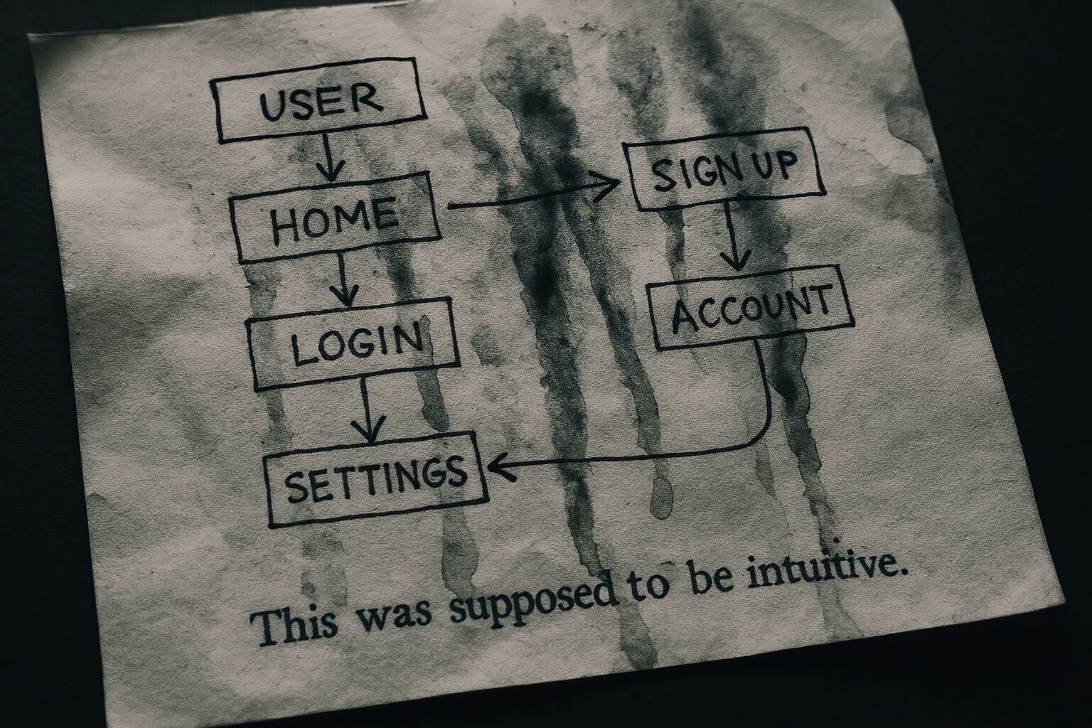
Ignoring platform-specific behaviors
Mobile apps need to feel native. When design patterns clash with platform expectations (iOS vs. Android, for example), users feel lost—even if the functionality is there.
Inconsistent gesture responses, unclear back behavior, or misaligned UI elements erode trust fast. These app UX mistakes usually come from treating mobile as an afterthought instead of designing intentionally for it.
Lack of clear feedback or status indicators
Users need confirmation—of actions, errors, successes. If your app doesn’t communicate clearly when something is loading, saving, or failing, it introduces anxiety and friction.
These types of app UX mistakes often go unnoticed by teams familiar with the product. But for new users, they lead to uncertainty and abandonment. A good product redesign takes communication into account from the ground up.
Microcopy that confuses instead of guides
Words shape experience. Labels like “Continue” or “Next” without context confuse users. Overly technical language or vague instructions break flow.
One of the subtlest but most impactful app UX mistakes is neglecting UX writing. In a redesign process, revisiting microcopy and placing it within context-rich screens can dramatically improve usability.
Ignoring error states and recovery paths
Errors happen. But what happens next determines if users stay or churn. Apps that fail to guide users when something goes wrong—no internet, failed login, invalid data—create dead ends instead of recovery paths.
If your app handles errors inconsistently or not at all, it’s not just a bug—it’s a UX mistake. A well-structured product redesign includes robust error handling as part of the core user journey.
Designing in isolation from user behavior
No matter how clean or creative your design is, if it’s disconnected from real user behavior, it will fail. One of the most critical app UX mistakes is assuming what users want without validating it through research.
When product decisions rely too heavily on internal assumptions, you end up solving the wrong problems. This is often a sign that it’s time to step back and consider a complete product redesign—this time grounded in data and user needs.
This might interest you
https://www.wandr.studio/blog/ux-research-plan
Conclusion
Usability issues don’t fix themselves. If your app has been patched repeatedly without results—or if users are still confused, stuck, or abandoning key flows—it’s time to ask if these are isolated fixes or signs of deeper app UX mistakes.
A product redesign isn’t just about refreshing the UI. It’s about rethinking the experience from the user’s perspective, identifying what’s broken at the core, and rebuilding with clarity and purpose.
👉 Ready to talk about your app’s next evolution? Let’s connect:
https://www.wandr.studio/contact-us