
Learn how to incorporate big data visualization into your business strategy. Below, learn how smarter insight increases sales brought to you by WANDR, ranked #1 UX Design and Product Strategy Agency in Los Angeles by Clutch.
What is big data visualization and why should you use it? In short, this tool offers a clearer picture of your daily operations. As a result, this picture allows you to optimize different areas of your business.
Analyzing large volumes of data helps organizations find ways to increase efficiency and lower costs. Deeper insight also allows businesses to tailor products or services to better meet their customers’ needs.
Big data visualization provides a contemporary solution for analyzing the relationships between data sets. With the right data visualization techniques, you can harness the power of big data to drive sales.
What Is Big Data Visualization?
Big data visualization is a visual representation of big data.
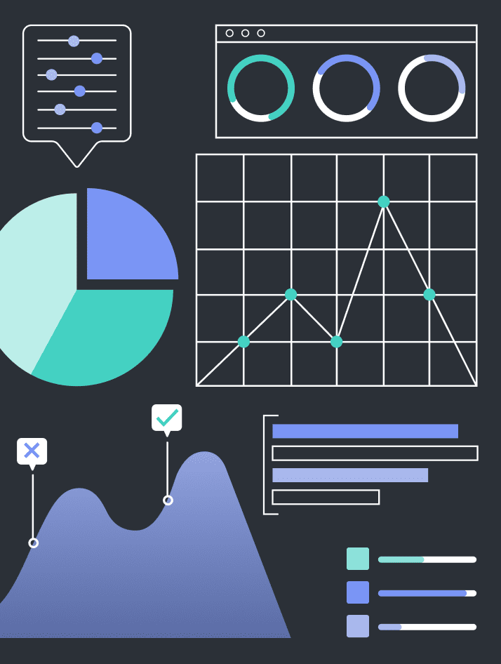
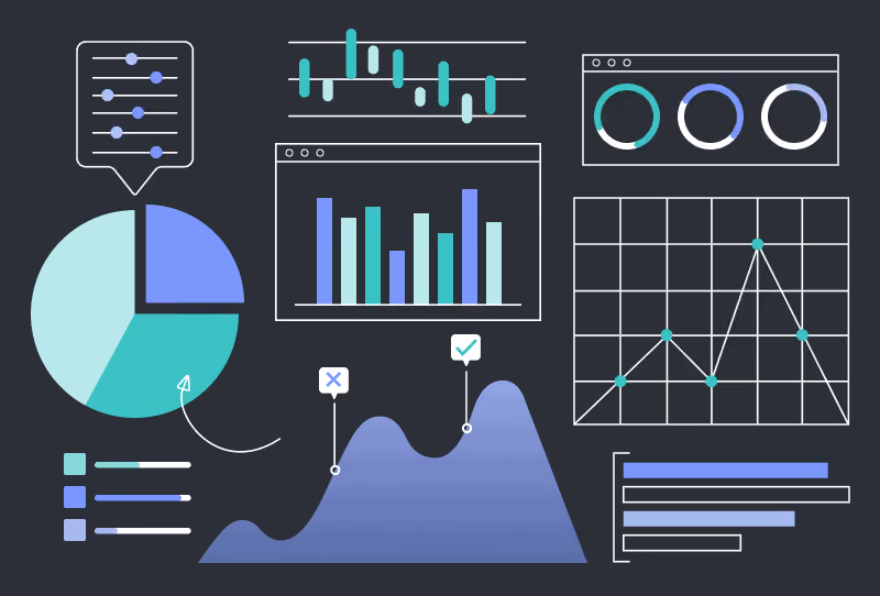
Bar graphs, pie charts, and spreadsheets are the traditional formats for displaying data. When dealing with vast amounts of information, those formats become confusing to decipher.
Instead of relying on rows and columns, stakeholders and the management team receives illustrated data that is easily digestible. Some visualization applications include real-time changes and custom graphics.
The right data visualization techniques help you gain more insight. The traditional methods for presenting data do not work well with large data. It is hard to find connections between data sets when looking at an endless spreadsheet. This can be tedious, time-consuming, and frequently, don’t communicate the whole picture.
Visualizing the data provides an interactive format for displaying the connections among sets of information. This may include animations and various graphical illustrations instead of charts or graphs.
The human brain simply cannot digest the vast amounts of data needed for big data analytics. Using visualization software, businesses can quickly generate a graphical representation of the data.
The graphical representations may still include traditional elements such as graphs, histograms, or pie charts. It may include multiple elements such as cartograms, linear lists, timelines, heat maps, tree charts, 3D computer models, or even computer simulations.
The visualization also tells a story.
Some of the most common big data visualization examples include infographics. Most infographics incorporate visual elements to represent real-world dynamics. Instead of using a text number to represent people, the infographic includes illustrations of people.
Above all, the goal of big data visualization is to make the data scannable and easy to understand. Visualization software allows you to spend less time analyzing and more time developing strategies based on that information.
Why Is Visualization Important in Big Data?
First and foremost, big data visualization techniques help decision-makers quickly analyze data. They also gain more insight into different business operations. This triggers additional advantages.
Here are a few of the benefits:
- Easily analyze big data
- Detect trends early
- Identify correlations
- Present big data to others
- Make data-driven decisions
- Quantify the results of your efforts
Detecting trends is incredibly difficult when using traditional and dated techniques like spreadsheets. Visualizing the data helps find these trends — early. As a result, you can respond before the competition.
Big data visualization also uncovers correlations between data sets. The data can reveal unexpected insights about sales and marketing, such as how customers respond to specific campaigns. Use the insight to optimize your sales procedures or marketing efforts.
Using data visualization is also beneficial when presenting data to stakeholders, board members, or potential investors. It is an effective method for communicating the insights uncovered in the big data. People do not need a deep understanding of the inner working of your business to understand the visualization.
3 Principles of Visualization Design for Big Data
There are best practices and techniques for getting the most out of your data visualization software.
Follow these 3 principles of visualization design:
- Select the right format for your data
- Provide context for the presented data
- Establish goals for the visualization
In particular, these three principles provide a framework for creating a useful visualization of your data. You should also ensure that the visualization uses clear headings, keys, and fonts. If the labels are difficult to read, big data analysis comes less effective at communicating a message.
1. Select the Right Format for Your Data
Firstly, the key to using visualization tools properly is to use the right format for that type of data and for your goals. For example, maps are often used to represent data across different regions.
Common examples of data formats include:
- Charts, tables, and graphs
- Maps
- Infographics
- Interactive infographics
- Dashboards
To choose the right format, you first need to understand your audience. Who is going to review the information? If you are presenting data to stakeholders or board members, you may want to focus on broad data sets. When allowing managers or department heads to analyze data, it helps to dig in with more details.
2. Provide Context for the Presented Data
Visual elements provide context for the presented data. For example, use visual cues and clear labels to ensure that the information is properly presented. Each section of the dashboard, infographic, or display should include helpful explanatory titles. The titles draw the readers in and help them scan for the most relevant information.
Additionally, it is easy to get carried away by adding visual elements to a display. Cluttered visuals decrease the value of big data visualization. Keep it simple and easy to read.
3. Establish Goals for the Visualization
Lastly, each visualization should have specific goals. What information are you looking for and what do you hope to get out of it? The answers to these questions shape the rest of the big data analysis process.
Goals make it easier to determine the message that you want to represent using visualization tools. This allows you to select the right metrics to analyze.
For example, if you want to determine why sales have declined in a specific region, you may need to include data related to customer retention rates, market share, and satisfaction scores. Combining data allows you to connect the dots and find the reasons for changes in sales figures.
When selecting data to visualize, choose the ones that matter most. As with adding too many visuals, cluttering the display with data sets creates a more complex picture. If you need to analyze additional data points, create multiple displays.
Closing Thoughts
Big data visualization allows the viewer to observe and understand complex information. As a result, you can detect trends, threats, and opportunities. As you identify correlations between data sets, you breathe insight into your business operations.
Visualization techniques provide powerful solutions for analyzing customer data. This helps decision-makers find opportunities to boost sales. Similarly, you can identify growth opportunities and untapped markets. In addition, use this data to find ways to make your products or services more profitable. The insight you gain can reveal the reasons behind customers’ behaviors. Above all, leading to strategies for increasing customer retention.
Certainly, big data visualization is more than a set of graphs and charts. It equips decision-makers with the information they need to make the best choices. Therefore, it drives your business direction and growth.
What Are Your Thoughts on Big Data Visualization?
Naturally, we’d love to hear your input! Please leave us a comment below or tag us on social media @wandrstudio.