
Cool looking websites earn their place on inspiration lists because they do something harder than just looking good: they make the experience of using them feel effortless. The visual design is what gets noticed. The UX is what makes someone stay, explore, and eventually convert. This post covers the websites that genuinely do both, from globally recognized products to Wandr client work, and what specifically makes each of them worth studying.
What Actually Makes a Website Look Cool
The word "cool" is doing a lot of work in web design conversations. It gets applied to websites that are visually striking, to websites that feel unusually smooth to navigate, to websites that use interaction in surprising ways, and to websites that simply communicate their product with unusual clarity and confidence.

The best cool-looking websites earn the description on multiple dimensions simultaneously. The visual design is distinctive enough to stop a scroll. The interaction design is smooth enough that using the site feels like a reward rather than a task. And the underlying architecture is clear enough that a visitor who has never heard of the product understands what it does within the first ten seconds.
The websites that make inspiration lists because they look impressive but feel confusing to navigate are not actually cool. They are decorative. The distinction matters because the goal of a company website is not to look impressive, it is to communicate clearly and convert visitors. Visual distinctiveness is a tool for achieving that goal, not the goal itself.
Public Examples Worth Studying

Wise, Product Transparency as Visual Design
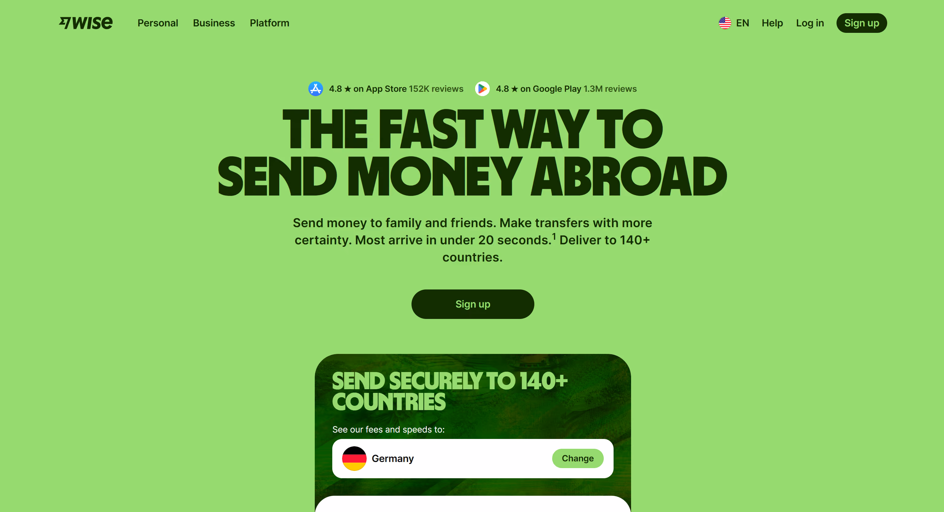
Wise's website is cool because it solved a hard design problem elegantly: how to make a financial product feel trustworthy and accessible to someone who has always assumed currency exchange was opaque and expensive.
The interactive currency converter above the fold does three things simultaneously. It demonstrates the product. It communicates the core value proposition, real exchange rates, low fees, without a word of marketing copy. And it creates a moment of genuine usefulness before asking for anything in return.
The visual design is clean and confident without being cold. The color choices communicate modernity without the crypto-adjacent aesthetic that most fintech products default to. And the motion is functional rather than decorative, every animation communicates something rather than just looking impressive.
What makes it worth studying: the hero section is doing product demo, value communication, and trust building simultaneously. That is a very high return on a single design decision.
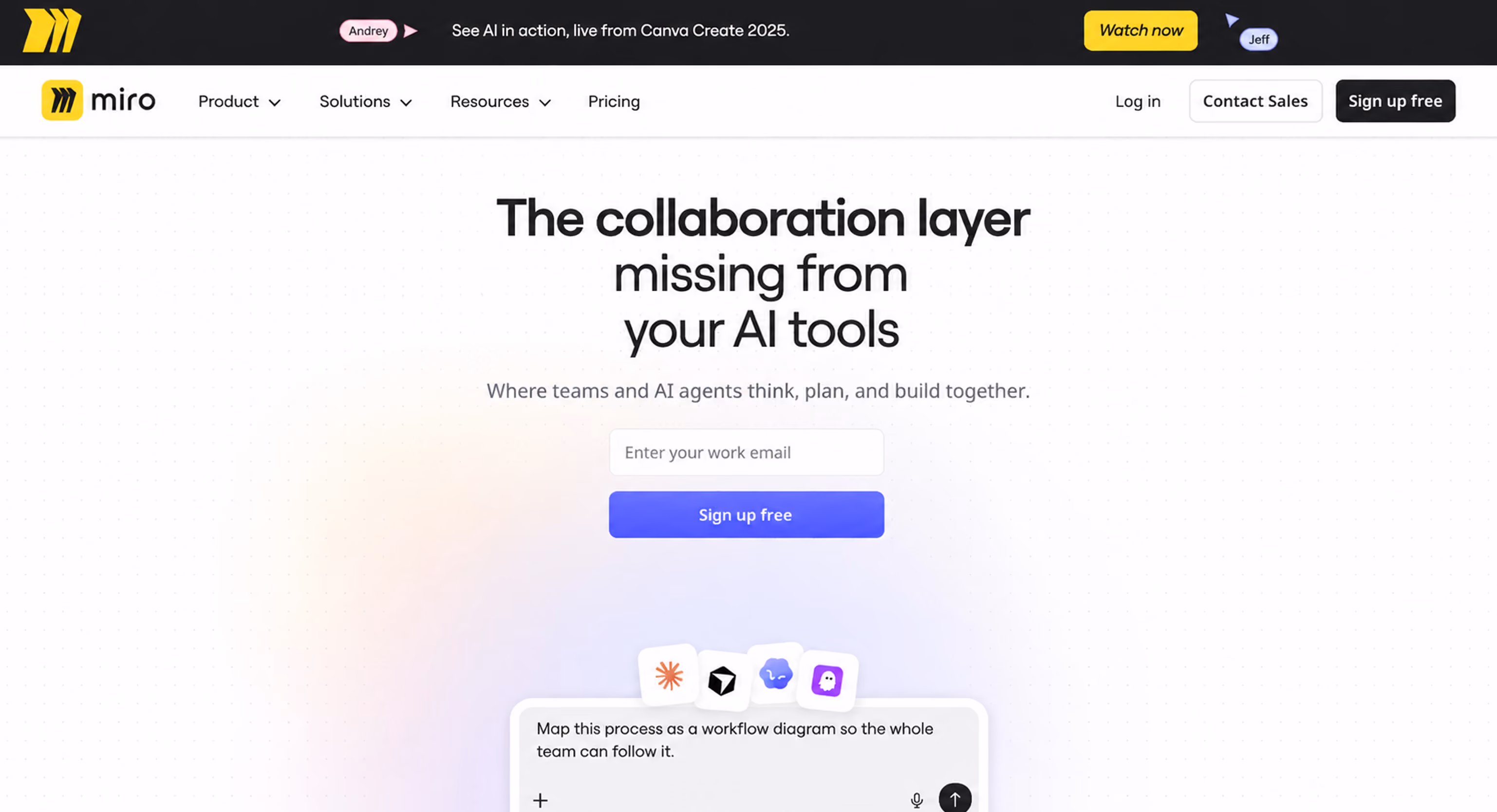
Miro, The Website That Feels Like the Product
Miro's website is cool because navigating it feels like using Miro. The interactive elements on the homepage mirror the drag-and-drop, collaborative nature of the actual product. The primary CTA is framed as a prompt to start creating rather than a registration form.
This is one of the rarest achievements in SaaS website design: a marketing website that functions as a lightweight product preview. The visitor understands what Miro feels like before they have signed up for anything. That experiential understanding is more persuasive than any feature list could be, and it is delivered through design decisions rather than copy decisions.
What makes it worth studying: the alignment between the website's interaction language and the product's interaction language. They feel like the same thing.
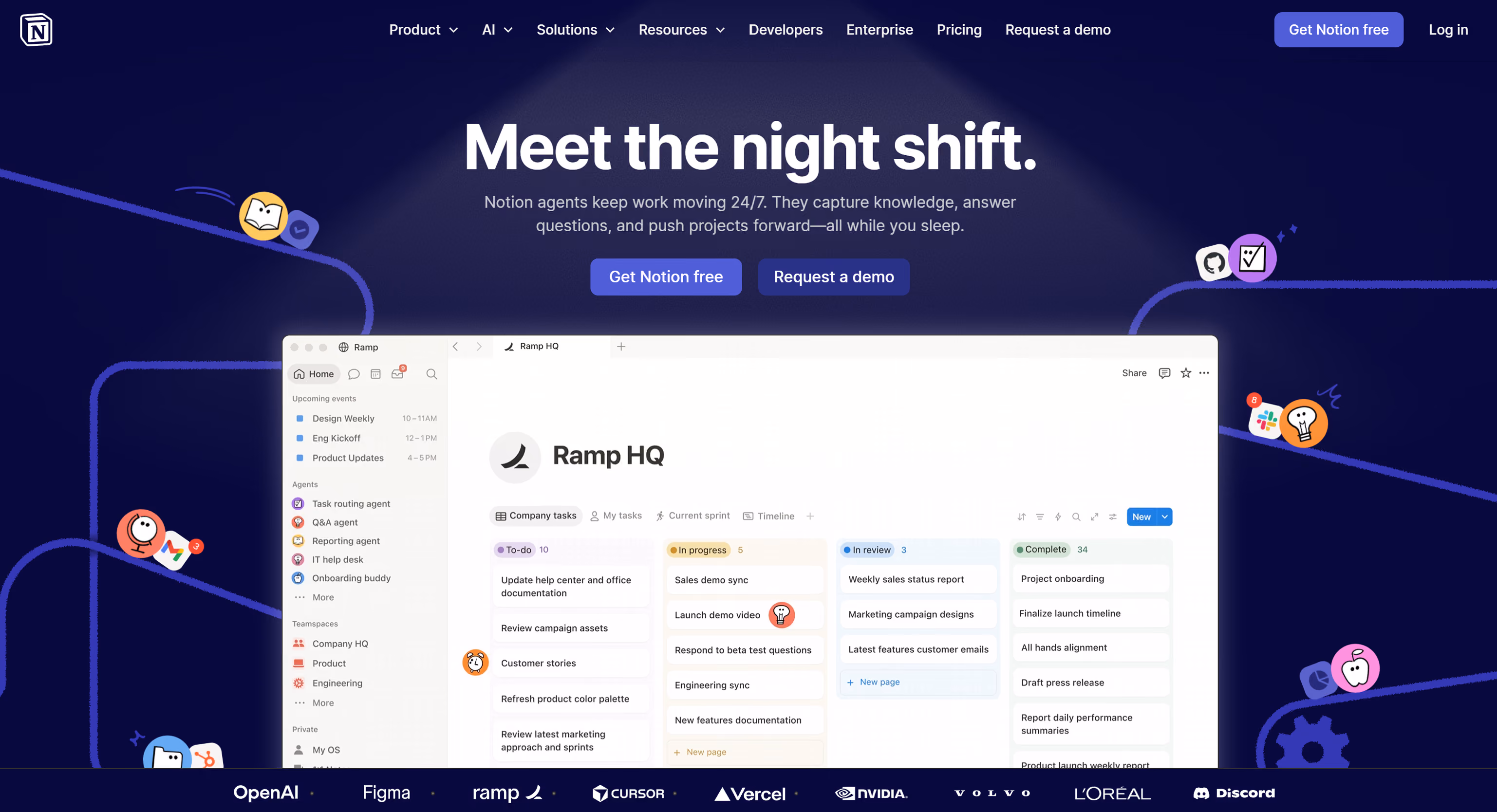
Notion, Simplicity as a Design Statement
Notion's website communicates something important through what it does not do. No dramatic hero animations. No complex parallax effects. No gradient overlays competing for attention. The visual language is calm, confident, and typographically led in a way that signals product maturity.
For a product that is used daily by millions of people for writing and organizing their thoughts, a website that feels quiet and focused is actually the right statement. The design reflects the product philosophy. That coherence is what makes it feel cool, not any individual visual decision, but the alignment between what the product is and how the website presents it.
What makes it worth studying: restraint as a design choice. The website demonstrates confidence precisely because it is not trying to impress you.
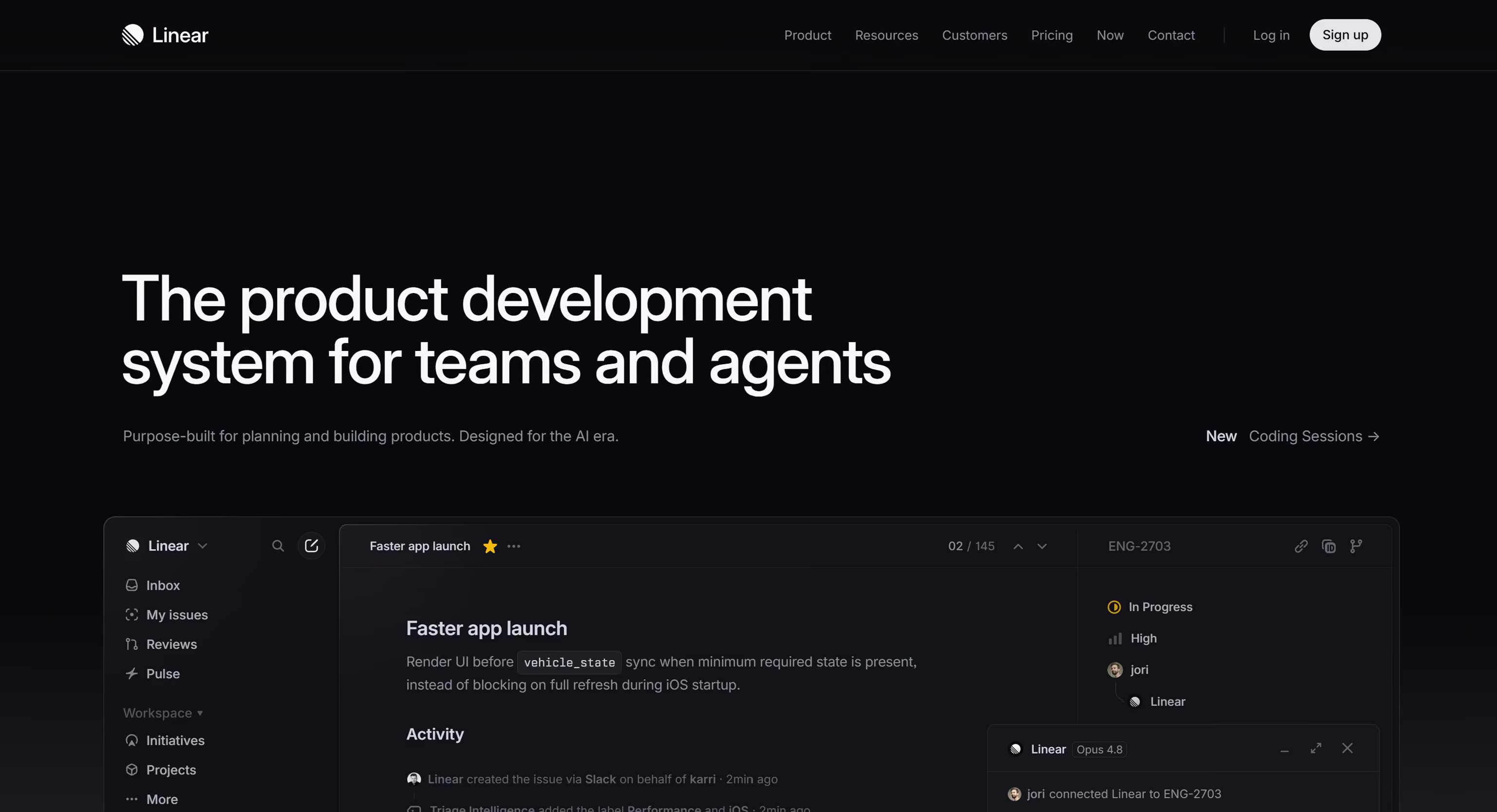
Linear, Engineering Aesthetic as Brand Positioning
Linear's website is cool in the most specific way: it looks like it was made by engineers who have exceptional taste. The dark aesthetic, the precise typography, the subtle interaction details, the performance, all of it communicates something very specific to its target audience of software development teams.
Linear is not trying to appeal to everyone. It is trying to signal to a very particular kind of user that this is a tool built by people who care about the same things they care about. That specificity is what makes the aesthetic feel cool rather than generic.
What makes it worth studying: design as audience self-selection. The website's aesthetic tells the right visitor immediately that this is for them.
Wandr Client Work Worth Studying
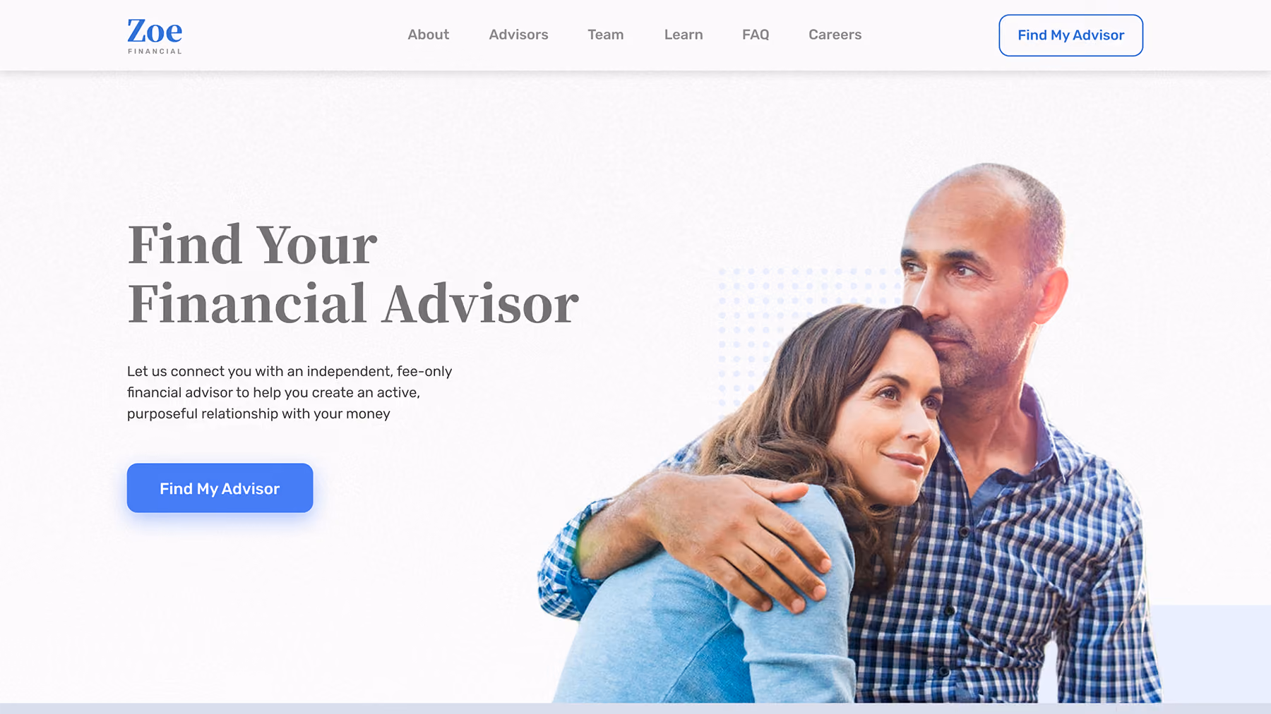
Zoe Financial, Trust as Visual Architecture
Financial advisory marketplaces have a specific design challenge: the buyer is making a high-stakes, emotionally complex decision, who to trust with their money, and every visual and interaction decision either builds or erodes that trust.
Wandr's redesign of Zoe Financial treated trust as the primary design constraint rather than as an element to include alongside other elements. The information hierarchy was rebuilt around the credibility signals that financial advisory buyers need most: advisor credentials surfaced early, security indicators positioned at decision points, and social proof placed before any ask rather than after.
The result is a website that feels calm and authoritative in a category where most competitors feel either clinical or sales-aggressive. It is cool in the way that high-end financial services firms are cool, through restraint, precision, and the communication of genuine expertise.
What makes it worth studying: the difference between designing trust signals into the architecture versus adding them as afterthoughts.
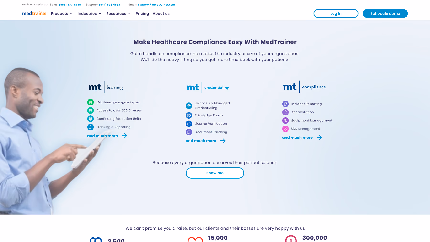
MedTrainer, Complexity Made Navigable
Healthcare compliance training platforms have a structural design problem: the product is genuinely complex, serving multiple buyer personas with different information needs, and the visual design has to communicate institutional credibility while remaining accessible to practitioners who are not design-literate.
Wandr's redesign of MedTrainer made the complexity navigable without simplifying the product. The navigation architecture allows different buyer types to self-select into the content relevant to them. The visual design communicates healthcare-sector credibility without the sterile corporate aesthetic that characterizes most healthcare software marketing.
Lead flow improved by 23% within the first month of launch, not because the website became simpler, but because it became clearer about what it was and who it was for.
What makes it worth studying: information architecture as a design problem rather than a technical one.
Field Agent, Two Audiences, One Coherent Experience
Field Agent serves both enterprise brand managers and small business operators, two audiences with different sophistication levels, different information needs, and different thresholds for evidence before taking action.
Designing a single website that serves both without feeling generic to either is genuinely hard. Wandr's approach built distinct content pathways for each audience within a shared visual system, allowing self-selection without requiring separate sites. The visual design is contemporary and energetic in a way that feels right for a technology product in the retail intelligence space.
What makes it worth studying: multi-audience design solved through architecture rather than through visual complexity.
The Patterns Across All of Them

Looking at both the public examples and the client work, the websites that genuinely earn the "cool" designation share a consistent set of characteristics.
They have a point of view. Wise's transparency, Notion's restraint, Linear's engineering aesthetic, Zoe's trust architecture, each communicates something specific about what the company believes and who it is for. Generic design has no point of view. Cool design has a specific one.
They use interaction purposefully. Every animation, transition, and interactive element serves a communicative function. Miro's interactive homepage communicates the product. Wise's currency converter communicates the value proposition. Decorative motion that does not communicate anything is not cool, it is noise.
They are fast. Every website on this list loads quickly. Performance is not separate from design quality. A visually impressive website that takes four seconds to load is not a cool website. It is an impressive composition nobody waits around to see.
They are coherent. The visual language, the copy tone, the interaction design, and the product positioning all tell the same story. Coherence is what makes a website feel finished and intentional rather than assembled from separately sourced decisions.
They earn the conversion. None of these websites ask for commitment before delivering value. Wise shows you the exchange rate. Miro lets you interact. Notion lets you explore. The cool websites understand that trust is earned through experience, not demanded through design pressure.
Final Thoughts

Cool looking websites are not a category separate from high-performing websites. The best ones are both because visual distinctiveness and experiential clarity are both outputs of the same underlying discipline: understanding exactly who you are designing for, what they need to feel and understand, and how design can deliver that more efficiently than words alone.
The inspiration list version of cool and the conversion-focused version of cool are the same thing when the design work is done well enough. The websites worth studying are the ones that demonstrate that alignment.
Build a Website That Looks Cool and Converts
Wandr designs websites for SaaS, fintech, healthcare technology, and enterprise companies where looking impressive is not enough. If your website is not generating the leads your product deserves, schedule a free consultation with our team and let us show you what is possible.