


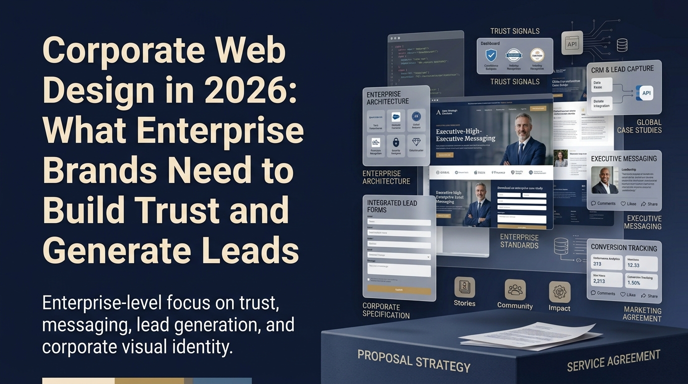
Corporate Web Design in 2026: What Enterprise Brands Need to Build Trust and Generate Leads
TL;DR: What Corporate Web Design Needs to Get Right
Corporate web design in 2026 is a business development tool, not a branding exercise. Enterprise buyers judge your credibility from design before they read a word of copy, so trust architecture and conversion design matter more than visual polish alone.
The best corporate websites define a single primary conversion event, usually a qualified discovery call, and build every page toward it. Below, we break down trust architecture, conversion pathways, SEO, design systems, and the common mistakes that quietly leak enterprise pipeline.
Corporate web design has a reputation problem. For most of its history, "corporate" meant safe. Neutral. Inoffensive. A site that communicated stability and professionalism by committing to nothing visually interesting.
That era is over, for companies that want to compete.
The enterprise buyers of 2026 have spent years using world-class consumer apps. They carry Figma-designed interfaces in their pockets. They know what good design looks like, even if they don't have the vocabulary for it. And when they land on a corporate website that looks like it was built in 2014, they make judgments, about the company's investment level, their operational maturity, and whether this is a partner worth trusting with a significant contract.
Corporate web design is no longer a branding exercise. It's a business development tool. The best corporate websites in 2026 are designed to generate qualified leads as actively as any outbound campaign.
What Makes Corporate Web Design Different from Other B2B Sites
Corporate and enterprise web design has a few specific requirements that distinguish it from a startup or SMB site:
Multiple stakeholder audiences. An enterprise website often needs to speak to procurement, IT, legal, and executive buyers in the same session, often on the same homepage. Each stakeholder has different concerns and different information needs. The best corporate sites layer this without overwhelming any single visitor.
Longer consideration cycles. Enterprise deals take months or years. According to Gartner's research on B2B buying, the average enterprise purchase involves 6-10 decision-makers. A corporate website isn't trying to close a deal on the first visit, it's trying to earn enough trust and clarity that the right person requests a conversation. The conversion goal is the discovery call, not the contract.
Higher trust requirements. Enterprise buyers are making significant commitments, financially, operationally, and in terms of organizational reputation. The design has to signal that this company is a serious, stable, trustworthy partner before a single word of copy does its job.
More complex content architecture. A startup site might have 10 pages. An enterprise site might have 100: product lines, industry solutions, regional offices, compliance documentation, partner ecosystems. Organizing this so a specific visitor can find what they need quickly is an information architecture challenge, not just a design challenge. This is where the principles we cover in designing a B2B website become especially important.
The Trust Architecture Problem
Here's the central challenge in corporate web design: trust is a feeling before it's a fact.
Before a buyer reads your case studies, before they evaluate your compliance certifications, before they talk to your sales team, they've already formed a gut reaction about whether this company looks like a serious, trustworthy partner. That reaction is based almost entirely on design.
Knowing whether your site is actually earning that trust means looking past a single number. As Sidney Rhoads, a product designer at Wandr, notes, you "shouldn't trust just one metric," pairing quantitative signals with qualitative feedback to know whether a site is genuinely earning trust.
We saw this acutely in our work with Zoe Financial. As a fintech marketplace connecting clients with financial advisors, trust was the entire product. Users weren't buying software, they were trusting a company with sensitive financial decisions. Every visual decision had to communicate credibility. The full story is in our Zoe Financial case study.
The same dynamic applies to enterprise B2B. A cybersecurity company with a dated website signals, unconsciously, that their attention to detail has gaps. A healthcare software provider whose site looks like a bootstrap template suggests their product might have the same problem.
Trust architecture in corporate web design includes:
Visual quality. Typography that's considered and consistent. A color system that's intentional, not default. Photography that's real, not stock. Layout that's structured, not cluttered.
Credibility signals in the right places. Client logos near the top, where they can do the most work establishing credibility. Compliance certifications visible on pages where security-conscious buyers look for them. Awards and recognitions where they're relevant, not plastered everywhere.
Copy that sounds like it was written for humans. Enterprise copy has a tendency toward jargon: "synergistic solutions," "end-to-end platforms," "scalable frameworks." None of these phrases communicate anything to a real buyer. Nielsen Norman Group's research on enterprise UX writing shows that clarity and specificity outperform jargon on every credibility measure.
A visual language that matches your brand positioning. A legal tech company and a creative agency should look different. Both can look excellent.
Corporate Web Design Doesn't Have to Be Boring
This is where we push back hardest against the conventional wisdom.
"Corporate" has been used as a euphemism for "design that took no risks." Beige, blue, and grey. Stock photos of diverse teams in glass-walled conference rooms. Typography that came with the template.
The most interesting corporate websites in 2026 don't look like that. They look distinctive. They use bold typography, strong contrast, considered motion, and visual personalities that reflect the company's actual culture and positioning.
The constraint is brand alignment, not professional convention. A financial services company and a B2B creative platform can both have extraordinary design, it just looks different. The question is: what does your brand actually stand for, and is your website expressing that in a visually distinctive way?
Bold doesn't mean loud. It means specific. It means making choices rather than defaulting to what's expected of the category. Look at the patterns in truly well designed B2B websites, the ones that stand out share specificity, not sameness.
The companies that win in competitive enterprise categories are often winning partly on design. Because when every vendor's product claims are similar, the brand that feels more confident, more considered, and more trustworthy gets the meeting.
The Conversion Problem in Corporate Web Design
The most common failure mode in corporate web design isn't visual. It's conversion architecture.
Enterprise websites often have a homepage that communicates the brand effectively, an "about us" page that tells a compelling story, and excellent case study pages, connected by a conversion pathway that was designed as an afterthought.
The "Contact Us" form gets 12 submissions per month. The sales team knows most are researchers, students, or tire-kickers. The actual enterprise prospects who wanted to talk never got there because the path wasn't clear.
Here's how the best corporate sites solve this:
They define success first. What is the primary conversion event for this website? For most enterprise companies, it's a qualified discovery call. Everything on the site should point toward it. This is the first step in our B2B website strategy framework.
They design the conversion flow backwards. Starting from "contact / request a meeting," they ask: what does a buyer need to have seen before they're willing to request that meeting? Usually: your positioning, your credibility, proof that you work with companies like theirs, and at least one piece of evidence that you get the specific problem they're trying to solve.
They put conversion CTAs in the right places. Not just in the header and footer. In the natural reading flow of every major page. After a compelling case study. After a section that addresses the primary buyer objection. At the end of every content piece a buyer might have found through search.
They make the form itself frictionless. Enterprise buyers are busy. A form that asks for 10 fields, including company revenue and current tech stack, will see high abandonment. Ask for the minimum: name, company, email, and what they want to talk about. Collect everything else in the first call. Baymard Institute's form research supports this approach decisively.
Common Corporate Web Design Mistakes
Beyond the conversion architecture problems, here are the patterns we see most often in underperforming corporate websites:
Jargon-heavy homepage copy. If your homepage headline requires domain expertise to understand, you're losing non-specialist stakeholders who often initiate vendor evaluations.
Navigation designed for internal logic rather than buyer needs. Products organized by internal team structure instead of buyer problem. Service pages labeled with proprietary terminology instead of the words buyers search for.
Content built for awareness instead of conversion. Thought leadership that's genuinely useful but has no pathway into the commercial relationship. A visitor can read five articles and learn a great deal about your perspective and still have no clear next step. This is why every article needs conversion architecture, a principle we explore in our B2B website content strategy guide.
Mobile experience de-prioritized. Enterprise buyers research on mobile. Commutes, travel, evenings. A desktop-only experience is leaking pipeline at every stage of the consideration cycle. Google's mobile-first indexing means this affects SEO rankings too.
No measurement on what matters. Many corporate websites track pageviews and sessions. Few have properly configured conversion events that connect website behavior to actual pipeline. Our B2B website KPIs guide covers what to measure instead.
The SEO Layer in Corporate Web Design
Corporate websites tend to underinvest in SEO architecture, which is significant given the potential scale of organic reach.
The most consistent opportunity we find: corporate websites generating thousands of impressions in Google Search Console for high-value queries, but converting very few into clicks because their title tags don't match what buyers are actually searching for. Before any redesign, before any content investment, open Search Console. The data you need to prioritize is already there.
From an architecture standpoint, corporate sites often have two SEO problems: pages that aren't indexable because they're blocked by JavaScript rendering issues, and pages cannibalizing each other because multiple product lines have similar keyword targets without a clear hierarchy.
A proper information architecture review, before any design work begins, prevents both problems. This is a core component of our B2B website redesign process.
The Design System Advantage for Corporate Sites
One of the highest-value deliverables in a corporate web design engagement is the design system, the set of reusable visual components, typography scales, color tokens, and spacing rules that govern every page consistently.
Corporate sites that lack a design system end up with visual drift over time. The homepage looks one way, the blog another, the case study pages a third. Nielsen Norman Group's research on design systems shows that organizations with mature design systems ship faster and maintain higher quality consistency across larger teams.
For corporate web design specifically, the design system serves a second purpose: it enables non-designers on the marketing team to create new content that looks on-brand. Without a system, every new asset requires a designer. With one, the marketing team can move independently.
What Corporate Web Design Costs and What It Returns
The right question isn't "what does a corporate website cost?" It's "what does the current website cost us?"
A corporate website generating 20,000 monthly visitors but booking only 8 qualified discovery calls per month has a conversion problem. If improving that to 14 calls per month means two additional enterprise deals per year at $50,000 ACV, the math on a $150,000 redesign investment becomes straightforward.
MedTrainer saw a 28% increase in book-a-demo conversions after we redesigned their website. For enterprise companies with higher ACV, that kind of conversion improvement has an outsized revenue impact.
The investment question is really a design-as-business-development question. What is a qualified enterprise prospect worth? And what is the current design costing you in prospects who landed on your site, couldn't find what they needed, and moved on? Our B2B website cost guide covers this calculation in detail.
How We Approach Corporate Web Design at Wandr Studio
Our process for corporate and enterprise web design starts with understanding the business before it touches the visual.
We ask: who is your highest-ROI customer type? What do they need to see, in what order, to feel confident requesting a conversation? What is the single primary conversion event the site should drive? What are the objections that most often stall deals at the consideration stage?
We're platform-agnostic. For many corporate clients, we recommend Webflow for its combination of design fidelity and marketing team independence. For clients with complex requirements, custom development may be the right call. Our Webflow for B2B guide explains the tradeoffs.
Book a free discovery call to talk through your corporate web design project. We'll give you an honest assessment of what your current site is doing well, where it's leaving pipeline on the table, and what a strategic approach to improving it looks like.
Implementation: Where to Start
The principles in this guide are most valuable when they're translated into a specific, sequenced action plan for your actual website. The companies that see the biggest improvements from B2B web design investments are the ones that approach it systematically, starting with data, moving to strategy, then to design.
Before touching anything on your site, spend one hour in Google Search Console. Look at your Performance report and filter for pages with more than 200 monthly impressions. For each of those pages, check the CTR. Any page with a CTR below 2% on a relevant query has a title tag or meta description problem that a quick rewrite can fix, no design required.
Then look at your top five organic traffic blog posts. Open each one and ask: does this post have a contextual internal link to a relevant service page? Does it end with a CTA toward your primary conversion event? If either answer is no, add them. This is the highest-leverage, lowest-effort improvement available to most B2B websites.
After those quick wins, you'll have better data and better visibility into where the structural gaps are. That's when the conversation about a deeper redesign, and the investment it requires, is worth having from a more informed position.
The Wandr Approach
At Wandr Studio, we work with B2B companies that want their website to generate pipeline, not just look good. Our process starts with data, your Search Console, your GA4 configuration, your current conversion rates, before any creative work begins. The design executes a strategy. The strategy is what creates the ROI.
We've helped B2B SaaS companies like MedTrainer achieve 28% improvements in demo conversion rates, and we've restructured onboarding flows like Zoe Financial's to meaningfully improve completion rates by sequencing information requests in the right order.
If you recognize the challenges described in this guide in your own website, that's a solvable problem. The data you need to diagnose it is already available in your analytics. The improvements are systematic, not magical.
This is the core of what our B2B web design agency delivers for enterprise and corporate clients: trust architecture paired with genuine conversion design.
Book a free discovery call to get an honest assessment of where your site stands and what the highest-leverage improvements would look like for your specific situation.
Related reading: B2B Website Strategy | B2B Website Redesign: The Complete Process | B2B Website Audit: How to Find What's Killing Your Conversions | How Much Does a B2B Website Cost?
Final Thoughts on Modern Corporate Web Design
Modern corporate web design succeeds when it treats trust and conversion as one connected system. Enterprise buyers arrive skeptical, evaluate you visually within seconds, and only request a conversation once the design has quietly answered their credibility questions. Get that sequence right and your website stops being a brochure and starts behaving like your most consistent business development channel.
None of this requires a leap of faith. The diagnostic data already lives in your analytics, the structural fixes are systematic, and the highest-leverage improvements are usually the least glamorous ones. Start with the questions, not the artboards.
Partner With a B2B Web Design Agency That Builds Trust and Pipeline
See how we rebuilt credibility and lifted conversions in our Trust ID case study, then explore what a strategic B2B web design agency partnership looks like for enterprise and corporate brands. When you're ready, Book a free discovery call and we'll give you an honest read on where your corporate website stands and the highest-leverage improvements available to you.
