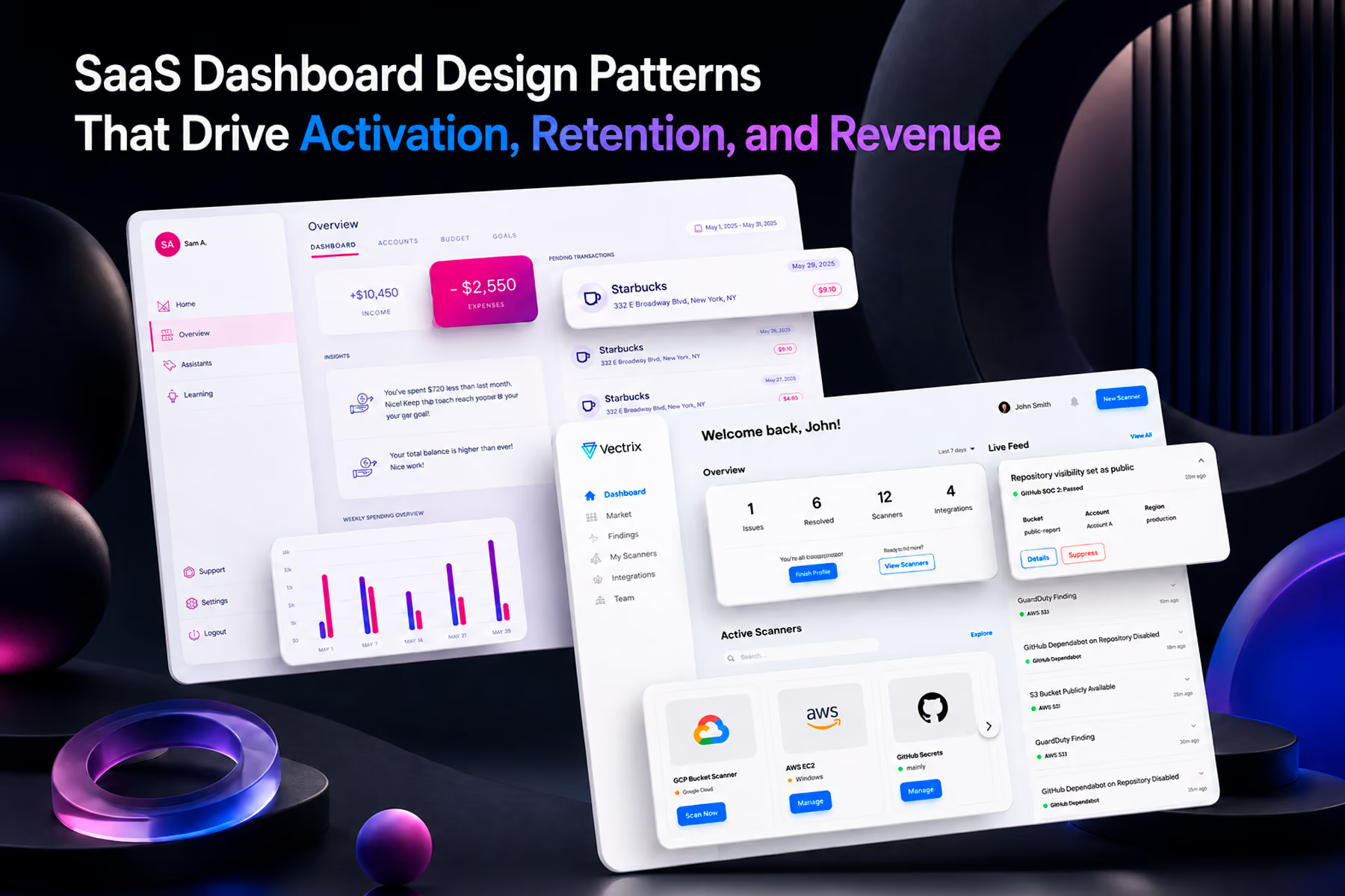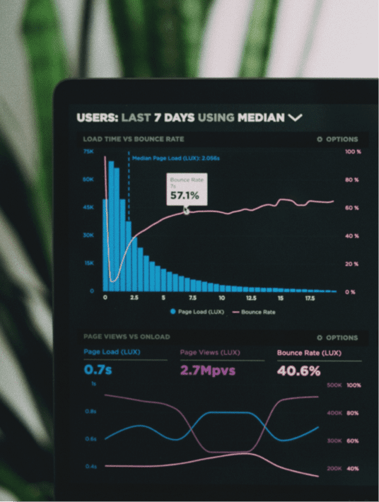
Dashboard design principles are not about making charts look good. They are about making the right information available to the right person at the moment they need to act on it. Most dashboards fail not because the data is wrong but because the interface was built around what the system can show rather than what the user needs to decide. This post covers the principles that separate dashboards that change behavior from dashboards that get ignored, drawn from Wandr's work designing dashboards for Tenable, Vectrix, Synchrony, and Modfi.
Why Most Dashboard Design Fails Before Anyone Opens It
There is a specific and expensive failure that happens regularly in enterprise product development. A company invests in data infrastructure, builds a reporting layer, and launches a dashboard that product and engineering teams are proud of. Six months later, the people who were supposed to use the dashboard are not using it. They have gone back to spreadsheets, to manual reporting, or to asking analysts for data exports.
The post-mortem almost never identifies the real cause. The data team concludes the data is hard to access. The product team concludes users need more training. The engineering team concludes performance needs improvement.
The actual cause is almost always that the dashboard was designed around the data rather than around the decisions the user needs to make. The interface shows what the system can surface, not what the person in front of it needs to act on. And when the gap between information and action is too wide, users stop trying to close it.
This is the problem that dashboard design principles are meant to solve. Not visual polish. Not chart selection. The fundamental alignment between what the dashboard shows and what the user needs to do next.
Principle 1: Design for the Decision, Not the Data
Every dashboard exists to support a specific set of decisions made by a specific person in a specific context. The most important dashboard design work happens before any visual decisions are made: defining exactly what those decisions are, who is making them, and what information they need at the moment of decision.

A Tenable security analyst monitoring threat exposure needs to know immediately whether there is an active risk requiring response. They do not need to navigate through multiple views to find that information. The dashboard either surfaces the signal or it does not, and if it does not, the analyst will find another way to get it.
A Synchrony financial product manager reviewing campaign performance needs to understand which channels are driving acquisition and whether cost per acquisition is within acceptable bounds. They need that information in the first scroll, not after drilling through five filter combinations.
When dashboard design starts with the question "what can we show" rather than "what does this person need to decide," the result is a dashboard full of data that requires significant interpretation before it becomes useful. The interpretation burden transfers from the system to the user, which is the opposite of what a well-designed dashboard is supposed to do.
The practical implication is that dashboard design should begin with user research and decision mapping, not with data schema review. Which decisions does this role make regularly? What information is required to make each decision confidently? What is the cost of a wrong decision? That hierarchy of decisions and information requirements is the architecture of the dashboard before a single visualization is chosen.
Principle 2: Visual Hierarchy Is Not Optional
Information hierarchy in a dashboard determines what users see first, what they look at second, and what they never look at at all. A dashboard without deliberate visual hierarchy forces users to work out what matters every time they open it, which is cognitive load that accumulates and eventually causes disengagement.
The highest-priority information should require the least effort to find. For an operational dashboard, that means the current status signal (red, amber, green) is visible immediately without scrolling. For an executive dashboard, that means the primary KPI is the largest element on the page. For an analytics dashboard, that means the metric the user will interrogate first is foregrounded before any breakdown data.
This sounds obvious. It is almost universally violated. The most common failure is treating all information as equally important, which in practice means no information is important. When everything competes for attention equally, the user has to reconstruct the hierarchy from scratch on every visit.
A second common failure is surfacing secondary information at primary visual weight. Supporting context, filter states, and metadata are necessary but should never compete with the primary signal. The visual weight of every element should communicate its importance in the decision hierarchy.
Principle 3: Reduce Interaction Friction to Near Zero for Core Tasks
The core task on any dashboard is the action the user performs most frequently. On a monitoring dashboard, the core task is checking current status. On an analytics dashboard, it is identifying whether a metric is trending in the right direction. On a performance dashboard, it is comparing actual against target.
Every interaction step required to complete the core task is friction that erodes engagement over time. A dashboard where the primary KPI requires three clicks to access is a dashboard that will not be checked regularly. A dashboard where the status check requires the user to apply filters is a dashboard that will be replaced by a Slack bot or a weekly email.
Friction analysis should be part of every dashboard design process. Map the core tasks. Count the steps required to complete each one. Challenge every step that is not absolutely necessary. The goal is not to make the dashboard simple. Complex dashboards serving expert users are often the right solution. The goal is to make the most frequent tasks frictionless while keeping the complex tasks accessible.
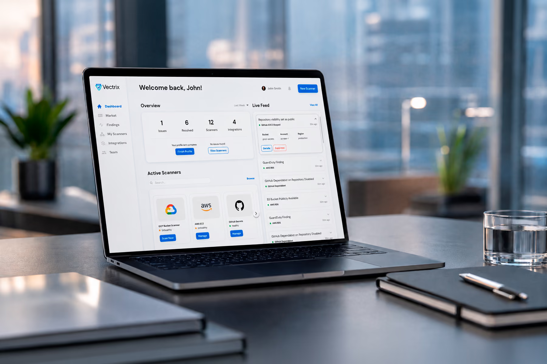
When Wandr redesigned dashboards for Vectrix, the core task was identifying security policy violations across connected cloud applications. The previous interface required navigating through multiple screens to understand exposure. The redesigned dashboard surfaced the most critical violations immediately, with context sufficient to assess severity without further navigation. That reduction in friction changed how the security team used the product from reactive investigation to proactive monitoring.
Principle 4: Context Makes Data Actionable
A metric without context is decoration. A 23% conversion rate is meaningless without knowing whether the target is 20% or 30%, whether it is up or down from last period, and whether it is above or below what comparable products achieve. Data that cannot be evaluated against a reference point cannot drive a decision.
Dashboard design should always answer the question: compared to what? The primary metric should be accompanied by its trend, its target, and where relevant its benchmark. These reference points are what convert a number into an insight and an insight into an action.
The absence of context is one of the most consistent failure modes in enterprise dashboard design, and it almost always has the same root cause: the data team knows the context and assumes users do too. They do not. Every user who encounters a metric without context has to go find the context elsewhere, which is the interaction friction described in the previous principle. Building context directly into the visualization is significantly more efficient than expecting users to carry it in their heads.
Principle 5: Design for the Real Environment, Not the Ideal One
Dashboard design is almost always done in ideal conditions: a large monitor, full screen, good lighting, focused attention. The dashboards get used in radically different conditions: on a laptop in a meeting, on a phone between calls, on a secondary screen while doing something else.

Responsive dashboard design is not a nice-to-have. For any dashboard accessed on mobile, which includes virtually every operational and executive dashboard, the mobile experience determines whether the dashboard gets used in the moments when decisions actually need to be made. A dashboard that degrades to an unreadable data table on mobile will not be opened on mobile, which means it will not be consulted in the contexts where quick decisions are most frequently needed.
Beyond screen size, design for interrupted attention. Dashboard users are rarely in a focused review session when they check a dashboard. They are in between other tasks, which means the time they will spend interpreting a visualization before moving on is measured in seconds. Every visualization that requires more than a few seconds to interpret will be skipped.
Principle 6: Empty States and Error States Are Part of the Design
The dashboard experience is not only the state where all data is loaded and everything is functioning correctly. Empty states (when there is no data yet) and error states (when data fails to load) are equally part of the experience and equally important to design.
An empty state that shows a blank screen tells a new user nothing. An empty state that shows what the dashboard will look like when populated, with a clear next action to generate the first data, gives the user a path forward. This is the difference between an onboarding experience that creates activation and one that creates abandonment.
Error states that show a generic failure message and nothing else force users to contact support. Error states that explain what failed, why, and what the user can do while the system recovers maintain trust and reduce support overhead. These states are consistently deprioritized in dashboard design because they are not visible in demos or stakeholder reviews. They are visible to every user when something goes wrong, which is the worst possible moment for the design to fail.
Principle 7: Performance Is a Design Requirement
A dashboard that takes eight seconds to load will not be checked regularly. Users habituate to the load time and begin opening the dashboard only when they have specific investigative intent, which means it stops serving its primary function of keeping people informed of ongoing status.
Performance requirements should be defined at the beginning of a dashboard design engagement, alongside user requirements. What is the acceptable load time for the primary view? What is acceptable for drill-down views? What happens when data is loading: does the user see a skeleton state, a spinner, or a blank screen?
These are design questions as much as engineering questions. The pattern by which data loads and the way the interface communicates that loading state are visual and interaction decisions that shape user perception of performance even when the underlying load time is the same.
What These Principles Look Like in Practice
Across Wandr's dashboard design work for Tenable, Vectrix, Synchrony, and Modfi, the engagements that produced dashboards that changed user behavior shared the same structural pattern: they started with decision mapping before data schema, they defined primary tasks before visual hierarchy, and they treated context, friction, and performance as first-class design requirements alongside visual design.
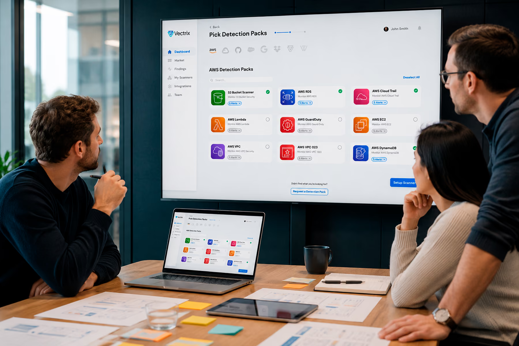
The dashboards that underperformed in these same organizations before Wandr's involvement were not badly built. They were built backwards, starting from what the data layer could expose and working toward what the user might want to see, rather than starting from what the user needed to decide and working backward to the data required.
That reversal is the single most important dashboard design principle. Everything else follows from it.
Final Thoughts
Dashboard design is one of the highest-stakes areas of product design precisely because it is one of the least glamorous. Nobody puts a dashboard in a design award submission. But dashboards are the surface where data becomes decisions, and when that surface fails, the cost is measured in time wasted, decisions delayed, and organizational trust in the product eroded.
The principles in this post are not theoretical. They come from designing dashboards for enterprise security platforms, fintech products, and SaaS tools where the stakes of a poorly designed dashboard are real and the users demanding better design are specific people with specific jobs to do.
Getting dashboard design right requires starting with those people and those jobs, not with the data and the visualization library.
Work With a Dashboard Design Team That Has Done This at Scale
Wandr has designed dashboards for Tenable, Vectrix, Synchrony, Modfi, and many other enterprise and SaaS products. If your dashboard is not driving the decisions it was built to support, schedule a free consultation with our team and let us show you where the design is creating friction.