Most SaaS products do not decide to build a design system. They wake up one day and realize they need one. The button that was blue in onboarding is teal in settings. The date picker behaves three different ways depending on which quarter of the roadmap it was built in. Every new feature quietly reinvents a component that already exists somewhere else in the product, and the gap between what design ships and what engineering builds keeps widening. If any of that sounds like your product, this guide is for you. It walks through what a design system for SaaS products actually is, why software companies feel the pain more acutely than anyone else, and how to build, scale, and govern one without stalling your roadmap.
TL;DR: Design Systems for SaaS Products in 60 Seconds
A design system for SaaS products is the single source of truth for how your interface looks, behaves, and gets built. It is the shared library of components, tokens, patterns, and principles that lets designers and engineers stop rebuilding the same button and start shipping features. For SaaS specifically it matters more than it does almost anywhere else, because SaaS products grow feature by feature, serve wildly different user segments, and often need to theme or white label the same interface for many customers at once. Done well, a design system cuts the time from idea to shipped screen, keeps a maturing product consistent as teams multiply, and makes redesigns and rebrands survivable instead of terrifying. Done badly, it becomes a museum of components nobody uses. The difference is not the tooling. It is adoption, governance, and treating the system itself as a product with a real owner.
What a Design System for SaaS Products Really Is (and What It Is Not)
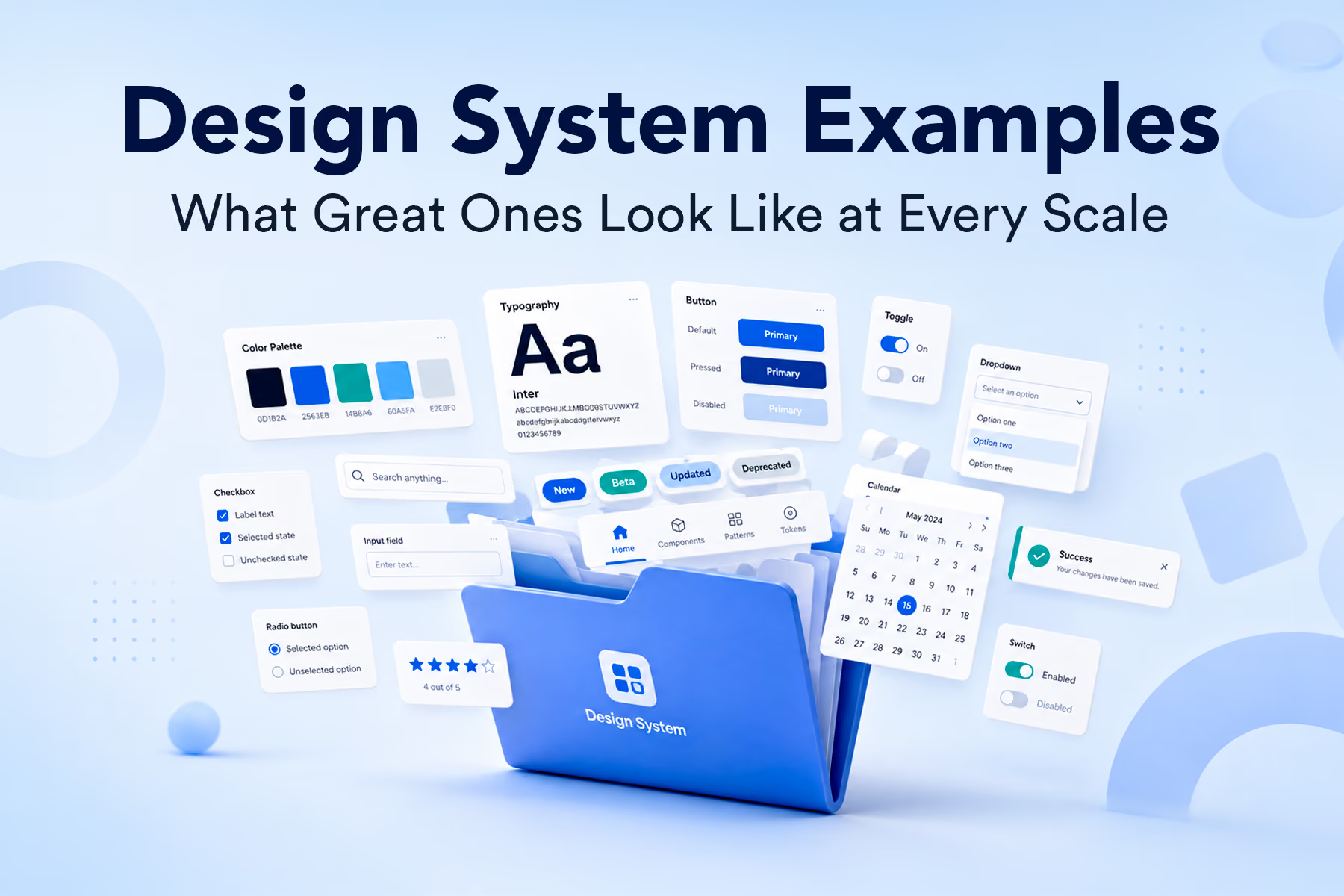
People throw the term around loosely, so it is worth being precise. A design system is not a style guide, and it is not a folder of Figma components. Those are ingredients. The system is the whole thing: the reusable components, the design tokens that hold your colors and spacing and type, the usage guidelines that tell a designer when to reach for a modal versus a side panel, and the principles that govern how the whole product should feel. WANDR's own definition, refined across hundreds of product engagements, frames it as the principle of how design should be treated and governed across your organization, not just a components library sitting in a shared file.
Our senior product designer Ed Orozco described the building blocks about as plainly as anyone can. A design system, in his words, is a collection of components and guidelines, basically all the buttons, forms, colors, and typography that, put together, make sense in the context of a product. That last part is the part teams miss. A pile of components is not a system. A system is what happens when those components share a logic, a naming convention, and a source of truth, so that changing one thing changes it everywhere it should.
This is also where the borrowed vocabulary comes from. Much of modern design system thinking traces back to Brad Frost's atomic design methodology, which builds complexity from the smallest functional units up: atoms like inputs and labels combine into molecules like a labeled search field, molecules combine into organisms like a full navigation bar, and organisms assemble into templates and finished screens. You do not have to adopt that exact taxonomy. What matters, as Ed put it, is that everyone working with you understands the naming and uses it, because the moment two people name the same component two different ways, inconsistency creeps back in.
Why SaaS Products Need a Design System More Than Almost Anyone Else
Marketing sites can get away without a rigorous system. A SaaS product cannot, and there are structural reasons why. The first is how software actually gets built. SaaS grows by accretion. You ship an MVP, land some customers, and then bolt on whatever the next contract or the next sprint demands. Our head of product Paula Lopez has a memorable name for what this produces over time: a Frankenstein, a product stitched together from mini apps and features that were each reasonable in isolation but never designed to live under one roof. A design system is how you give the Frankenstein a spine. It forces the question of what the baseline pattern is, so every new feature inherits it instead of improvising.
The second reason is scale of usage. Interface elements in a SaaS product are not used once. They are used thousands of times across hundreds of screens. Ed makes the math concrete. Change one icon that appears across a hundred screens without a reusable component, and you are editing a hundred screens by hand. Multiply that by every color tweak, every border radius change, every rebrand request from a nervous stakeholder, and you can see how much senior design time gets burned on work that a system would make a single edit. When your components are consistent, you also move to new platforms faster, because a web product with a real system already dictates how the eventual iOS or native build should look.
The third reason is uniquely SaaS: you are often designing one product for many masters. Multi tenant platforms, white label deployments, and enterprise clients who each want the software to feel like theirs all demand the same underlying interface to flex. Paula describes exactly this tension in the compliance software her team rebuilt, where dozens of embedded mini apps needed a common umbrella and then per customer customization on top. Without a token driven system, that kind of theming is a nightmare of copy and paste. With one, it is a controlled set of variables you swap.
If you want to see what happens when a SaaS product gets this right under real pressure, our work on Vectrix is a good study. Vectrix was a zero trust SaaS security platform where a coherent, scalable interface was not a nice to have, and the product was strong enough to be acquired by Cloudflare. Security software is dense, high stakes, and unforgiving of inconsistency, which makes it a useful stress test for whether a design system genuinely holds up.
How to Build a Design System for a SaaS Product From the Ground Up
The instinct when building a design system is to start with the fun parts, the buttons and the color palette. The better order is to start with the foundation, because everything downstream inherits from it. Type comes first. Ed argues for anchoring the system in a typographic scale, because typography sets the proportions for the entire interface and carries most of the brand's mood before you have drawn a single component. Pair it with a spacing grid, a four pixel base is a common and flexible choice, so that every element has a predictable rhythm. Then colors, then the humble button, which is the most common way a user ever touches your interface and should carry its full set of states from the start: default, hover, pressed, disabled.
From those atoms you build up. A label plus an input plus a button becomes a form field. Form fields and menus become a toolbar. Toolbars and content areas become a screen. The value of building this way is not theoretical tidiness. It is that when the inevitable change request lands, you fix the base component once and the update cascades everywhere. Ed calls this the single source of truth, and in practice it is the difference between a product that gets easier to change as it grows and one that gets harder.
There is a trap here worth naming, because SaaS teams fall into it constantly. A design system is not supposed to be a cage. Ed borrows a sharp metaphor from the design community, the workshop versus the storefront. The storefront is the clean, well lit, finished library you show people. The workshop is the messy space where you actually explore, break things, and figure out new patterns. The mistake is locking yourself in the storefront, only ever assembling screens from components you already made, and never returning to the workshop to invent. As he puts it, the system should not be a monolithic, hard to modify thing. It needs to be organic, needs to evolve with the product. Build in the workshop, standardize the good solutions, and fold them back into the storefront.
One practical decision that pays off later is how you handle the earliest, most reusable layer of components. Our designers have built systems from scratch enough times to see the waste in redoing the same base work on every project. The idea they keep coming back to is a headless approach, where a component like a button has behavior and structure but no styling yet, ready to be restyled per product. For an agency that starts new SaaS systems often, that is a speed multiplier. For an in house team, the same principle means your base components should be as unopinionated and reusable as possible before you layer brand on top.
Design Tokens and Component Architecture Inside a SaaS Design System
If there is one concept that separates a system that scales from one that cracks, it is design tokens. A token is a named placeholder for a value. Instead of applying a specific hex color to a component, you apply a token, say a primary color, and store the actual value in one place. Change the token, and every hue derived from it updates automatically, no copy and paste across the file. Our designer Marlind Tako walked through why this is so powerful using Atlassian's public example, where the team used tokens to revamp an entire color palette, fill the gaps in their light and dark mode ramps, and fix accessibility issues, all without hand editing every instance. Tokens are what make dark mode, theming, and white labeling tractable in a SaaS product instead of a manual slog.
Component architecture is the other half. As SaaS interfaces get more complex, the naive approach of building one giant component with every possible variant collapses under its own weight. The WANDR team hit this wall on Asset Panda, a product with brutally complex data tables where a single cell might hold text, a hyperlink, an image, or GPS coordinates, each with its own set of states. Building every combination as a variant would have meant an unmanageable explosion. Their fix was subcomponents: split the cell's status into one component and the data type into another, then compose them. That single decision took the design from close to 180 variants down to twelve. The lesson is not to shatter everything into subcomponents on principle, because over engineering is its own trap. The lesson is to reach for this architecture precisely when a component's complexity would otherwise become unmanageable.
Worth borrowing from the same conversation: the branching and merging model that engineering has used for years is now part of how mature design teams work. On Asset Panda, when the team needed to overhaul the navigation, they branched the design system, worked on that component in isolation, reviewed it with the client, and merged it only when it was right. Everything updated instantly, with no risk of a stray duplicate floating around some forgotten page. That is what treating a SaaS design system with engineering level rigor looks like in day to day practice.
Scaling and Governing a SaaS Design System Across Teams
Here is the uncomfortable truth that tooling vendors will not tell you. A beautiful system that nobody uses is worthless. As the WANDR team put it after studying how the big product organizations run their systems, a design system is only as good as its adoption rate. Everything about scaling a system is really about adoption, and adoption is a people problem before it is a components problem.
Zalando's story, which our designers dug into, shows why scale changes the game. Operating in more than twenty languages with hundreds of designers, Zalando once had a single product card with something like fourteen thousand instances across four hundred files, owned by different teams for different contexts. A small regulatory change to how prices displayed rippled across the entire system and even affected how many cards fit on screen, which touched conversions and, in turn, the business. At that scale, a seemingly trivial tweak is never trivial. The takeaway for a growing SaaS team is to build the muscle for coordinated change early, while your instance count is in the hundreds rather than the tens of thousands.
Governance is what keeps a system alive as the org grows. The single most important governance decision is ownership. Marlind's blunt summary is that a design system is not easy to manage and must be treated as a product, which at minimum means someone owns it at all times. Clients routinely assume a system maintains itself. It does not. Someone has to triage requests, resolve naming disputes, keep documentation current, and shepherd the whole thing through change. This is the discipline that has grown into what the industry calls DesignOps, and it is exactly the layer WANDR sets up for clients who want a system that stays useful after handoff rather than rotting in a file.
Adoption also depends on people who are not designers. When the team studied Farfetch's approach, the standout move was that Farfetch treated their own design system as a research subject, asking how it was actually used, what did not work, what needed adding, and how it could improve. The quick wins that surfaced were unglamorous and universal: consistent, logical naming that designers and developers agree on, and a genuine one system approach that engineering references directly. The longer term wins were an onboarding experience, a sandbox where a new hire can safely learn the system, and a documentation strategy built for your team rather than copied from someone else's. If you are scaling a SaaS product, put those on the roadmap before you have two hundred designers, not after.
Common SaaS Design System Mistakes That Quietly Slow Teams Down
The failure modes are predictable, which is good news, because predictable problems are avoidable. The first is building the system in isolation from engineering. If designers name a component one thing and developers call it another, every handoff meeting becomes a translation exercise. The fix is embarrassingly simple and rarely done: sit with your developers and agree on names together, and mirror the way they structure things in the code base so the two worlds speak the same language.
The second is treating the system as finished. A SaaS product is never done, so its system cannot be either. Teams that freeze their system the day it ships watch it drift out of sync with the live product within a quarter. Build in a cadence for iterating on the system itself, especially during big transitions like a move to tokens, and accept that the rollout will zigzag rather than march in a straight line, because every designer and developer adopts at a different pace.
The third is over engineering. The same subcomponent trick that saved Asset Panda becomes a liability if you apply it everywhere out of enthusiasm. Complexity has a cost, and a system that is too clever to understand is one people route around. The fourth, and most common in fast growing SaaS, is starting a rebrand without a plan for the transition. The old system has to keep working while the new one is being built, which splits your resources whether you plan for it or not. Start from existing foundations, tackle the heaviest and most used screens first, and keep naming consistent across the switch so the transition does not detonate on your team.
Underlying most of these is a mindset gap. The teams that struggle, as the design community keeps observing, are the ones so focused on reusing the components they already made that they stop exploring new solutions. A healthy SaaS design system is a living balance between structure and freedom, tight enough to keep the product consistent and loose enough to let designers solve genuinely new problems.
What a SaaS Design System Actually Does for Speed, Consistency, and Revenue
It is fair to ask what all this effort buys, because a design system is an investment and someone on the leadership team has to justify it. The clearest return is speed. When most of the interface is already built from existing components, designers stop redrawing buttons and engineers stop rebuilding them, and handoff gets dramatically faster because the pieces already exist on both sides. In WANDR's experience delivering systems for product teams, work that used to take three to four months can compress to under a month once the system is doing its job. That is time your team redirects from pixel pushing to solving real product problems.
The second return is consistency, and consistency in a SaaS product is not a cosmetic nicety. It is trust. A user who sees the same patterns behave the same way across your product spends less cognitive energy fighting the interface and more energy getting value from it, which shows up in activation, retention, and the metrics your board actually watches. This is especially true in data heavy SaaS, where dense tables, filters, and dashboards live or die on predictable behavior. If dashboards are central to your product, the same system thinking applies directly, and our breakdown of dashboard design best practices goes deeper on that surface specifically.
The third return is the ability to change without fear. A token driven, well governed system turns a rebrand from a multi month panic into a controlled sequence of variable swaps, and turns a new platform launch into an extension of work you have already done. It also makes onboarding new designers and developers faster, because the system is the map of how your product works. If you want to go one layer beneath the component library into the reusable interaction patterns that make a product feel coherent, our guide to UX design patterns is a useful companion. For the broader theory of what a design system is at scale, the Nielsen Norman Group's primer on design systems is a solid, vendor neutral reference.
Final Thoughts: Making Your SaaS Design System Actually Stick
The hard part of a design system for a SaaS product was never the components. Any competent designer can draw a button set. The hard part is the parts that do not show up in a Figma file: agreeing on names with engineering, keeping the system organic so it evolves with the product, giving it a real owner, and building the documentation, onboarding, and governance that turn a library into a living standard. The companies that get durable value from their systems are the ones that treat the system as a product in its own right, measure its adoption honestly, and keep one foot in the workshop even as they polish the storefront. Do that, and the system stops being a thing you maintain out of guilt and starts being the reason your product ships faster and feels coherent as it scales. Skip it, and you are back to editing a hundred screens by hand and hoping the blue matches.
Build a SaaS Design System That Ships With WANDR
If your SaaS product has outgrown its patchwork of components and you want a design system that actually accelerates your team instead of gathering dust, that is exactly what we do. WANDR builds and governs design systems for SaaS companies, from foundational tokens and component architecture to the DesignOps layer that keeps the whole thing alive after launch. Explore WANDR's design systems services and let's turn your Frankenstein into a system.