
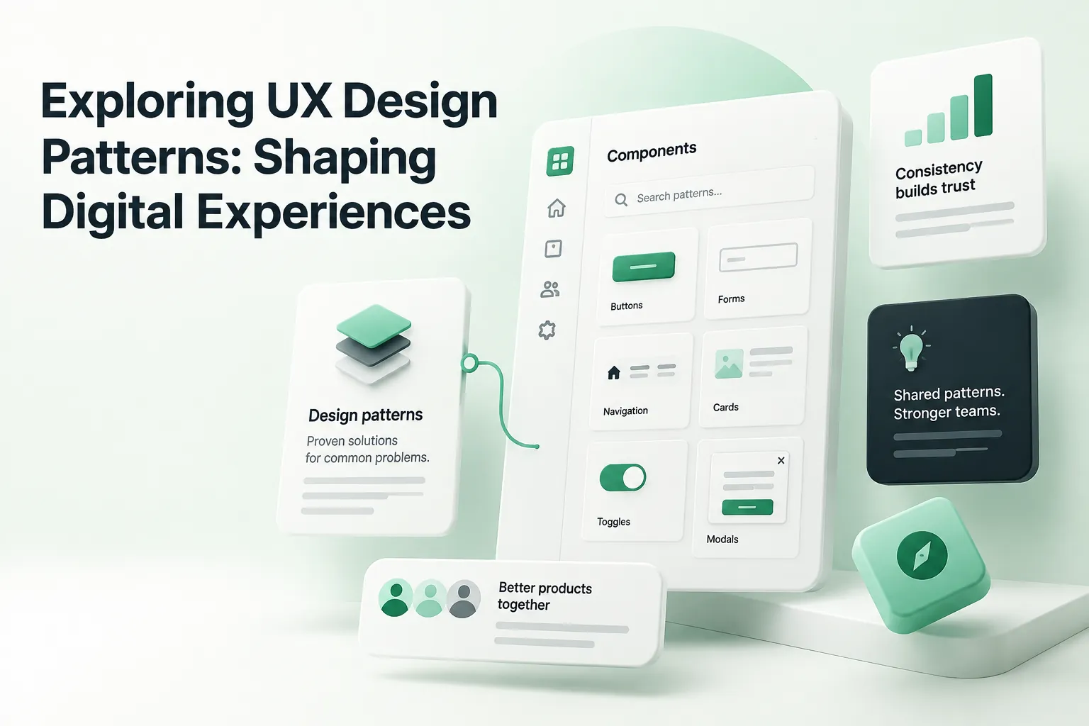
Quick answer: Exploring UX design patterns starts with a simple definition: they are reusable, proven solutions to recurring interface problems, such as navigating a site, filling in a form or recovering from an error. Common examples include breadcrumbs, inline form validation, progressive disclosure and tabbed navigation. Familiar patterns make products easier to learn, reduce design debates and keep experiences consistent across teams.
A look into the UX design patterns that guide a modern, intuitive user experience brought to you by WANDR, the leading UX design agency in Los Angeles and San Francisco, ranked by Clutch and Design Rush.
The digital world can be complex and difficult to navigate without the right interface. Web users who visit business websites, for example, expect a certain level of functionality.
Users:
- Need to be able to easily find products and services.
- Want to find the information they need.
- Expect to be able to do this easily, quickly, and without having to browse elsewhere.
Why Do UX Design Patterns Really Matter?
The web has provided us with many great things, but one thing it has done is reengineer our idea of what is acceptable in terms of an interface. Customers have high standards when it comes to business websites and other applications.
Nielsen Norman Group's design-pattern guidelines cover the most common interface patterns in depth.
Many customers are tech-savvy enough to understand that poor interface design easily leads to lack of market share. Thus, customers will quickly browse to another website if they cannot find what they need.
Designing a product with good UX is vital for the product to stay in business. UX design organizes all of the meaningful information into an easily understandable hierarchy that users can navigate quickly and intuitively. Without the right UX design, a user is likely to go elsewhere and LESS likely to recommend that business.
The Problem for Large Companies
Solving this issue may be easy enough for small businesses that have an equally small digital footprint. Their websites may not be overly complex or offer a lot of complex information. However, larger companies rely on large teams of designers, coders, and marketers need to deliver a brand consistent message through their UX design.
Imagine a large company with an equally complex website. Over time, this website needs to be maintained by many different people. The problem is, unless there is an underpinning philosophy regarding design elements across the website, those designers will struggle to maintain UX consistency. This is why UX design patterns and an easily understood pattern design system is crucial.
What Are UX Design Patterns?
UX patterns assist web and application designers to develop interfaces that are consistent, easily understood by a target audience, and easily recognizable. Here are some of the most common UX design patterns that developers and designers reference:
Navigation
When you browse a website, there is a common expectation that it can easily be navigated. This includes links that are in the right place, graphical buttons and elements that make sense, and other design elements that allow for browsing through the pages in a website.
Input
Sites that allow users to input data, such as credit card and other personal details, need to have consistent design. Users are able to easily understand what is being asked and what information is required.
Content Structure
Closely related to navigation, content structure is about the meta-structure of a site or an application. UX architects and designers need to structure the content of a site or an application in a way that is meaningful to a specific audience.
Information Hierarchy
How is the information organized? Is there low level and high level information that should be organized into a meaningful hierarchy that makes sense to end users?
15 Common UX Design Patterns (With Examples)
The four categories above are broad. In practice, designers work with specific, named patterns. Here are 15 of the most widely used UX patterns, grouped by the problem they solve, with when to use each.
Navigation patterns
- Breadcrumbs: A trail of links showing where the user is in the site hierarchy. Use on sites with three or more levels of depth. Example: Ecommerce category pages such as Home › Men › Shoes › Running.
- Mega menu: A large dropdown that shows many links grouped under headings. Use when a site has many sections and users need to scan options quickly. Example: Retail and university websites with dozens of departments.
- Tabs: Switch between related views without leaving the page. Use for a small number of parallel sections, not for sequential steps. Example: Product pages with Description, Specs, and Reviews tabs.
Input and form patterns
- Inline validation: Check each field as the user completes it and show the error next to the field, not after submit. Example: A password field that confirms the requirements as you type.
- Forgiving format: Accept input in different formats instead of forcing one. Example: A phone field that accepts spaces, dashes, or brackets.
- Autocomplete: Suggest values as the user types to reduce effort and typos. Example: Address fields and site search suggestions.
Onboarding patterns
- Lazy registration: Let people use or explore the product before asking them to create an account. Example: Shopping sites that let you fill a cart before signing in; Airbnb lets you search listings without logging in.
- Progressive disclosure: Show only what is needed for the current step and reveal advanced options on demand. Example: An "Advanced settings" link under a simple form.
- Steps left (progress indicator): Show how many steps remain in a multi-step flow so users know the effort ahead. Example: Checkout flows labeled Shipping › Payment › Review.
Feedback patterns
- Skeleton screens: Show gray placeholder shapes while content loads so the page feels faster and layout doesn't jump. Example: Social feeds and dashboards on first load.
- Toast notifications: A brief message that confirms an action without interrupting the user. Example: "Message sent" or "Item added to cart."
- Empty states: Explain what belongs in an empty area and give a clear first action. Example: A new project tool showing "No projects yet. Create your first project."
Content and discovery patterns
- Cards: Group an image, title, and short summary into a clickable unit. Good for browsing many items of the same type. Example: Blog indexes, product grids, and streaming catalogs.
- Faceted search (filters): Let users narrow results by attributes such as price, size, or date. Example: Ecommerce and job boards with filter sidebars.
- Pagination vs. infinite scroll: Pagination helps users find and return to specific items; infinite scroll suits casual browsing. Pick based on the task. Example: Search results usually paginate; social feeds scroll.
What is a Pattern Library in UX?
A pattern library is a database of UX patterns. A designer, UX architect, UX analyst, or anyone else involved in the design of applications and websites can access these patterns to ensure a consistent interface experience.
Many large and well-known brands maintain such pattern libraries, and this is critical to their ongoing appeal and success in the market. There are also many UX patterns available from other sources that anyone can access and use. For instance, incorporating third-party contact form code on a company website will often contain graphical and field elements that are known to appeal to users in a specific way.
How Do UX Patterns Help?
When there are a range of common design and interface problems that need to be solved across a site or application, UX design patterns are extremely helpful. In this context, UX design patterns form a consistent language that designers can use to create a consistent experience for users.
A large corporate website may have a whole UX pattern library that designers can use to create a consistent web experience. For example, one pattern may describe in detail the way that header navigation links on a website should work. This pattern may include the following information:
- The color of main navigation links on
- Whether those links include CSS elements such as link hover and link activation behaviors
- Graphical elements that may make up the links
In this way, a designer can simply access UX design patterns in the pattern library and find out how main navigation links are to be coded and designed. This makes it easy for a company to ensure that a consistent design philosophy is applied to their digital presence. It also helps end users in the following ways:
Meeting Expectations
These days, web users have a whole slew of expectations that need to be met by interface designers. Users want:
- A fast, convenient, and intuitive experience.
- To be able to find information, services, and products quickly.
- An interface that is attractive, appealing, and related intimately with the business brand.
A consistent pattern design system allows for pattern libraries to be built that allow for the creation of websites and applications that meet user expectations.
Building Interface Rapport and Familiarity
When users visit websites, they expect familiar elements. Many such expectations are actually unconscious, based on many years of web browsing.
For example, how does a company indicate intuitively and smoothly to a user that scrolling down a web page will present them with further useful information? It is this kind of usability that UX design and UX design patterns can address time and time again throughout a website or application.
In the best possible scenarios, the browsing and navigation habits of users are addressed in such detail that they become habitual and intuitive. Interfaces like this produce the best online experiences and can build brand recognition, market share, and improved e-commerce.
The Importance of Patterns to the Human Brain
The human brain is hardwired to recognize patterns. If you have ever looked up at the clouds and seen animals and other recognizable things, this is because your brain is wired to look for order in an otherwise chaotic world.
UX design patterns matter because they appeal to our search for order. Websites and applications that incorporate easily recognizable design elements in a consistent way appeal to users at a subconscious level.
When we recognize a familiar pattern and it presents us with a meaningful interaction that we expect, our brains produce dopamine. This chemical reward makes us feel good and we associate that with the website or application we are using. By extension, we associate these good feelings with the brand.
UX Patterns vs. UI Patterns vs. Design Systems
The terms overlap, but they describe different layers:
- UX patterns solve a behavioral problem: how users find, decide, enter, or recover. Lazy registration and progressive disclosure are UX patterns.
- UI patterns are the visual and interactive components that carry them out, such as a modal, an accordion, or a stepper. One UX pattern can use several UI patterns.
- A pattern library documents both, with guidance on when to use each.
- A design system adds the code components, design tokens (color, type, spacing), and governance that keep everything consistent across teams.
How to Use UX Design Patterns Well
- Start with the user problem. Name the task first ("users abandon the signup form"), then look for a pattern that solves it.
- Prefer conventions. If most sites in your category solve a problem the same way, users already know that pattern. Deviate only with a clear reason.
- Test it in context. A pattern that works in one product can fail in another. Validate with a handful of real users before rolling it out.
- Document it. Add the pattern to your library with when to use it, when not to, and a live example.
- Avoid dark patterns. Tricks like hidden costs, pre-checked add-ons, or hard-to-find cancel buttons may lift short-term numbers but damage trust.
Where to find UX pattern libraries
Good public references include Google's Material Design, Apple's Human Interface Guidelines, the GOV.UK Design System, Nielsen Norman Group's design-pattern guidelines, and UI-Patterns.com. Use them to learn how established teams document patterns, then adapt what fits your users.
Exploring UX design patterns step by step: how to choose the right one
Knowing a pattern exists is not the same as knowing when to use it. This short process helps teams pick patterns deliberately instead of copying whatever a competitor shipped last month.
Step 1: Name the user problem
Describe what the user is trying to do and where they get stuck, for example "users cannot tell which step of the application they are on." The problem points to a pattern family, in this case progress indicators or steppers.
Step 2: Shortlist two or three candidate patterns
Look at pattern libraries, your own design system and products your users already know. For a long form, candidates might be a multi-step wizard, a single page with sections, or progressive disclosure that reveals fields as needed.
Step 3: Check the context
Consider device, frequency and stakes. A carousel might work for browsing inspiration but hide critical content on a banking dashboard. Infinite scroll suits social feeds but frustrates users who need to find a specific item again or reach the footer.
Step 4: Check accessibility
Some patterns are much harder to make accessible than others. Custom dropdowns, drag and drop and auto-advancing carousels all need extra care for keyboard and screen reader users. The WAI-ARIA Authoring Practices Guide documents accessible versions of many common patterns.
Step 5: Prototype and test
Build a quick prototype of your preferred option and test it with five users on a realistic task. Patterns are proven in general, but your content, users and constraints are specific.
Step 6: Document it
Once a pattern works, add it to your pattern library or design system with guidance on when to use it, when not to, and accessibility notes. That documentation is what saves the next team from repeating the same debate.
Common mistakes when applying UX patterns
- Using a pattern because it looks modern rather than because it solves the user's problem.
- Mixing several patterns for the same job, such as three different filter styles across one product.
- Breaking user expectations, for example placing the primary action where people expect a cancel button.
- Ignoring empty, loading and error states, which every pattern needs.
- Inventing a custom pattern when a familiar one would do. New patterns have a learning cost, so save invention for problems that truly need it.
Conclusion
UX design patterns are not just about making things easy for web and application designers. They provide end users with a consistent and enjoyable experience that relates closely to how a brand, service, organization, or product is perceived. In this context, a pattern design system is crucial to ongoing success.
For more on this topic, read UX Patterns: The Key To Profitable Online Marketplaces and 5 UX Design Principles for Success: Part I.
What UX Design Patterns You Are Most Familiar with?
Drop us a comment below, or talk to us on LinkedIn, Instagram, Facebook, or Twitter.
Book a $499 UX audit call with Lina.