


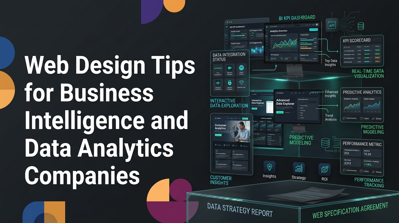
Web Design Tips for Business Intelligence and Data Analytics Companies
TL;DR: Web Design Tips for Business Intelligence and Data Companies
Business intelligence and data analytics companies face a split-audience problem: the technical users who love the product rarely control the budget, while the business buyers who sign off search for outcomes, not specifications. Winning web design for BI and data companies leads with business value on the homepage, keeps deep technical credibility one scroll away, and supports a self-serve evaluation experience that lets buyers see their data in the tool before booking a demo.
Below you will find practical web design tips for business intelligence and data analytics companies, covering the translation problem, homepage architecture, self-serve evaluation, pricing transparency, technical content moats, measurement, and the strategy-first process that ties it all together.
Data and analytics companies have a specific website design problem: the people who most appreciate the technical sophistication of the product are rarely the people who control the budget.
Your data engineers and analysts love the query performance, the connector library, and the transformation capabilities. Your buyer, often a business executive, cares about whether their team can get answers faster, whether reporting stops being a bottleneck, and whether the investment produces measurable operational improvement.
Designing a website that serves both audiences, while leading with the business value, is the central challenge in B2B data and analytics web design.
The Translation Problem: Technical Capability to Business Value
The central positioning challenge for data and analytics products is translating technical capability into business value without dumbing it down.
The translation isn't about simplifying, it's about reframing:
"Query performance at petabyte scale" becomes "Your team can ask any question of any data, instantly, even as your data grows."
"Native connectors for 200+ data sources" becomes "Connect every tool your team uses in hours, not months of engineering work."
"Row-level security and column-level access controls" becomes "IT can give every team exactly the access they need without creating security risks."
Each technical capability has a business value equivalent. The homepage should lead with the business value. Technical depth should be available for evaluators who need it, in documentation and feature pages, but it shouldn't be what the buyer-facing copy leads with.
This framing matters for SEO too. Business buyers search for outcomes ("reduce reporting time," "business intelligence for operations teams") not technical specifications. Positioning copy that leads with outcomes ranks better for business buyer queries.
The Homepage Architecture for Data and Analytics Products
Data and analytics products need to communicate complex capability to business buyers while also establishing technical credibility with the IT and data engineering stakeholders who will evaluate the architecture.
The homepage scroll architecture that addresses both audiences:
Above the fold: business outcome positioning. The headline is for the business buyer: "Every department gets the insights they need, without waiting for the data team." The ICP is named. The outcome is concrete.
First scroll: product visibility. A clean dashboard screenshot or brief product walkthrough. This is where the business buyer gets visual confirmation that the tool is professional-grade, and where the technical evaluator forms a first impression of the UI quality.
Visual consistency is a big part of what makes a dashboard read as professional-grade, and it comes from a disciplined design system rather than one-off screens. As Ed Orozco explains in a Wandr talk on design systems, "when you use the same component over and over again, you are minimizing the risk of having a button looking different across many devices." That same discipline is what keeps a data product feeling trustworthy from the marketing site through the live dashboard.
Second scroll: use case specificity by role. "For finance teams," "for operations teams," "for marketing teams", each with a specific use case description. Visitors self-select into their most relevant scenario.
Third scroll: technical credibility signals. Integration ecosystem (connected tools logos), security certifications, data residency options, API availability. For the technical evaluator who scrolled past the business content looking for their information.
Fourth scroll: social proof calibrated to both audiences. Business-outcome testimonials ("reduced reporting time by 60%") from business users, and enterprise customer logos that signal the product scales.
The Self-Serve Evaluation Experience
Data analytics products have a higher "show me before I talk to anyone" expectation than almost any other B2B category. Buyers want to see what their data would look like in the tool before investing time in a demo.
The self-serve evaluation patterns that reduce time-to-demo:
Interactive sandbox with sample data. A pre-built environment with sample data that prospects can explore, building dashboards, running queries, creating reports, without connecting their own data. This is the gold standard for data product evaluation.
Template gallery. Pre-built dashboard templates relevant to common use cases (revenue dashboard, marketing attribution, operations metrics) that buyers can preview to understand output quality.
Embeddable product widgets. Some data products can embed actual product functionality, a live chart builder, a sample query interface, directly on the marketing site. Technically complex but creates a compelling "try before you try" experience.
Guided trial setup. For products that require data connection to evaluate meaningfully, a guided onboarding flow that gets buyers to their first meaningful insight in under 30 minutes reduces the activation friction that causes trials to stall.
Pricing Transparency for Complex Products
Data and analytics products have highly variable pricing, usage-based, per-seat, or hybrid models make it hard to give a single number. This often leads to "contact us for pricing" across the board, which creates evaluation friction.
The pricing transparency approaches that work:
Usage-based pricing with a calculator. If pricing scales with query volume, data volume, or user count, an interactive pricing calculator lets buyers estimate their own costs. This is one of the highest-trust pricing experiences available.
Tier structure with ranges. "Teams of 5-25 users: typically $X-$Y/month depending on data volume." Gives buyers enough context to self-qualify.
Clear enterprise differentiation. If your enterprise tier has meaningfully different capabilities (unlimited users, dedicated support, on-premises deployment), make the differences concrete rather than hiding them behind "contact us."
The Sales Enablement Content Layer
B2B data purchases often involve a lengthy technical evaluation phase after initial discovery. The prospect liked what they heard, and now needs to evaluate the product more deeply, often with their IT and data engineering stakeholders.
The website content that supports this mid-cycle evaluation:
Technical architecture documentation. How does the product handle data ingestion, transformation, and storage? What are the available APIs? How does data residency work? This content lives in a dedicated "Technical" or "Security and Architecture" section, findable from the main navigation.
Benchmark performance data. Query performance at scale, dashboard load times, data refresh latency, specific, testable performance claims with methodology disclosed. This differentiates "fast" from "actually fast at the scales we operate at."
Integration documentation depth. Beyond the marketing-layer integration list, buyers evaluating data tools want to know how the integrations actually work. Well-documented integration pages build technical credibility that a logo list cannot.
Security white paper. A downloadable PDF covering data encryption, access controls, audit logging, and compliance certifications. Standard in enterprise data product evaluation; its absence is noticed.
The Competitive Moat That Technical Content Creates
B2B data and analytics companies that invest in genuinely technical content create a competitive moat that's hard for competitors to replicate quickly.
Most SaaS marketing content is surface-level. Technical content goes deeper: it explains how specific architectural decisions were made, why certain tradeoffs were chosen, and what the implications are for buyers with specific requirements.
The technical content categories that create genuine differentiation:
Architectural decision posts. "Why we chose columnar storage over row-based for our query engine, and what it means for your dashboard load times." Attracts data engineers evaluating architectural fit.
Benchmark transparency. Publishing honest performance benchmarks, including conditions under which performance degrades, builds more trust than cherry-picked best-case numbers.
Integration deep-dives. "How our Salesforce connector handles deleted records and field type changes" is the kind of content that data engineers search for.
This content takes longer to produce than standard marketing content. It compounds in authority, organic rankings, and credibility. Review your Google Search Console data to see which technical query categories your site is already generating impressions for, those are your highest-priority content opportunities.
The Search Console Foundation
Before any redesign or major content investment, spend an hour in Google Search Console. Find your highest-impression pages with a CTR below 2% and rewrite those title tags to match search intent. This is the fastest, cheapest way to increase organic traffic, no design work required, results often visible within 30-60 days.
Then check your top five organic blog posts. Does each link internally to a relevant service page? Does each end with a CTA toward your primary conversion event? If not, add both today.
Forrester finds over 70% of B2B buyers complete most research before contacting a vendor. HubSpot data shows companies with documented strategies generate more qualified leads. Gartner's research confirms 6-10 stakeholders in the average enterprise purchase, all evaluating you on your website.
At Wandr Studio, every engagement starts with data before creative work. MedTrainer saw a 28% increase in book-a-demo conversions after a strategy-first redesign. Trust ID rebuilt its identity verification site to lead with business outcomes while keeping the technical depth its evaluators demand, see the Trust ID case study. Zoe Financial improved onboarding completion by restructuring information request sequence, see the Zoe Financial case study.
Our B2B web design agency has designed marketing sites for data and analytics companies that need to speak to both business and technical buyers.
Book a free discovery call for an honest assessment of where your site stands and the highest-leverage improvements available.
Related reading: B2B Website Strategy | B2B Website Redesign | B2B Website Conversion Optimization | Designing a B2B Website
The Measurement Layer: Proving What Works
Building or improving a B2B website is only half the work. The other half is knowing whether the changes are working, and that requires a measurement infrastructure most B2B companies haven't fully set up.
The measurement hierarchy runs from least to most useful:
Traffic metrics (sessions, pageviews) tell you whether your site is being seen. They're the easiest to measure and the least connected to revenue.
Engagement metrics (time on page, scroll depth, pages per session) tell you whether visitors are interacting with content. Directionally useful, still not tied to business outcomes.
Conversion metrics (form completions, demo requests, trial signups) tell you whether your website is producing qualified leads. This is where measurement starts to matter commercially.
Pipeline metrics (opportunities sourced from website, revenue attributed to website) tell you what the website is actually worth to the business.
Most B2B companies measure the top two layers with precision and have almost no visibility into the bottom two. The investment should be flipped. Our B2B website KPIs guide covers the full setup, configuring GA4 conversion events, connecting Search Console, and building CRM attribution so you can answer the question that matters: how much pipeline is your website actually generating?
HubSpot's research on marketing measurement consistently shows that companies with proper conversion tracking make better investment decisions than those flying blind on vanity metrics.
Why Strategy Has to Come Before Design
The most common reason B2B website projects disappoint isn't a failure of design craft, it's a failure to answer the strategic questions before design begins.
Who is this website for? What is the single most important action it should drive? What does the buyer need to see, in what order, before they take that action? What objections stall deals at the consideration stage, and how does the site address them?
When those questions have clear answers, design work moves quickly and produces something that performs. When they're vague, even beautiful design ends up on a site that doesn't convert.
This is why every serious B2B website strategy starts with discovery, stakeholder interviews, analytics review, ICP mapping, competitive analysis, before a single design decision is made. The strategy is the foundation. The design executes it. Reversing that order is the single most expensive mistake in B2B web design, and it's the reason so many redesigns produce sites that look better but perform about the same.
The output of a proper discovery process is a strategic brief that guides every subsequent decision. It also creates internal alignment, resolving competing stakeholder priorities before they become expensive design debates. When the strategy is documented and approved, feedback cycles are shorter, the design work is faster, and the outcome is measurably better.
The Mobile and Performance Reality
Whatever your B2B website's specific goals, two technical factors affect them across the board: mobile experience quality and page performance.
Google's mobile-first indexing means Google evaluates the mobile version of your site to determine rankings. If your mobile experience is inferior to your desktop experience, your search visibility is limited by your mobile quality, regardless of how good the desktop site looks.
And Core Web Vitals, Google's measures of loading performance (LCP under 2.5 seconds), interactivity (INP under 200ms), and visual stability (CLS below 0.1), are direct ranking factors. A site that fails these on mobile competes at a disadvantage in organic search.
The most impactful performance improvement for most B2B sites is image optimization: compressing images and converting to WebP format typically resolves the majority of load time issues. Run your site through Google PageSpeed Insights to see your specific issues and their impact. Our responsive B2B website design guide covers the full mobile and performance playbook.
Beyond SEO, mobile and performance directly affect conversion. B2B buyers research on mobile throughout their consideration cycle, during commutes, between meetings, in the evenings. A slow or broken mobile experience leaks pipeline at every stage of the journey. Complete your primary conversion flow on your own phone: whatever friction you encounter, your mobile prospects encounter too.
Building for the Long Term
The highest-performing B2B websites aren't the products of a single redesign, they're the result of treating website performance as an ongoing practice.
The rhythm that compounds:
Monthly: Publish one to two new content pieces mapped to specific keyword targets. Scan Search Console for new quick-win opportunities. Check conversion rates for unexpected changes.
Quarterly: Deep-dive into Search Console data to find high-impression/low-CTR pages that need title tag work. Update your top-performing blog posts with fresh data and examples. Review conversion rates against your baseline.
Annually: Comprehensive audit of the entire site. Review whether positioning still reflects who you are and who you serve. Assess whether visual quality remains competitive with what buyers see from alternatives.
This ongoing practice, small, consistent improvements, produces dramatically better results over 12-24 months than periodic crisis-driven redesigns. A site that gets 2% better every month is a substantially better site after two years, without ever requiring a disruptive rebuild.
The companies that win on B2B web performance are the ones that build this discipline into their operations. Not the ones with the biggest one-time budget, but the ones who treat their website as a living asset that deserves consistent attention.
That's the approach we bring to every engagement at Wandr Studio: strategy-first design, measurable outcomes, and a foundation built to keep performing long after launch.
Final Thoughts on Web Design for Business Intelligence Companies
Great web design for business intelligence and data analytics companies is not about choosing between the technical buyer and the business buyer. It is about sequencing them. Lead with the business outcome, prove it with a self-serve evaluation experience, and keep genuine technical depth one click away for the engineers who will validate the architecture. Layer measurement on top so you know which choices actually move pipeline, and treat the whole site as a living asset that compounds over time rather than a one-time rebuild.
Do that consistently and your website stops being a brochure and starts being your most reliable source of qualified demand from both audiences.
Work With a B2B Web Design Agency That Speaks to Data Buyers
If your business intelligence or data analytics site is speaking to engineers but losing the buyers who sign, our B2B web design agency can help you translate technical capability into business value that converts. See how we did it in the Trust ID case study, then book a free discovery call for an honest assessment of where your site stands and the highest-leverage improvements available.
